Indoor scenes, critiques welcome.
-
@LauraA Thank you so much for your feedback. I might fiddle a bit more with the pirate piece later this week.
I think I try to give viewers very different feelings of the space with these 2 images:
- With the pirate image, I want to make the viewers feel they are also in the middle of the game, they are close with the characters.
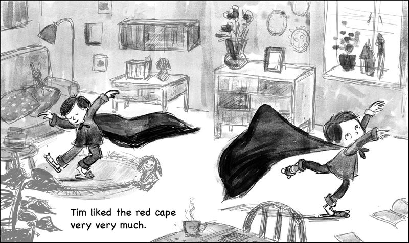
- with Tim and the cape image, I want to viewers feel that they are standing by the door wathcing a kid dancing accross the room.
The second image is part of the dummy picture book I am working on. It is so encouraging to get positive feedback on it, making me very motivated to continue the dummy book.
-
Overall, I think it's psychologically realistic and specific enough to be interesting! What @Su said!
Cannot say better neither! Lovely work!
-
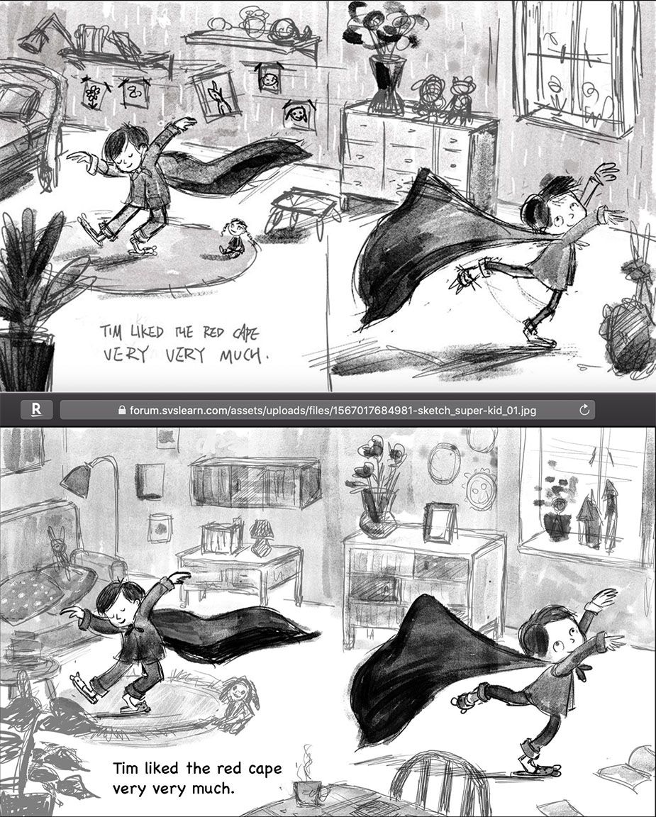
An quick update on Tim, the super-kid. Many of you commented the scene does not look like a boy's bedroom. This made me realize this scene actually works better in the living room. Because in the next page, readers will meet Tim's mother, who has been watching him dancing.
Do I have interesting enough shapes in the background? is the scene to crowed now? Any thoughts?
-
I like the flow of the original better. The boy moves from one page to the other more diagonally in the first one and more horizontally on the second. The second one doesn't read as smoothly. I don't think lowering his position to make room for showing more of the background couch, shelves, or foreground tables adds anything to the narrative. I like the smaller doll too — he looks like he's going to trip over the bigger one.
Try to keep the gestural quality of the linework. It's oozing motion in the first one and is much stiffer in the 2nd. I know, that's easier said than done (my perpetual struggle) but that's part of what's so beautiful about your sketch.
Everything about the first sketch to me is nearly perfect! I don't care what room he's in, just that he's got that feeling of joy! Which is exactly what I feel when I look at that picture.
-
@Su Thank you so much. I see what you mean. Now I know what to do tomorrow :-). I always struggle with how to avoid getting stiff the more I work on a piece. I think this one is especially difficult, because of the movement. I might need to study how other artists slove this: keeping a sense of movement with in an image. I am looking up some comic books on my shelf.
-
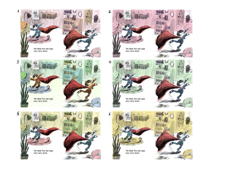
another round of rough sketch, and some color studies. Any thoughts?
-
@xin-li I've loved watching you work on this. I like the color in #5 because the red tones on the boy and the rug immediately beneath him keep him as the focal point, but I also like #3. I have to admit color is something I'm bad at so take my opinion with a grain of salt. It's a great picture whatever you do.
-
@xin-li This is like a squinting test I think. I took my glasses off (legally blind without them) and the color studies where the little boy is most visible are #4 and #6.
P.S. I love your characters!
-
These are fabulous I love your style!
-
I love how you cleaned up the clutter to give him room to dance! And the motion lines around the feet and cape are perfect — you successfully captured the emotion AND motion! Currently I like the direction of #2. I love the red and pink together and understand that you do need to add more colors. I love the blue pjs and red cape with all the pink. Very retro!
Did you see Lee White's new post in the forum? Take a look if you can — it's got fantastic information in it. https://forum.svslearn.com/topic/7944/how-to-do-awesome-illustrations-every-time/11 . He recommends working out color palettes before painting and studying palettes from artwork that you like.
I often have trouble deciding what colors go best with each other and end up using too many colors. (I'm not saying that you are doing this.) I've been trying to use more neutral colors and use strong colors for when there's something that I want to pop. That helps tie together all the colors I tend to use. I'll be trying Lee's process and hopefully it'll help!
-
@demotlj @lmrush thank you so much.
@BichonBistro interesting approach. I will try this next time.
@su thank you for your feedback. Yes, I have seen Lee's video. I am a huge fan of Lee both as an artist and as a teacher. My current process is very much coming from Lee's teaching, although I have to admit I do not reach 50 thumbnails (something I am working on). -
I like 3 and 5 the most
-
Your style is soooooooooo cuuuute! Gonna second michaela and say I like 3 and 5 as well