Society of Visual Storytelling

    SVSLearn Forums

    • Register
    • Login
    • Search
    • Recent
    • Tags
    • Popular
    • Users
    • Groups
    • Search

    Urgent feedback on thumbnail

    Artwork
    8
    34
    1521
    Loading More Posts
    • Oldest to Newest
    • Newest to Oldest
    • Most Votes
    Reply
    • Reply as topic
    Log in to reply
    This topic has been deleted. Only users with topic management privileges can see it.
    • Nyrryl  Cadiz
      Nyrryl Cadiz SVS OG @NessIllustration last edited by

      @NessIllustration i think your work looks pretty solid!

      Portfolio: nyrrylcadiz.com
      Instagram: https://www.instagram.com/nyrryl_cadiz/
      YouTube: https://www.youtube.com/channel/UCbJCF1Im8ZO7hpGWTKOJMuA

      1 Reply Last reply Reply Quote 2
      • ArtofAleksey
        ArtofAleksey @NessIllustration last edited by

        @NessIllustration keep at it! Glad something I said was helpful!

        instagram and twitter: @artofaleksey
        alekseyillustration.com

        1 Reply Last reply Reply Quote 1
        • Zachary Drenski
          Zachary Drenski last edited by

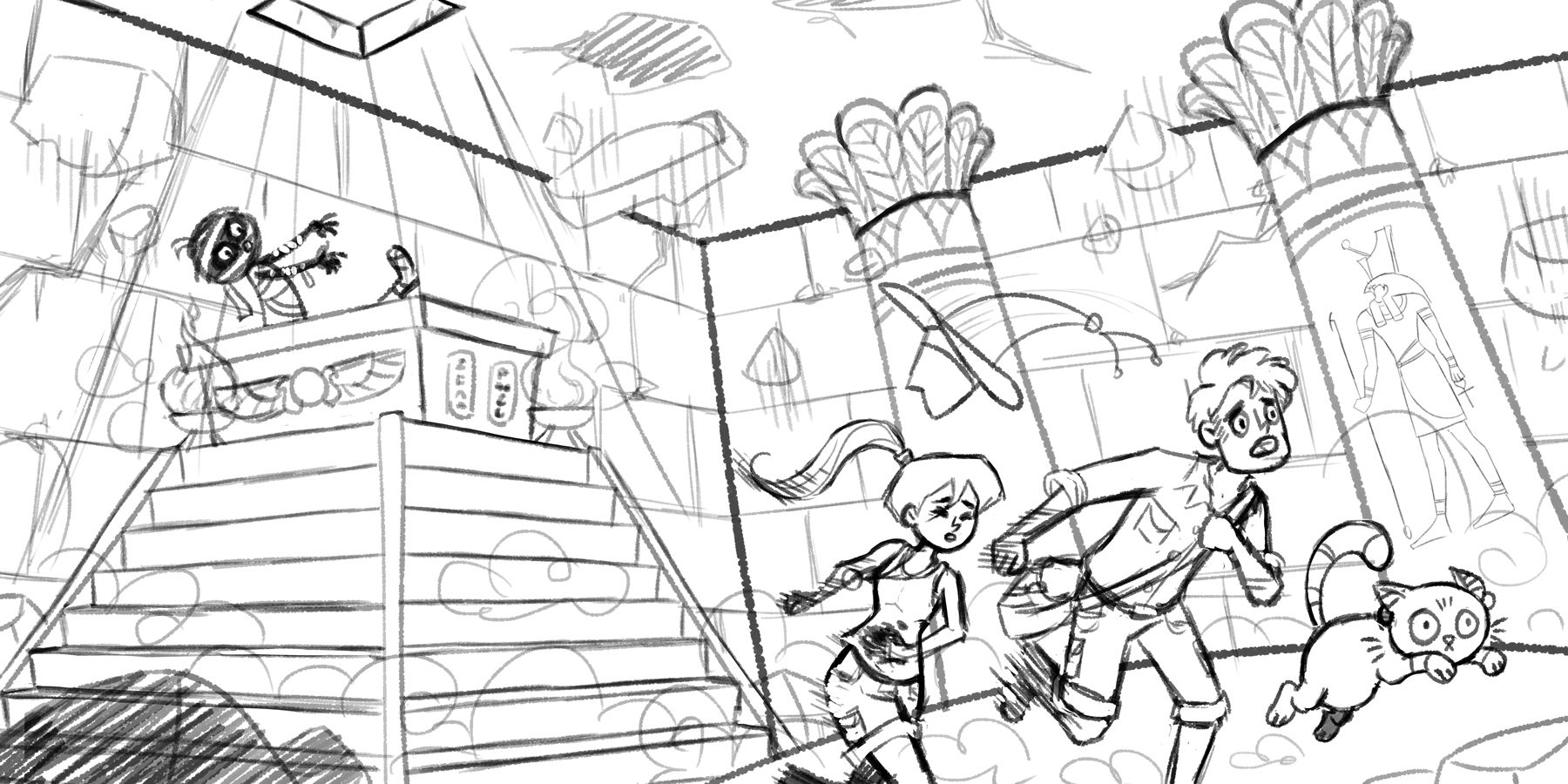
          Everyone else had great feedback so I'm just going to add a bit to that. My first thought was kind of along the lines as @Aleksey with it looking rather safe for a chase scene. If you are okay with wonky perspective, you could try playing, exaggerating, and pushing the perspective to create dynamism and a sense of shakiness and unease. You could also try falling rocks to go with the perspective stuff to indicate danger. You do great work, and this sketch looks awesome already, so go with what you like/have time for.

          NessIllustration 1 Reply Last reply Reply Quote 3
          • NessIllustration
            NessIllustration Pro @Zachary Drenski last edited by

            @Zachary-Drenski Ouuhhh I like the fallen rocks idea! It could be like those booby trapped, self-destructing chambers! That would be wicked cool! Thanks for the idea Zachary 🙂

            vanessastoilova.com
            instagram.com/vanessa.stoilova/

            Check out my Youtube channel for tips on how to start your career in illustration! www.youtube.com/c/ArtBusinesswithNess

            1 Reply Last reply Reply Quote 2
            • NessIllustration
              NessIllustration Pro last edited by

              @Aleksey @Nyrryl-Cadiz @peteolczyk @Perrij @Zachary-Drenski Thank you so much again for your feedback! Here is my sketch.. What do you think?

              Mummy-Sketch-Vanessa.jpg

              vanessastoilova.com
              instagram.com/vanessa.stoilova/

              Check out my Youtube channel for tips on how to start your career in illustration! www.youtube.com/c/ArtBusinesswithNess

              peteolczyk ArtofAleksey MichaelaH 3 Replies Last reply Reply Quote 8
              • peteolczyk
                peteolczyk @NessIllustration last edited by

                @NessIllustration I think that’s great Ness

                www.peteolczykillustrations.com

                www.instagram.com/pete_illustrations

                1 Reply Last reply Reply Quote 1
                • ArtofAleksey
                  ArtofAleksey @NessIllustration last edited by

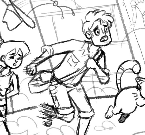
                  @NessIllustration the middle guys leg or arm positions should be reversed (opposite arm/leg) and make the hat flying still but closer to the guys head so it still feels like his hat and not a random hat flying off of someone.

                  instagram and twitter: @artofaleksey
                  alekseyillustration.com

                  NessIllustration 1 Reply Last reply Reply Quote 2
                  • NessIllustration
                    NessIllustration Pro @ArtofAleksey last edited by

                    @Aleksey Great advice for the hat! For the limbs though, are you sure? 😮 He's bringing up his right leg now so he's in the middle position - where his arms should be in the middle as well. His right arm is currently moving back, opposite the right leg, and the left arm is holding on to the bag so staying relatively put. This seems right to me, but I may be wrong cause sometimes I mix it up with these running positions

                    vanessastoilova.com
                    instagram.com/vanessa.stoilova/

                    Check out my Youtube channel for tips on how to start your career in illustration! www.youtube.com/c/ArtBusinesswithNess

                    ArtofAleksey 1 Reply Last reply Reply Quote 0
                    • ArtofAleksey
                      ArtofAleksey @NessIllustration last edited by ArtofAleksey

                      @NessIllustration if you take his bent leg and bring it forward instead of back it will look better. Try it! It’s a minor thing though i dont think it matters because hes clearly running and some people run differently from others maybe i run weird...

                      instagram and twitter: @artofaleksey
                      alekseyillustration.com

                      NessIllustration 1 Reply Last reply Reply Quote 0
                      • NessIllustration
                        NessIllustration Pro @ArtofAleksey last edited by

                        @Aleksey Do you mean like this?
                        test.jpg

                        vanessastoilova.com
                        instagram.com/vanessa.stoilova/

                        Check out my Youtube channel for tips on how to start your career in illustration! www.youtube.com/c/ArtBusinesswithNess

                        ArtofAleksey 1 Reply Last reply Reply Quote 1
                        • ArtofAleksey
                          ArtofAleksey @NessIllustration last edited by

                          @NessIllustration i cannot tell the difference

                          instagram and twitter: @artofaleksey
                          alekseyillustration.com

                          NessIllustration 2 Replies Last reply Reply Quote 0
                          • NessIllustration
                            NessIllustration Pro @ArtofAleksey last edited by

                            @Aleksey Oh.. Then probably not what you mean ^^''' I brought the right leg forward, closet to the other leg..

                            vanessastoilova.com
                            instagram.com/vanessa.stoilova/

                            Check out my Youtube channel for tips on how to start your career in illustration! www.youtube.com/c/ArtBusinesswithNess

                            1 Reply Last reply Reply Quote 0
                            • NessIllustration
                              NessIllustration Pro @ArtofAleksey last edited by

                              Okay the sketch is due Monday (pretty much now-ish) so I think I'll hand it in like this and try more poses for Indiana Jones later at the color stage. If I rush this to get the pose right tonight I'll mess it up, I'm sure!

                              vanessastoilova.com
                              instagram.com/vanessa.stoilova/

                              Check out my Youtube channel for tips on how to start your career in illustration! www.youtube.com/c/ArtBusinesswithNess

                              1 Reply Last reply Reply Quote 0
                              • MichaelaH
                                MichaelaH @NessIllustration last edited by

                                @NessIllustration It is really great, what I would change, maybe some connection with the team and the mummy, like one of them has his pupils looking back (man or the cat)...

                                https://www.instagram.com/michaelaheimlich/
                                https://www.heimlich-illustration.de/

                                1 Reply Last reply Reply Quote 1
                                • Zachary Drenski
                                  Zachary Drenski last edited by

                                  This looks really awesome! I think @Aleksey meant put that back leg forward so that it is in a similar position as the girl's. I see what he is saying but, in my opinion, the man's running position is fine and even better that the girl and him are not striking the same pose.

                                  @MichaelaH mentioned having the eyes of the cat or the man looking toward the mummy. That could be a nice touch. If you decide to do that I think you should have the man looking back because if you have the cat looking back, it will appear to be looking up at the man.

                                  The mummy looks so good, I love how cute it is, so I feel bad even bringing it up, but (to me) the mummy's body and leg don't look like they are connected. Overall, this is looking great and I can't wait to see how it turns out.

                                  NessIllustration 1 Reply Last reply Reply Quote 2
                                  • NessIllustration
                                    NessIllustration Pro @Zachary Drenski last edited by

                                    @Zachary-Drenski Thank you Zachary for your helpful suggestions ❤ I have to agree with you about the mummy's foot, it looks disembodied.. I'll probably remove it entirely! The eyes suggestion is also great and as for the running, I'll see if I can improve it but like you, I don't wish to have the running poses mirror each other and really want them to be different for more variety and dynamism.

                                    vanessastoilova.com
                                    instagram.com/vanessa.stoilova/

                                    Check out my Youtube channel for tips on how to start your career in illustration! www.youtube.com/c/ArtBusinesswithNess

                                    1 Reply Last reply Reply Quote 1
                                    • Elinore Eaton
                                      Elinore Eaton last edited by

                                      What a fun illustration! @NessIllustration I'd love to see the running characters be a bit larger and closer to the audience, maybe have the cat the closest. It will create a stronger dominance structure, as well as bring some stronger layering and perspective. If you make them larger and shift them just slightly so that they overlap the stairs a bit, you're also going to lead the eye from the mummy to them and back again, and the composition won't be divided by that strong line illustrating the corner of the room. I did a quick re-size to show you what I mean. Nice work!

                                      alt text

                                      http://www.elinoreeaton.com/
                                      https://www.instagram.com/elinoreeatonart/

                                      NessIllustration 1 Reply Last reply Reply Quote 2
                                      • NessIllustration
                                        NessIllustration Pro @Elinore Eaton last edited by

                                        @Elinore-Eaton Elinore, this looks wonderful!! Thank you so much for this!! ❤

                                        vanessastoilova.com
                                        instagram.com/vanessa.stoilova/

                                        Check out my Youtube channel for tips on how to start your career in illustration! www.youtube.com/c/ArtBusinesswithNess

                                        Elinore Eaton 1 Reply Last reply Reply Quote 1
                                        • Elinore Eaton
                                          Elinore Eaton @NessIllustration last edited by

                                          @NessIllustration Yay! So glad, anytime. I'm kind of a composition junky. 😉
                                          Looking forward to seeing how this goes!

                                          http://www.elinoreeaton.com/
                                          https://www.instagram.com/elinoreeatonart/

                                          1 Reply Last reply Reply Quote 1
                                          • Perrij
                                            Perrij last edited by

                                            Not sure if anyone else mentioned this yet, but the perspective on big columns the is off. They should be pointing straight up and down. Of course, it could be an artistic choice to skew the perspective, but in this case I feel its more distracting than anything. I did a quick draw over to show you what i mean perspective draw over.png

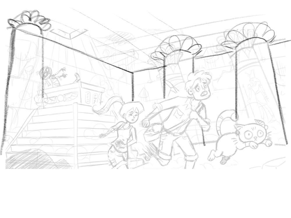
                                            and I added a third column because the wall behind the mummy was feelin kinda empty.

                                            https://perrijs.myportfolio.com/

                                            NessIllustration 1 Reply Last reply Reply Quote 1
                                            • First post
                                              Last post