SEPTEMBER WIP Maybe???Prompt Question
-
@juliepeelart haha! It probably comes from being the dad to three girls myself.
-
@chrisaakins Did you do what Will does in the class and do several colour studies to find one you like?
-
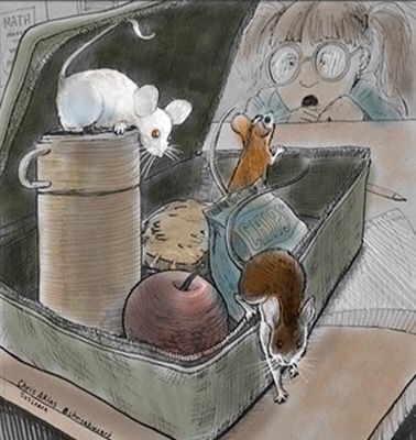
I think you have a really strong piece for the theme this month- but as you've pointed out the presentation could be slightly better. The color could potentially work, but I would simplify the green on the lunch box. You've added additional textures and are trying to get too tricky with the color variation. It's sticking out from everything else. The textures are competing with the charm of the ink work. Color variation can be a good thing, but I think it needs to be reigned in for this case- especially if you don't have a ton of time to work out the problems. Let the lunch box simplify. Maybe go over it will a solid transparent color, letting the ink do the heavy lifting. I also think you need to brighten up the piece slightly overall, it's feeling a little somber to me.
Just my opinion. I'm looking forward to what others have to say.
-
The main problem I see with the color is that you have a lot of competing strong saturated colors. I like the mice as a focal point and I would make sure that they are the most saturated colors in your scheme. I’d move the saturation of the other items more toward the gray, especially the green lunchbox and the red apple — those colors next to each other, especially at a higher saturation, are really puling my attention away from the mice. I did a very quick color study which is too grayed out now but it’s just to show you what I mean.
-
@Braden-Hallett no. I wasn't really planning on color. I was going to let the inking be the star. Maybe I should just stick with that idea. @demotlj I agree. I think I need to step away from it a bit and come back to it. Maybe I can get a better picture of the original and that will fix my dissatisfaction with it, because I really do like the original.
-
I agree your B&W is the strongest. I think you have a good foundation with that and can now use this time to have fun experimenting with color. Keep posting your experiments here and if you find one that really works that's great! If not you at least have a strong piece without color.
-
I really like the B&W values of the color versions. I like them better than the color versions themselves.
My feeling would be to keep with the B&W but really push the values to be stronger. It is easy to do that with ink.
-
@chrisaakins said in SEPTEMBER WIP Maybe???Prompt Question:
@Braden-Hallett no. I wasn't really planning on color. I was going to let the inking be the star. Maybe I should just stick with that idea. @demotlj I agree. I think I need to step away from it a bit and come back to it. Maybe I can get a better picture of the original and that will fix my dissatisfaction with it, because I really do like the original.
If you're not happy with it so far colour-wise (and you wanna colour it) copy it, shrink it down, and paste it on a new canvas 6 times or so (so you've got 6 little mini paintings) Use a colour or multiply layer to quickly try out a bunch of colour schemes. I'm willing to bet money you'll
find something you like")
-
@jakecrowe Thanks! I really enjoyed your work last month. That was a neat graphic design. Congratulations on the win! I went back and read everyone's initial positive responses to my post (which were some of the best I have gotten so far) and I think I am overthinking it. I just need to let it be a black and white piece. Thanks everyone! @demotlj @Braden-Hallett @TessaW @lou @Aleksey @theprairiefox and everyone else who commented!
-
"and I think I am overthinking it. I just need to let it be a black and white piece. Thanks everyone! @demotlj @Braden-Hallett @TessaW @lou @Aleksey @theprairiefox and everyone else who commented!"
Note I just noticed this last post of yours, but I still wanted to chime in.
Hey. So I too prefer the black and white but I do really like the additional subtle colours in the white mouse. The green is distracting. If you returned to the black and white and added subtle colour details to the white mouse (as you have in this one) and add subtle colours to the other two grey ones (not some much yellow -similar to the feel of the white mouse), I think those changes would give it the little boost.