Colour harmony help-working digitally
-
Well when you're just starting out working digitally, you can always "borrow" color schemes from paintings that you like. I've known many artists to do it and it's very helpful when you have such an unlimited possibility of colors in digital art programs.
-
@Perrij that's a great idea, will give it a try thankyou
-
Hi Anya, I also struggled a lot with this issue for a long time. But now I used to make small color composition before I make a real size digital painting and it really helps. You can also check Marco Bucci's video here about color harmony: https://www.youtube.com/watch?v=4LhcNbFMkTw
He also has lots of videos related to that. -
@lenwen thankyou so much for the link I will definitely watch, I think I need to start doing the little colour study sketches, but then it's hard because I end up changing colours and redoing half way through the piece anyway

-
I too struggle with color, both digitally and traditionally. I find it to be my biggest challenge in illustration. I have found however that treating digital like traditional helps quite a bit.
I'll select a few colors and only play with those using black and white to shade and tint with a "natural" feeling brush, or a brush on low opacity and mixing those initial colors together. I find the color pallete in photoshop, or procreate, whatever your program to be overwhelming so I like to do what I can to simplify it!
-
I really like brushing in my best guess of colors under my drawing, applying a Gaussian blur to it to naturally get a blended palette to work from and to unify some things. You can even completely blur out an image/photo to color select from.
Then also using color balance to harmonize/shift the colors I initially selected/image color ref.
I’ve seen other artists use this technique to great effect. I tried it on my last illustration and LOVED how it turned out and how much easier it was to pick colors relative to their neighbors. My contest image was very purple/pink/blue but there was a hecka ton of colors I would not have had the color picking prowess to pick from a blank canvas.
Having a smooth harmonious base to work from will definitely be something I include in my illustrations going forward!
-
@Shara-Mills That's a neat trick. Thanks for sharing that!
Previously my method has been to think about the potential colors I might want to use and go to google and search for the closest color scheme. For example, in my August contest image I used a triadic scheme. I went to google and typed in "triadic color scheme" in the image search and came up with some images that had colors that I thought might work for my drawing. This is the one I referenced:
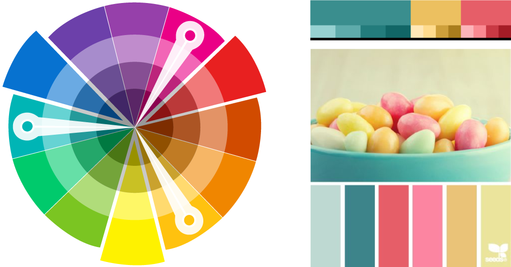
I have difficulty guessing which darker or lighter values I can use, so an image like this helped a lot.
http://twiggyt.com
Instagram: www.instagram.com/twiggyt_art/
Twitter: @twiggyt_art -
@jakecrowe this is what I've been trying to do too but I think I can limit my palette even further so I'll try that I think
-
@Shara-Mills oooh that's a great trick I will definitely give this a try thankyou!
-
@TwiggyT this is a great idea, I thought of doing something similar but wasn't sure how it would work but I will definitely try this for my next piece!