Villian Concept critique
-
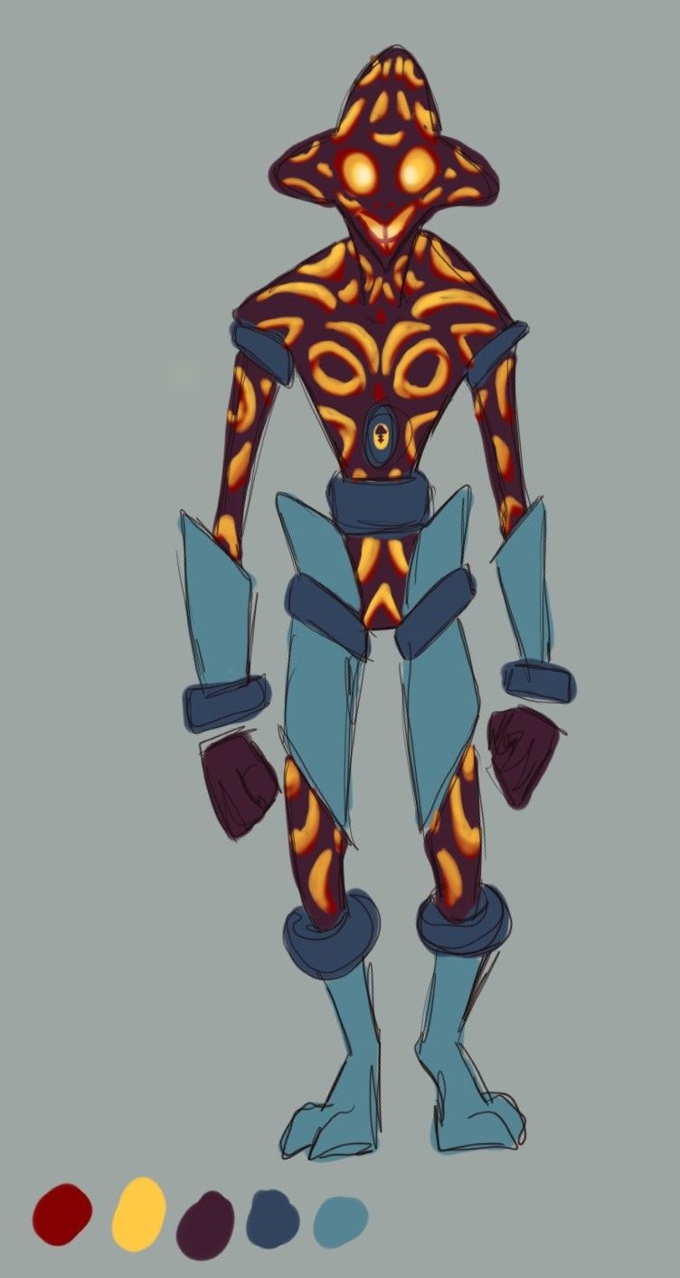
So I just went through the Villian and Monster course and wanted to practice some character design. I thought making a space pirate may be fun so I gave it a go. My initial thought was that my villian was a being made of light that was trapped in a physical body as punishment for an unforgivable crime. He was banished from his realm and now travels the solar systems plundering and leaving destruction in his wake as he seeks to destroy the light. I picture him being more of a tragic/tourtured villian. Hes in constant pain (light trapped bounces continually in its prision) and is the definition of pent up energy. Because of this he tends to be extremely reactive and has gone slightly insane over the years. That's a brief summary of his backstory, I could go on but I don't think its benefical here. Here are some very rough and simplified concepts for him. His hands are not attached to his body because they are an electromagnetic material that he can manipulate into different forms to be a conduit for his energy attacks.
My Questions are:
-How does his design read?
-Does the color scheme flow well together?
-Are there any major flaws in the design you see?
-Any general comments or critiqes?
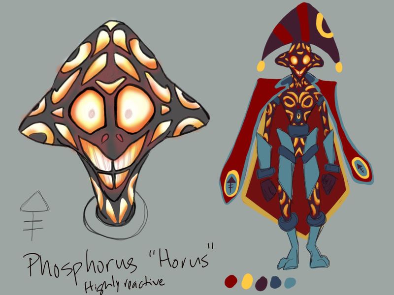
And if you're wondering about his name, Phosphorus in Greek mythology was the morning star or bringer of dawn. The element was named after the mythological god becuase it gave off a faint glow. The symbol above his name is the alchemical symbol for phosphorus.
Thanks for taking the time to look!
-
I like the look of the orange texture contrasting on the dark red skin color, it looks like he could actually explode! The nose and mouth areas on the full body look a little harder to read than the close up so maybe they could use a little more contrast? Nice work!
Instagram: https://www.instagram.com/studioevergarden/
Behance: https://www.behance.net/studioevergarden -
@kanari-illust thanks and good point! I'll work on making sure his eyes and mouth stand out!
-
I love it! It's a fun design, and I like how you've broken up the complexity of the skin with the larger, simplified costume design. Overall I think this just needs a bit more contrast in general-maybe having a darker background is all it needs to have the glowing effect really enhanced.
Website: www.tessawrathall.com
Instagram: www.instagram.com/tessawrathall_art/
-
@TessaW thank you and I agree about the need for more contrast!