Serious Critique Request
-
I feel I submitted a really strong piece this last month. In my own eyes I feel it was a really strong piece. I have been submitting to the contests for years now. And for years, my work is never picked. So my self esteem continues to get crushed month after month. I get back up and work harder. I take the classes, I do the work, I take the critiques from others and incorporate it into my work. I still seem to fail.
I am posting my piece again looking for feedback on what I did wrong and what can I do better?
Thanks from a deflated artist...
-
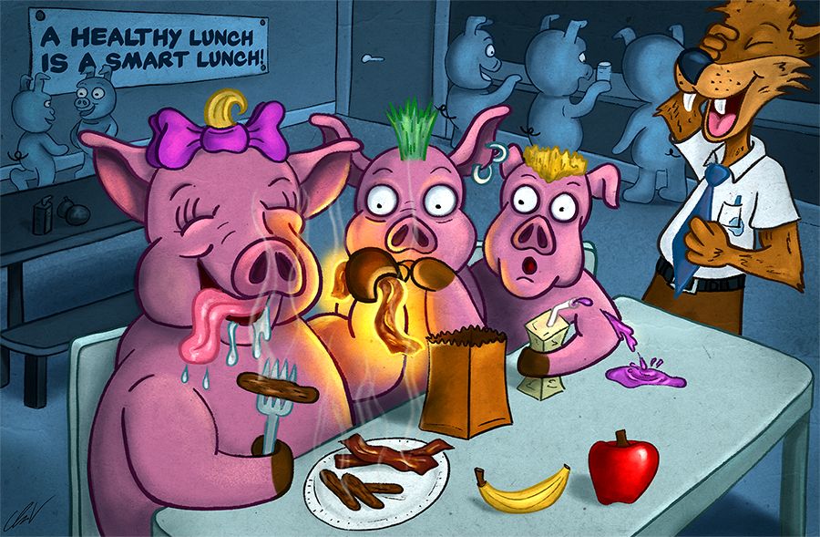
@Chip-Valecek I’m not sure Chip. This one’s pretty strong. It checks all the boxes. The shock factor is there for story telling. Clever with the pigs and wolf. The style is pretty universal on this one. The glowing, almost radioactive bacon is good. I like the coloring and saturation in the front and muted background. It’s strong to me.
Would scbwi be worth checking out? How can you get your work in front of other people’s eyes other than our svs bubble?
Honestly, I think some personal feedback from the big guys would be nice. You show up every time, you are trying hard, you’re active in the forum and help others out. We know who you are as an artist. It would be awesome for some “am I doing it right, and if not, please point me in the right direction.”
Can we do a “if you take so many classes and do the homework and submit to the contest x amount of times” we get an email or something like that? I know they are insanely busy, but that would be one heck of an enrollment perk!
-
@Whitney-Simms thanks for your feedback. I know my work doesn't always fit the childrens book style or the subject matter either. Could it be that it is too dark of material? I mean a pig eat another pig is sorta dark but I lean it towards funny dark.
-
@Chip-Valecek Granted, my attendance here has been spotty, but I've noticed you've been improving all along, so please don't be discouraged.
This piece has excellent color. The foreground stands out nicely against that blue background. I think that's my favorite thing about this piece.
I also like all the touches of humor: the irony of the sign, the teacher's leaky pen, the shock of the bad boys at the table, not to mention the girl pig enjoying her bacon and sausage.
Some things that need tweaked are perspective (like the foreground table); and the lines on secondary objects like the background characters and the juice box could use a little touching-up.
The composition reads really well, but I would've moved the boy pigs over towards the teacher more so that girl pig's arm and bacon read in silhouette. I think that would allow you to emphasize the bacon without making it glow.
One thing I think you should work on more is character design, because your characters are a little stiff. To me, that's the biggest thing.
I agree 100% with @Whitney-Simms, they should do feedback for long-time subscribers. That would be such an awesome way to help people out and reward them for their commitment to the site. Especially as you're a mod or staff or whatever.
Anyway, don't give up! Your work just keeps getting better.
And if it's any encouragement, your faithfulness in commenting on other people's work (mainly mine, lol) has been a boost to me to keep posting. So take that for whatever it's worth.
-
@Chip-Valecek Hi Chip, I don’t know unfortunately I just caught the last 5 minutes of the critique. I thought it would be helpful if we look through and see if there’s any pattern or common denominator in winning pieces.
You’ve got a good, and slightly dark sense of humour it was a fun piece. -
Chip, first I want to say I respect you so much! You are always practicing and trying and submitting. It's hard to watch these crit events when you don't see yours up there. (Mine didn't make it into the top 16, so clearly I have a lot to learn, so please take my comments with a grain of salt.)
I this image has my eye bouncing around a lot because of the color choices. But eventually falls to rest on the glowing bacon. But then it leads me to wonder why is the bacon glowing? Is it magical? If it is then why are the other pieces not glowing as well? One of the take away points I noticed from todays crit was limit color choices and unifying the piece as a whole. The red apple in particular is really drawing my eye away from the main focus.
Some things that I really like are the expressions on all of the characters faces. Very expressive and fun! I also appreciate that you can tell it's a school lunchroom and that the one pig is squeezing all the juice from his box... that movement and moment are really entertaining!
-
Hi Chip I have been following you on IG and took a look at your other pieces to see if I could provide any feedback. In this piece, the quality of line could be a factor that could improve. You do have thick and thin lines (comparing the back characters to the front) but within the pink bigs themselves the lines heaviness is almost all the same. I looked at your Alien and Husky piece on IG and the line quality in that one is really good, In this piece it feels a little heavy handed. Another thing I would change is the shadows, on the pigs seem to have black in them? I am not sure its reading more like dirty than shadow. Are you using a multiply layer for the shadows? or painting them on? The shadows on the Alien piece are great they look green still just in shadow, the same approach here might be good here. Don't get discouraged, keep trying we are all working always trying to improve our work. Hope this helps. By the way, love the dark humor!
-
Thank you everyone for your feedback. It really helps to see where I went wrong. I been submitting to the contest back when 3rd Thursdays were a thing. I never hit runner up. I been critiqued a few times. When they say during the critiques if you are not being picked you are doing something wrong, and you been trying so hard for years and never getting up there you have to question yourself and your art.
I know when my pieces are not good or if I fall short. But there have been a few (this one included) that I thought were really strong. I get a lot of positive feedback but when it comes down to it they fall short. I guess you can only loss so many times before you just give up. That is were I am at right now.
@Olga-Herrera yes i am using multiply and I can see now it looks muddy. I should have colored my shadows. Sometimes multiply gives an unwanted color LOL. I also see what you mean on my line work. I will work on that some more. I just don't want to get to heavy with it.
@artwithashley thank you for the kind words. I tried to limit my colors, but I see what you mean about the apple and the magic bacon. Its really not magic, but when she is about to eat it, it becomes magical like bacon should LOL. I do see how that can be confusing story telling wise.
-
I feel like your hard work is paying off, and I've seen a noticeable improvement in your work since I've been here.
Here is my honest opinion- I don't think that your character design style is mainstream enough to hit the sweet spot for the judges in terms of their sensibilities. It doesn't fall into the current children's market style range, and it serves more of a niche audience that likes twisted humor in an edgy cartoon style. That is not supposed to be discouraging, niche markets are not a bad thing and can be an advantage in many cases. My hunch is that it's just a mismatch of personal tastes. I feel like I've seen a couple of the judges comment on the way you stylize certain things in some of your previous illustration threads.
I think if you had kept the cannibalism concept as is- but made the characters very mainstream cutesy and perhaps made the lighting more cheery, it might have been a stronger contender in the judge's eyes. This is just speculation on my part however- I can't speak for the judges.
That being said, I hope you don't stop contributing pieces to the contests! I look forward to seeing your take on the prompts each week. You definitely have a unique voice in your artwork.
I hope this wasn't a harsh critique. It wasn't meant to be.

Website: www.tessawrathall.com
Instagram: www.instagram.com/tessawrathall_art/
-
Chip, I have a feeling the October challenge is going to be right up your alley. Keep going!
-
Aw Chip don't get discouraged your work is getting so strong, look back and see how much you have grown, I have been there with you here at SVS each step of the way. I have really been noticing your work these past weeks across all the platforms, I actually stopped on one of your pieces this week and thought wow his work is really starting to stand out. You are there. 100 entries; that is huge! There were so many entries I am sure it is hard for the judges to pick. You have a great distinct style and unique concepts, you have grown so much as an artist, your piece is great I wouldn't change a thing. I swear you are on the cusp of something amazing!!!!
-
I really liked your September piece! It was totally worth being top 16, but I think there were just so many good pieces not every one could make it. Asking for a serious crit and staying with it shows how dedicated you are. I get a bit down now and then about it all too so I totally get it. Really. But, your piece was good. A different day or different judges and you could have been top 16.
-
@Chip-Valecek I really like honest critiques, the ones that only tell us how good we are just hurt the artist.
In your case I would recommend going back to study the basics, anatomy, coloring and perspective. Also, remember to use references, loads of them
I tend to recommend the same three books all the time, but never get tired of it; perspective for comic book artists by David Chelsea, Color and Light by James Gurney as well as Tonko House's course at schoolism.com, Figure Drawing by Michael Hampton, and finally Framed Ink by Marcus Mateo Mestre (I think there's a whole series by this author but I haven't read it)
If you red all this in the past, give it another run and try doing the exercises and copying the examples
Cheers
-
@TessaW thank you! It was not harsh at all.
@Laurel-Aylesworth I might not be doing the contest this month. I am having a hard time trying to do the inktobers. If I get any free time I might try to come up with something.
@Jose-A-Nieto I have heard of those books. I have not read them but I will look into getting them. Thanks!
-
@Jose-A-Nieto said in Serious Critique Request:
@Chip-Valecek I really like honest critiques, the ones that only tell us how good we are just hurt the artist.
In your case I would recommend going back to study the basics, anatomy, coloring and perspective. Also, remember to use references, loads of them
I tend to recommend the same three books all the time, but never get tired of it; perspective for comic book artists by David Chelsea, Color and Light by James Gurney as well as Tonko House's course at schoolism.com, Figure Drawing by Michael Hampton, and finally Framed Ink by Marcus Mateo Mestre (I think there's a whole series by this author but I haven't read it)
If you red all this in the past, give it another run and try doing the exercises and copying the examples
Cheers
I agree with this. You have really good concepts. That being said I don't think it's because your designs aren't traditional children book styles I just think going back to basics and strengthening that is going to really help. I find when I don't go back to doing studies once in a while my drawings are really off.
Specifically your colors need to more harmonious and I say this as someone who really struggles with color. There was this video on YouTube from Marco Bucci that I saw a little while back that really clicked for me and I had my ahah moment. I'll have to search around for that video but I'll post it.
I always see your posts and improvement and as long as you keep going youll be happy with your work.
-
This is the video he has a series on colors. I hope this helps

-
@DarleneAnico thanks, I will check out the video.
-
@Chip-Valecek Hey Chip, I am with you on this. I thought I had a really strong piece last month, too and everyone else seemed to like it. I was really disappointed yesterday, too.
That being said, as I watched the critiques, I realized that my piece still had work to be done on it. I listened to many of the things as I was working on this month's prompt and I realized that I was not doing some of the things they said pros do, like silhouetting the characters and making my highest color(or value) contrast be right at the focal point. (I promise I am not making this about me and I am getting to my point.)
I think your pig idea was great. It had a really good composition and told a great story. Reading everyone's comments, here, I am in agreement. There are areas you could have tweaked. But so could every artwork that appeared on that sweet 16.
I see great improvement in your work and more importantly, you have insight into how to use photoshop and you are always encouraging others and lending your expertise. I for one really appreciate how you comment on my work, often when no one else does.
So... to wrap it up. Keep on keeping on! Learn and grow and don't make these few guy's approval the end goal, but your success as an artist, whether that be as a niche artist or as a mainstrem children's illustrator. (I am preaching this to myself, too) Kick butt on this Halloween style prompt! -
Like so many others have said, I think this is one of the strongest pieces you have submitted primarily in terms of storytelling. In watching you develop it, however, my feeling was that you had it nailed down as a solid children's illustration right before the end but then you went that extra step adding the glowing bacon and the eerie lighting that is your distinctive style and in doing so it moved it out of children's illustration into a more "Mad Comic book" style. Your style feels more geared toward an adolescent market than a children's market to me, and though I think you do that style really well maybe that's why you're not getting attention in the contests.
I agree with @Whitney-Simms that it would be nice if long time subscribers could have a ten minute personal critique from one of the teachers. What a perk that would be.
Laurie DeMott
instagram.com/demotlj -
@Chip-Valecek okay. Been thinking about it for a little bit I have a few other ideas. I would love to see your art hero’s. I think the project would be the dream portfolio. Who are your art hero’s that are working in the market currently? There is a Skillshare class I watched on licensing. I can’t remember what it is. Go into your hot topic and Spencer’s and look who manufactures that stuff. Scratch that. Just show us who your hero’s are that are similar in style. Maybe do some master studies of their work.
Look outside the svs community to see if there is someone who could be a mentor. I think offering to pay for a portfolio look and a conversation is something that would help. Someone who knows that niche of the industry.
Make a product. Go to a place where they would sell said product. Your horror paintings would make a nice book. Your inktobers. Christmas is cute. I would pass on the Christmas collection. Maybe a compilation of monthly contests? I don’t know. Find who buys your stuff and make stuff. Or something. You need more people looking at your work in your niche. To buy and to give feedback. You base too much of your value on svs monthly contests. Give yourself more table legs!
Your people are there, find them!!!!!!!! You know i love surface design and stationary. My work certainly doesn’t fit into story telling. But These classes still are really well done. I don’t way stop learning from them. I feel last inktober really changed things for me and my direction. Your inktobers would be great for those hydro flask sk sk ssskkk and stickers.
Good luck! But don’t leave us either!