Slowvember WIP update!
-
@BichonBistro also, I found it super helpful to go find some illustration references to help me think up new thumbnail ideas. It’s cool, because I ended up with a few that were very different than my original idea. I don’t think my original idea even made the cut to the fives. If I had done it just by trying to think up stuff on my own... well I’m tapped out. I need some creative bank account deposits.
 ️
️ -
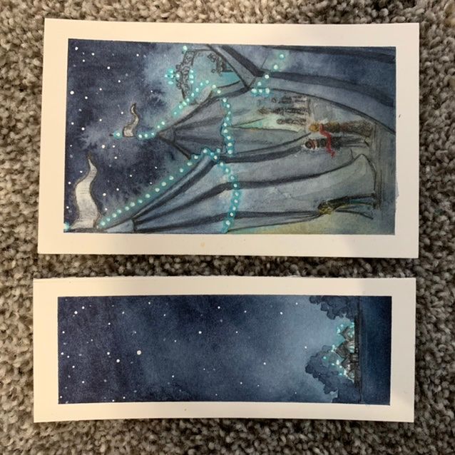
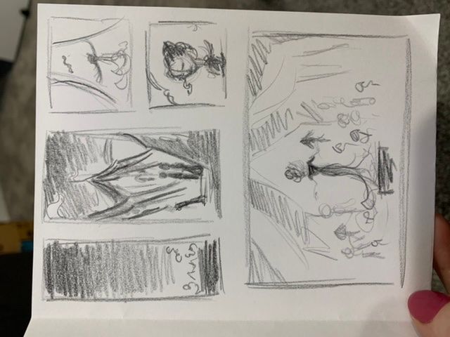
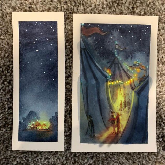
Update... I messed around with my favorites for a couple weeks before I realized why nothing was working. I can’t capture the story in one image... so this has turned into a new challenge for me. I’m going to attempt to do this illustration In a graphic novel style. One page with 5 images. Ive always wanted to try this and it involves using 2ish of the thumbnails I already did, but it is waaaaay outside my comfort zone. I’m too excited about the painting to put it away, but it definitely won’t be done at the end of November. Also, I’m feeling like I don’t have the skill set to pull off what I want to. But, I’m going to try anyway. I’m posting the very loose sketch of my layout and two of my color comps that I’ve been messing with. I need feedback on these. The illustration is based on the novel “the night circus” and that’s the problem. The circus takes place only at night, and the tents are all striped black and white. I’m having trouble maintaining focal point with all of the contrast of the stripes. I don’t want to lose the stripes, but I need everything to be more muted or darker around the focal points. I feel like I’m close with that first little panel because it’s so far back but I’m struggling with the other one. I’m also wondering if I should keep the images more black and white and less blue... my eyes are struggling with this. Anyone have suggestions? @Lee-White do you have some wisdom for this?
-
@Pamela-Fraley I really can not give you any advice on how to manage your colors with water color but I really love that second color study. Could you mess around in photoshop or something to just get a color scheme in place and then try to mimic it with water color? Would that help at all?
-
You are really getting there with your 2nd color study. I do have some recommendations. The first is, pick your favorite illustration from this series and just focus on that. You can ultimately do 5, but adding that much work during this challenge doesn't make that much sense. The idea is to actually slow down and focus. What you are doing is what I see a lot of my students do in class. If I ask for a 3 panel narrative they propose a full graphic novel. When I ask for a character design they propose a full cast of characters. etc. You have to watch out for needing to add more, then not being able to finish it due to the workload. That is what happens in my class a lot, even with the constant warning I give them when they are pitching it. Both of the scenes you have done for the color studies are lovely. You could focus on either one and that would be more than enough. Like I said, the illustration could be part of a bigger story of course, but I'd recommend just picking one for now and making it good! : )
Now, for the technical part of the illustration. You are on the right track and I like your studies. With night scenes, you have two very powerful weapons at your disposal, and that is value and color/light. In your cool, night areas you can stay saturated with the blues and keep the values close and dark. In watercolor most people don't go nearly dark enough. Your second study is dark enough but your first has a ways to go before really getting to the dark values. Then, contrast those dark cools with bright and warm light. Watch out for putting lights everywhere on the tents. Think of the lights as your way of keeping the attention in a certain spot. Here's a quick paint over to show you what I mean. I probably pushed it too saturated, but you get the idea. Warm vs cool and light vs. dark will makes these scenes relatively easy to pull off if you think of them in that way.
SVS Faculty Instructor
www.leewhiteillustration.com -
@Lee-White Thank you! I really appreciate you putting the time in to give me feedback. I will do what you said and focus on just finishing one of these by the end of the month. It's hard. I'm seeing it as a whole page of panels now, and it made sense to me to figure them all out and then paint them together for cohesiveness. I'm not sure how people usually do graphic novel pages. (@Jake-Parker ??) I think it makes sense though, to really work on dialing it in one piece at a time first, even if you do have to repaint or tweak them when you put them together.
The close up tents is the one that's really stretching me so I think I'll stick with that one. And yes! The lights needed to be more purposefully placed. I think I was trying to be consistent with the look of the tents and I lost my focal point. The draw over is super helpful. Just moving the lights made a huge difference! If I'm sticking to the text, even the lights of the circus are not warm at all but a cool white... which makes that contrast a bit difficult. I may just have to really push the values. Okay... round 4! :smiling_face_with_open_mouth_closed_eyes: -
@Chip-Valecek That would be so helpful! I have thought with every assignment how much easier it would be to mess around with color and value if I could put a sketch into my computer and mess around with it digitally. Unfortunately, all I have at the moment is Procreate pocket on my iphone. And, I do use it it a bit, but I dont actually know what I'm doing. I think I'm one of the last remaining artists who has never even touched photoshop. I'm totally clueless about digital anything.
-
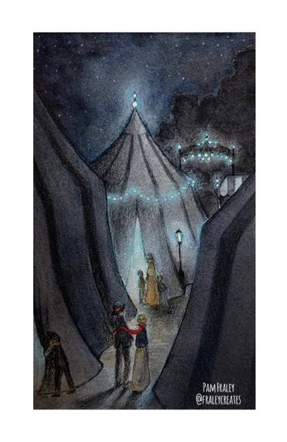
Here’s the final. Unless I decide to start over Again... Slowvember is messing with my brain.
Also, sorry about the resolution. I still haven’t quite figure out how to get a good image of my paintings to upload. -
@Pamela-Fraley beautiful! Did you post on the November Contest thread? Just asking because I didn't notice this piece on there and thats where finished ones I believe are supposed to be posted...but i'm not 100% sure, I'm new to the forum!
")
-
@KaraDaniel I didn’t post it there. But, I’m not officially done either. I used the Slowvember challenge to help me work through the concept for this, but I only did 1 picture of the whole page I wanted to do.
-
Beautiful!
-
@Pamela-Fraley gotcha. well I love the color palette you chose for this one, looking forward to seeing the whole page.
-
@KaraDaniel thanks! I’ll be sure to post.
️