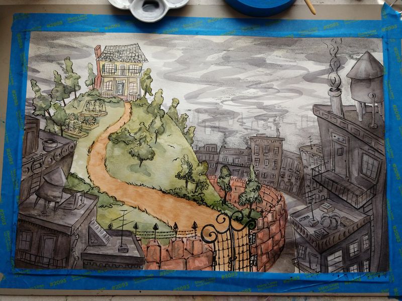
Slowvember WIP
-
@Laurel-Aylesworth I love the idea of darkening the foreground. I do plan on having text in the sky. I'll probably add them in the final. I agree having some people in the city would be good. The mean old woman lives alone on the hill but I could show birds squirrels, or flowers to give it more life. Thanks for all your ideas!

-
@Braden-Hallett
I might play with super over-exaggerating the differences between the city and the green space. Super dark almost black sooty coal smoke and grunge covered pipes for the city. Have a dark black pipe with a sick coughing bird in the foreground. Gaunt children in poor boy caps staring forlornly at the literal beam of light shining on the sparkly GLEAMING house nestled in an emerald grove. Birds swooping and playing in a cerulean fountain. Puppies cavorting across the perfectly cut grass. Everything you can think of except a sign that says 'good place' with an arrow pointing at the house

You can tell you were an English teacher...
 Look at all them fancy words.
But seriously, I am in agreement. There is a theatre idea that comes into play: BIG BAD and BOLD. If you cannot see it from across the room, you ain't doing it enough.
-
Really nice work. I think we need the gray buildings to look a bit more run down, maybe broken windows, and definitely more trash like old tires, clotheslines, etc. Great concept. cant wait to see more.
-
@chrisaakins I like that. Big bad and bold!

-
Did a little paint over with some watercolor...as I posted on another thread i'm getting tired of drawing this same image over and over (I made some color studies and drew another with people in it but I didn't really like how it turned out so I went back to square one). Ugh I'm just ready for a new project lol.

-
Also how do ya'll get your photos you upload to not be blurry? They look crisp and sharp but mine are blurry unless clicked on and brought up in another window. Is it my file size?
-
Your picture look pretty clear to me? I'm not sure what others are doing, but I save the file as a PNG, 72 DPI. If it's in landscape format, I save it to 1000px on longest side. If it's in portrait I save to 700-900 px on the the longest side.
-
@TessaW I'll try that next time thanks. I think my file is too big probably at least 300dpi and its a jpg.
-
I was focused on a technical comment before, but just wanted to stop back in and say that the piece is looking really good. I really love the concept and it's shaped up nicely.
-
@KaraDaniel I think this new version is great. The darker city really makes the colorful house stand out, and the added smoke really does punch up the point of tbe city being dirty and polluted