Color Critique
-
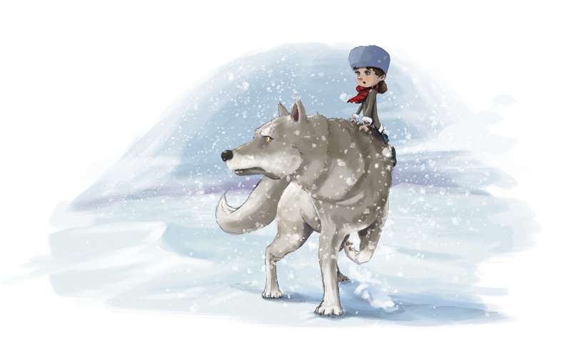
@jdubz looking great! love the progress. I like the color of her hat and now I feel like they are both looking at the same point on the horizon. Great adjustments!
-
Thanks for all the continuing comments all. I just finding some more time to work on this with all the other stuff going on
")
@Hui-Li I'm doing a color test with the orange/ochre color but I don't know if I like that particular combination. I may not be the most objective though, so if I'm just being color blind to it and it looks better I'm all ears
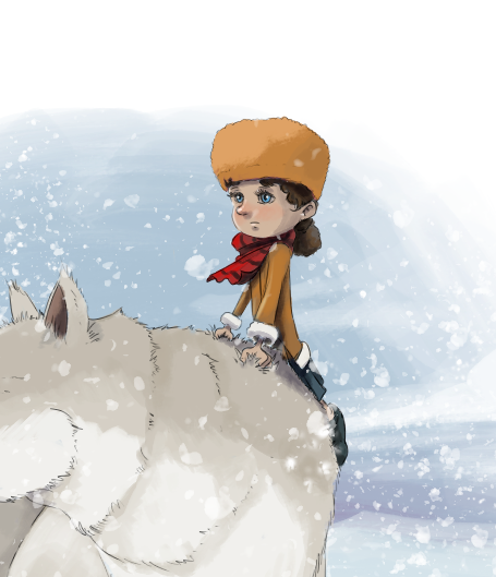
@chrisaakins I'm going to mess with the wolf today and see what I can do with her. I agree there needs to be some more shadow work for sure.
@Heather-Boyd I'm hoping by working on the wolf that should solve the problem. With her falling off, she kind of is - I think I need to work on indicating the action because the her other leg would be swung on the other side of the wolf, but think of it as if the wolf was trotting along and then suddenly saw something and she swung her body immediately up to see what was happening - so the girl is clutching her fur to keep steady. I think I need to add some kicked up snow or something to help visualize the action sequence.
-
@jdubz maybe you could bring more expression of gasp of the suddenness of the event in her face -she looks quite calm, to match or to add to the expression on your wolf which is working strong for your story. That way if your two characters colours are not as similar their expressions would be.
-
I'll be honest in that I don't yet have a story lol. I'm kind of shaping up some of the characters a bit and I have a few different sketches of these two but I wanted to nail down some colors and environments first before I did anything more. I'm hoping to come up with something I can add them to though
-
@chrisaakins What do you think of this on the wolf? I really darkened her down and then popped with highlights.
I also tried blue for the hat. I do like the pinkish color but I felt like maybe it was competing with the scarf for attention so I tried a darker blue.
-
@jdubz the changes you made to the wolf and the ocher colored hat/coat are really improving it! Wow totally better, in my opinion.
-
@jdubz it very much does improve the form of the wolf and now she looks more a part of her setting, too. Good job.
-
Maybe give it a bit more time, and working on a few new pieces? I see you put lots of energy and time in this piece.
Sometimes when you take a step back and come back later (and because of the extra experience you are gaining), things will look much clearer. Good luck!