Slowvember Sketch Critiques
-
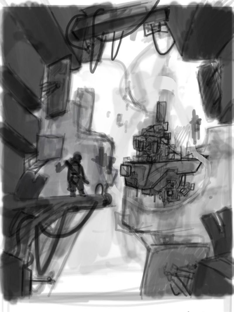
Hey everyone, if any one has any critiques for this sketch, especially having to do with composition and perspective . I was having a little trouble with the perspective. Be as specific as you can! Thank you! -
ooh cool sketch so far!
I'm wondering if it's worth moving the plank and the character down a little so he is the clearer focus on the lower left third, and moving the floating construction up a little to also fall more on a third. right now they're just sort of hovering close to the middle and don't feel super decisively placed.
I'm liking the values and foreground/background elements a lot! -
Fun concept! @Nathalie-Kranich makes a good point about where the elements are placed. It might be good to explore.
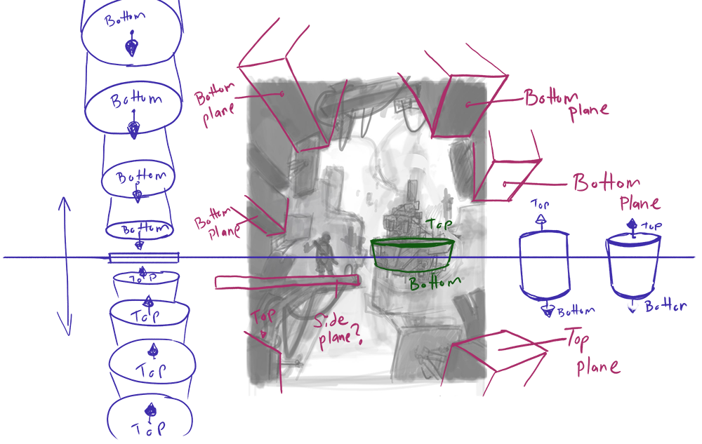
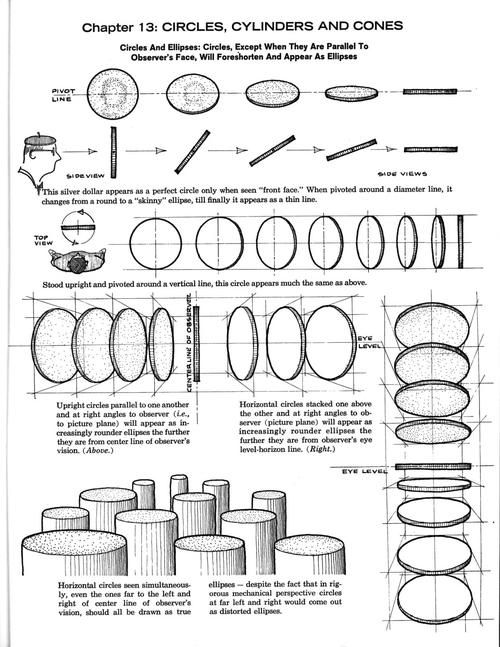
As far as the perspective goes- I think it works pretty well. Since you've created an environment that feels pieced together and floating- the perspective can be played with a bit. If you do want the perspective of that floating ship to match a little better with the foreground- just be careful of the top plane of the ship. It could end up looking tilted if you show too much of it, since the horizon line seems to below the top plane of the ship.
A couple of other elements to play with- the person's scarf may look cool if it's following the diagonals of the foreground perspective. It also might balance the piece a little more if you add some hanging cords on the right side as well, a little above center.
I'm looking to see how this progresses!
Website: www.tessawrathall.com
Instagram: www.instagram.com/tessawrathall_art/
-
@TessaW said in Slowvember Sketch Critiques:
...>just be careful of the top plane of the ship. It could end up looking tilted if you show too much of it, since the horizon line seems to below the top plane of the ship...
Thank you! I was thinking that I would have more freedom to mess with the perspective alittle since it was floating. What did you mean by the top plane? -
@Nathalie-Kranich Thank you a lot! Yeah I noticed that about the thirds, I think it is worth it changing that, thanks
-
I think you do have freedom to mess with the perspective, like I said before. I would just be careful about making the space ship look too tilted toward us. Maybe it's just me, but the general horizon line looks a little lower than the top of that floating ship- so if we see the top of it- it will look tilted toward us. It looks like you've shown us a little sliver of the top of the floating ship, so it looks slightly tilted. It's not necessarily a bad thing- just something to be aware of, so you can control how you want the perspective to read. Just my 2 cents. I may be off base here.
Website: www.tessawrathall.com
Instagram: www.instagram.com/tessawrathall_art/
-
@TessaW Thanks so Much! I do agree about that, thanks for taking the time to send those