Serious critique needed, please!
-
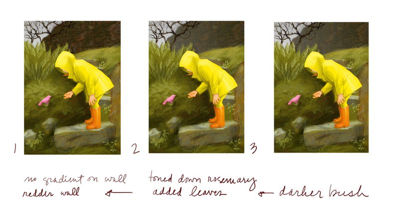
Final versions: 1, 2, or 3?
I could really use some input!
Of course any suggestions are welcome, because I can still rework. I just can't see it straight anymore. The 3 versions are actually in reverse chronological order, but it doesn't matter because they're numbered.
Here's the rest of the thread for the evolution of the piece. Over the course of the last week or two, it tightened up a lot. That's up for comment, too, because stylistic experimentation was part of my goal for Slowvember. I was trying to see if I could finish looser, but in the end I didn't: https://forum.svslearn.com/topic/8315/slowvember-progress/26
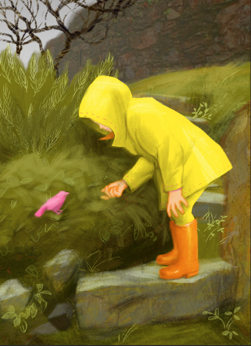
And just yesterday it was like this:
Thank you for your fresh eyes!
And, for all you Americans, Happy Thanksgiving and enjoy your family and friends! As an American living in Europe, it's just Thursday here. I'll see if I can pull something together with the neighbors in early December, though!
-
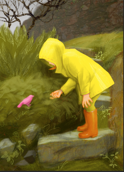
first of, all very nice little image. I think 2 & 3 work best, mostly because the darker rock face, while nice, flattens out the image in terms of value/perspective or tonal perspective. Another small issue I have that is slightly flattening the image is that the girl's shadow is casting onto the hill behind her as if it is very close (almost like a wall). I would have it cast, and taper or follow the curve of the hill.
great work!
edit: sorry the bush, not the hill, I think the cast shadow of the girl needs to follow the curvature of the bush, I read it as a hill, because I thought it was continuing from the hill with the little stepping stones behind her.
-
@Fossi-Images Thank you! You've hit on my exact dilemma: Is this a flattened cut-out image or a dimensional one? It started out much more abstract and tightened up as I went along. I kept wanting to keep some of the paper cut and collage spirit I had going at first, with sharp value contrasts.
The shadow, likewise, was originally just compositional in the abstract sense and meant to create a lot of contrast with the front of the raincoat, thus drawing the focus there. In the rain there might not be a strong cast shadow per se, but you've hit on a good point: I need to work on the volume in the bushes. That has been bugging me all along. Thanks again!
P.S. I looked at your lino cuts. Really nice!!
-
This post is deleted! -
@LauraA hi! I really love this piece. Perhaps my one issue is the yellow pants. Lol
 I think that’s enough yellow.
 -
@LauraA thank you!
Ok, so maybe to keep with the flat feel but not a flat image, rather than curving the shadow, what about stopping the dark value just short of her hair, this will indicate a change in the plane and not result in more rendering or tightening up
-
It’s a lovely image Laura, so well drawn and painted.
If I was being really overly picky, I would say the wellies jump out a bit.
I might be very wrong though maybe it looks better with bright wellies. -
Thank you all so much for your feedback!
@Nyrryl-Cadiz I had been thinking about making the pants dark green. But then I wanted to keep the contrast. Maybe I'll try an adjustment layer with a mask and see how it looks.
and @peteolczyk, the boots were yellow until two days ago, because the whole figure was just a silhouette, but then I couldn't resist making it more realistic. I'll try some adjustment layers with the boots, too, and see what happens.
@Fossi-Images I will definitely have another look at the shadow tomorrow, when I am fresh. It's night here, I know this is going to take some brain power, and I am definitely better at seeing these things early in the morning!
Today, frankly, was all about that back wall, the tree, and the bottom step, because when I flipped the image the whole thing looked like it was sliding downhill. I probably should have flipped it way earlier!
Thanks again!!!
-
@LauraA she looks great Laura, I really like the way you’ve done foliage too.
-
Here are two re-dos taking your critiques into consideration
 :
:The first version has slightly darkened pants and boots. Any more, or changing the color outright (I tried gray pants and jeans), messed with the color harmony or accentuated the sharp angle at the bottom of the coat. The second version has the original pants and boots, but some adjustments to the shadows in the sage bush. In both versions I added some rocks in the foreground, but all of these are quick versions and therefore I can eliminate them with no qualms. If they become permanent I'll work them out with more care.