Help needed with Color Comps
-
@Nyrryl-Cadiz The red rex in #3 is definitely a great focal point
")
-
@Braden-Hallett thanks Braden! I think so too!

Portfolio: nyrrylcadiz.com
Instagram: https://www.instagram.com/nyrryl_cadiz/
YouTube: https://www.youtube.com/channel/UCbJCF1Im8ZO7hpGWTKOJMuA -
@Nyrryl-Cadiz Thank you for sharing the list. I've been floundering lately on what to start working on for my portfolio. For your color comps, I really like #4 because I associate purple with your key word "magical." Great dino!
-
@Laurel-Aylesworth thanks! I really like 4 too.
-
@Nyrryl-Cadiz I vote #3, because the orange successfully makes the T-Rex the focal point, but doesn't dominate the rest of the characters, and the cool sky separates from all the characters.
-
@ajillustrates thanks! I also like how the t-rex pops out in 3.
-
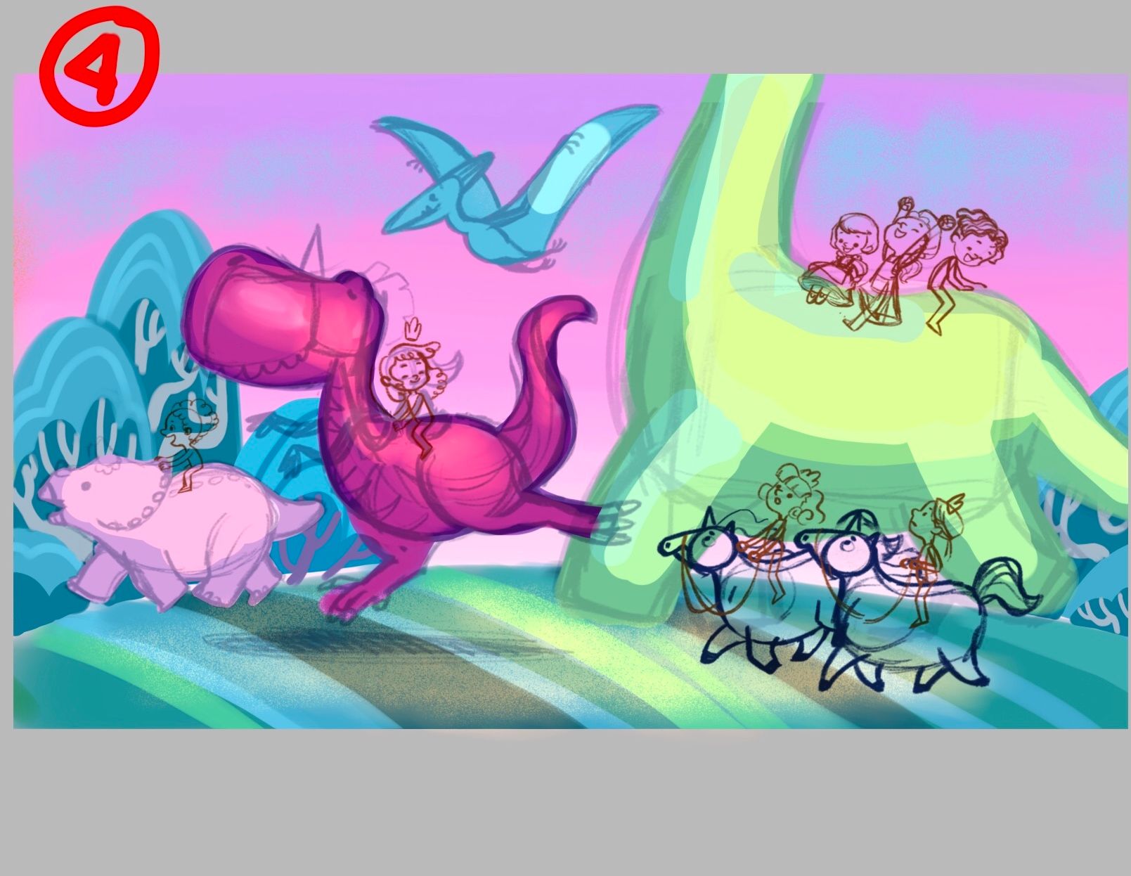
Hi, everyone! Thanks for the comments. I really agree that 3 has a strong focal point because of the red. However, I also really like the colors in 4. That’s why I tweaked 4 a bit. I changed the t-rex’s color to a warm dark pink. I feel he stands out more in this. What do you guys think?
Portfolio: nyrrylcadiz.com
Instagram: https://www.instagram.com/nyrryl_cadiz/
YouTube: https://www.youtube.com/channel/UCbJCF1Im8ZO7hpGWTKOJMuA -
@Nyrryl-Cadiz I really like the one you chose. Looking through your portfolio site really fast, I think this particular color palette will keep a nice balance to the overall scheme of your portfolio, and also add variety. You have a fair bit of warm sunsety/sunrise pieces already but not one with this sort of atmosphere. It's really pretty.
Website: www.tessawrathall.com
Instagram: www.instagram.com/tessawrathall_art/
-
@TessaW thanks! You’re really convincing me more to go with 4
 ️
️Portfolio: nyrrylcadiz.com
Instagram: https://www.instagram.com/nyrryl_cadiz/
YouTube: https://www.youtube.com/channel/UCbJCF1Im8ZO7hpGWTKOJMuA -
@Nyrryl-Cadiz Honestly, I think you could go with any of them and they would look great! They all look good to me as you've color balanced/harmonized them all really well. I'd say go with the one you're really feeling at the moment, or the one that would fit well in the portfolio.
Website: www.tessawrathall.com
Instagram: www.instagram.com/tessawrathall_art/
-
@TessaW definitely. I really like 4 too. And I totally agree, my portfolio is oversaturated with warm sunsets. I’ve always thought my portfolio is too “yellow” for a long time now. Lol When I squint my eyes at my portfolio, it seems like all I see is yellow/orange most of the times.
-
@Nyrryl-Cadiz I really like the harmony in 4. Just for the sake of playing devils advocate, do you need a strong focal point? I see the harmonious colour as helping to keep that harmonious composition.
(Lovely work Nyrryl) -
@Nyrryl-Cadiz I really like 4 too, but I think because the sky is purple, green pops the most. I would try switching the Rex to the bright green and give the green Dino the deep pink color
Check out my art and tutorials :)
Instagram: www.instagram.com/carliannecreates/
Youtube:
https://youtube.com/c/CarlianneCreatesShop: www.carliannecreates.com
-
@carlianne i’d have to disagree. Sure, green is somewhat a compliment color to purple but whenever there is a vibrant reddish color or any reddish color for that matter, that reddish color will trump the green. The eyes will always go to that reddish color even though in this situation my red is more of a hot pink and the green will be pushed backwards. I don’t want that long neck dino to be the star.
Portfolio: nyrrylcadiz.com
Instagram: https://www.instagram.com/nyrryl_cadiz/
YouTube: https://www.youtube.com/channel/UCbJCF1Im8ZO7hpGWTKOJMuA -
@peteolczyk you’re making me more confused
 I’d have to think this through more
 -
@carlianne tho I’d still like to thank your input.
 ️
️Portfolio: nyrrylcadiz.com
Instagram: https://www.instagram.com/nyrryl_cadiz/
YouTube: https://www.youtube.com/channel/UCbJCF1Im8ZO7hpGWTKOJMuA -
@Nyrryl-Cadiz sorry
. I just mean I like the colours on 4 as you first did them. -
@peteolczyk i really like them too but having a strong focal point is also good. I’m torn. Lol
Portfolio: nyrrylcadiz.com
Instagram: https://www.instagram.com/nyrryl_cadiz/
YouTube: https://www.youtube.com/channel/UCbJCF1Im8ZO7hpGWTKOJMuA -
@Nyrryl-Cadiz I don’t know. I suppose it depends what your trying to get across in your image.
Is there a main character to focus on?
Would it help with the diversity and inclusivity theme if you have lots of characters, like you have - but break that rule (of having one strong focal point). -
@Nyrryl-Cadiz I mean that's cool and I totally support you doing whatever you feel looks best. But what I'm saying is right now my eye keeps going to the green Dino instead of the purple one
Check out my art and tutorials :)
Instagram: www.instagram.com/carliannecreates/
Youtube:
https://youtube.com/c/CarlianneCreatesShop: www.carliannecreates.com