I’m back! *update: Semi-Finished Piece critique needed :)
-
Hi guys!
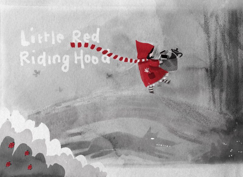
The big move has been successful and although it’s been exhausting, I have enrolled myself again and I’m ready to proceed the work on my kidlit portfolio! I posted the sketch of this illustration I’m working on before and here’s a WIP version. All input is welcome! Also, if you have any suggestions about what kind of illustrations/skills are missing in my portfolio, that is also greatly appreciated! You can find my work here: www.nadyart.me/gallery
Thanks so much and I look forward to browse through the forum again!!
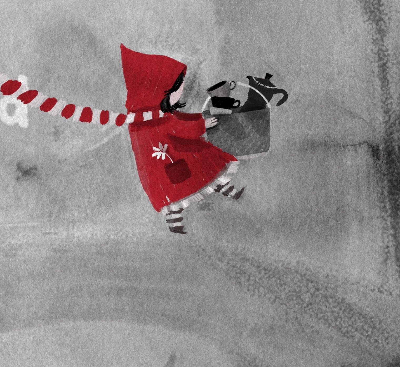
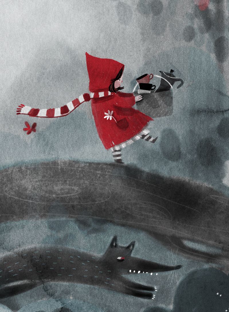
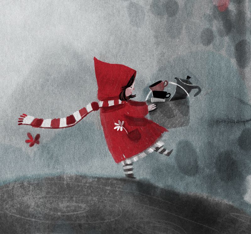
Close-up of Little Red (her face hasn’t been drawn yet)
-
Welcome back! I'm new here so I don't know what other WIP versions looked like. I love it so far and I really love your portfolio!
I'm not too convinced by that pocket style in that placement. A side pocket would be placed there at the seam running down the coat from under her arm.
(edited to add: please excuse my flaky posts all over this forum as I figure out how to be ok with posting and giving feedback)
-
I love your character style of little red! My concern would be her scarf covering the "D." It first read to me as "Hooo." looking forward to seeing your progression on this piece.
-
P.S. I checked out your website, I really love your style!

-
I really enjoyed your portfolio! I love the mixed media
 A lot of your work leans on the cooler side of color temperature, so maybe some warmer palettes to show variety? I’d also like to see a few people, but with Little Red you’re already on it. I look forward to seeing more of your great work!
 -
Wow, I like your style. I like the little red riding hood, but I think the work gets lost. Perhaps if you increase the contrast you could get a bit of a greater sense of threat from him? I'm a beginner, though, so take my comment with a grain of salt.
-
I really like this style! It's super cute and definitely reminds me of those book illustrations that have so many tiny details to explore. I agree with @KaraDaniel that the scarf might impeded legibility of the title--I would love to see the scarf going behind the letters to make a little pop of dimension. And I confess I didn't realize the wolf was there until I saw @sisimite-azul's comment; bumping up the contrast would go a long way to make it stand out, and it would be great to showcase some of the texture you've got going on as well.
Can't wait to see where this goes!!
-
Hi Nadya, I’ve had a look through your portfolio but I also see your art regularly. Your art has a really nice feel to it and I love seeing it on Instagram.
Because you’re asking for feedback on art that already has a nice quality, I’m just wondering if it would help to know what sort of direction you can see yourself going in.
Do you have some favourite artists or artwork (dream portfolio) that you aspire too?
Do you have any particular publishers that you are aiming for?
Are you looking for a drastic change or just tweaking what you already have. Like expanding your subject matter slightly?
Is there something about your art that you would like to keep hold of, for example, graphite, whimsical, cute animals. -
so lovely! wish to see more of your colored work in your portfolio!
-
Woooow) I like it!!!
-
Thanks everyone for your super valuable tips!! I have read all of them before, but wanted to take the time to address each of you. You've helped me a tremendous amount going forward this piece!
@carolinedrawing Thank you! I agree about the pocket, I will change that I think! And your post is okay I think, nothing wrong there! Welcome to the forum!
@KaraDaniel Thanks so much!! And your comment about the "Hooo" really made me laugh! I will fix that haha!
@Kalimostlypaints Thank you! And thanks for the amazing tip, I agree with the overal color temperature of my work (I tend to lean into monochrome and melancholic as a personal reference, but this is not all a publisher would want to see) so I will definitely do something about this!
@sisimite-azul Thank you for your compliment and tip! You're definitely right about the wolf, you noticed that correctly! He is still in the sketch layer with not much opacity - I still need to paint him. But I understand that may have not been clear, I should have mentioned it!
@thousandwrecks Thank you for your kind words and the tip, I will try that with the lettering! The wolf hasn't been defined that much yet - it's the underlying sketch layer that is visible, yet he is not yet drawn. I'll make sure to give him enough contrast though and showcase the texture! I hope to post an update soon.
@peteolczyk I do have a dream portfolio, yes! I do have some favourite children's book illustrators in mind and Ideally I would mix some elements of what I like about all those styles into my own style. If that makes sense? I am also aware of the (Dutch) publishers I'm aiming for, but I'm not sure if I should also try publishers abroad. I am not looking to change my style completely. I do want to simplify it a bit, so less realistic. The cute animals and whimsical style is something I want to keep though, yet the biggest change would be as you implied, the expansion of my subject matters. Not just animals, but adding humans. And also adding more complex compositions and environments. However; it feels like so many things to tackle at once, that I freeze up a bit. Do you know that feeling? I hope to break through that roadblock this year.
@idid Thank you! And thanks for the tip!
@Athenahoros-P Thank you!!
-
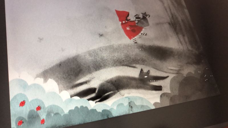
A little update on the Wolf. Added a dash of color extra color too, which I’m not yet certain of if it will stay. Still quite some decisions to make for the environment. Should have done better in the thumbnail stage, but I’m determined to finish it :).
-
@nadyart yeah I get the same feeling. It will all come together though I’m sure. I’m really interested to see what new things you’ll bring to your art.
-
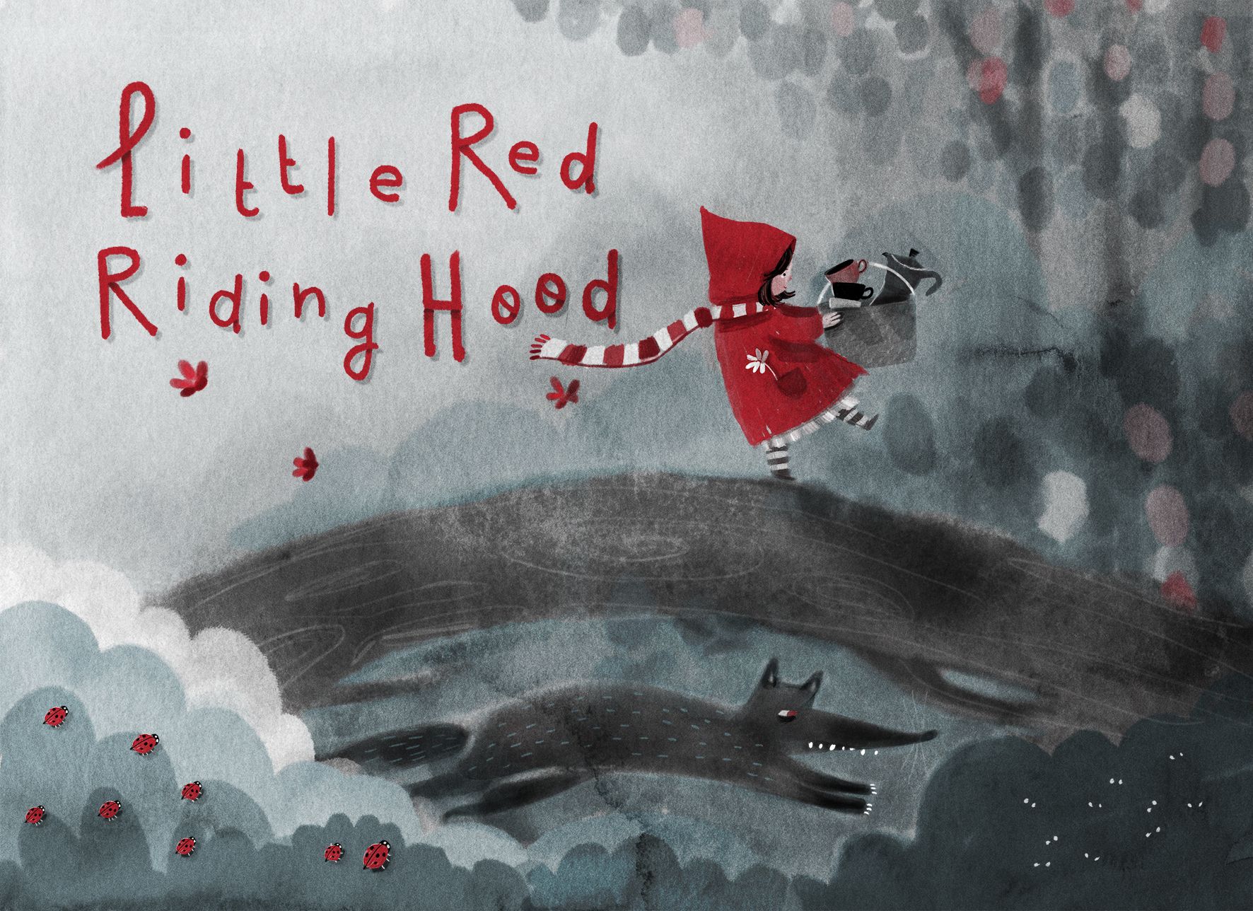
I think the piece is semi-finished. I'm curious to hear what you guys think

In the end, I added a blueish hue to the piece as well. This was more by accident, since I wanted to
color a layer, and the color was set to an illustration that I previously worked on. It seemed to work out!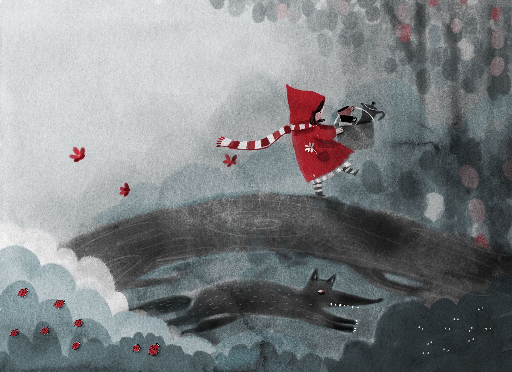
-
@nadyart love this! I would love to see the whole story illustrated in this style! Just picky little things...the L in "little" is a bit hard to read. (I notice this because my daughter has a hard to time reading odd fonts and this would be a story for her age), I wonder what cropping in the image a bit on the right side would look like...it may help pull little red more away from the dead center. Might be worth a click to see if it works better or not. Finally the two characters seem unknowing of each other at the moment...would it make more of a narrative to have the wolfs eyes looking upward as if he is secretly chasing little red? Just nit picky thoughts, but overall I love it!
-
@KaraDaniel Thank you a lot for your input! The font was just something I was trying out, because I was trying to keep enough space open to place the text. It is good to know that it would be difficult to read though! I will keep this in mind when drawing the letters next time!
I have edited the wolfs eyes to create interaction, thanks for the great tip! -
Hi everyone!
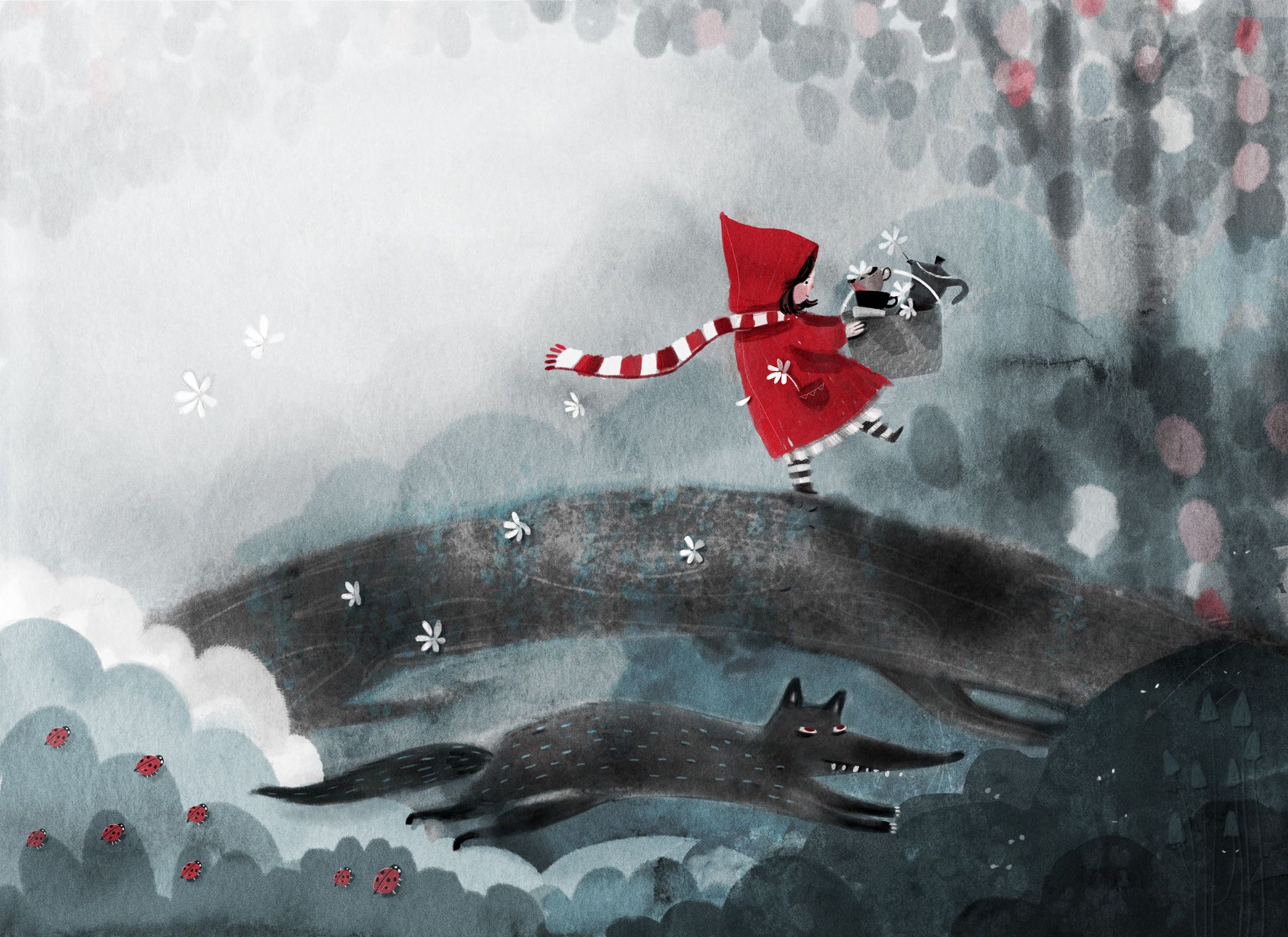
Thank you again for your valuable tips and input. I have finished the piece and actually put quite another number of hours in it! I will leave it as is now and probably revisit it once I have learned some new skills again :). Overall I'm content about it!
-
@nadyart Hi Nadya, I kept thinking about this piece in the days after you posted this final version. I'm sure that means I really love it and wish I had created it. This means no feedback is necessary but I wanted to tell you that I kept thinking, what if the bridge is the wolf? The wolf and the bridge echo each other because the log is curved like the wolf's body and the branches of the log look like legs, and what if he is slyly looking back at her as she crosses?
-
@carolinedrawing Thanks so much! Also thanks for the suggestion! I think that would be a great idea and make for an interesting piece art wise. I'm just not sure what I'd think of this option, keeping the narrative in mind. I'd want the wolf to be able to run around freely, so I'm not sure how I'd fit this in were I to create additional illustrations from the story. But maybe I'm not understanding the idea correctly, in which case please feel free to correct me!

-
@nadyart It seems to fit to me when the wolf is willing to dress as the girl's grandmother to get to his victim. The narrative is all about a character that is willing to be elaborate about tricking his victim, so I can picture him testing his abilities by playing a bridge to see if she will walk blithely across. Plus this shows that he is way ahead of her. In the original version he looks like he is trying to catch up to her.
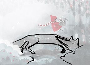
Changing the bridge into the wolf eliminates the repetition between the log and the wolf and increases the threat of the wolf. The main thing that changes for the narrative is that the wolf is much bigger and there is water underneath. But I think that actually helps the narrative. Anyway, lovely work, Nadya.