Dream Portfolio- Textured/Colorful
-
Okay so here is my dream portfolio:
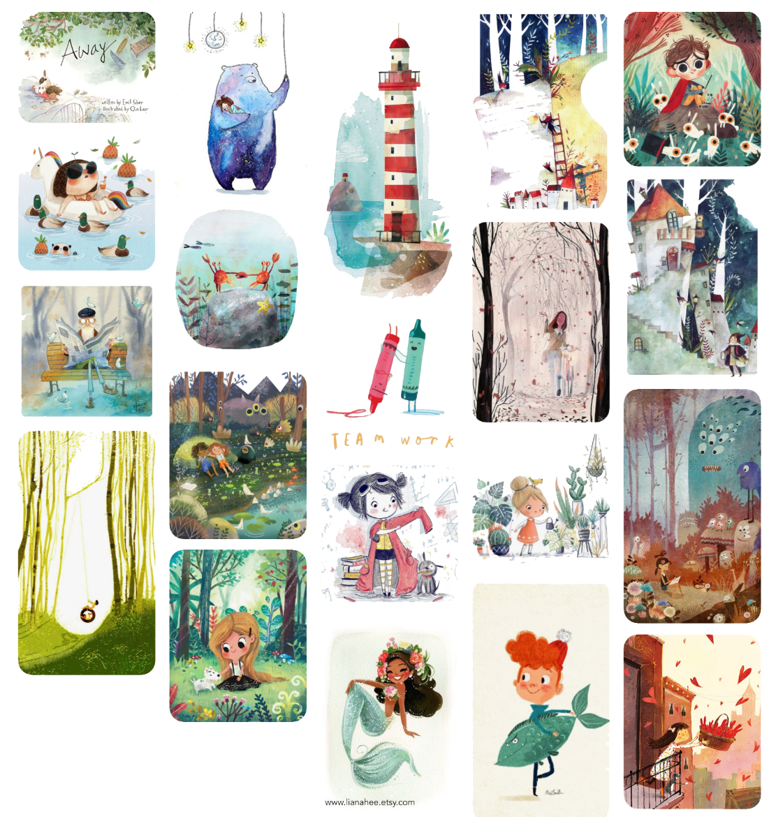
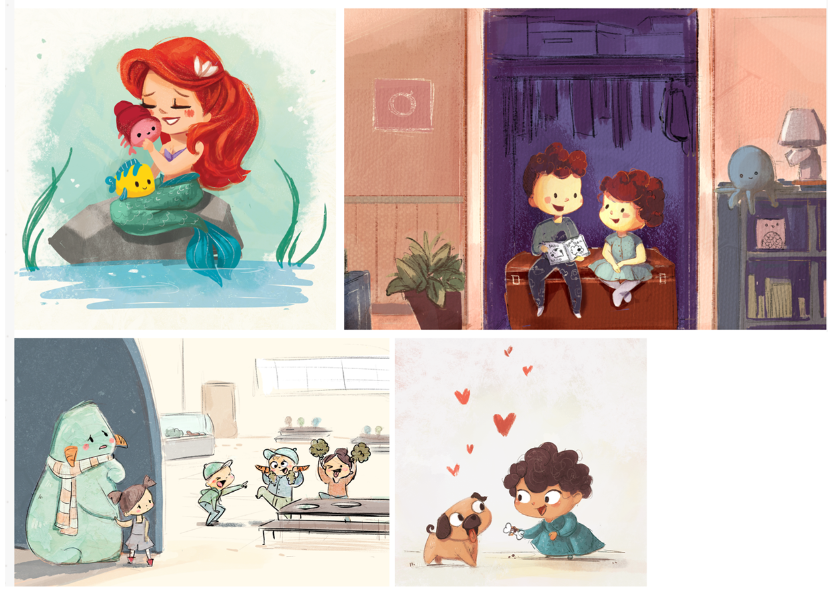
And here are a few of my pieces (I'm re-doing my portfolio in a new style so I don't have very many yet)
So I began the process of redoing my portfolio in a new style and I hadn't fully done the dream portfolio because I was too confused about what I liked and wanted to do in the beginning. Now that I feel like I sorta know the direction I want to go in I'm taking a break to put this together.
It seems like I prefer a mix between muted and colorful pallet if that makes sense? For sure I prefer stylized shapes, and an almost decorative, graphic detailed texture?
When I look at my work I feel like it is missing the detail and graphic texture most of all, and maybe also more movement? Also it's clear I like watercolor, so I would like to try some pieces in it. I just have to figure out how to set that up with two toddlers in my apartment.
Is there anything else I'm not seeing? I'm really trying to improve in this area and feel like I'm struggling so critical feedback is welcome.
Check out my art and tutorials :)
Instagram: www.instagram.com/carliannecreates/
Youtube:
https://youtube.com/c/CarlianneCreatesShop: www.carliannecreates.com
-
I also think it is hard to translate a dream portfolio into your own preferred style (I am struggling a bit with this, looking up to all of the beautiful pieces!). The dream portfolio is really beautiful. The colours and textures stand out indeed and they are fun and quirky. They lean towards red and blue hues in their color schemes and the colors are often pretty saturated. The compositions are rather full I think. Not too complex though, just a lot of details.
Maybe try experimenting with some alternative borders for your illustrations to add some spot illustrations to your portfolio. I really like the composition of the third piece, it reads very well! I certainly think you'll be able to create a very interesting portfolio. Good luck to you! -
@carlianne beautiful choices. Where is the blue bear at the top left from?
Nicola Schofield
Twitter: twitter.com/NSchofieldArt
Instagram: instagram.com/NicolaSchofieldArt/ -
@neschof Thank you! Her name is Manka Kasha. I chose that one because it reminded me of when I used to do water color and I would do random colorful washes inside of regular objects. I want to remember that I need to try that again.
Check out my art and tutorials :)
Instagram: www.instagram.com/carliannecreates/
Youtube:
https://youtube.com/c/CarlianneCreatesShop: www.carliannecreates.com
-
@nadyart Thank you so much for taking the time to look through it! I love the personal style you are working in as well. Are you using watercolor?
Check out my art and tutorials :)
Instagram: www.instagram.com/carliannecreates/
Youtube:
https://youtube.com/c/CarlianneCreatesShop: www.carliannecreates.com
-
I would take another look at the way color is used in your dream portfolio. The majority of them are split complimentary and using color to push a focal point.... perhaps find a way to find that in your work? (which is lovely!) This is an exercise I am working on-so, hat's off to you!
-
@carlianne Wow your dream portfolio is dreamy indeed!! You have some of my own personal favorites on there as well, like @vidsierra

It's true your own illustrations feel more "digital", less textured and decorative. Experimenting with brushes would be fun and beneficial! If you have trouble setting up watercolors in your situation, why not try digital watercolors?
Spot illustrations and little rounded corners also seem a fave of yours!
vanessastoilova.com
instagram.com/vanessa.stoilova/Check out my Youtube channel for tips on how to start your career in illustration! www.youtube.com/c/ArtBusinesswithNess
-
on a first glimpse, first two pieces of yours, fit in quite well!
") Good job:-)
Good job:-) -
@carlianne yes, exactly what I was thinking! Real watercolour also feels so nice to use, it's almost alive. Now, where did I leave my paint brushes....
-
One thing I noticed about your dream portfolio pieces, is that many of the characters are light and whimsical, with longer legs etc. I think you captured that look primarily in your third piece (in the cafeteria). I also noticed a lot of teals or blue/green in the dream portfolio pieces, very pretty, and that many of the backgrounds are outdoors. I haven't given this a try yet. I can't imagine how hard it must be to find consistencies that you want to incorporat into your work. I like so many different things. I guess that's why I need to do this.
-
@NessIllustration
Thank you! I would LOVE to use digital watercolors, I've struggled creating that effect. Do you have some leads or recommendations in that area? -- And I definitely love spot illos. I actually have been preventing myself from doing them so that I have some full page illustrations in my portfolio lol@Laurasketches
Thank you so much for breaking down the color for me. I was having trouble seeing what the connection was, and you're totally right! Definitely something I'll have to try out.@aska
omgosh thank you so much!!@deborah-Haagenson
Oh man you got me on teal/pink and the out doors hahahaha. I actually love outdoor pieces and nature and I avoid indoor images (The two contest pieces I did indoors to push myself). I'm wondering if I need some indoor images for my dream portfolio, so it feels more robust?Check out my art and tutorials :)
Instagram: www.instagram.com/carliannecreates/
Youtube:
https://youtube.com/c/CarlianneCreatesShop: www.carliannecreates.com
-
@carlianne I don't know which setup you have so which would affect my answer.. If you're on Photoshop, try Kyle Webster's brushes (you can get them free with the Photoshop subscription). If you're on the iPad, Procreate has some very good watercolor effects as well. Look up youtube tutorials, there are a ton explaining how to do digital watercolor
")
vanessastoilova.com
instagram.com/vanessa.stoilova/Check out my Youtube channel for tips on how to start your career in illustration! www.youtube.com/c/ArtBusinesswithNess
-
@carlianne Thanks so much! Yes, I use water colors often
I usually use graphite and/or watercolors, mixed with digital painting. -
@carlianne I overlooked the toddlers part earlier. It can be tricky finding the time and space to paint with children around (I know from my own experience :p). Do you have some tools to work with water colors and maybe a set time of the day when they nap / at night to feel free enough to experiment?
-
@nadyart Yeah! My husband helped me replenish my set for Christmas. So I have like a 2 hour slot on Saturdays during their nap
 . But I think I can try to prep everything ahead of time to make the most of it! I kind of want to try printing an image on watercolor paper that I've drawn previously so I can just practice the painting part.
 -
@NessIllustration Thank you so much! I've never heard of Kyle's brushes before so I think I just downloaded way too many but I'm excited to try them out!
I feel silly that I didn't think of YouTube videos. I realized when I was researching digital watercolor it was in adobe Illustrator (what I use at work) and there were very little resources for it. I totally forgot that I hadn't researched it in Photoshop
Check out my art and tutorials :)
Instagram: www.instagram.com/carliannecreates/
Youtube:
https://youtube.com/c/CarlianneCreatesShop: www.carliannecreates.com
-
@carlianne Yeah watercolor is fundamentally incompatible with clean vectors, so Illustrator wouldn't have the tools for that