Book Cover, Stuck, Art Block, Bleh
-
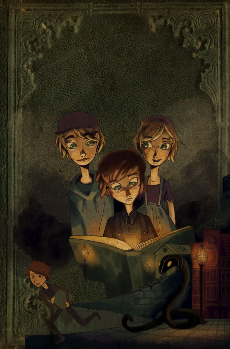
First of all, this is awesome - I love the look of this! Second, I agree with Bobby about placement of the snake and figure. The only thing I could add is that it would be great if you had some kind of creature or ghost or maybe even the snake looming over the back of the kids (so that it fills up the entire space above them), as if it's about to get them & they're unaware...
-
Super cool. But what @bharris said too. The painting is very airbrushy and shiny while the cover is grungry textured. I had this same issue with the Christmas piece. Crisping up your shadows will help.
-
@bharris
Thanks for your input! I really appreciate the thoughts, especially about the texture differences between the book and color. That has been bugging me! -
How great to have proper customers!
") This is looking good. I agree with the other comments…first of all I looked just at the coloured version and I was confused as to what was happening behind the running figure, but looking at the thumbnail it makes more sense.
This is looking good. I agree with the other comments…first of all I looked just at the coloured version and I was confused as to what was happening behind the running figure, but looking at the thumbnail it makes more sense.I agree with everyone else about the texture contrast, hopefully a different brush will help. The other thing that might bring the two together, since you are using a real texture for the book background, is to use more of them in the coloured part too. e.g. you could use a smaller paper/leather texture over the book). If it were me I’d maybe experiment by putting antique paper on a multiply layer over the whole thing, then do another paint layer over the top.
Also the snake is great but he is blending into the dark blue shadow a bit…would be good to increase the contrast there somehow. Will be good to see your next version of this!
PS I was too curious to see what antique paper on top would look like…
-
@Dulcie is on to something here. I think what you might be struggling with is melding those textures of the background with the digitally painted images. Your lighting on the top three figures seems very good. Some of the other items seem disconnected. I think you have a great cover design in the works. Keep trying different things. Move things around.
-
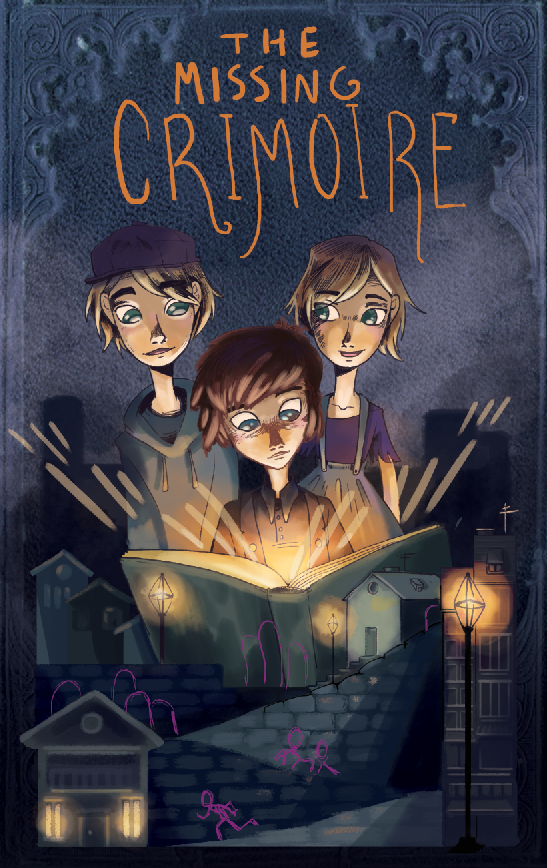
Thanks for all the input guys! I've been stressing over this and all your input as well as some from my friends has gotten me back where I need to be! (Which is excited about this project!) I tried out some more rough brushes which I'm loving and went back to my original design for the lower half. Any input on this newest version would be lovely but I am on my way! You guys all rock!
-
Glad you are feeling better about this project now! I think it reads better having smaller figures at the bottom, nice lighting from the building in bottom left too. The one thing I would change is the lighting coming out from the book, because the rays of light are almost like fingers, and if you represented it in the same way as for the street lights it would be more consistent. But great work
-
I agree! The smaller figures and bottom half design is a much easier read. Post it when you've finished!
-
Yep...much improved. I like what you have changed in the bottom of the image.
-
I agree with @dulcie... your original glow from the book is better than the light streaks which are too uniform and evenly spaced. I love the changes to the bottom half! Can't wait to see more!