basic perspective- my final assignment
-
hi everyone! just want to, first of all, say hi, its my first time saying anything on the forum, iv been with svs a few months and i also read other people's posts on here but iv been too shy to say anything!
")
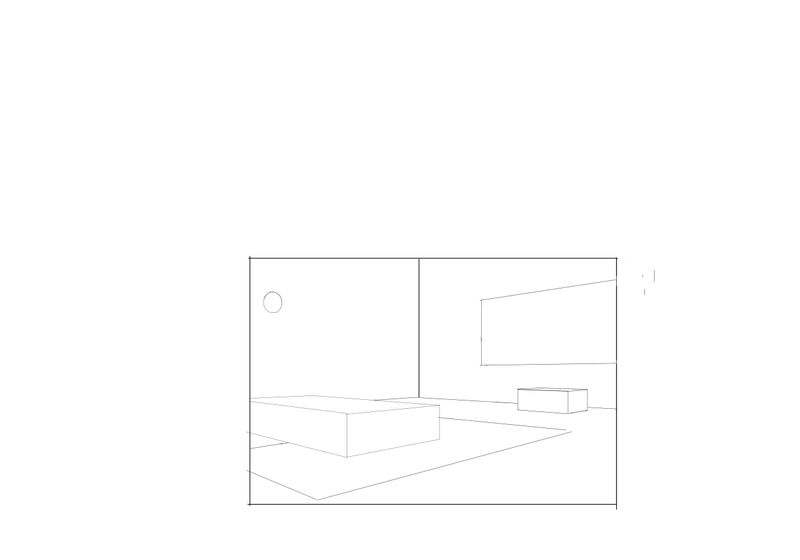
anyway, im just in the middle of my final assignment of David Hohns basic perspective course, i just would be so happy if ppl could comment on here whether the perspective looks right or if its a bit off?
my next step will be to add tone to the image, and then to add more detail. i was planning to make this a childs bedroom, and use a low eye-line, a child's point of view, that its a child looking in his or her own bedroom, but im not sure what happened but this is not really a childs point of view!also i hope everyone loves my ellipse!!! it took me so many tries to create an ellipse in perpective. its really not perfect but this is the best i could make it. im using a wacom Intuos, so im drawing on my tablet and looking on my screen so its a bit difficult to reach all the tangents and also make it nice and round but im practising, im practising....
-
oh i just realised im not even finished! must add in the desk
-
Oh is this from the the new curriculum of classes?
-
I think your perspective looks great. I also draw on a wacom tablet and sometimes i just get do fed up that grab a ruler and use it on the tablet to get a straight line..or hold it up to my screen to check perspective.
I think that if you make everything taller it will make it look like a child's perspective. Your POV is too high, like an adult looking down on the room instead of a child looking straight on. -
yes this is from the first set of classes of the new curriulum.
-
but i think i will just leave the POV as it is.
-
Hey Leah - it looks like you are asking for feedback so i hope you don't mind my muddled draw over. It looked like there might be multiple vanishing points and a tilted horizon in your drawing so i did a quick draw over - it is pretty hard to make out what i did now that i look a my drawing....the large box in the foreground has a different horizon line than the carpet it is sitting on is the main thing i tried to show - the multiple vanishing point are ok but they should all hit the same horizon line - i put the orange boxes on the lines to show the tilt of the perspective - i think all vertical lines should be perpendicular to the horizon line unless it is in three point perspective.... Anyways...hope this is not annoying feedback - maybe David will check and do a better job explaining...or let you know that i'm wrong
@Leah-Katz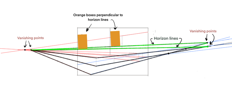
-
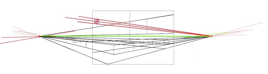
Hi Leah. Yay! I love to see people working on perspective. I would recheck the rug. It almost looks as if a couple of the lines (the ones parallel to the wall with the circle on it) are spreading farther apart, instead of receding toward a vanishing point. Or like Kevin mentioned, it could also appear that it's tilting. Either way, it doesn't quit seem to be following the same rules as the rest of the scene.
-
well iv tried more work on it, but something went wrong. going to start all over again! will try spend all evening on it. and kevin your right about tilted horizon line, im not sure how that could have happend bec before i started, i drew a horizon line and orthagonals to guide me but somewere along the way i must have tilted it somehow.
thanks everyone for your feedback! as soon as ive got it drawn again i will post it again -
ok i redid it a bit this time i checked my vanishing points really carefully! so what do you think of this?
thanks eveyone for your feedback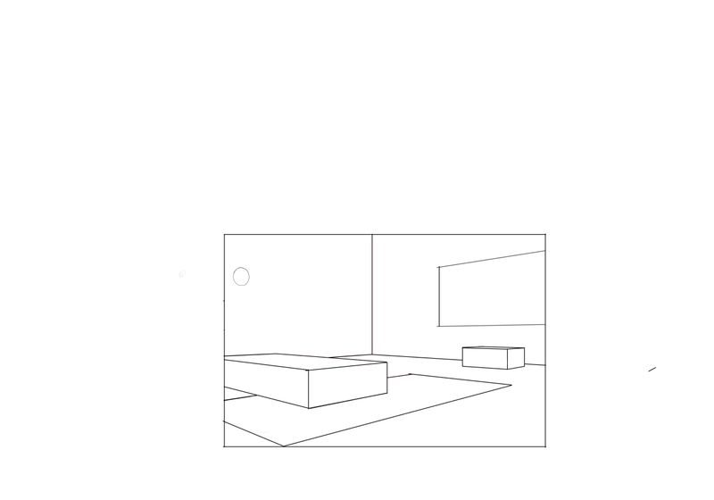
-
@jenithornhill you mentioned you also use the wacom tablet. mine has all markings from the pen on it. is that normal? its pretty new, i only bought it on black friday... will it ruin the quality and sensitivity of thetablet?
-
@Leah-Katz Looks very good!! Two vanishing points and one horizon
-
@Leah-Katz My old one had a lot of marking on it. I got a new one, the intuos pro.. and it has a smoother finish with no marks. I have been using this one for over a year now.
-
ok thanks. here is my assignment with tone added, next will be to add detail (and neaten up the tones!)
what does everyone think? do the different tones make sense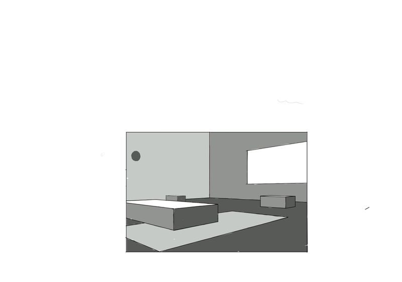 or not really?
 -
@Leah-Katz if the tones are to show the light/shadow and the light source is the window then I'm not sure they're working yet. E.g. The floor would be a similar tone to the top surface of the bed and the side of the bed facing left, away from the window, would be one of the darkest. Sometimes drawing the arrow for the light direction helps me to think more clearly about what values the surfaces should be.