March WIP critiques needed.
-
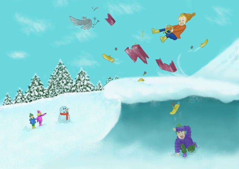
Hello all, could do with your eyes, working on this for the March contest but it just seems so..bland!
Any ideas please?Thank you all!
-
I love the energy and expressions. I might play with the composition and/or camera angle if you're feeling that it's bland. If the sled character is large(er) in the foreground for instance, it might created a dynamic contrast with the small observers in the background. You've done this a bit already but it's subtle. Maybe if you push the size contrast more? Really fun image so far!
-
@Chris-Philpot thanks for that, i'll give a go! really appreciate the feedback!
-
Hi Rachel! This is so fun! Great job with the gesture and expression of the kid in the air. The snow man is a really cool touch as well. I have a few ideas to throw out. Please take them with a grain of salt.
")
-
I would like to see the characters bigger in the frame. I think all of them could benefit from being larger within the frame while still maintaining the hierarchy between the foreground and the background.
-
I also want the kid in the air to really shine as the main focal point. Right now I feel the boy under the ledge is stealing the spotlight a little too much. I feel he should be the 2nd focal point. Maybe play with his gesture and downplay the intensity of the colors on his clothes.
-
The details of your background trees are really sharp and the values between light and dark are very contrasted, while your foreground characters are more softly rendered with less contrast. I would soften the trees and give them less value contrast. It might also be nice to try adding some trees to the hill to help frame the boy in the air.
Those are my quick takes- great job so far!
Website: www.tessawrathall.com
Instagram: www.instagram.com/tessawrathall_art/
-
-
This looks like so much fun! I really struggle with composition, but I was thinking, maybe you could make use of the rule of thirds. If you could shift your illustration a bit down, so the kid falling is in the top right mark, and also move the surprised kid below to the bottom left mark. That way the illustration might look a bit more balanced? And it would add the funny expectation of the second kid being in the way of the crash landing kid. That's my two cents

-
@TessaW that is fantastic advice, thank you so much! Really appreciate it. Thanks for taking the time to comment x
-
@Daisy I really like that idea thank you! I love this forum, you guys have great ideas!
-
Right now my eyes are drawn to the large, grey area below the jump and the trees in the background. What I do when I’m feeling really stuck is just go back to square one, as painful as that might be sometimes. Do some thumbnails, maybe 10 but you can ever do too many thumbnails. Then pick a couple to refine and keep it narrowing it down until you have the composition you like. Next block in just the values and finally move onto color.
More specifically for you’re piece I would suggest playing around with camera angles. What are the top three or maybe just two elements that you want the viewer to look at. From there you can create thumbnails with that in mind.
-
Hi @rachelpenman This is a fun idea! I get by context that this is a snow scene but the way it's rendered and shaped it looks more like an ocean wave. Did you use any photo references? Maybe if you put a little more contrast between the hill and the background. Also, I would deepen the saturation on the foreground figures to get better aerial perspective, especially the bird and the parts flying toward the viewer. Everything seems even in value and contrast and that is confusing the sense of space and flattening it out. For example, the trees are just as bold as the person in the foreground and they would be greyer and bluer.