Graphic novel cover design
-
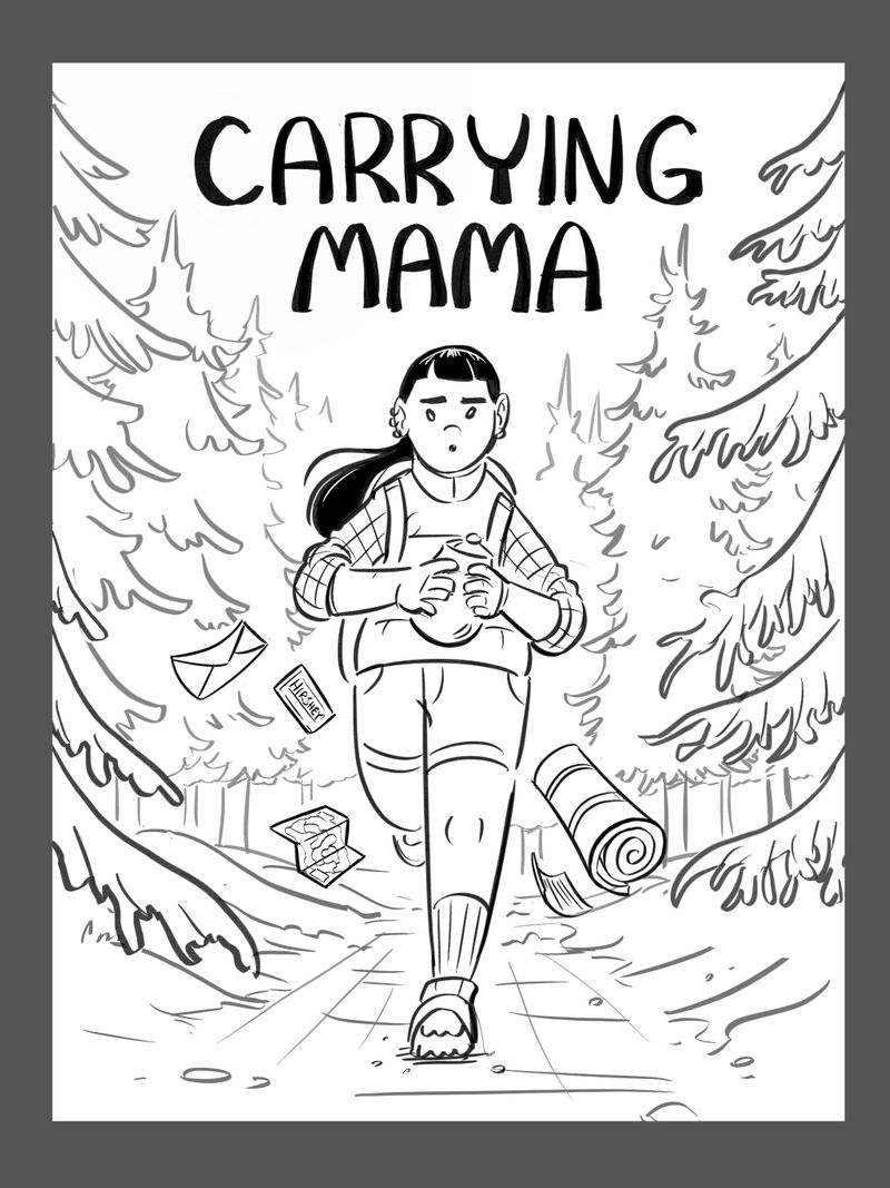
Hey, thank you all for the feedback! The more I considered, I agree with what a couple of people pointed out that the top 2 look more like interiors, the bottom left is weird, so that's leaves the bottom right! Plus, in researching kids graphic novel covers they seem to be more in line with this, usually simple, character-focused, not overly cluttered or composed (except for Amulet, those are rad!) My brother pointed out that the bottom right needs a little extra something of interest so I'm going to add some items falling off her backpack behind her that pertain to the story.
Oh, and the thing in her hands is an urn. ._.
Nat Iwata
www.iwataillustration.com -
@natiwata I like the last one too
") The top 2 are lovely but they don't focus on any one character in particular. Who is the main character? The last cover makes it clearer who's story this is!
The top 2 are lovely but they don't focus on any one character in particular. Who is the main character? The last cover makes it clearer who's story this is! -
These look lovely! They are all really great in their own way, but I'd have to agree that bottom right says "cover" more and I understood right away that she was carrying an urn with that particular illustration in conjunction with the title. It makes me tear up a little!
-
Thanks guys, here’s an update of the line art:
Nat Iwata
www.iwataillustration.com -
@natiwata This looks good. I am glad you went with this one.
-
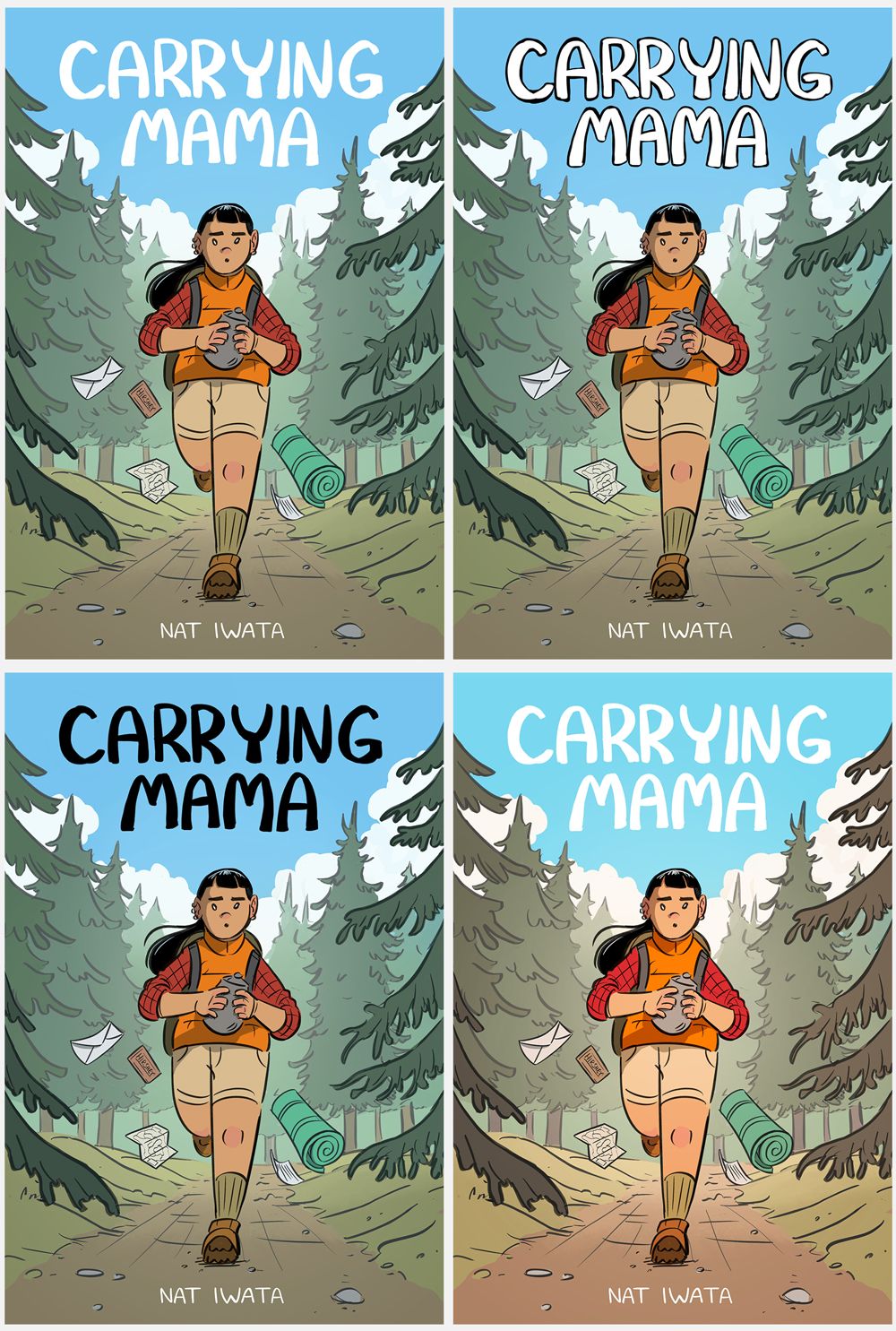
Tried some slight variations on title and coloring, not much time as it's due tomorrow, but I think I'm settled on the bottom right.
Nat Iwata
www.iwataillustration.com -
@natiwata I agree with your bottom right decision!!
-
This post is deleted! -
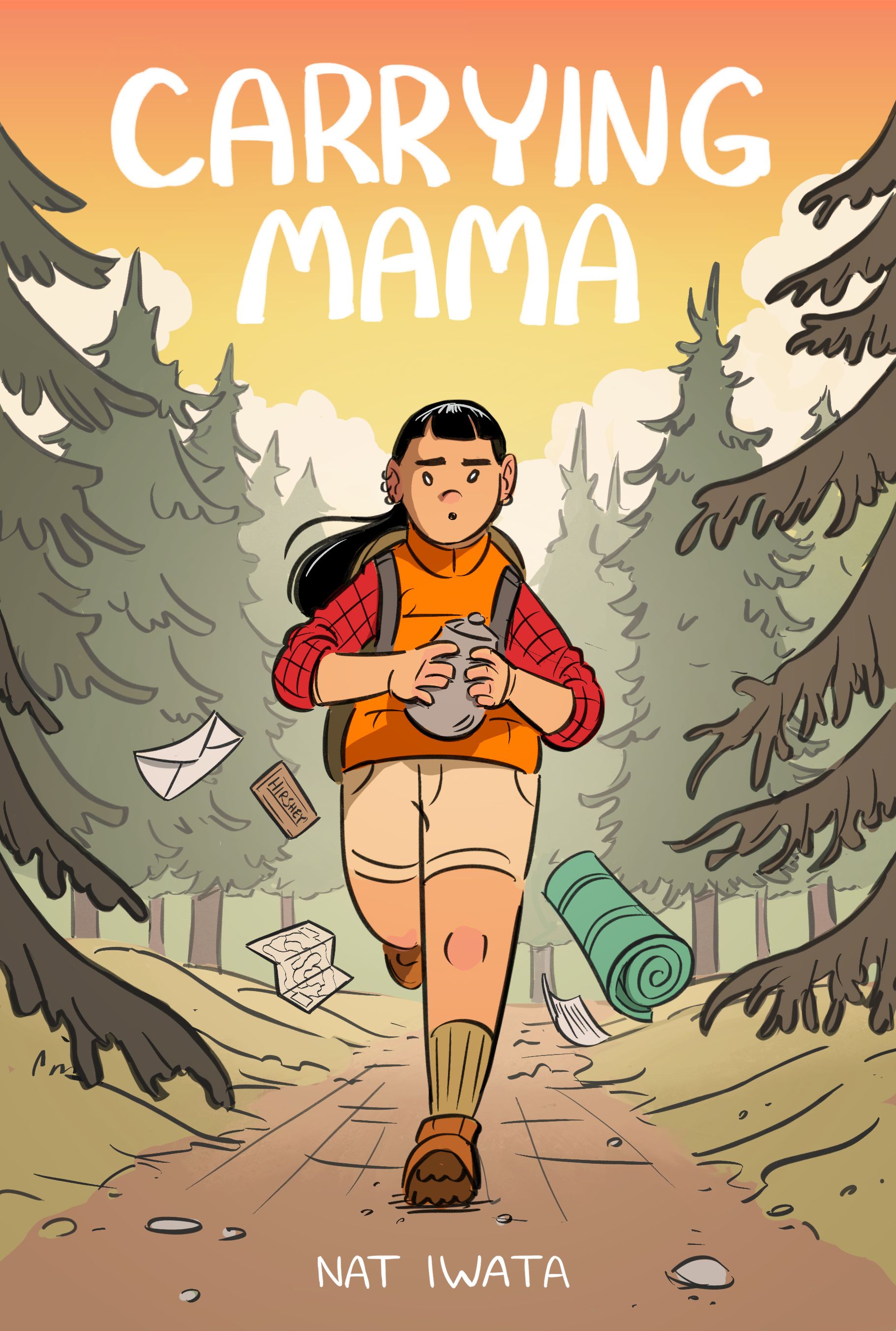
One more option...sunset?
Nat Iwata
www.iwataillustration.com -
@natiwata I like both, but they have slightly different emotional reads for me. Last batch neutralizes the mood a little, so the emotion and action are slightly more open to interpretation. The sunset definitely has more dramatic connotations, like time is running out before darkness. It amps up the speed of the action and makes her expression look more intense.
So I guess day version makes me feel that the graphic novel is a bit more introspective and the sunset scene makes it feel like it might have more action-adventure in it.
-
@natiwata i love it.
-
-
Definitely the sunset version, great work!
-
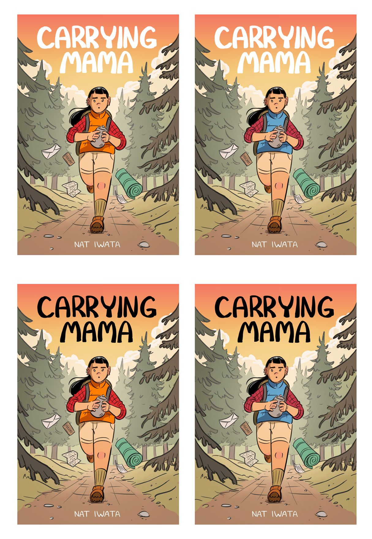
@natiwata with the sunset one. I was thinking everything is using such warm colors that if you wanted to add emphasis to the urn you could make it blue or purple (a cool color) to draw the viewer to it.
-
Thanks everyone! Looks like sunset wins. Now one last decision before I submit it tomorrow:
Nat Iwata
www.iwataillustration.com -
@natiwata I like the bottom right. The blue really draws the viewer into the girl and urn.
-
@natiwata I also like the bottom right. The blue vest helps pull the eye to the urn.
-
I've looked at this several times already and still really can't make up my mind. However, I think the bottom left (black letters, orange vest) offers the most suspense.
-
I like the black lettering and blue vest. This has the best contrast in my opinion. I like the composition and the colors of the trees indicating the three grounds. Well done.