Feedback: Woodland Pink
-
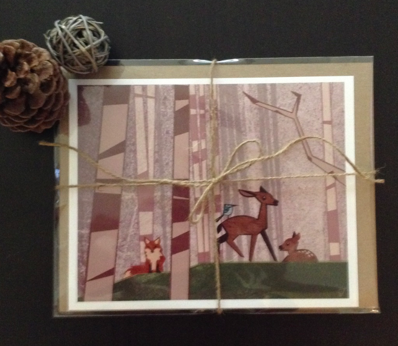
Here's the print ready to go to it's new home:
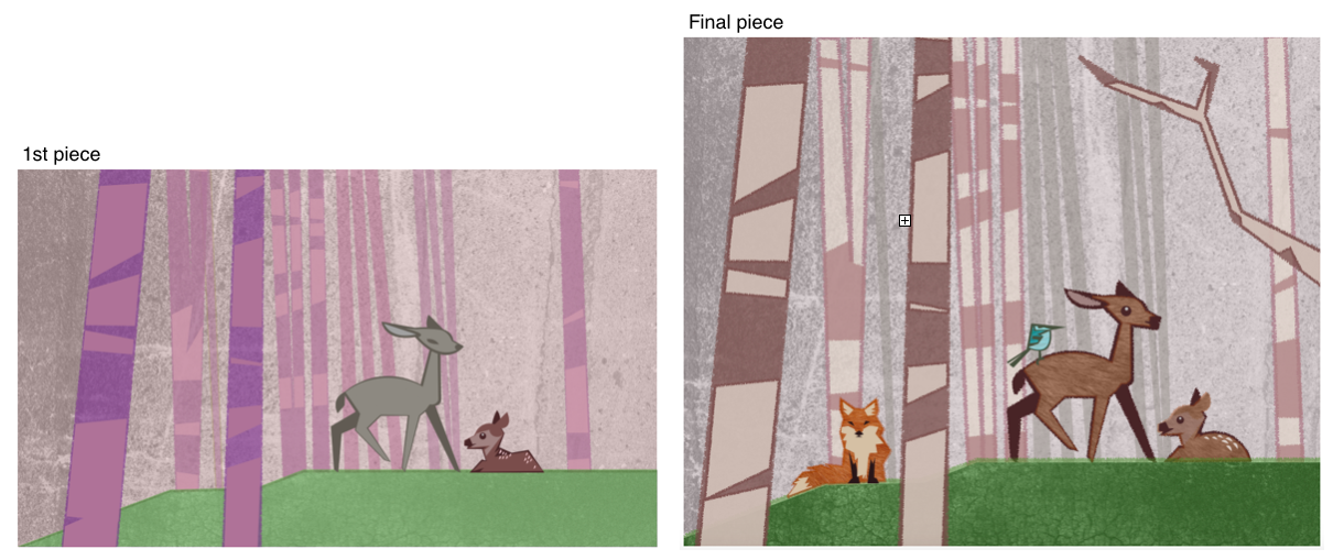
Here is the final comparison. Thank you all for your wonderful feedback. My wife loves it.
Original Post
Well,
I've spent too much time on this, the colors seem weird to me. I don't know if I like the baby deer. Any suggestions will help. Thank you.
Theme: Woodland
Purpose: Nursery Picture for 1 year old girl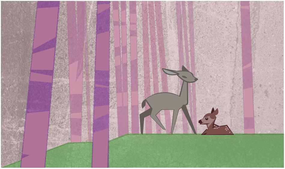
-
I like it--it might be good to reduce the line weight on certain parts of the bigger deer though. Just my opinion.
-
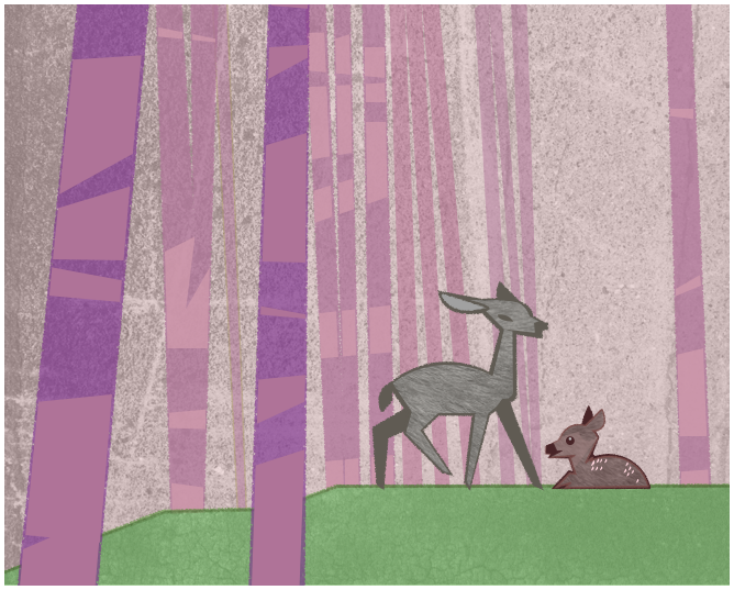
@carlossketches Hi Carlos - I like the direction you are going in. I might suggest that you use that same brush style (with the rough edges and textures ) that you used on the trees/background to also outline/fill the characters. Right now they look too solid and smooth compared to the texture everywhere else in the image.
-
@Rich-Green Great suggestion on the textures!!!
Here's an update:
-
@mattramsey thank you. hopefully the texture update offsets the line weights.
-
@carlossketches - Hi Carlos, yes I think adding the texture works really nicely here. One other small detail might be to change the shape of the eye on the mother deer and the baby deer to match. Right now they are very different and I think if they were similar it would really help connect them a bit more.
-
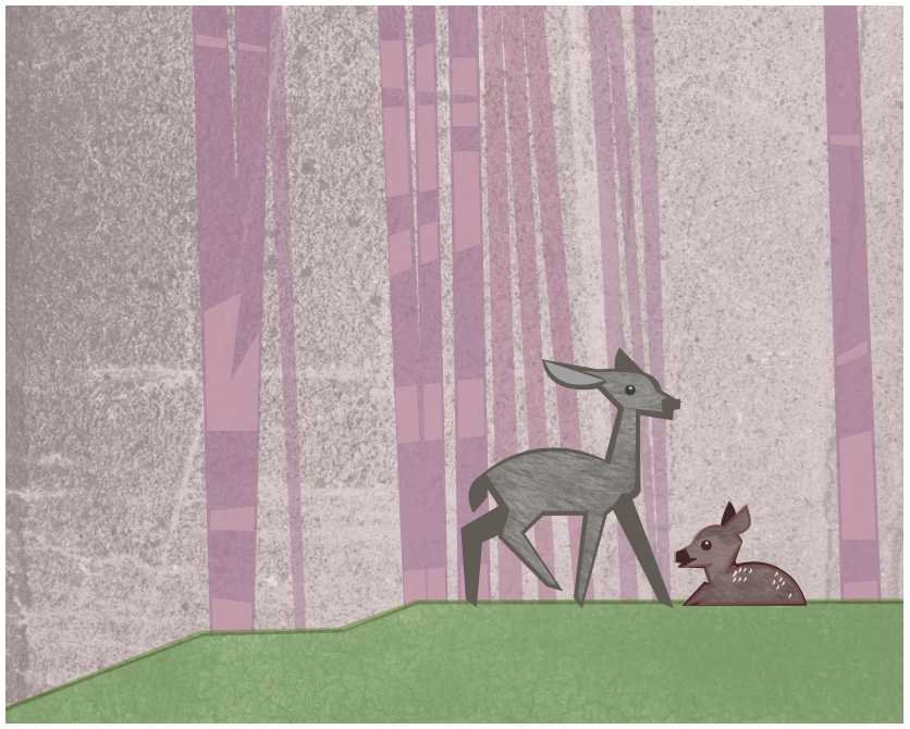
@Rich-Green Do you think it works without the two foreground trees?
-
@carlossketches I really liked those foreground trees actually.
It gave more interest to the piece for me.
-
@carlossketches - I like the update to the eye and I think you should keep the foreground trees - I liked them!
-
@carlossketches - also I think the foreground trees give the viewer a feeling as if they are in the forest seeing a special moment taking place between the mother deer and the baby. It gives you more of an emotion. Without them we feel like we are almost to close to them and it loses that feeling a bit.
-
@carlossketches Also without the foreground trees, you notice both of the equal sized large areas of the background. And it reads as blank space... the foreground trees add color, dimension, and as has been mentioned, gives a more emotional intimate scene.
-
Thank you all for the feedback. I decided to keep the foreground trees, I knew I liked them but everyone's explanation really cemented my why.
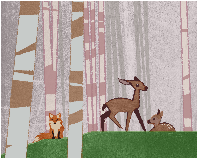
Let me know what you think on this new update. Made some color scheme changes and other minor adjustments, plus added a fox:
-
love your new fox, love the feel. I also like the concept of having the foreground trees, but in this latest tweak, the foreground trees, because of their color difference, have the illusion at first glance of being in the background and cutting the image. Perhaps if the brown in the foreground trees were in a closer yet darker gray tone, it might not have this illusion? (hope that was clear)
-
The addition of the fox changed the story so now the mom looks startled. Her back leg is up, her front legs seem to be guarding the baby and her mouth is open. Is the fox there to eat the baby? What is the story you want us to see?
-
@Nancy-Gormezano thank you. yes, you are right, something was off on those trees. I will readjust them.
-
@gimmehummus great feedback. I haven't been thinking of a story for this yet.
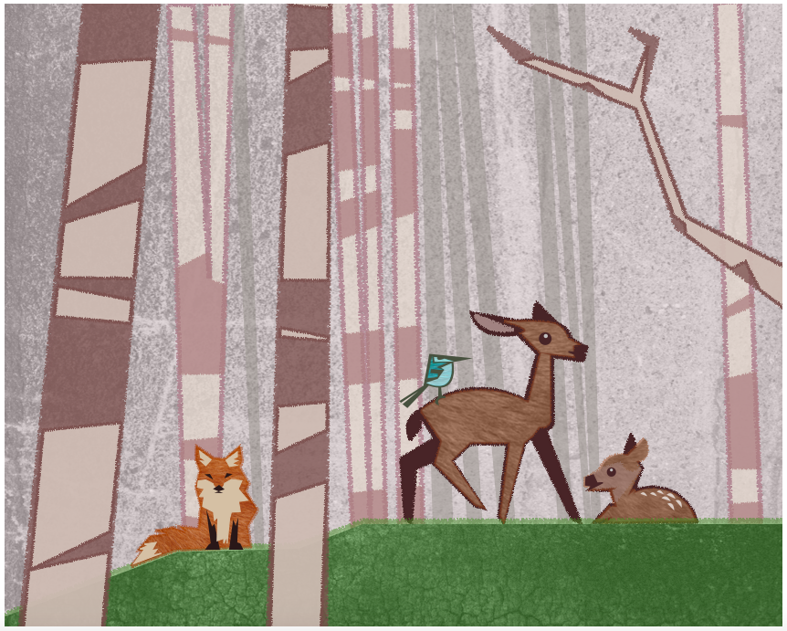
My art director (wife) said something in the theme of woodland, with a couple different animals in the drawing. So I might have to add another animal in the future. Maybe I can change the mommy deer so she doesn't seem scared and add a bird or raccoon.
lot's to think about now. thank you again.
-
Here are the latest changes. Thank you all for the amazing feedback!!
-
@carlossketches updated with comparison
-
@carlossketches updated with print picture
-
Your final product turned out really lovely! The extra color and shapes added a lot of dynamic, but still kept it readable and calm for a child's room. Well done!