Peer To Peer Feedback on April Piece?
-
@Jeremy-Ross I feel the same way. Maybe we need to have an after critique post where we submit our work that didn't make the cut and get critiques on it. I am sure with a high volume of pics, its possible that at some point the work is professional and good enough but maybe just not what the judges want. I heard Jake say it was all about very specific things this time like what was the robot supposed to do first, before it went bad. I know I didn't communicate that. But I get insecure because I don't know if my work was "good enough" but not their cup of tea or if it was truly weak in some areas and thus not selected, or it was fine but there were twenty others just better. It's the not knowing that eats me. Because sometimes I think I produce good stuff and every one else is just, "meh." I don't want to be "meh". So its hard but I think you are doing the right thing by asking for critique.
-
Hi Jeremy, first I have to say, every month a lot of really good pieces don't make the cut. They have to draw the line somewhere and with a different pair of judges or a different day, the picks could have been different and just as deserving! I know there where many I really loved that didn't make it into the 16. I'm glad you were confident in the piece- you should be! And it's great you're willing to seek feedback. I know what it's like not to make the cut, so I can commiserate with you some.
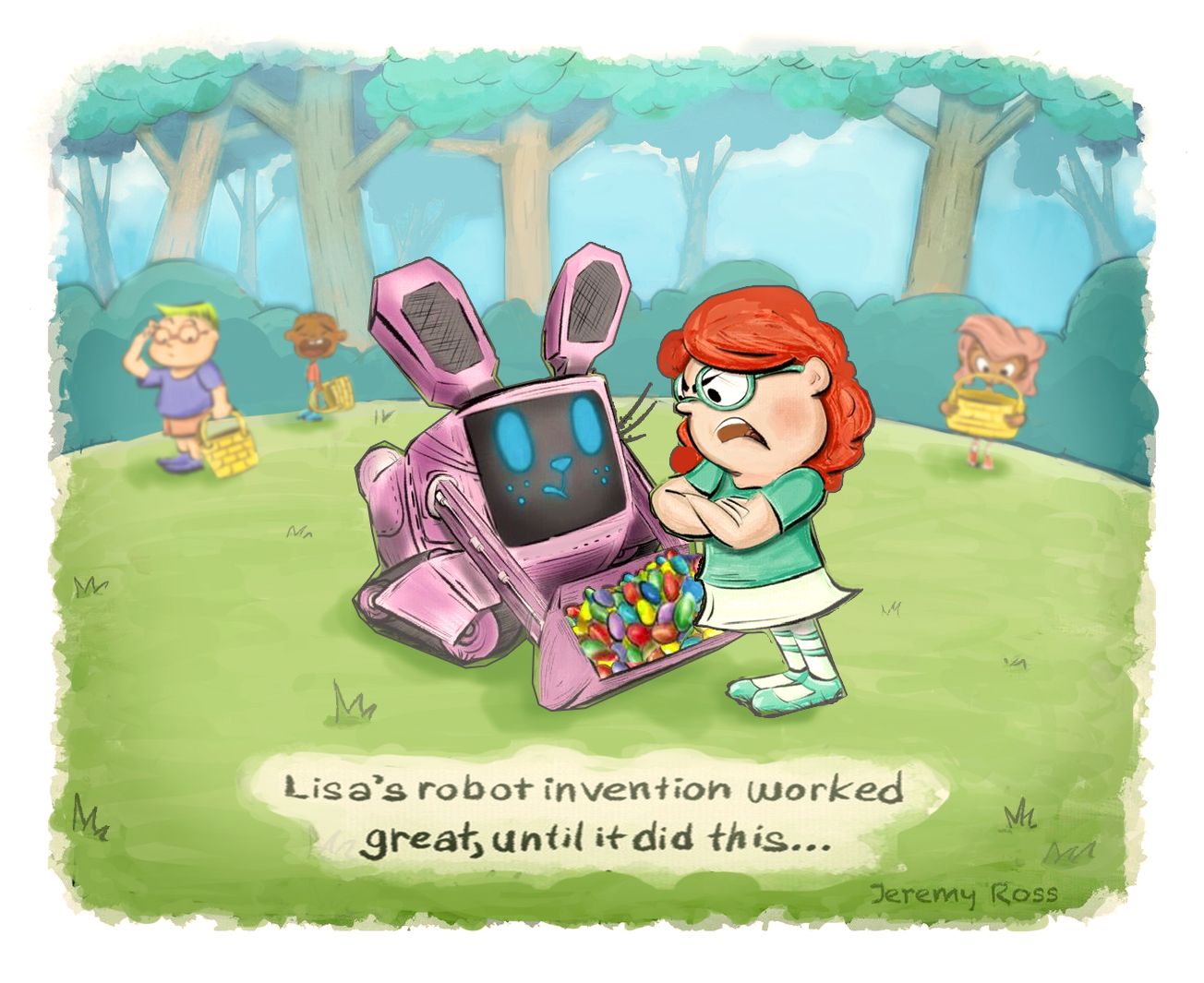
I think you have a lot of great things going for this piece. I love how you've rendered that background. The pencil marks with the watercolory washes combined with the style of the trees is so attractive. The design of your bunny is adorable! Your character expressions are well done.
My critiques are:
-
You are not letting the focal point of the robot and the mad girl be dominant. All of the values, line work, and colors are on similar levels and it's not allowing us to focus on any one thing in particular. I do really like your base color palette, but I think you need to do some studies, tweaking their value and saturation levels. The background for example could be made a lighter value as a whole. The three supporting characters in the back are just as large as our focal points. The pink haired girl is right on top of the bunny, that crying boy is so cute, and his expression so strong that my eyes just want to stare at him the whole time. You may be able to keep the 3 background kids as is, but if you extended the format,moved them to the right, and made them a bit smaller, it might help the main focal points shine better.
-
A few elements don't quite feel "authentic". I don't think that in children's illustrations, everything needs to be accurate or true to life, but I think certain elements need to feel authentic or they are distracting. The Easter eggs for example- if any of those kids were to pick one up, the size would indicate it was a candy and not an Easter egg. Maybe this is a regional thing though? In my experience Easter Eggs are larger. The fact that they are so small, give me pause, and that distracts me as a viewer from the point of the piece. I also feel like the clothes don't seem quite right. I think it's fine to keep clothing design simple, but I feel the shirts of the boys need a couple of simple detail lines to make the cut of their shirts look more boyish. Like an indication of a collar or cuff lines. Not saying boys can't wear feminine clothes, but I thought I'd point it out.
A couple more things to think about. What if the bunny looked proud? Would that perhaps give more emotional impact and/or humor? Another thing is- maybe the timing of showing an Easter piece was a little off? I know that for a lot of people, the period immediately following a Holiday- you kind of want to move on from that Holiday. It's over, you may be a little fatigued from it, and you haven't had enough time to build up excitement and anticipation of it again. With the selection process for the contest falling shortly after Easter, it may have been bad timing. Just speculation of course, I have no idea if this was relevant or not.
Anyway, just some thoughts. Again, I think you should be really proud of yourself. I wouldn't be surprised at all if you won a contest one of these days. Even if you don't, I'm sure a lot of learning and great pieces will come out of participating.
Website: www.tessawrathall.com
Instagram: www.instagram.com/tessawrathall_art/
-
-
@Jeremy-Ross so first of all I really love a lot of your work. The avocados in the snow and the lady bugs with the balloons were some of my faves. I shirts look forward to see what you'll post.
For this piece I agree that story was a little unclear because its job was to collect eggs, so did it really misbehave? Also, maybe it's just me, but I disliked the red haired girl character. Something about her looks really mean and bratty? It might be her more angular face and nose and the extra wrinkle in the cheek makes her feel older. But then I look at this I just feel bad for the bunny robot and dislike Lisa. But then there's all the kids crying so I feel confused on an emotional storytelling level about how I should feel about the bunny.
Regarding what your wife said I think bright colors are great but maybe instead of having every color be it's local color, you can try a color scheme? So instead of grass is green and tree trunks are brown etc. There is a yellowish light from the sun on everything and casting a tint? Will talks a lot about how he used to use all the colors at full saturation and had to learn to control them. I personally like using a split compliment pallet for this reason. Also, his magic of color class is super short and really really good.
I think it's amazing that you're asking for feedback so you can grow. I try to remind myself that if I'm feeling uncomfortable with my art that means I'm pushing myself and I'm growing, and that means I'll get better. Please keep going, I think you're close!
 ️
️Check out my art and tutorials :)
Instagram: www.instagram.com/carliannecreates/
Youtube:
https://youtube.com/c/CarlianneCreatesShop: www.carliannecreates.com
-
Hi Jeremy,
There is a lot of nice things going on on your picture. The character designs, their expressions are nice; the background, trees are very well done.
The storytelling may be confusing. The robot was built to collect easter eggs, but it collected also eggs of the other children, and that made the girl angry? If so, maybe a different reaction of the girl (right now she makes a very mean impression), exageration with much more eggs (some of them crushed), some other children in the background intensively looking for eggs, might help.
The composition migh benefit from separating of the character groups (three children group from Lisa/Bot group).
The colors need indeed more harmony. It is hard to control a lot of different high saturated colors. An overlay layer on top could help to pull the colors together as the fastest fix. Better value structure will definitely help to get a better read.
Just some thoughts.Sometimes it is hard to get picked in the contest. I guess, it much depends on how interesting the concept is and how well the storytelling is done (i struggle with that a lot)... and there is always so many entries, plenty of styles and judge/audience preferences... so it is tough
 . But the more one tries, the more one learns and the better picture will come, even if not picked. And critique is always good, at least to get different points of view after starring for a long time in one image, allowing to explore more options.
 -
Hello!
First of all thank you for sharing your piece for us to enjoy. The line work is confident and each individual character feels expressive and grounded on a solid plane. If no one questions this it is a sign it is well done! And kudos for completing another image!
I agree with others that the storytelling doesn't quite come through and has room for improvement. My experience viewing the piece went like this: Red hair > girl's expression > candy eggs > bunny ears (glazed over big blue eyes) > eyes and hair of girl#2 > boy#1 glasses > boy#2 expression > caption. The characters were designed in an oval layout to help direct the eye and it seems to have worked for me, but in the process I somehow completely missed the story. Only after studying the image (and I admit I am not the sharpest pencil in the box) I realized the robot scooped up all the eggs/candy and why the children with empty baskets are unhappy or confused.
To improve the storytelling or address viewer confusion perhaps you can consider the following (and these points ends up echoing others' suggestions):
-
Increase bunny size to become even more predominant (it technically takes up the most space on the page but subdued by being a value similar to the ground. If this is on a separate file layer it wouldn't be much of an issue, I hope. I think it would be OK if it covers the girl's basket in the background)
Eggs/Candy can be larger to emphasize the importance of what bunny did wrong (the colors grab your attention but I didn't realize its' importance immediately) -
Tone down saturation of red hair color (she is a plenty strong character!)
-
Tone down the whites in the background children's eyes/teeth and text background (and help the main girl/bunny maintain attention)
-
Help the background sink back even more by reducing contrast between trees.
P.S & Disclaimer: This my first time posting a critique response and it is my intention to add helpful feedback and not discourage. I am just re-(re?)-beginning my art journey and am not in any position of authority. But again, I applaud you for getting another piece done!
-
-
Hi @chrisaakins, thanks for your response! I am grateful to be among so many great artists, but more importantly, grateful to receive such valuable feedback to help me grow!
I’ve never taken traditional art classes, so being here in the SVS program and community is all I have.
To receive such valuable critique from other members is a gift! Although I’m 40, I’m a freshman artist, haha!
By the way, love all your work!
-
Hi @TessaW, Thank you so much for your kind words and thoughtful feedback!
I completely agree with everything you said and knew I had those weaknesses when I submitted my piece. I believe all the time I spent rendering made me ignore the important details you pointed out.
Regarding timing and theme, I submitted my piece on Easter, which is like publishing a Halloween book in Christmas, lol. Very good points!
Finally, thank you for your closing thoughts! I definitely feel like I’m growing, especially with the amazing feedback and thoughtful critiques from you guys!
Friends and family say Wow!! - But this community is where you get honest feedback and grow as an artist.
Thank you!
-
Hi @gavpartridge, thank you so much for your feedback!
You make very valid arguments, which certainly crossed my mind when I was making the piece.
I think Lisa totally screwed up on her bunny bot design
 !!!
!!!Thanks again for chiming in! I’m collecting good notes for my May piece!
-
Hi @carlianne, thank you so much for your feedback!
Yes, Lisa is a mean girl; however, I was not going for that! So funny how things turn out.
Thank you for the tips on color and saturation, I’m definitely struggling in this area. I will certainly take more time on color studies before making a final decision.
Your kind words on my other pieces are greatly appreciated! My goal is to grow with each piece and get just 1% better. I’m only 40, and although I started Art late in life, I am in love with the process!
Ps, love all of your work! I’m like “dang!, hope I can get that good one day!”
Thanks again for taking time to provide your valuable feedback!
-
Hi @marek-halko, thank you so much for taking the time to provide your valuable feedback.
Your comments regarding the story and colors are consistent. I’m thankful for so much feedback! You guys are all helping me more than you think!
Admittedly, I was debating on whether I should post my April piece for feedback, but the overwhelming constructive feedback made me so happy I did!
Thank you!
-
Hi @Kawa, thank you so much for your helpful critique!
Thank you for taking me thorough your lense, that was pretty fun!
I also appreciate the kind words on the line work, that was my favorite part of making the piece actually.
Look forward to seeing your work and more critiques. Thank you for taking the time to impart your excellent thoughts!
-
Hi Jeremy!
There is a lot of cool designs in this illustration.
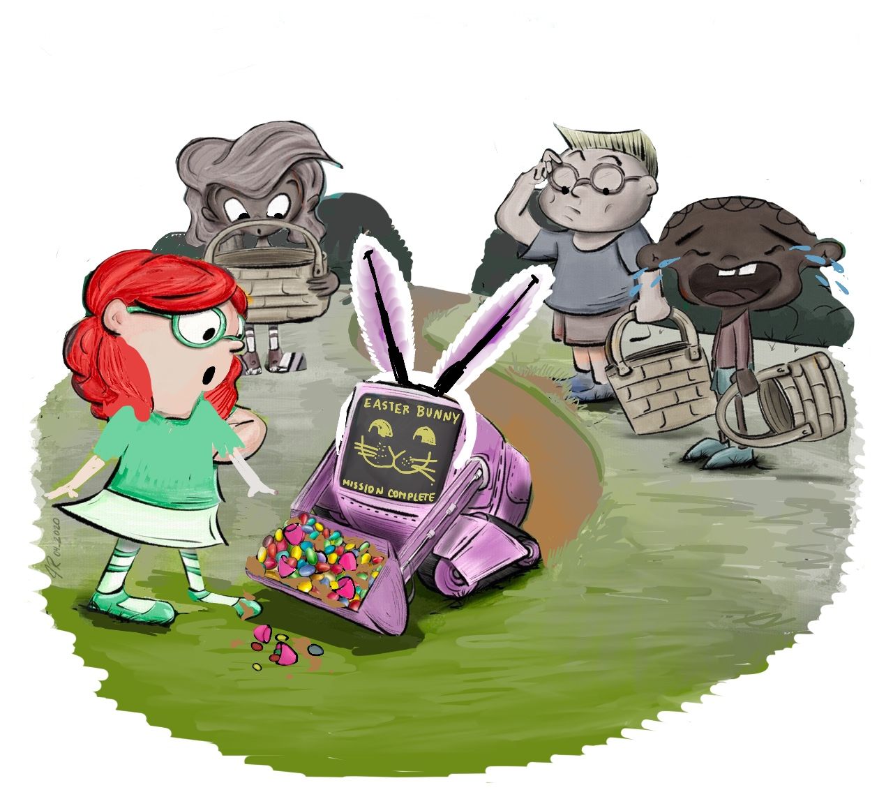
I really like the Robot design and the overall concept idea.I did a paint over to try and help with the composition maybe give the characters more space.
They are not in order

-
Updated the Canvas space of the scene
-
Centered the main characters, Lisa and the Robot
-
simplified the environment more so the focus stays on the main characters, I did that by using Atmospheric Perspective in photoshop I use a
Lighten layer with an aqua color similar to the sky in the scene -
Simplified the shrubs in the background by rounding shapes and using small medium and large shapes.
-
rounded the grass hill
-
Centered the Text and enlarged it a bid
-
foreshorten one of the Robot's ear and Face
-
fliped the robot and Lisa
-
Moved Lisa closer to the robot where she overlapped the robot, though it will help sell the confrontational look
-
Spaced out the back characters and shrunk them down. to show more depth and distance.
-
Used Gaussian blur to blur the back characters individually
-
to finish I did some color adjustments by using the - Adjustments Layers.
-
Hue/Saturation - move the Hue a bit to the right to +13
-
Made a Vignette using another Hue/Saturation layers, by using an alpha mask
-
Photo Filter - Warming Filter (85) Density: at 25%
-
Levels - Moved the wires a lil to the left and the blacks a lil to the right
I really hope this wasn't confusing, hope I could help in some way, at least show you another composition idea!
-
-
Hi @franksandovalart, thank you for such a detailed draw over with full explanation in all! Wow! I really like how you added space to the scene and brought more attention to Lisa and her Bunny bot.
I will definitely keep your notes for future work; however, much of what you noted went over my head! I have lots to learn.
By the way, your robot piece is incredible! It looks like it came right out of a movie! Keep up the amazing work and thank you very much for the wonderful feedback!
-
-
@Jeremy-Ross It looks like you've gotten really great feedback so far! My draw over is a bit of what people have already said and definitely things I just made up with my daughter helping out. And then she fell asleep on me, so I will explain more later. The only thing I want to point out is that a graphic designer would not like working with a text box like that, so it needs to be an open space suitable for text that might change. Also I changed to to a tractor-bot that decided to be a bunny on Easter. I loved your rendering of the trees but felt the real setting was the group hunting for eggs together.
-
Hi @carolinebautista, thank you for yours and your daughter’s feedback and draw over! I like the overall roundness of the layout and changed expressions.
Thank you for taking the time to provide your feedback!
-
@Jeremy-Ross sure! It wasn't really necessary after all, but I don't mind. I think sometimes it's interesting to really feel out what kids notice, since they're our market too. My daughter really reacted to the clothing. She's not as able to articular why she didn't like things but we discussed what Lisa could be wearing and why. I think in every culture there is a somewhat neutral clothing that kids can be wearing, and then something that makes a statement. Either way, it seemed clear to me there should be a character-driven reason for the clothing. In my version, if Lisa invented a tractor-bot, she may have been wearing more of a farmer outfit.
Also, one thing that I took away from this conversation with my kid is character design consistency. I know it has been mentioned plenty of times that a character should be consistent across multiple images, but I do think that it's worth considering how consistent the character design is between characters. Lisa's eyes are white in the rims of her glasses, but the boy in the background has skin color. The crying boy is very thin, while Lisa had more intimidating, strong-looking arms. So I think something I might be doing is to go through my characters in one image or story and identifying shapes and what they mean, then applying them consistently. The variety you have here is great, but I think putting some meaning into the variety can strengthen the storytelling.
Yesterday I listened to @jdubz talking about his process and he showed how he used to choose very saturated colors, and then he showed his new range. Looking at it, it's surprising because they seem like dirty colors when you pick them with the bright ones nearby. But they read as perfectly controlled. It was really helpful to see it mapped out like that. I hadn't thought of that before, and I think I might go back and rethink how and what I choose for color.
-
Very good points @carolinebautista, thanks for the additional input on character design consistency!
-
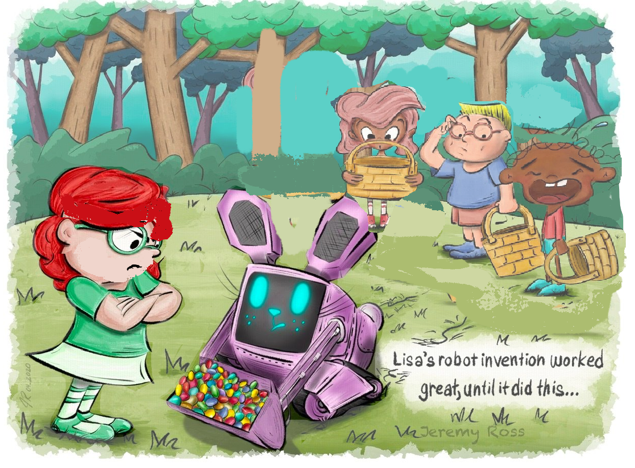
@Jeremy-Ross I went ahead and did a very VERY rough pass just to communicate what I think a few people have tried to say here. I think because of the composition and colors your piece had started to lose its focal point. The characters and colors were all equally bright and large. By moving the 3 kids farther away, and making parts of the background less saturated it helps you first see the girl and bunny, and then see the kids in the back. I also adjusted Lisa's face so that her eyes are lower down as it makes her look a bit younger and more like a child
And thank you so much! I have just had a lot more time to practice than you! And even still I get frustrated at my progress (even today!) and have to push through it. It is SO great that you enjoy the process though, as I think that's the only way to be able to persevere! If you do a post for WIP on your next piece, feel free to tag me!
Carlianne
Check out my art and tutorials :)
Instagram: www.instagram.com/carliannecreates/
Youtube:
https://youtube.com/c/CarlianneCreatesShop: www.carliannecreates.com
-
Thank you @carlianne! Your draw over looks great and reinforces your earlier feedback!
I’ll tag you on my May WIP this evening.
Thanks again!