Peer To Peer Feedback on April Piece?
-
Hi @gavpartridge, thank you so much for your feedback!
You make very valid arguments, which certainly crossed my mind when I was making the piece.
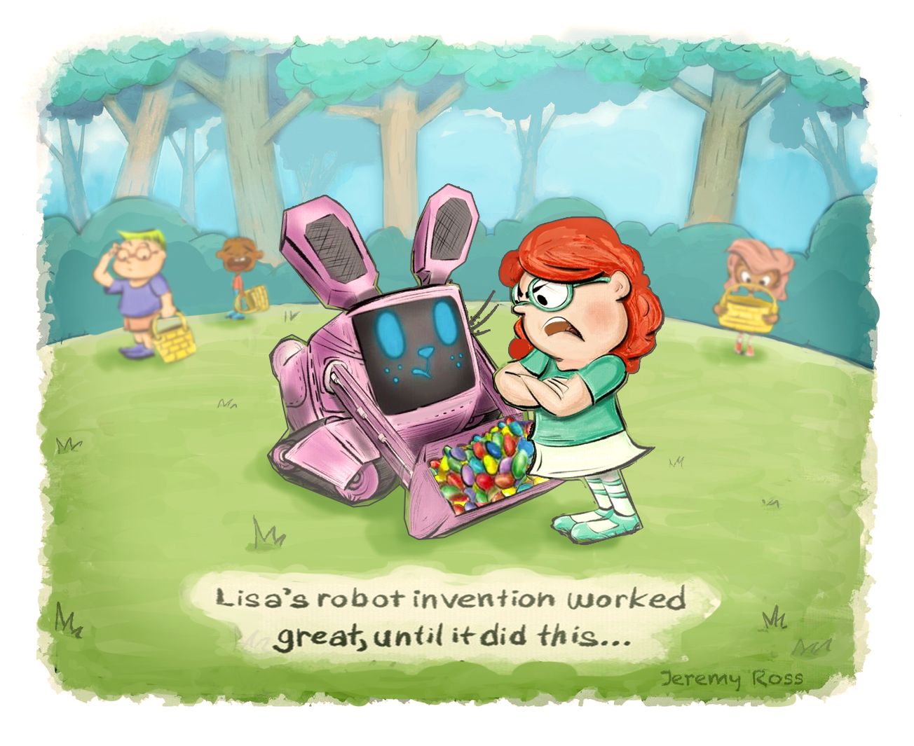
I think Lisa totally screwed up on her bunny bot design
 !!!
!!!Thanks again for chiming in! I’m collecting good notes for my May piece!
-
Hi @carlianne, thank you so much for your feedback!
Yes, Lisa is a mean girl; however, I was not going for that! So funny how things turn out.
Thank you for the tips on color and saturation, I’m definitely struggling in this area. I will certainly take more time on color studies before making a final decision.
Your kind words on my other pieces are greatly appreciated! My goal is to grow with each piece and get just 1% better. I’m only 40, and although I started Art late in life, I am in love with the process!
Ps, love all of your work! I’m like “dang!, hope I can get that good one day!”
Thanks again for taking time to provide your valuable feedback!
-
Hi @marek-halko, thank you so much for taking the time to provide your valuable feedback.
Your comments regarding the story and colors are consistent. I’m thankful for so much feedback! You guys are all helping me more than you think!
Admittedly, I was debating on whether I should post my April piece for feedback, but the overwhelming constructive feedback made me so happy I did!
Thank you!
-
Hi @Kawa, thank you so much for your helpful critique!
Thank you for taking me thorough your lense, that was pretty fun!
I also appreciate the kind words on the line work, that was my favorite part of making the piece actually.
Look forward to seeing your work and more critiques. Thank you for taking the time to impart your excellent thoughts!
-
Hi Jeremy!
There is a lot of cool designs in this illustration.
I really like the Robot design and the overall concept idea.I did a paint over to try and help with the composition maybe give the characters more space.
They are not in order

-
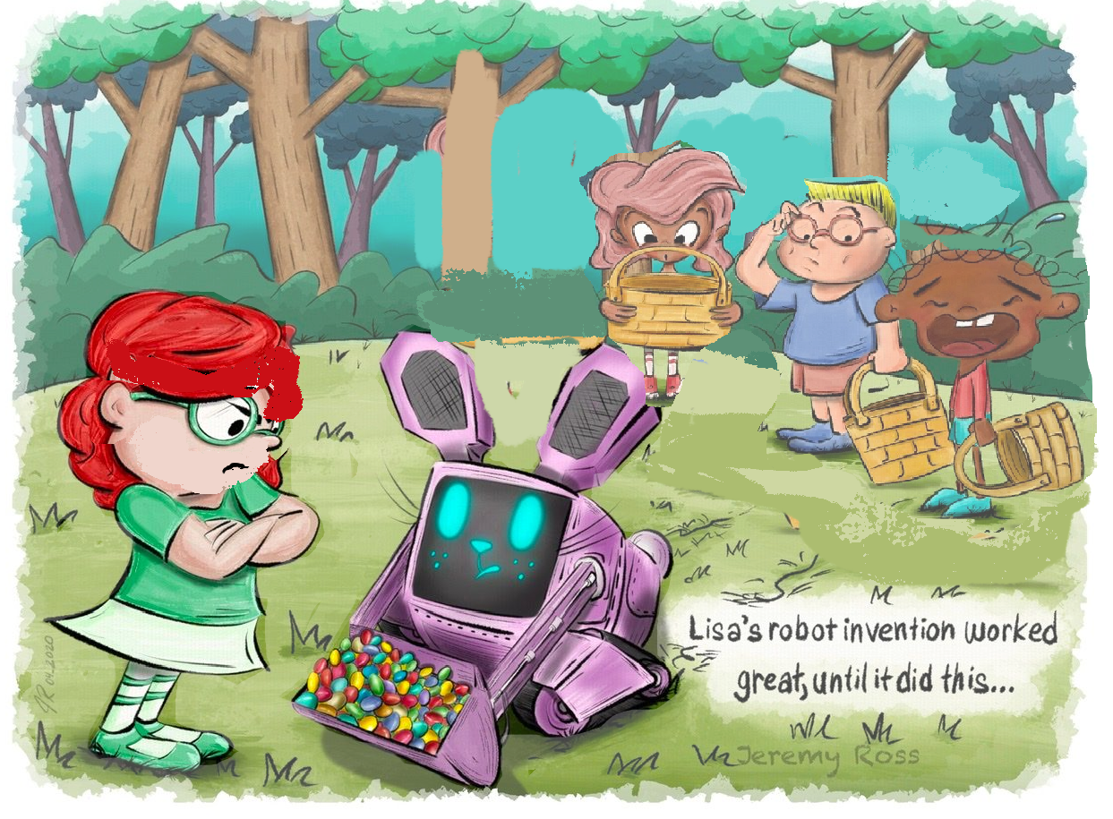
Updated the Canvas space of the scene
-
Centered the main characters, Lisa and the Robot
-
simplified the environment more so the focus stays on the main characters, I did that by using Atmospheric Perspective in photoshop I use a
Lighten layer with an aqua color similar to the sky in the scene -
Simplified the shrubs in the background by rounding shapes and using small medium and large shapes.
-
rounded the grass hill
-
Centered the Text and enlarged it a bid
-
foreshorten one of the Robot's ear and Face
-
fliped the robot and Lisa
-
Moved Lisa closer to the robot where she overlapped the robot, though it will help sell the confrontational look
-
Spaced out the back characters and shrunk them down. to show more depth and distance.
-
Used Gaussian blur to blur the back characters individually
-
to finish I did some color adjustments by using the - Adjustments Layers.
-
Hue/Saturation - move the Hue a bit to the right to +13
-
Made a Vignette using another Hue/Saturation layers, by using an alpha mask
-
Photo Filter - Warming Filter (85) Density: at 25%
-
Levels - Moved the wires a lil to the left and the blacks a lil to the right
I really hope this wasn't confusing, hope I could help in some way, at least show you another composition idea!
-
-
Hi @franksandovalart, thank you for such a detailed draw over with full explanation in all! Wow! I really like how you added space to the scene and brought more attention to Lisa and her Bunny bot.
I will definitely keep your notes for future work; however, much of what you noted went over my head! I have lots to learn.
By the way, your robot piece is incredible! It looks like it came right out of a movie! Keep up the amazing work and thank you very much for the wonderful feedback!
-
-
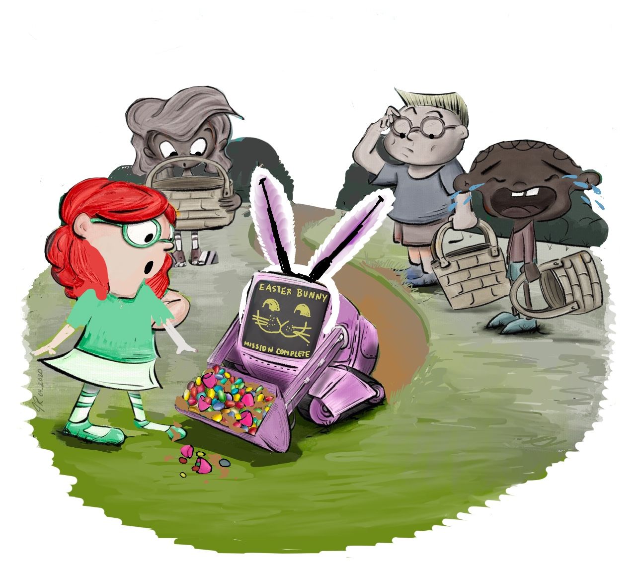
@Jeremy-Ross It looks like you've gotten really great feedback so far! My draw over is a bit of what people have already said and definitely things I just made up with my daughter helping out. And then she fell asleep on me, so I will explain more later. The only thing I want to point out is that a graphic designer would not like working with a text box like that, so it needs to be an open space suitable for text that might change. Also I changed to to a tractor-bot that decided to be a bunny on Easter. I loved your rendering of the trees but felt the real setting was the group hunting for eggs together.
-
Hi @carolinebautista, thank you for yours and your daughter’s feedback and draw over! I like the overall roundness of the layout and changed expressions.
Thank you for taking the time to provide your feedback!
-
@Jeremy-Ross sure! It wasn't really necessary after all, but I don't mind. I think sometimes it's interesting to really feel out what kids notice, since they're our market too. My daughter really reacted to the clothing. She's not as able to articular why she didn't like things but we discussed what Lisa could be wearing and why. I think in every culture there is a somewhat neutral clothing that kids can be wearing, and then something that makes a statement. Either way, it seemed clear to me there should be a character-driven reason for the clothing. In my version, if Lisa invented a tractor-bot, she may have been wearing more of a farmer outfit.
Also, one thing that I took away from this conversation with my kid is character design consistency. I know it has been mentioned plenty of times that a character should be consistent across multiple images, but I do think that it's worth considering how consistent the character design is between characters. Lisa's eyes are white in the rims of her glasses, but the boy in the background has skin color. The crying boy is very thin, while Lisa had more intimidating, strong-looking arms. So I think something I might be doing is to go through my characters in one image or story and identifying shapes and what they mean, then applying them consistently. The variety you have here is great, but I think putting some meaning into the variety can strengthen the storytelling.
Yesterday I listened to @jdubz talking about his process and he showed how he used to choose very saturated colors, and then he showed his new range. Looking at it, it's surprising because they seem like dirty colors when you pick them with the bright ones nearby. But they read as perfectly controlled. It was really helpful to see it mapped out like that. I hadn't thought of that before, and I think I might go back and rethink how and what I choose for color.
-
Very good points @carolinebautista, thanks for the additional input on character design consistency!
-
@Jeremy-Ross I went ahead and did a very VERY rough pass just to communicate what I think a few people have tried to say here. I think because of the composition and colors your piece had started to lose its focal point. The characters and colors were all equally bright and large. By moving the 3 kids farther away, and making parts of the background less saturated it helps you first see the girl and bunny, and then see the kids in the back. I also adjusted Lisa's face so that her eyes are lower down as it makes her look a bit younger and more like a child
And thank you so much! I have just had a lot more time to practice than you! And even still I get frustrated at my progress (even today!) and have to push through it. It is SO great that you enjoy the process though, as I think that's the only way to be able to persevere! If you do a post for WIP on your next piece, feel free to tag me!
Carlianne
Check out my art and tutorials :)
Instagram: www.instagram.com/carliannecreates/
Youtube:
https://youtube.com/c/CarlianneCreatesShop: www.carliannecreates.com
-
Thank you @carlianne! Your draw over looks great and reinforces your earlier feedback!
I’ll tag you on my May WIP this evening.
Thanks again!