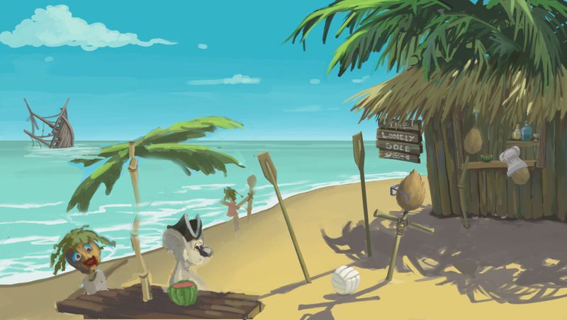
May WIP- Does this look 'too light' to you.
-
Hi all, I'm working on my Isolation piece and on my tablet (XP Pen Artist 15.6) it looks fine, but when I drag photoshop onto my other monitor (Phillips LCD 227E6) it looks too bright, washed out like. Not saturated, more like if someone took a perfectly good image, and turned the brightness up 5 degrees. I knew there was a discrepancy between the monitors, but this is pretty noticeable.
I know its tricky, as you don't know what I intended, but the image should feel warm, the sand pretty yellow, the sky pretty blue, trees pretty green etc.If you've got 5 mins, would you mind having a look on your kit and seeing if anything looks weird to you please?
Also, if anyone knows a good way to make them both display the same, and preferably as near to colour correct as they are capable of getting, please let me know, i'd appreciate it.
-
@gavpartridge I think it looks okay? I usually check stuff on my phone if I'm struggling with the balance to see what it "really"looks like lol. Otherwise I don't have advice I think there are programs you can run to color correct but I always feel like my two monitors are different.
-
This isn't about color, but I think your main character gets a little lost next to the sand. Maybe try something to bring him out a little bit?
Love the theme and I thing Caribbean colors come across very well even though I don't know what you are seeing on your screen. Definitely a bit of Castaway vibe going on!
-
@carlianne thankyou, youre right it looks fine on my phone, i dont know why that didnt occur to me, nice one.
-
@LauraA yeah, i know, i didnt plan that too well. Im hoping that if i make the sand darker and bathe the rat in sunlight it'll make him read a bit better. We'll see!
-
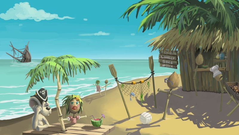
@gavpartridge I think you could solve the color issue with the rat by making its shadows darker. You could also move the rat so that he is silhouetted by the shadows of the palms or the blue of the water. I drew a BUNCH of white mice over the last few months (just check out my Instagram page, haha!) and you learn to get creative in placement. Shadows on white in bright sunlight can be quite dark. I would check out some photo references.

Here is one that I found that looks natural. (Unfortunately, a lot of photographers edit out the deepness of the shadows.)
Here is another:

-
@chrisaakins Mate this is perfect, thanks for doing that! I was literally just painting in the rat when I saw this post! I thought i'd post it up as it is at the minute and see what you reckon. Is it reading any better?
Yeah I still need to work the rat, he's problematic. Ill probably change his colours now i've seen those photos, they're good references! I moved him around so theoretically if people read an image from left to right, he should be the first thing they see, or at least the table scene. I've made him a bit bigger too. To be honest the pictures getting away from me a bit, its so hard keeping all values and colours reading well, and it was always going to be busy. Its fun though, got a few more bits and pieces to throw in there, then clean it all up.
-
@gavpartridge this looks so much better. I think the silhouette is great. I am glad I was able to help!