Society of Visual Storytelling

    SVSLearn Forums

    • Register
    • Login
    • Search
    • Recent
    • Tags
    • Popular
    • Users
    • Groups
    • Search

    Isolation Landscape WIP - critiques welcome

    Artwork
    10
    27
    1377
    Loading More Posts
    • Oldest to Newest
    • Newest to Oldest
    • Most Votes
    Reply
    • Reply as topic
    Log in to reply
    This topic has been deleted. Only users with topic management privileges can see it.
    • theprairiefox
      theprairiefox @carlianne last edited by

      @carlianne thanks! You are so right.

      These both feel more like fine art than illustration. I was focusing so hard on the feelings I forgot the story!

      I think I have an idea about how to put some stories in.

      -The Prairie Fox
      https://www.instagram.com/theprairiefox
      https://www.theprairiefox.com

      1 Reply Last reply Reply Quote 1
      • Eelwick
        Eelwick last edited by

        heh. I got the reference to Wyeth right away!

        Erich von Hasseln
        https://ashcop-illustration.carbonmade.com/

        theprairiefox 1 Reply Last reply Reply Quote 1
        • theprairiefox
          theprairiefox @Eelwick last edited by

          @Erich-von-Hasseln I am glad I didn't miss the mark by too much.

          That piece just evokes the isolation of the prairie. I decided I could use it and twist it to fit in my world.

          I read Bolivar not too long ago and I love the scenes he does that pull reference from Edward Hopper's work.

          -The Prairie Fox
          https://www.instagram.com/theprairiefox
          https://www.theprairiefox.com

          1 Reply Last reply Reply Quote 0
          • theprairiefox
            theprairiefox last edited by

            @carlianne here are the updates.

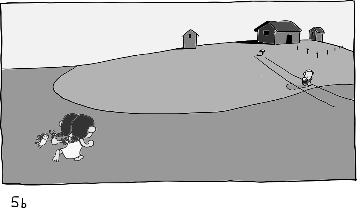
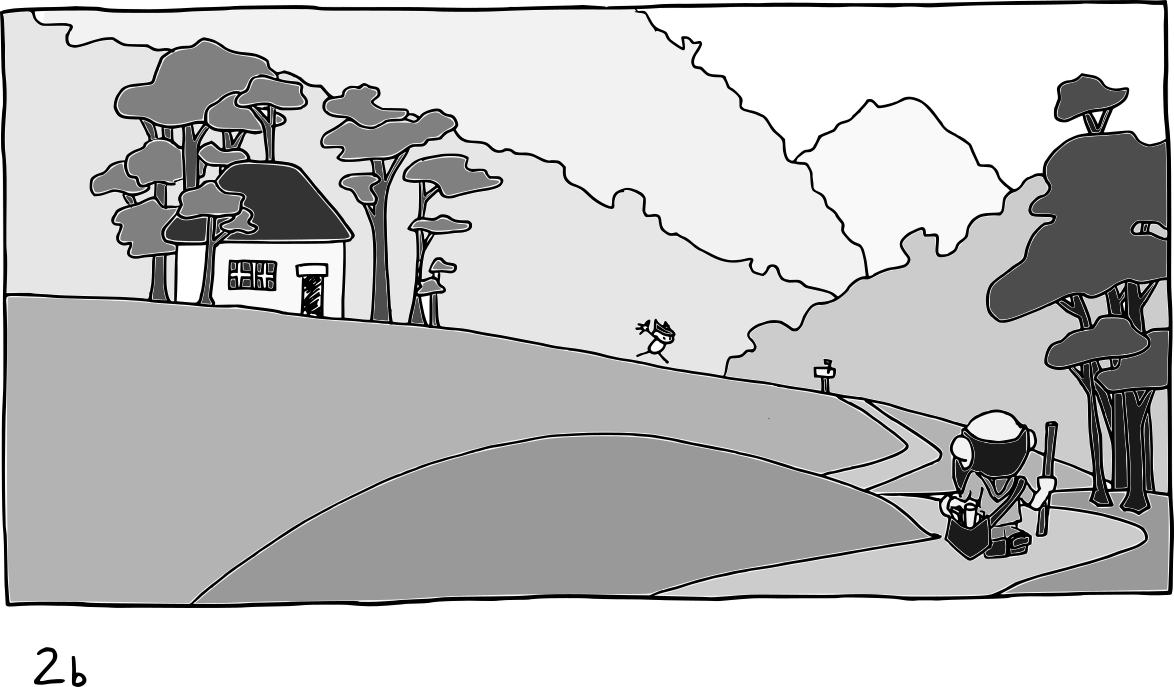
            I wanted to go with the story of how much mail means when you live an isolated life. I think all of us are experiencing that right now. But when the prairie lands were settled mail and news were a huge deal as well.

            Anyway, let me know if you are getting more story?

            I was thinking about if there should be a shadow under the prairie girl. I could be easily swayed.

            The kid in the mountain piece will probably be a little girl with a dress as well, it was just too small yet to get that in.
            Isolation_Values_b005.png

            Isolation_Values_b002.png

            -The Prairie Fox
            https://www.instagram.com/theprairiefox
            https://www.theprairiefox.com

            korilynneillo carlianne 2 Replies Last reply Reply Quote 1
            • korilynneillo
              korilynneillo @theprairiefox last edited by

              @theprairiefox I like 5B!

              I wonder what would happen in 5B if you turned the mailman around so he’s facing towards the viewer? Right now it looks like he’s headed toward the house, but the girl running for the mailbox seems to imply that he’s already dropped off the mail (at least to me!)

              If you go for 5a, I’m definitely missing the shadow under the little girl! Especially since the mailman has one, it makes her feel like she’s floating in space.

              instagram: instagram.com/korilynneillo
              Twitter: @korilynneillo
              Portfolio/shop: korilynneillo.art

              theprairiefox 1 Reply Last reply Reply Quote 0
              • theprairiefox
                theprairiefox @korilynneillo last edited by

                @korilynneillo good idea! I will play with turning him around.

                He could then be looking at the girl as well moving the reader in a better triangular motion.

                I will definitely play with the shadow.

                -The Prairie Fox
                https://www.instagram.com/theprairiefox
                https://www.theprairiefox.com

                1 Reply Last reply Reply Quote 0
                • theprairiefox
                  theprairiefox last edited by

                  @gavpartridge I am working on establishing a base style for my characters. I am glad you are liking them.

                  Thanks for the advice on the hair it looks much better. I haven't done the detail on the characters yet. The whole picture is still only 7 inches wide (and I work traditionally).

                  I will definitely clean that up on the next revision when I get it to full size.

                  -The Prairie Fox
                  https://www.instagram.com/theprairiefox
                  https://www.theprairiefox.com

                  1 Reply Last reply Reply Quote 0
                  • carlianne
                    carlianne @theprairiefox last edited by

                    @theprairiefox 2B reads as a story to me! But I actually thought it was a dad coming home it something, kinda reminded me of dads coming home from war.

                    Check out my art and tutorials :)

                    Instagram: www.instagram.com/carliannecreates/

                    Youtube:
                    https://youtube.com/c/CarlianneCreates

                    Shop: www.carliannecreates.com

                    1 Reply Last reply Reply Quote 0
                    • theprairiefox
                      theprairiefox last edited by

                      With this piece (or both if I have time) I am planning on using papercut and watercolor.

                      I just did a test of my process on a small amount and thought I would share how it came out.
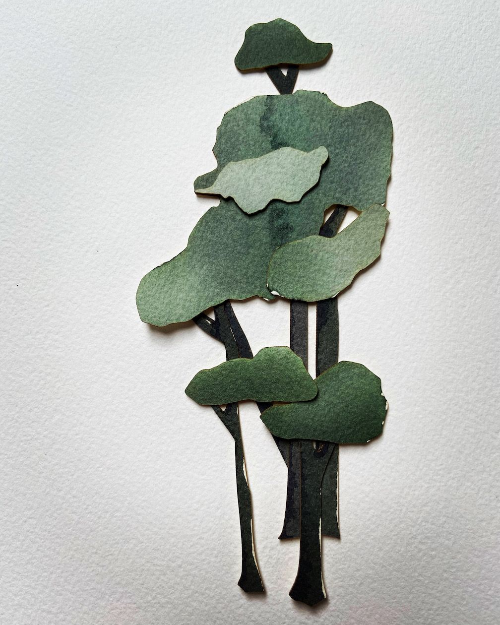
                      Photo May 26, 11 17 44 AM.jpg

                      -The Prairie Fox
                      https://www.instagram.com/theprairiefox
                      https://www.theprairiefox.com

                      1 Reply Last reply Reply Quote 3
                      • Braxton
                        Braxton last edited by Braxton

                        @theprairiefox Cool! I've also been considering doing paper cutouts + watercolor this month (currently I have a watercolor background with a digital character on top, but I've been considering changing the digital character to a paper cutout). One thing to consider might be scanning the paper cutout pieces separately and then compositing them digitally? I think a key thing with cutouts that can give them some depth is the little shadows where they overlap, and creating these digitally made give a little more control? It's definitely possible to do that with photography but it seems tricky.

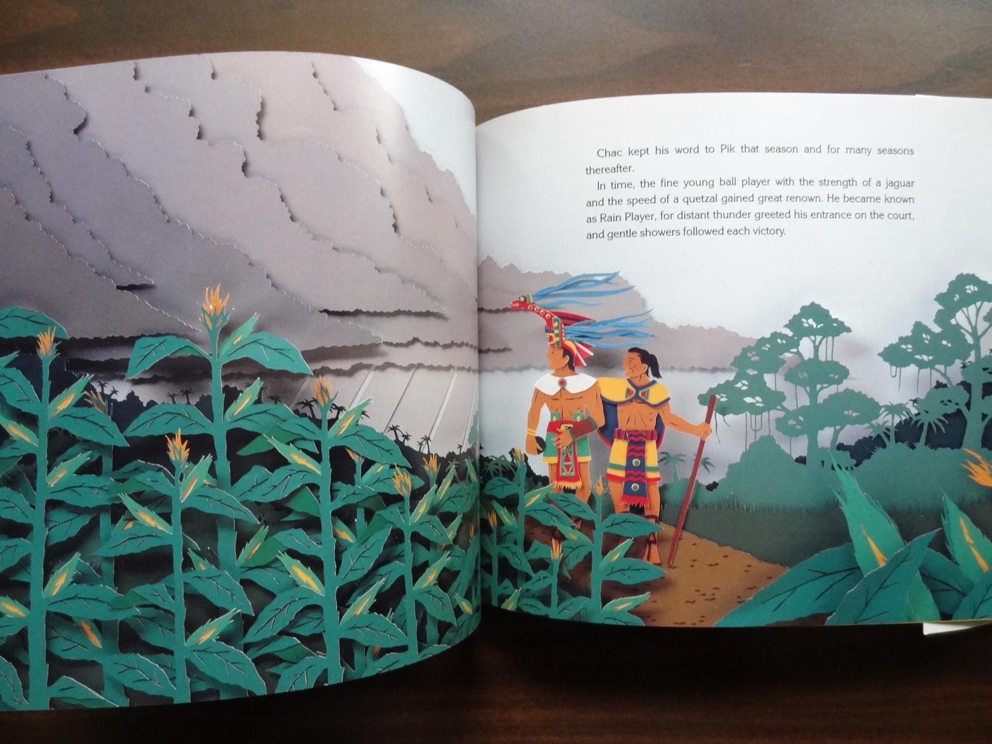
                        Ps, if you haven't seen his work before, I recommend the books of David Wisniewski, who made children's books with amazing paper cutouts. Might give some inspiration. Here's a so-so photo of one of his books:
                        IMG_1938.JPG

                        theprairiefox 1 Reply Last reply Reply Quote 0
                        • theprairiefox
                          theprairiefox @Braxton last edited by

                          @Braxton very cool. I will definitely check David Wisniewski out.

                          I connected with Kelsey Sheldon who does some very cool paper cut work both illustration and animation. She had some great advice and she is mixing watercolor and papercut as well.

                          She suggested:

                          double sided, sticky foam spacers are really helpful for adding dimension- like you said about your own piece, that dimension can be really lovely! This is a way to add it while keeping everything secure, and it gives you more control over where the spacing is. I usually use these in combination with rubber cement.

                          Another illustrator you might want to look at is Camille Garoche she has done a couple of wordless books using papercut and watercolor. She actually mounts her paper cuts in a box with space in between to give that depth as well.

                          -The Prairie Fox
                          https://www.instagram.com/theprairiefox
                          https://www.theprairiefox.com

                          1 Reply Last reply Reply Quote 0
                          • theprairiefox
                            theprairiefox last edited by

                            Another WIP update.

                            I am not convinced that I like the amount of color texture with the washes. I almost find it too distracting.

                            Let me know what you think. Everything is still editable, very little is glued yet.

                            On to the characters...
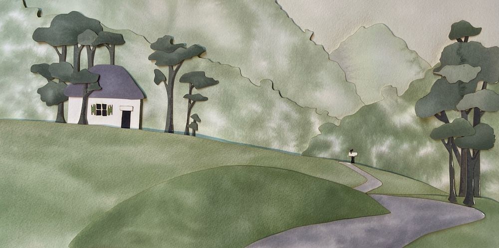
                            Photo May 28, 9 06 48 AM (1).jpg

                            -The Prairie Fox
                            https://www.instagram.com/theprairiefox
                            https://www.theprairiefox.com

                            M 1 Reply Last reply Reply Quote 1
                            • theprairiefox
                              theprairiefox last edited by

                              Okay, here is the first version with everything. Questions abound, would love to hear your thoughts.

                              • Do the mountains have TOO much contrast? Are they distracting?
                              • Does the color of the girl work? Should she be redder and less orange?
                              • Does the person walking convey mailman? I made him slightly blue and added a hat and letter.
                              • Does the border work? I thought it added some professionalism... I might be crazy though.

                              Thanks for the input.

                              Note I will retake the photo playing with lighting as well.
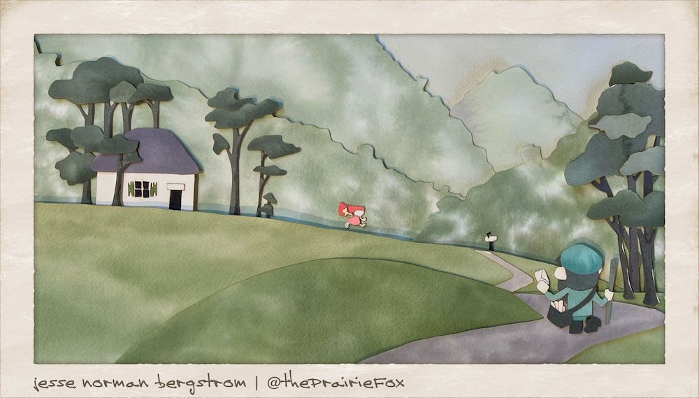
                              Photo May 28, 7 15 28 PM.jpg

                              -The Prairie Fox
                              https://www.instagram.com/theprairiefox
                              https://www.theprairiefox.com

                              ? carriecopadraws 2 Replies Last reply Reply Quote 2
                              • ?
                                A Former User @theprairiefox last edited by

                                @theprairiefox It's really well done. The only thing I think is a little distracting is the white unpainted parts of the background.

                                1 Reply Last reply Reply Quote 1
                                • carriecopadraws
                                  carriecopadraws SVS OG @theprairiefox last edited by

                                  @theprairiefox This is really interesting! The mountains are a bit distracting. I am wondering if the mountains could have an additional blue wash over them in the same tint as the mailman? That would bring in that color more and might make the mountains more subtle too.

                                  Very fun to experiment with!

                                  Carrie Copa
                                  https://carriecopadraws.com/

                                  1 Reply Last reply Reply Quote 1
                                  • M
                                    Mara Price @theprairiefox last edited by

                                    @theprairiefox I love the textures and the variation of the color. Love it!

                                    1 Reply Last reply Reply Quote 1
                                    • theprairiefox
                                      theprairiefox last edited by

                                      Here is the landscape for the prairie picture.

                                      I am going to try to get the characters on today and then I will have to decide which to submit?!?!?
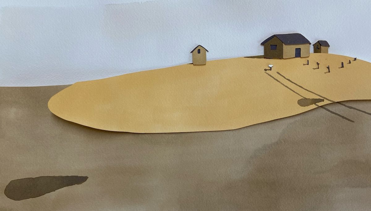
                                      Photo May 29, 3 37 08 PM.jpg

                                      -The Prairie Fox
                                      https://www.instagram.com/theprairiefox
                                      https://www.theprairiefox.com

                                      1 Reply Last reply Reply Quote 3
                                      • theprairiefox
                                        theprairiefox last edited by

                                        Here is the final(ish) for the second one.

                                        Any feedback on this one is welcome.

                                        Also, which do you think better fits this month's prompt?
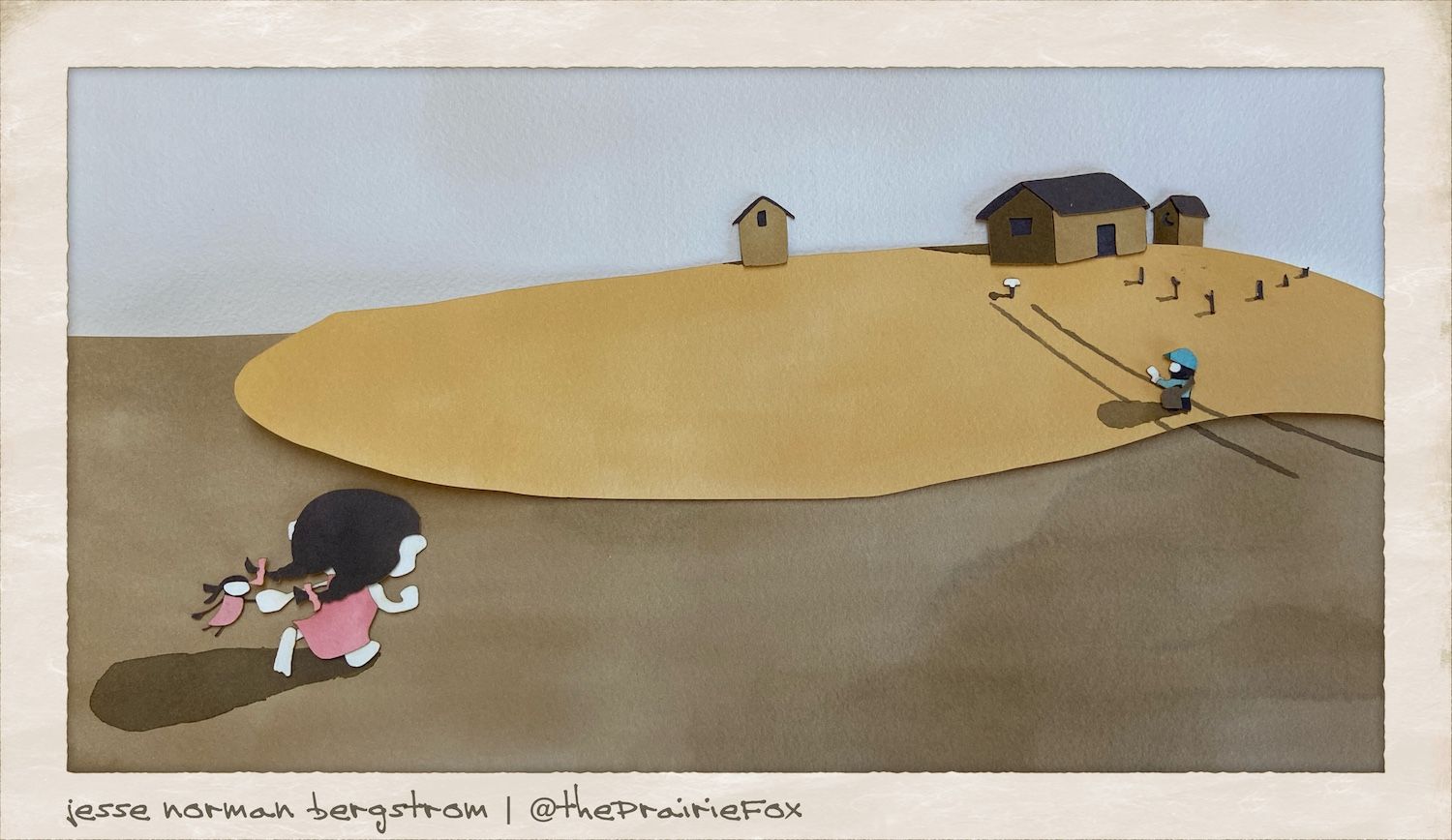
                                        Photo May 29, 5 33 08 PM (1).jpg

                                        -The Prairie Fox
                                        https://www.instagram.com/theprairiefox
                                        https://www.theprairiefox.com

                                        Braxton korilynneillo 2 Replies Last reply Reply Quote 0
                                        • Braxton
                                          Braxton @theprairiefox last edited by Braxton

                                          @theprairiefox looking good! To me the first one (with the little girl small) fits the prompt better, as her scale and distance from the viewer makes her feel more isolated. I do like the greater degree of contrast in the second image though.

                                          1 Reply Last reply Reply Quote 1
                                          • korilynneillo
                                            korilynneillo @theprairiefox last edited by

                                            @theprairiefox

                                            I think the second is a better image, but the first fits the prompt better. I agree that the mountains are too busy - the postman is also getting lost a little bit, it took me a second to find him. What if you made the postman a similar color to the little girl?

                                            instagram: instagram.com/korilynneillo
                                            Twitter: @korilynneillo
                                            Portfolio/shop: korilynneillo.art

                                            1 Reply Last reply Reply Quote 1
                                            • First post
                                              Last post