Prop Design Assignments
-
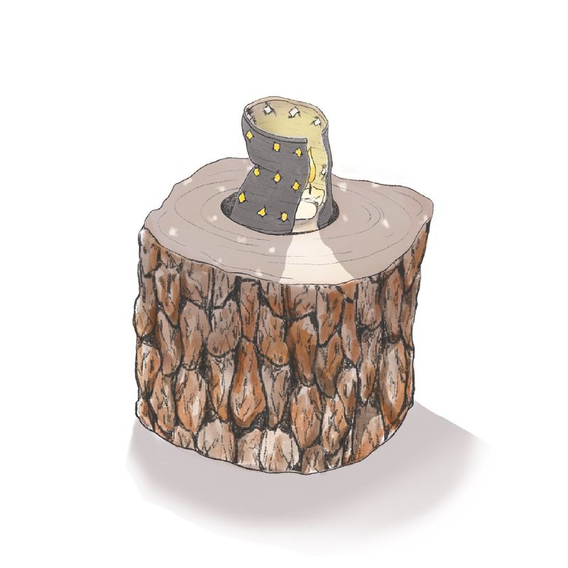
Hello all, I’m very nervous about posting my progress, but I figure that accountability is a good thing, so here goes. I’m not quite finished with the prop design class yet, but I have finished creating my lamp (which is really a candle). My idea is that this is something you might find in a bear cave, if the bear also had furniture and other human-like things
 .
.I was just hoping to gather thoughts about my design before I move on, especially as far as proportions, harmony, and contrast. And any other thoughts you might want to share, really. I struggle with perspective...does everything look okay there? I definitely want to get this right before I move on.
I so appreciate everyone taking the time to read this and comment - thank you!
-
This is looking really nice!! I love the idea - I think it's very sweet and a bear would be lucky to have such a nice lamp.
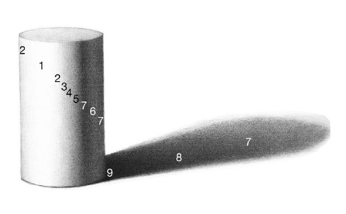
Some things that I think you could work on - the shadow below the stump. It currently has some soft edges, some hard edges, and is probably a little too long if the candle is the only light source. Because the candle is above (unless there is another light source we are imagining) then the shadow would be quite short. It also is lacking the darkest point right at the base of the stump where the stump actually connects with the floor.
Shadows are darkest at the point of contact - see below where 9 is directly under the cylinder and then it fades out. Now this cylinder is lit from ways away and at a low angle due to the length of the shadow as it moves away but the concept stands. It would help to ground the stump to add a darker point below it.
I also think the line qualities between your stump bark texture could be lightened up a little. The line quality in your can is quite delicate and contrasts heavily with the thick dark bark lines. It feels as though they are drawn by two hands to me right now.
I would also try playing with the color of your lines! They don't have to be black
") perhaps they are black lower down on the stump but then drift more towards a warmer browner line at the top, adding to the idea that there is light from above. Maybe the can has some subtle blue lines around it. Or is rimmed with a yellow line to create the effect that the metal is glinting a bit!
perhaps they are black lower down on the stump but then drift more towards a warmer browner line at the top, adding to the idea that there is light from above. Maybe the can has some subtle blue lines around it. Or is rimmed with a yellow line to create the effect that the metal is glinting a bit!I hope you build more in this bear world. I look forward to seeing it!
Instagram: https://www.instagram.com/eliamurrayart/
Portfolio: www.eliamurray.com -
@EliaMurrayArt Oh, thank you!! I have a hard time with envisioning how shadows ought to look, so this is helpful. And I’ll definitely play around with line thickness and color. I really appreciate your thoughtful response
-
@sarahlash you're doing great work!
-
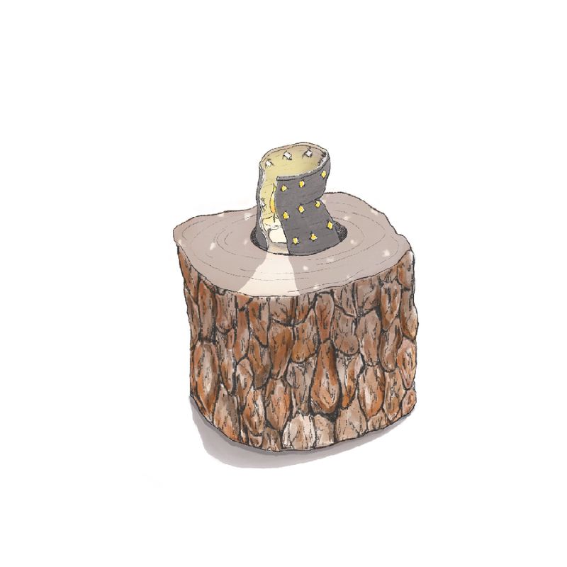
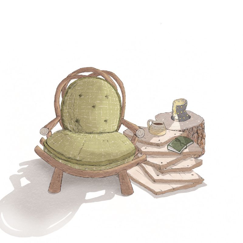
All right, I’ve done a bit of work on my lamp - thinned out the lines of the tree stump and added highlights on the metal can to look like it’s reflecting light. I’ve also shortened the cast shadow quite a bit. I think it’s much better now - thanks to @EliaMurrayArt for your suggestions!
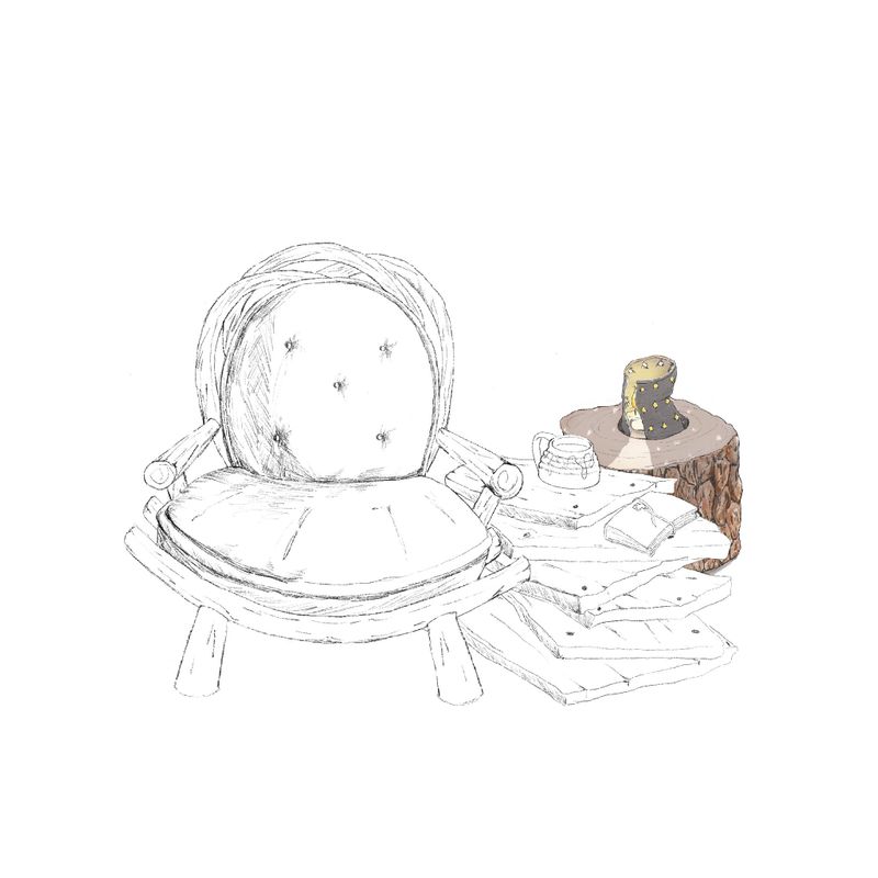
I’ve also drawn out a sketch of the rest of my prop ensemble, and I wanted to share here before I go too much further. I’d love any feedback - particularly as it relates to perspective. Thanks to everyone for taking the time to look!
-
Just wanted to go ahead and post my final image. This took a really long time, but I feel that I learned a lot. And I’m guessing that the more comfortable I get, the faster this process will go.
This is the original:

And this is with a paper effect. Which is fun, but I’m not sure I love it.
-
@sarahlash This turned out great! The pieces are all very cohesive. I like it
 Can't wait to take this class.
Deviantart: https://www.deviantart.com/jacy13
Instagram: https://www.instagram.com/jacy13draws/?hl=en
Portfolio: https://jacy13.artstation.com/ -
@Jacy13 Thanks!! It was a great class - I learned so much from it.