Aubry Ballerina WIP
-
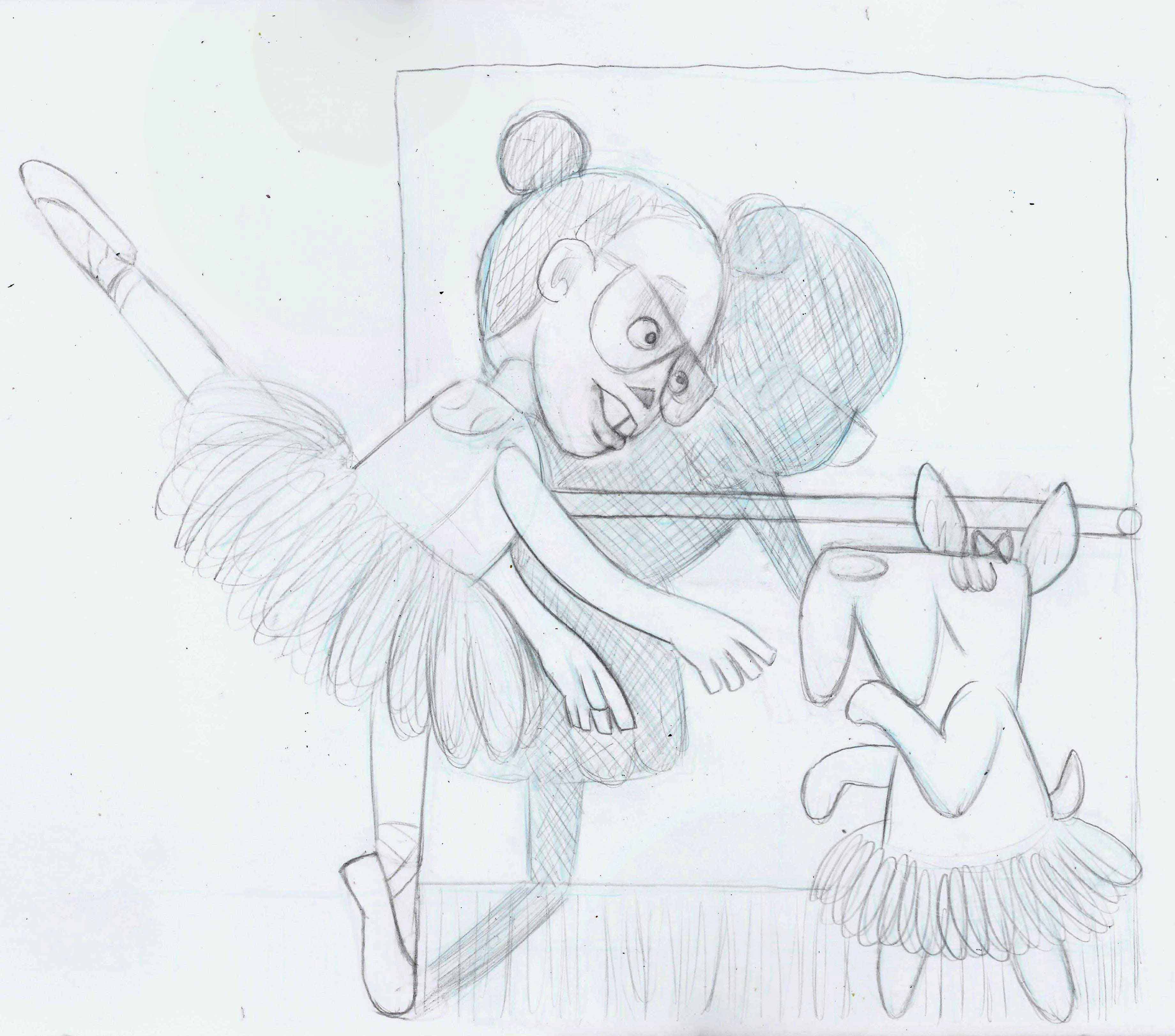
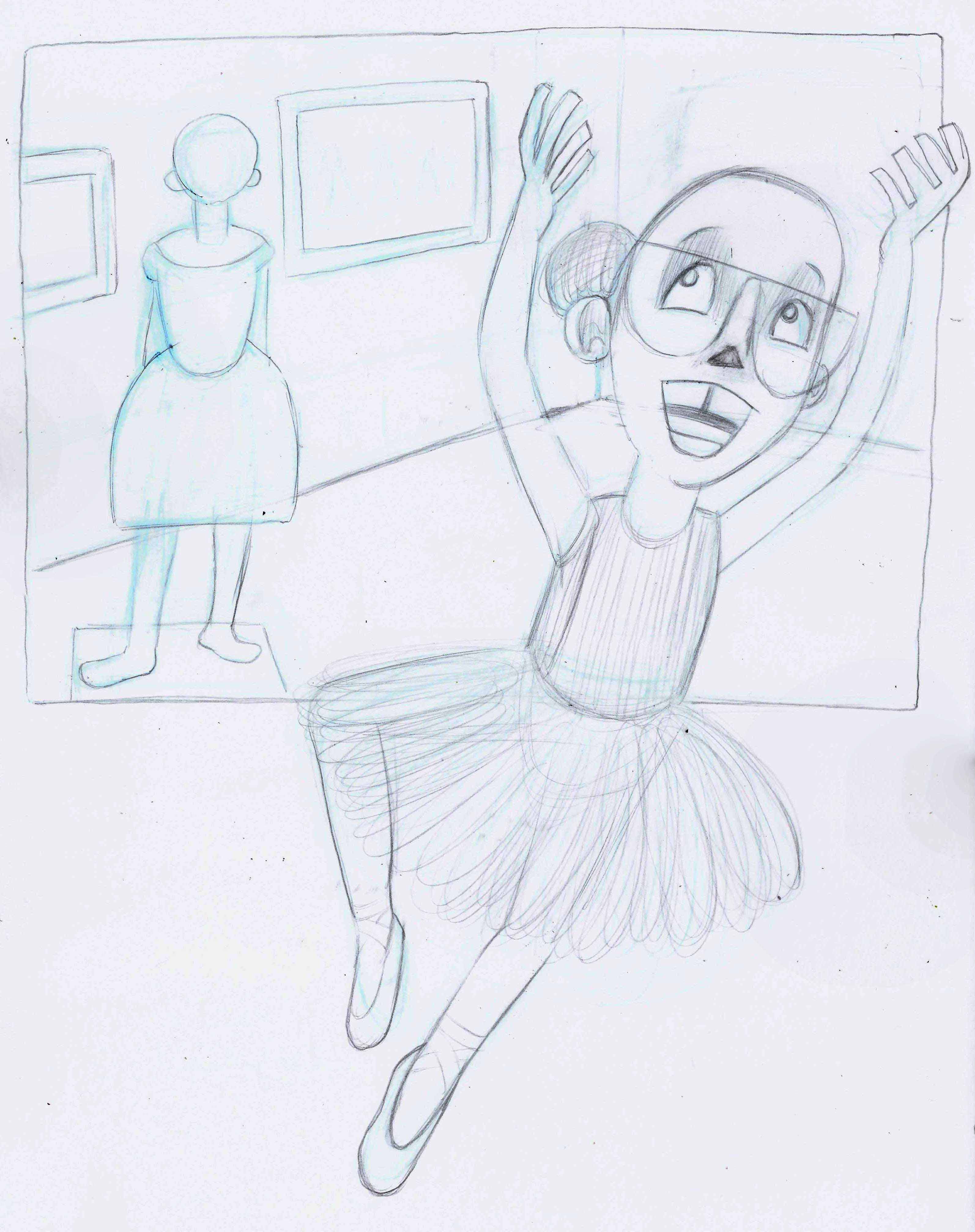
Please Critique for composition.
-
Hey @Chris-Perry,
I love your lil' ballerina. As for a critique, the main thing that jumps out at me for the first image is tangents. Not sure how much study you've done on tangents, but when 3 lines join together it confuses the brain and doesn't look as appealing. Also, lining things up on the same line have a similar effect. I mean, that was a super rudimentary explanation of them, but Google will have a ton of information on it. I've outlined the most obvious tangents that jump out at me.
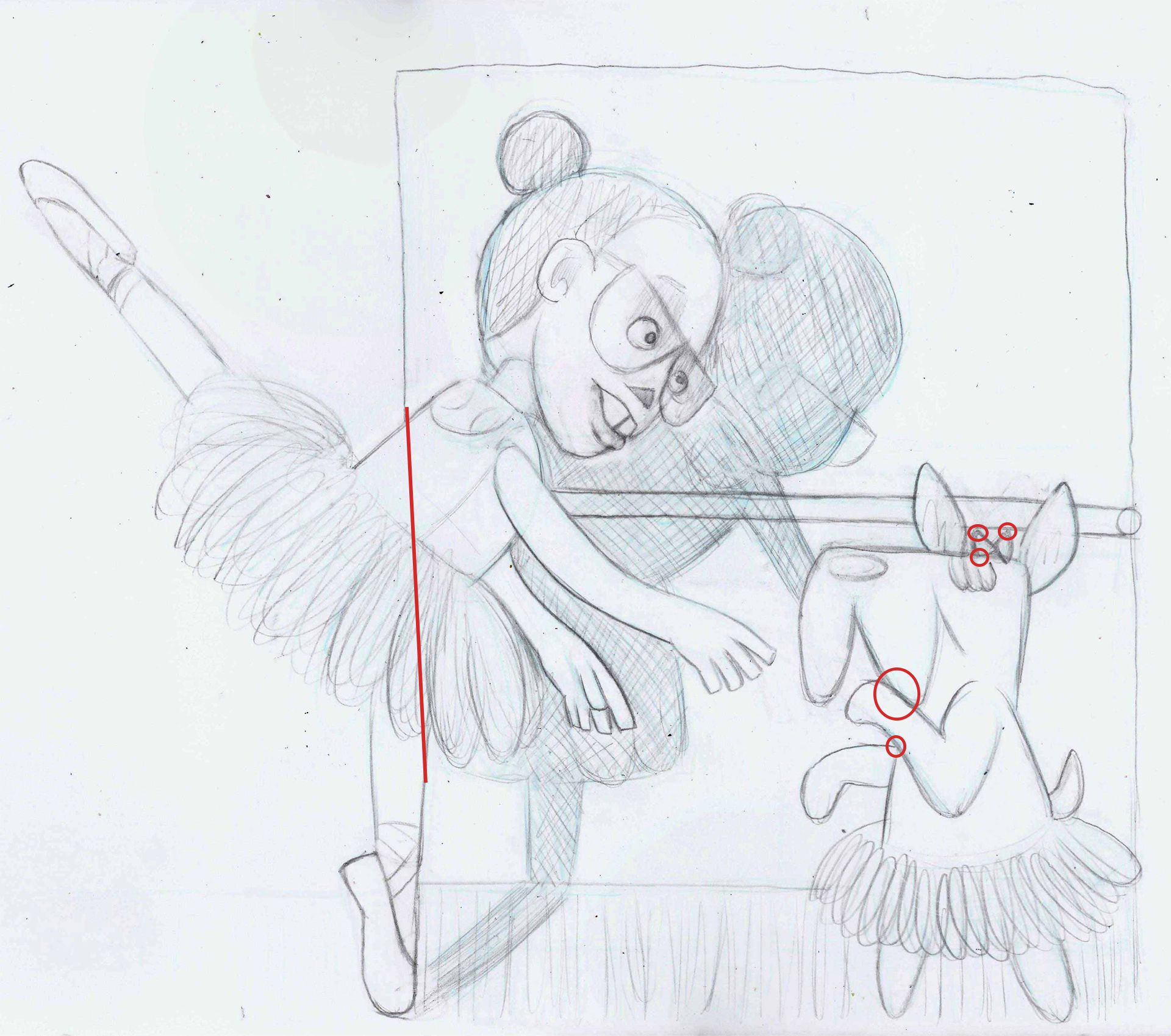
The vertical one probably won't be as much of an issue when it's coloured, so you can maybe take that one with a grain of salt, although I'd move the left hand side of the mirror. The other ones are a lot more obvious. I may have missed a few, I just did it quickly but when you're drawing, always try and be conscious of them.
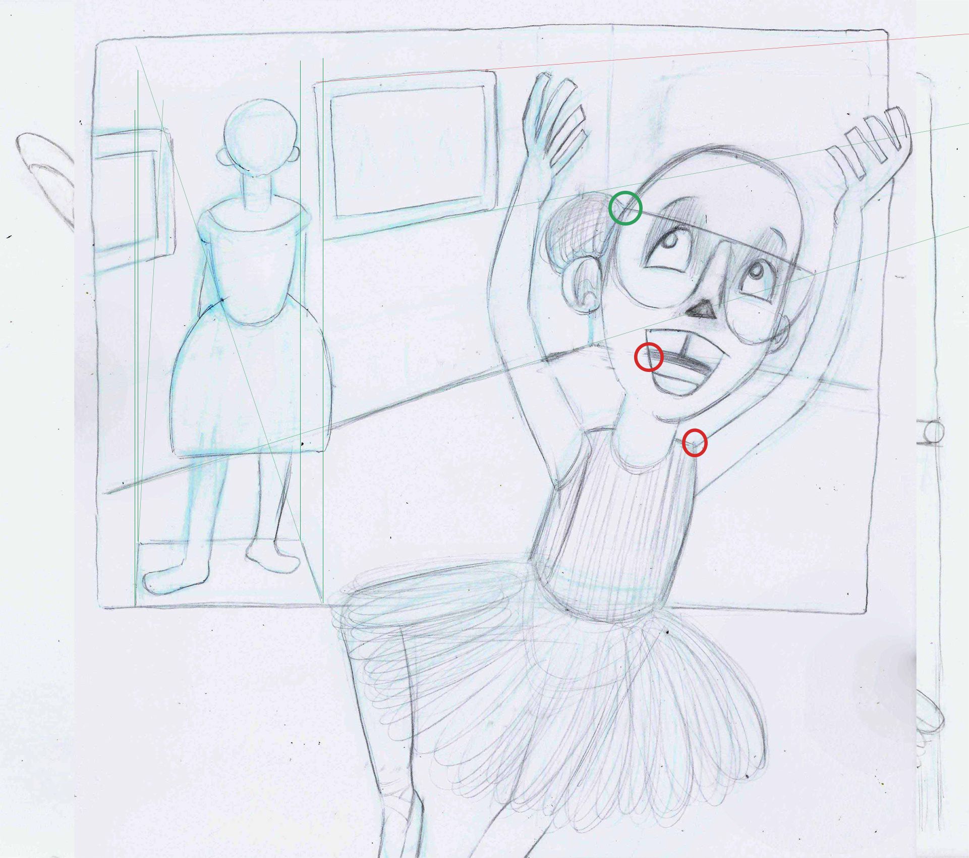
With the second image, there are a couple of tangents again. The one on the mouth is that the opening of the mouth is lined up with the floor plane. The mannequin's area is on a different horizon line than the room. The horizon line for the mannequin is above the pictures but the horizon line for the room is higher and off the page. The mannequin has a weird feel in that the top half feels like it's against the wall and the bottom half away from the wall. The horizon line issue might have something to do with it, but as well, I'd draw a box up in perspective like I have and draw within that.
Hope all these help. I really like the design, it just needs a few tweaks in my opinion.
Cheers,
Ace -
Also, I'd also spend a bit of time just drawing hands for a bit. I understand the hands you've drawn are stylised, but everything else in the image has good form so the hands are just jumping out to me a bit.
Happy holidays
Ace