WIP Nature Illustration - please crit
-
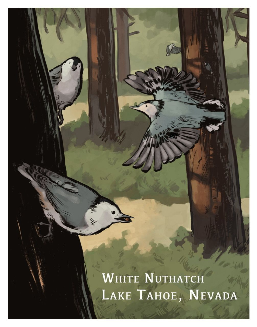
Hi all, I’ve been working on this piece for a week now. There’s no story but it will be part of a longer narrative involving my observations of the natural world. Trying to get better with composing, inking, and painting digitally. Please let me know your thoughts!
Erich von Hasseln
https://ashcop-illustration.carbonmade.com/ -
@Eelwick I really like the line work and where this is heading! My one note for the composition is that the tree on the right’s line creates a tangent with flying birds wing.
-
Hi, I really like your line quality in this one, they feel organic and really liven up the image. I also like the light splotcheson the tree trunk, nice touch. I agree with the flying bird being on a tangent with the tree trunk, id shuffle things around there. Maybe move the tree to the right edge. Its a bit hard to critique if I dont know the end goal. If you are going for more realistic, the flying bird also has some anatomical issues on where the wings are attached on its body. They dont look like they are attached at the same spot, and the wing closer to us is coming out of the birds cheek. But it's an easy fix to move that down a bit. the back wing feels better located. Also the eye on the closest bird to us feels too high and its beak is sticking up from its skull. But if you are going for a more stylized look, then its no big deal. I assume you will be adding something to the ground, that is just fields of color? In general this is a really cute little drawing, and I would love to see more of them.
-
That right wing on the flying bird looks kind of like it's smashed up against the tree. Otherwise I love this, the style, your line work and the colors. Very Nice!
-
I agree with the comments made so far. One other thing, you might consider choosing and emphasizing a strong focal point...for example currently all three birds about roughly the same size, you might consider introducing some more variation. Of course it depends on the story you're trying to tell.
-
Hi everyone, thanks so much for the feedback. It’s really pushed this piece ahead.
@MirkaH The breakdown of the anatomical issues really helped! I checked the references I had and you were right. Good spots. I’m not sure where I’m going to land but I know that naturalism is going to be a big part of my work. I don’t know if I necessarily have the technical skill for science illustration, but I am exploring that as a potential pathway. Also, education illustration - specifically education comics. So, long story short, I may not be going for realism but I want science to be a big part of my work. I guess I’m a little in-between. By the way I checked your website and I really like your work! My background is in printmaking as well. I really admire your wood engraving.
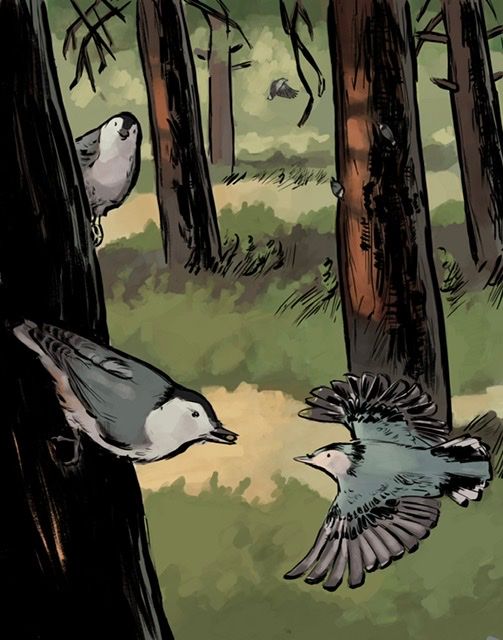
@gavpartridge i alpha locked my line work and played around with the values, does this look better?
I’m still trying to tackle the bird/tree collision. I can shuffle things around but it’s going to set the piece back a bit. I think playing with values helped to separate the space a little. What do you all think?
-
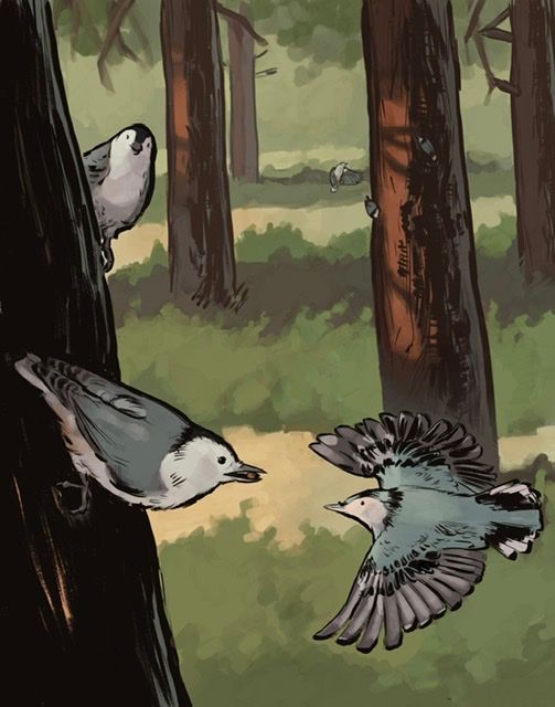
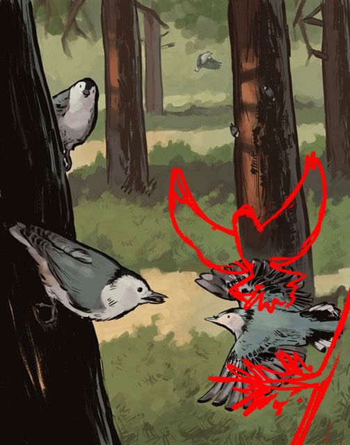
Hello! I really love the muted colors, as well as the combination of lines and painting, but as far as my critique would go, I did a quick draw over as far as placement/composition is concerned. I felt that the tail of the bottom right bird was too close to the edge of the image, so I drew the bird in a different position and added a bit of a tree detail to keep the viewer's eye in the image instead of letting trail off. I understand if that's a lot of work you don't want to do, I understand!
-
@Quackamos @gavpartridge thank you so much for your ideas and draw-overs, they are giving me a lot to think about! Here’s where I left the work yesterday. I’m going to shelf it for now and work on the next project but I’m going to keep layout and lighting in mind when i come back to it. I just started Will Terry’s painting Light & Shadow class and I think it will be very helpful. I think another takeaway from this piece is I need to spend a little more time thumbnailing to get the best composition planned before setting to work.