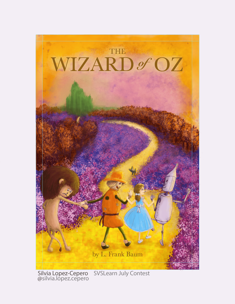
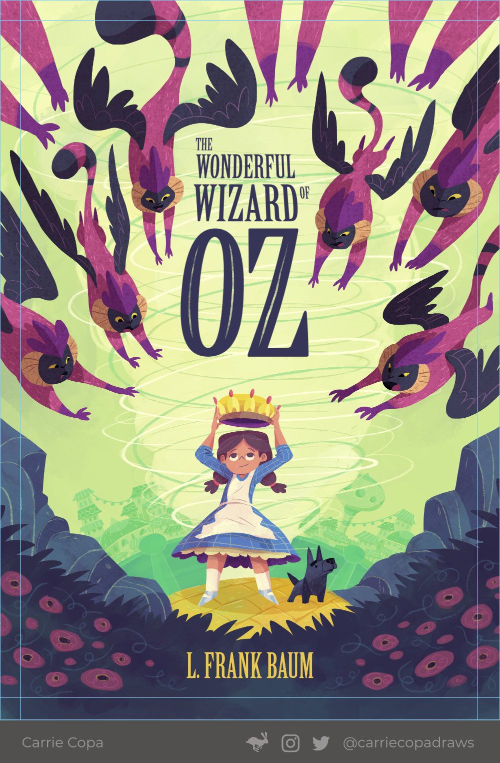
JULY CONTEST: Design a book cover for the Wizard of Oz
-
@Mary-Toth This one is really fun and different! I love the concept of it, and the watercolor rendering is quite polished.
-
@Megan-van-der-Berg This is truly amazing, from concept to execution. So much to look at... but the eye never feels lost. It all makes sense to the concept and themes of the book. If I saw this at a bookstore, I might have to pick up a copy, even if I already owned the book!
-
@ina This is brilliant, zigging into red when the obvious direction is to zag into green. The bold choice really works!
-
@miranda-hoover I really enjoy your Dorothy design! And the skewed perspective is really effective in portraying that she is coming to a new world.
-
@mag Absolute love the rendering here, and the muted, warm pallette.
-
@Ryan-Ehr So much to love here... the innovative composition, the limited palette, texture of the rendering.
-
@Ryan-Ehr Love this approach!
-
It was a challenge, but I can’t say I didn’t enjoy it!
 so great to get people’s feedback in this forum... so helpful! Love all the designs

-
@mag You incorporated so many elements so well! This is easily one of my favorites so far. Some of the best and most unique character designs (and expressions!), really fun composition, eye-catching and playful typography, and really subtle use of texture and color. Wow.
-
@aprilshin Wow. This is really great! Wonderful illustration. Love your work.
-
@aprilshin Thank you very much!! Ditto!!
-
The clock is ticking!

-
Well done @silvialcg!
-
@Jeremy-Ross thanks, Jeremy. Your comments were very helpful! I think I need to share my project sooner... I didn’t have much time to apply all the awesome feedback you guys gave me.
-
@cynthia-bowman - this is really atmospheric! Love it!
-
@KathrynAdebayo - this is a really clever design, The witch looks really sinister, well done.
-
My entry is intended as a fresh, modern cover to attract new middle grade readers to the story. The flying monkeys play a larger part in the book than the movie - whoever wears the golden cap can demand 3 wishes from them.

-
@Chris-Perry-0 - Hi there, yes just post your finished piece on this thread. The file size is usually meant to be less than 500k I think, but I’m not too tech savvy, @Chip-Valecek was extremely helpful when I asked him a few questions about reducing files sizes etc so maybe contact him or other SVS staff if you need more support.
-
This post is deleted! -
This post is deleted!