Composition help...
-
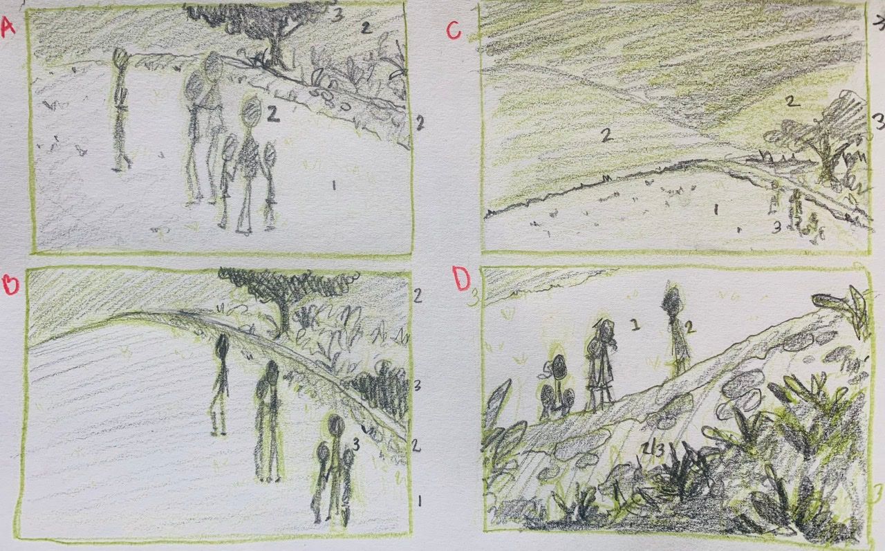
This is for a personal project, but it is pretty specific to match the text. There are six characters walking by a low stone wall. It’s nighttime. The side they are on is very neat and trimmed and the other side is very over grown and wild... but in a nice way. I’m struggling, because I can see it all very clearly when I close my eyes, but only in one specific way. Experimenting with the composition is hard because my imagination isn’t flexible I guess. I’ve tried more ways than these and I’m going to try to do some in portrait style instead of landscape. The numbers are just me thinking about values. Any suggestions? I’ll try to post more later.
-
@Pamela-Fraley I like D, it's a very striking composition!
vanessastoilova.com
instagram.com/vanessa.stoilova/Check out my Youtube channel for tips on how to start your career in illustration! www.youtube.com/c/ArtBusinesswithNess
-
I like the D too! (but it might be because I'm always driven to these kind of compos) However I would suggest that if the main point is the enviroment why not try to frame it a bit further in the distance so the characters are only tiny spots (so you can tell where they are) but the main picture is the landscape so you can play more with textures and layers on it.
Also I think the light on this could be so beautiful.Website: cristamay.com
Instagram: www.instagram.com/cris_tamay/ -
I have to agree, D is the best one in my opinion! The low angle with all the plants and grass with the characters has a really nice calming feeling, like walking home right after a sunset; I can almost hear the crickets!
")
-
D looks good because it highlights the two most important features your characters and the garden area.
-
@Pamela-Fraley Definitely D. The silhouettes are striking and you have a neat opportunity to make those plants look really wild. I also like this one because you will be able to see the character's expressions.
-
@Pamela-Fraley My vote is for D for the reasons already listed in previous comments, but it's also the only composition where the characters are moving forward, rather than receding. That, combinded with the low angle shot, empowers the image.
-
@NessIllustration said in Composition help...:
@Pamela-Fraley I like D, it's a very striking composition!
Thanks for your help. It was unanimous too. I’ll play around with that one then. ️
️ -
@cristamay @ajillustrates @Laurel-Aylesworth @Quackamos @chrisaakins Thanks everyone!! It’s easy since everyone agreed. I wasn’t expecting that.
️. I’m still going to draw up some portrait style thumbnails, just to see. I’ll update this thread. -
What I noticed with D is that one of the kids is right in the middle of the picture. D is the best one, but I would move them slightly to avoid middleness
-
I like B and D.
It depends on what you want to highlight. D is definitely great but I think it's not highlighting the contrast of the trimmed vs wild (which is more prominent in B )