How do you bring your art to a finished level?
-
@Taigyo I love the shadow cast by your tree.. it looks super nice to me. I think it stands out because there is no black line around it and looks like water color doing a great job doing what water color does best. To me some of your lines look sketchy in your finished piece which is not a good or bad thing - i make Very sketchy original sketches but working digitally gives me the luxury of working on a drawing until i feel good'ish about it - i spent over 61 hours and made more than 50,000 strokes on my last drawing...i don't think i would have any success with an image if i did not work digitally. It seems like you have one shot when you work in water color and you don't have the luxury of reworking the same image over and over. So i guess more careful mark making would be what i would say is what would make it look more finished to me... I hope that does not sound harsh to you... i need to work on my mark making too...and i could be wrong too LOL! I found a link a while ago to a PDF of a Peter de Seve drawing/watercolor tutorial that seems pretty great. Huge amount of prep work before the paint goes down..i'm not sure if he talks about the three inks he mixes for his linework in this one or if it is in a book i read...but he does not use black for his line. Maybe check it out? He is the best of the best..(Carter Goodrich too) Here is the link http://www.sjhcalvin.com/peterdeseve_tut.pdf
-
Not harsh at all, thanks for the feedback. I am a big admirer of Peter DeSeve and I actually have a copy of the article where he describes his technique. I think perhaps I should do some master studies of his work. If I remember correctly, he uses a brown or sepia pencil for his line work. It contributes to the shape but does not dominate. Thanks again I will look seriously at my mark making.
Blane
-
-
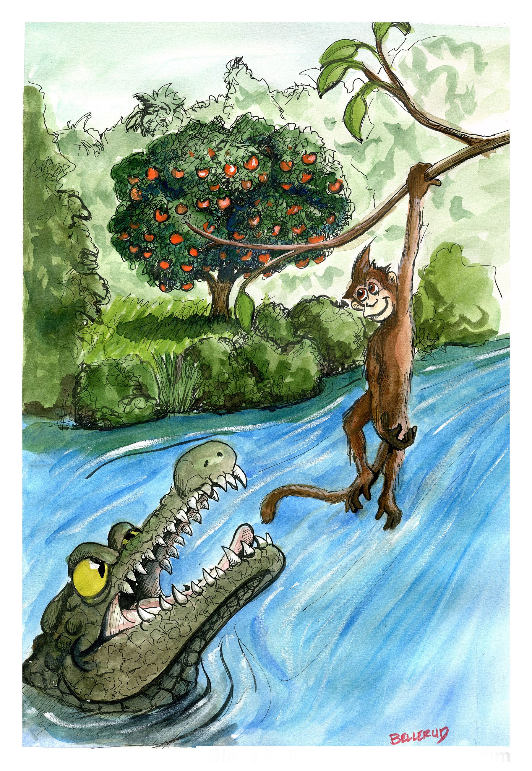
@Taigyo I'm not sure how long you worked on this, but I agree the reason it feels less finished because the mark making looks less intentional, more like a sketch. Overall it looks kind of rushed?
If you used this image as your color study and then did another pass on a new piece of paper and took your time, maybe it would look more finished because you had less figuring it out as you went?
But also I do think this is something that will come with time the more comfortable you get in general with your tools
-
@Taigyo You have a wonderful sketchy style, which I think is great for watercolor/water based markers! I think watercolor shows the most of its potential when it's looser, rather than really polished, because the spontaneity of the water effects is gorgeous and cannot be replicated. Similarly you sketchy inking style is really intriguing.
I think you just have to find a better balance and figure out which parts of the illustration to put more detail/definition, and which parts to leave more sketchy and loose. a lot of it has to do with where the focus is and what parts really need the detail. For example if you're drawing a portrait, you could leave the hair and clothes sketchier but you really need the face to be clear and detailed. In characters in general, the face, eyes, and hands need to be really defined. In your illustration, the tree is incredibly dense with detail with the way you inked it. It has some of the darkest colors in all the image, has high contrasts with these oranges, and is right in the middle of the illustration. So it's the one thing that stands out the most, instead of your characters. Now look at the background, the tree line. I love how sketchy it is and it feels very appropriate that your didn't put too much detail there. The water would have been a great opportunity to be looser and explore water effects of your media. Instead, it feels a bit overworked with all those opaque brush strokes (it's also not how a real flowing river looks like, the flowing lines would be horizontal). The closer things are to the camera, the more detailed they should be but also the darker they should be. The tree is darker than the bushes on the left and the branch over it in the forefront. All of those things make for an image that while really nice, looks a bit sloppy and unfinished compared to some other pieces.
TL;DR - Check your amount of details, make sure it's appropriate with your focus areas, let loose and sketchy in areas of least importance, and plan your values and lighting carefully before you start painting the final piece!
-
Thanks! Good feedback.
-
@Kevin-Longueil This pdf is so helpful. Thanks for posting this link.
-
Getting the right balance between sketchy/lively/loose and finished is really difficult and something I've been working on too. For me, the word finished really just means "intentional." Does the final product feel like every mark and paint stroke (even loose ones) were laid down intentionally to create a desired effect? Your crocodile gets closer to the right balance, I think, because it looks like you were using the line thoughtfully to create the right texture and form but the background trees feel less finished for me because you outlined the contours of the trees in a pretty strong ink line but left the foliage undrawn so that I'm not as sure of what you were intending by the line.
I like your loose style and I think it will just take some experimenting for you to find the right way to use it to best effect.
-
@gavpartridge Thanks for taking the time to provide such detailed feedback
-
@Taigyo hi! I guess it totally depends on what your definition of finished is. Can you provide other images that you consider as finished?