Finishing Wizard of Oz Cover - need sugestions and critique!
-
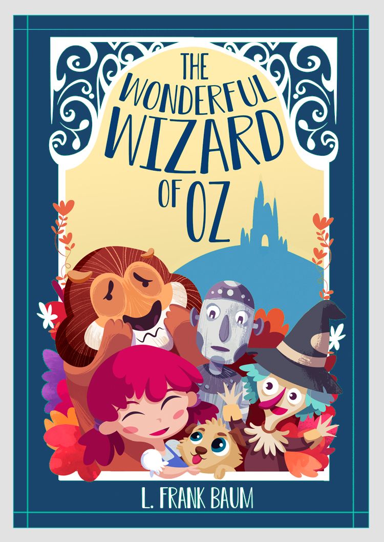
I first felt that the characters were too crowded and hanging off of the sides but then it might seem that way because the title is not popping out. Somehow here needs to be more contrast. There is a ton going on with the characters with all of the bright colors, etc. Mayb ejust need to find a balance between the parts? Very cute though and I think it is a great composition. Great work!
Oh! I wonder what would happen if you swapped out the green border etc. with the tan behind the title? Maybe it would help the title pop out against the green. The orange-ish tan color around the border might look nice. Just a thought. (It might look horrible too
") )
) -
This looks fantastic! I love the composition and style
 I agree with comments that the title fades into the background, treat all the text like you did the word Wizard and it will pop. Also did you intend to spell wonderful with two l’s? It stands out as a typo to me, although Google says that apparently it is an archaic spelling so perhaps you were denoting age to the story..
Scarecrow’s purple hues could possibly be toned down as he stands out the most due to vibrancy.. The directions of Toto’s pupil’s just need to be matched up and he’ll look cute as! Great job!
-
@JoshSchouwstra Agree with Josh about the Tin Woodman expression. Everyone looks happy apart from him. Will Terry posted a video suggesting that we don't have our characters looking at the reader (breaking the fourth wall).
Also, at first glance I thought that the scarecrow was a witch. Maybe it is the hat. And maybe it's just me!
Excellent work though! I'm looking forward to the finished piece.
...
Just had another look at it. I was thinking "where's the lion's nose?" Then I realised that what I thought is his mouth is in fact his nose. What do you think? -
whoa, thanks for all the feedback it really helped!
@deborah-Haagenson , Thanks! I think sometimes I'm too perfectionist in the wrong way ^^ u
@JoshSchouwstra everything you say is so true! I changed the tinman eye direction and that helps a lot, is true that his expresion was so dominant. Now looks more relaxed and integrated. Also I clean a few leaves, there was to much of them! Thanks for the honest feedback!
@Nyrryl-Cadiz Thanks! Yes I did some changes on that, moving them a little bit to have more space to breath between then, thanks for the tip
") !!
!!@Neha-Rawat @cszoltan @MOO I didnt think about that until all you pointed it and yep! The title was getting to small, I also did some ajusments to make the title pop-up more and more bigger! Thanks!
@Lovsey @Adam-Thornton I tonned down the Scarecrow and I think it helped to relax all de color composition it was to much saturated also the colors as Adams says lookslike a witch!
Im going to update the final version today or tomorrow. I dont know why there are pieces that I get stuck to finish it, I really hate when this happen. Usually I have a fast workflow but when I got stuck I got stuck really bad haha
-
Here is the final image, I dont think I will do more changes, just want to move forward to another project, anyways any feedback is always wellcome! thanks for all the help!

-
@Jordi-Ventura This is really great improvement, but the text is still so hard to make out.. Any reason you're not making it black, or a very dark teal or brown, so it stands out against the pale sky?
-
@Jordi-Ventura Nice work on turning the feedback into improvements - this works much better in my opinion!
 The only part I miss from the original is the inclusion of the door to the Emerald City, it helped define the shape nicely.
 -
@Jordi-Ventura you could still move the lion higher. He’s just getting covered up by Dorothy.
-
@NessIllustration If Im honest probably I was little lazy/tired and want to finish it hehe, I tried a little bit to change but I didnt like it, feels like black was breaking the color harmony, but after you posted I give it another try and I think now looks better!
@Lovsey true, added!
@Nyrryl-Cadiz hey! yes, I upper bit and I make the mouth expresion 100% visible, was little hidden.
Now I see is very important to have the PSD file very well organized to make fast changes, if not can be a pain in the ass haha. Also thinking about the illustration I feel one of the big mistakes I did was not taking enough time in the value phase, I jumped to draw to color to fast, I see time after time that values are the most important.
So here is the images with all the changes, now for sure is finished, no more changes!! haha
Also I added a the proces if someone is interested!Final image:

Process:

-
@Jordi-Ventura Actually I wasn't talking about the shadow, but the white text itself! The title is most important on a cover and has to be readable from far away. White on pale yellow is a very odd choice! The shadow helps, but it doesn't really get to the root of the problem...
-
@NessIllustration ups! ok, I tried and looks more way solid, its true that from the distance was hard to read, I think now it can read well, thanks!

Here I can see it reads way better, Also I think it helps to equilibrate the composition! thanks for all the suggestions, I really appreciate it!

-
@Jordi-Ventura Wonderful!!

-
@Jordi-Ventura One last thing and feel free to completely disregard this. But I'm not really sold on your green color for the background... I'm not sure what it is about it! But your characters all seem to have some blueish tinge to their shadows, like how tin man and the witch hat have a blueish sort of gray, so I think a blue background would really groove with this color scheme:
vanessastoilova.com
instagram.com/vanessa.stoilova/Check out my Youtube channel for tips on how to start your career in illustration! www.youtube.com/c/ArtBusinesswithNess
-
@Jordi-Ventura said in Finishing Wizard of Oz Cover - need sugestions and critique!:
an @MOO I didnt think about that until all you pointed it and yep! The title was getting to small, I also did some ajusments to make the title pop-up more and more bigger! Thanks!
Hi Jordi, I think the Title is much better with the solid dark green, it reads much better. It also works with the deep blue!
-
@Jordi-Ventura great job!
-
@NessIllustration Hey Ness! This blue version looks really good! I think I like it more than the green one haha, feels more integrated. But I will keep it the green one because I feel green color its a key color to the history at least from the reference I got from the movie and other works I saw.
I will keep that in mind for next time to play a little bit with the background
!@cszoltan Yes, I think that too!
@MOO Thanks!Thanks everyone for all the help, you rock!