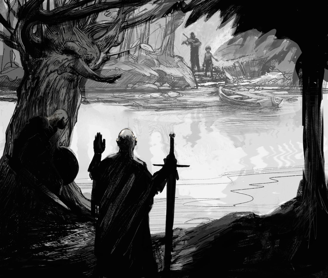
Work In Progress
-
@Pixby Thank you Pixby - i think wanting to know whats going on is a great compliment - thank you! It is a violin/fiddle (i think how you play a violin makes it a violin or a fiddle...i think they are the same...?) I imagine this to be the next image of the boy and fiddle player from my "Charly" third thursday entry - https://www.flickr.com/gp/133598262@N02/32360Z - you can check it out here if you want - thanks again

-
@Naroth-Kean @mattramsey - Thank you both for taking the time and you are both right about the reflection - i just raided my son's legos and set this up on a mirror to see what might happen - the boys reflection could be o.k. i found - but the fiddle player should have a much shorter reflection because he is farther from the edge.......if i move the fiddlers reflection back and shorten the boy's by a tiny bit i think it might be more believable....the far waters edge is supposed to be a bit mucky and murky and the water is supposed to begin at the base of the stone steps - ....maybe i need to shorten the boys reflection by more than i was hoping - ..anyways so great to get feedback and i appreciate yours and everyone else's - i will post an improved version hopefully soon - Thanks Again!
-
@Joy-Heyer thank you Joy! - you are right too! - I will work on the reflections - and thank you for the feedback it is very helpful to get encouragement about the image!
-
Wow this is such a great sketch! Already has so much depth, wonderful shapes and value range. Not sure the story behind this, but would it be too big of a change to put a third guy in the bottom right foreground? Or maybe just something to fill the space a little?
Really looking forward to see where this one goes!
-
@Kevin-Longueil I just noticed you are in Portland, I am just across the river in Vancouver! We should grab a beer sometime and talk art!
-
Hi @Kevin-Longueil!
Great piece! I wish I could give you some great advices because you gave me so many good idea on my work, but this piece is really strong! The only thing that I would do is maybe apply @natiwata's idea and add a 3rd character in the foreground. I have heard Will, Jake and Lee saying that 2 is a bad design number as it creates tension between the elements... I think it would really add to this piece to include a 3rd foreground character!
Great work!!
-
Really sweet piece! Only thing I might suggest is organizing your values. This crit is only a suggestion because depending on the finished style, you may want to keep it high contrast (a la Mike Mignola). In this comp I limited the background values and lowerd the contrast so they recede. Then I subdued the contrast in the forground leaning towards the darks so it separates.
Just food for thought. Again, really solid one ya got here! : )

-
@natiwata @NoWayMe Thank you for your feedback Nat and Noemie! The 2 and 2 is something i was worried about compositionally...... my hope is that the Tree with the face serves as a 3rd on the closest bank? - but i'm thinking it is not quite working that way since you both made the observation - the blank'ish space to the right of the closest character on the ground and in the water is where i was planning on a text box of some design going - would this maybe balance it visually....? Not to wander too far off into the weeds but i have been wondering lately if that format would even work for me - i think my images might be a bit dark...maybe it should be more graphic novel than children's book format...i don't know.....anyways back to the question at hand - i think story wise there are supposed to be parallels between the two sets of characters so i would be changing the story for the composition - i totally see your points though - i am not defending my piece for sure - just thinking out loud with you guys - i really appreciate getting the feedback and help - Thank you again!
-
@Lee-White Thank you Lee! - Really appreciate your time - the contrast change you made gives a much clearer feeling of depth - i will work on my values - Thank you again!
-
It's good to see you posting work again @Kevin-Longueil, and to see the progress on this piece! It looks fantastic
 I love the values and the beautiful linework. It does evoke a really interesting mood and makes me want to know more about what's going on, and what's going to happen on the next page...
 -
@Dulcie Thank you Dulcie! i made some changes from the first version
 thank you for your help on that - helped me realize i really needed to nail down the story in my mind before i finished the image - wanting to know what happens next is a great compliment - thank you!