Society of Visual Storytelling

    SVSLearn Forums

    • Register
    • Login
    • Search
    • Recent
    • Tags
    • Popular
    • Users
    • Groups
    • Search

    July contest feedback

    Projects
    4
    6
    355
    Loading More Posts
    • Oldest to Newest
    • Newest to Oldest
    • Most Votes
    Reply
    • Reply as topic
    Log in to reply
    This topic has been deleted. Only users with topic management privileges can see it.
    • Griffin McPherson
      Griffin McPherson last edited by

      Howdy, folks!

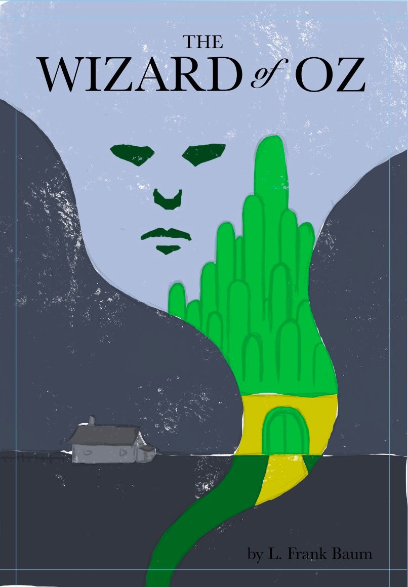
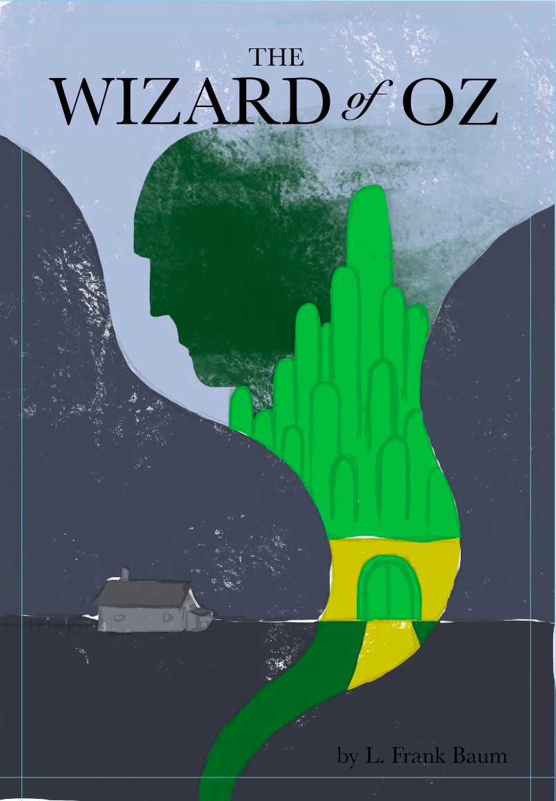
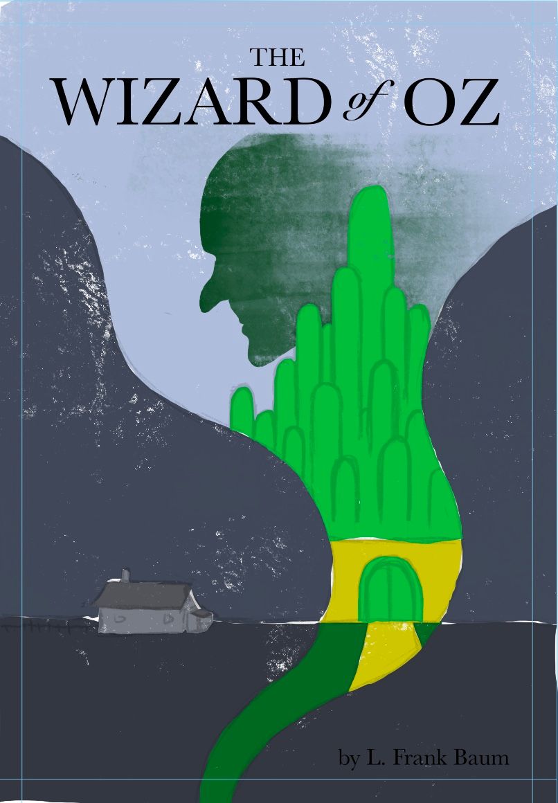
      So I’ve got these three rough versions of my oz concept

      I’ve got one with the wizard in profile which is my favorite but I also realize this may not be familiar enough and the association with the wizard might not be strong enough. I’m just trying to a different take on things so let me know how that’s working in your opinion.

      I also have the witch in profile which doesn’t look right to me because she’s just bald and when I gave her hair or her hat it looked even weirder so I’m not sure if that’s the right option

      Then I have the wizards floating face which was my original idea in the thumbnails but I don’t find it very compelling or dynamic with the rest of the image, however it is a bit more recognizable than the profile wizard I think.

      Let me know your thoughts!
      310A77EF-8837-4C14-8F05-AAFBADDC5853.jpeg B0D6F544-334E-44A0-A920-FFB3B71E6A40.jpeg 41587C44-023E-4BD1-B043-912372A21411.jpeg

      Kevin Longueil 1 Reply Last reply Reply Quote 0
      • TessaW
        TessaW last edited by

        I personally like the floating face. I'd recommend seeing what it looks like if you extend the yellow brick road down into the funnel of the tornado a bit more. I'm getting 60-70's vibes from this cover- it's cool!

        Website: www.tessawrathall.com

        Instagram: www.instagram.com/tessawrathall_art/

        Griffin McPherson 1 Reply Last reply Reply Quote 1
        • Kevin Longueil
          Kevin Longueil SVS OG @Griffin McPherson last edited by

          @Griff I’m liking the middle composition best

          Portfolio: kevinlongueil.com
          https://www.instagram.com/kevinlongueil/

          Griffin McPherson 1 Reply Last reply Reply Quote 1
          • Griffin McPherson
            Griffin McPherson @TessaW last edited by

            @TessaW glad you’re liking it! I definitely need to play around with the yellow brick road. Still much to do!

            1 Reply Last reply Reply Quote 0
            • Griffin McPherson
              Griffin McPherson @Kevin Longueil last edited by

              @Kevin-Longueil awesome, thanks for the feedback!

              1 Reply Last reply Reply Quote 0
              • Lovsey
                Lovsey last edited by

                I also vote for the middle cover design with the face in frontal view. Loving the retro vibe on these! 🤪

                1 Reply Last reply Reply Quote 0
                • First post
                  Last post