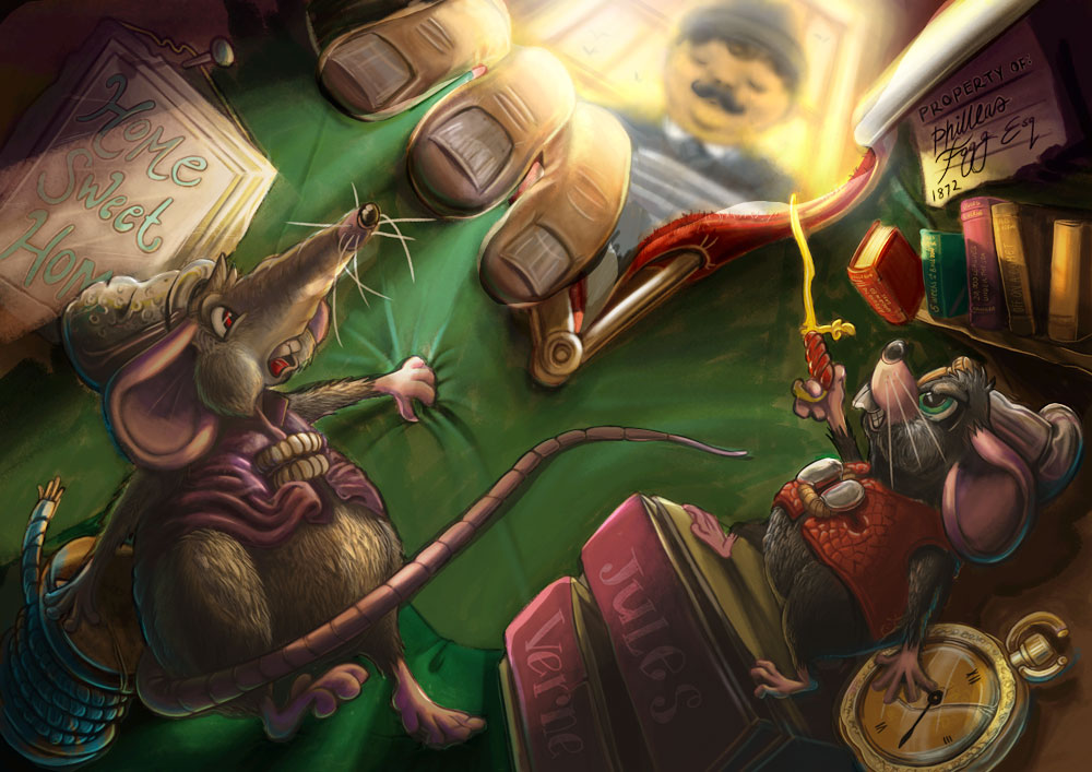
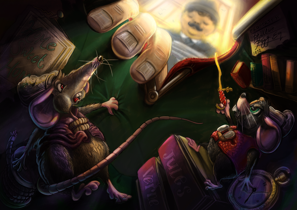
I would love your feedback on my Around the world in 80 days illustration.
-
I still think that the overall contrast and darkness of this image is way too high. Aside from small details and looking at the big picture, if you squint at it you lose the overall forms of the characters. This is due in large part to the fact that they are dark on dark background with very hot spots of light scattered throughout. Also there are a lot of very saturated varying colors.
On the lighting, even just putting out the characters as the closest foreground layer, then the bag, then the outside would help clarify depth and make it more readable.

-
Hi @natiwata. Firstly, thank you for taking the time to give me such amazing feedback and taking the time to edit my illustration. I can see what you mean about the losing the forms when you squint. I will take a look at that. As for the contrast and darkness, I stuck with that as it gave more of a victorian dark, dank atmosphere to the inside of the bag. Plus, as you said in your original comments, it shows a real distinction between the outside and inside of the bag. I'd love anyone else to give input. I know it's a personal piece, but i really want to get it right. Thanks again. Have a great day.
-
This post is deleted! -
Hi @damien-rambacher, thank you for your suggestion. @natiwata thank you so much for your feedback. I have decided to repaint a lot of the colours to get it right and to limit the contrast points as you both suggested to make the piece read better. I would love to hear your thoughts. It's nowhere near finished, but I just wanted to make sure I was going in the right direction still. Have a great day. Pete.
