Working on Style -- Critiques?
-
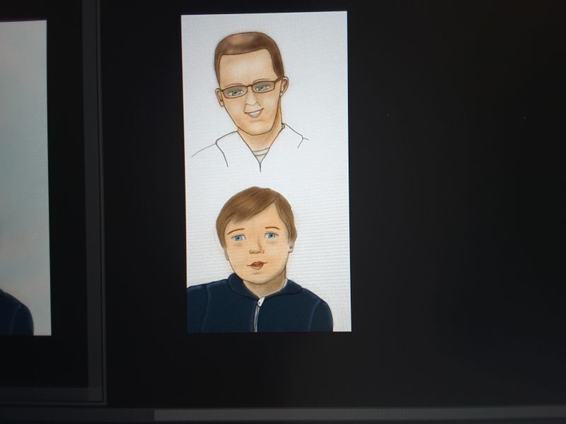
@Nyrryl-Cadiz Thank you! I just finished the father. I was able to stay consitent. I was going to wait to add it, but I'll add it now.
-
@deborah-Haagenson I love the woman but I think there's a few issues with the man's face. Like how the right side of the jaw is wonky and maybe his eyes are low in relation to his face? Is this a portrait of someone you know?
Portfolio: nyrrylcadiz.com
Instagram: https://www.instagram.com/nyrryl_cadiz/
YouTube: https://www.youtube.com/channel/UCbJCF1Im8ZO7hpGWTKOJMuA -
I think you are striking a nice balance between realism and cartoon and I like the linework with the soft coloring. I think the style is really worth pursuing!
A couple of things to think about-
-
For me, I can't quite discern the focus of the eyes in both of your characters and it's looking a little "uncanny valley" to me. Any little tweak and placement of the pupils can really affect the gaze of a character. I'd consider playing with the pupil placement, the placement of the highlight, to see if you can really nail down their focus.
-
I think you balanced the softness of the hair in the boy character nicely with the linework over top. In the older character his hair has that "digital airbrush" quality we are warned so often against. It's sort of in the middle between not being soft enough or not being hard enough. I'd consider softening the transition of the highlight on the older character's hair even more and maybe placing a few line work details over top.
Website: www.tessawrathall.com
Instagram: www.instagram.com/tessawrathall_art/
-
-
@Nyrryl-Cadiz Thanks! I see the wonky chin. He isn't someone I know. My reference has a very high forehead. I'm going to take closer look at this.
-
@deborah-Haagenson ah... I see...
-
@TessaW Thank you! This is a photo of my screen and you can't see the highlights in the eyes. As for the hair. Thank you for the analysis of this. I'm going to work on the man'shair and see how I need to tweek it to get a softer look.
-
@deborah-Haagenson Oh, I should have been more specific with my comment about the highlights. I noticed that the highlights were looking as if they were placed underneath the pupils, which can of course happen, but I typically see them placed more toward the top of the eye in standard lighting. I was wondering if you placed them differently, like more above or something, it would help with the focus issue I mentioned? Not sure if that would help, but that's why I mentioned them.
Website: www.tessawrathall.com
Instagram: www.instagram.com/tessawrathall_art/
-
@TessaW Ok, thanks!
-
Hi @deborah-Haagenson
 I’m working on the same thing at the moment! If you’re subscribed to SVS I recommend Jake Parker’s class ‘Stylizing Human Characters’, it will help you decide on the blend of realism, symbolism and abstraction you want to combine to depict your characters.
Other than that I suggest a lot of research - who are the artists who already work in the style you are aiming for? Study their work.
My own icon for a cartoon human style (apart from Disney ) is W.E. Joyce’s Morris Lessmore character, a realistically rendered human on the cartoon side. I learn a lot from his realistic moody lighting and how his chosen features express emotion.
Looking at the images you have posted I think you’re on the right track, the characters look soft and sweet but I think you could push further into abstraction of the human form by really simplifying the face shapes into more basic, symmetrical shapes (remembering how different shapes depict different personalities) and then work on your lighting to give them even more 3D form. The problem we can encounter with realistic cartoons is that if they’re ‘too human’ they can look like unfinished portraits.
Going forward working with the faces you have I recommend drawing them a lot (without thinking too much about the reference), experimenting with the shapes, sizes and positioning of their features to play with the elasticity of the cartoon side of things to bring more life, emotion and relatability. Then do the same experimentation to give them appropriate body shapes for their personalities/stories. Have fun with it!
-
@Lovsey Great suggestions! I think I will take that class of Jake's. I have a long way to go and a lot to learn, but I feel like I have at least reached a jumping off point. I have been creating traditional art for years and I've been on this site since November, so now I really need to focus on furthering my character development skills. Thank you! Your post has helped me to realize where I need to go with this next.
-
@deborah-Haagenson I have a lot to learn too, but it feels good to have a plan and steps to work through doesn’t it!? You’ve jumped the first few hurdles already.
The Introduction to Gesture course has been really valuable for my character design as well and might come in useful for posing yours in the canoe scene you have in mind (I actually just drew a mother and son in a boat last night from one of the reference prompts in the ‘two figure interaction’ section, which I like so much I want to develop further and add a background to
 )
)I’m looking forward to seeing how your characters develop throughout your process

-
@deborah-Haagenson I very much understand your dilemma about realism vs. stylization. And I think it's fine to remain realistic, as long as you avoid the uncanny valley, as @TessaW points out. (That's kind of a hard concept to describe! Anyone know where Will discusses it?).
I also think you've gotten some good critiques here. I think that one thing that might help particularly at this point is to find a course that explores 3D form. For example, I was watching the gesture class yesterday (lesson 2) and Brooklyn Walker talks about building a form from simple 3D shapes, specifically talking, for example, about how to give a foreshortened leg roundness. I also think it might be helpful to do a few pieces (just as an experiment) in which you use a defined brush that forces you to make decisions about form. Someone once helpfully critiqued my work using a Sargent quote about the facial features just being "spots on an apple." The point was that form comes first.
About style: I think that what happens is that once we draw a whole lot, even if we are realistic, we naturally start to stylize. Maybe someone who knows they want to go cartoon-y stylizes faster, but everyone does to some degree, if for no other reason, because we can't always work from personal reference photos! In the latest podcast, the guys talked about just how very long artists have to work to develop consistency. It can be discouraging to think about spending years developing a style (it is for me because I'm not young), but at the same time, sometimes it helps just to look at our own work six months ago and see the progress!
I love realism, but I think what has gotten me off dead center is seeing the range of expression possible in professional character design. I think of Wouter Tulp, for example (not so much his caricatures as his character designs). Once you see all the possibilities that can come from exaggeration and dynamic poses, you tend to want to try it out. But it doesn't mean you have to leave realism altogether, and you can practice different styles side by side until you're comfortable. Publishers want a consistent style in the end, but I think a few years of just drawing and drawing and experimenting with styles are or order for most of us.
-
@LauraA Thank you Laura! I'm not as concerned about my drawing. I feel prettey confident there. Even though I do need to do like you said and start pushing my creativity and creating more exagerated and active characters. I do think that this will be fun! However, I think my digital coloring/painting needed work too. Now that I am feeling a little more comfortable with this I will be going back to my drawing skills, probably first by taking Jake's character design class that was mentioned. I tend to tackle things in stages that aren't linear or make sense to anyone else. Eventually it will hopefully all come together, by going back and forth like this.