Forum interface issues
-
This is a lot to take in here. Reading through most of the comments it comes down to user experience. Most of the issues that people are having can be changed in your settings. You can customize how you best want to use the forums. The forums is not a custom built tool. It is a service that SVS pays for and I help to manage and make sure things are running smooth.
If there is something that you can not configure through your settings, feel free to send me a chat message here and I can look into further.
-
@Griffin Once you have set and saved your homepage preference the only way I can find to actually go to your homepage is to use the blue URL link ‘Home’ at the top left of whatever page I happen to be on (eg. Unread)
-
@Griffin @TessaW Oh! I now know why
 My ‘Sort by’ button has been set to show most popular first. I don’t even know how but that’s another problem solved. This is a very useful thread indeed!
-
@Coreyartus What do you think about having an introductory tutorial thread with screenshots like this to show new people the basics? Perhaps it could be pinned in the Introductions section so it’s easy to find. There seem to be quite a few confused new people around that would benefit from having a bit of a guide.. just a suggestion

-
@Lovsey I think that's a great idea! I'm just not the one who can do that--I think that's the SVSLearn folks. I'm just a moderator--we don't have the capacity to pin posts and such. On top of that, I think others know the inner workings of the site a lot more than I do. I think a clearer and more thorough tutorial could be made than I could assemble... @Chip-Valecek ?
-
Thank you for the feedback everyone! Just to give some background, SVSLearn has had this forum for many years and through a couple different websites. The interface takes some getting used to, but we keep this platform because it's evolved into an awesome community!
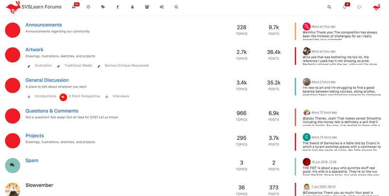
That said, we are open to making tweaks that would improve user experience. @TessaW had mentioned adding permanent categories, which it turns out is something we can do on this platform. But, in order for it to work, users would have to actually post to the correct categories, instead of defaulting every post to Announcements (I am definitely guilty of this!) If we add categories, the home page would look like this:

So instead of a feed showing the most recent activity, you would see a list of categories, then you would click on the category you want. We'd probably have to clean up/simplify the categories too.
What do you think? Would that be helpful?
-
@LisaF I think it would be nice to have categories but I also like being able to see a running thread. sometimes people post things I wouldn't think to look for but come across it because it's at the top of the thread. Is there a way to also have a category for everything all together? If I had to choose one though I think I'd vote this new category version

-
@LisaF i really like the current feed. When I search for new posts, I don't really care what type of category it is. If I see that I haven't read it or gave my comments to it before, I'll click on it immediately. Can we still have an option to use the current format?
-
@LisaF Thanks for considering the change! Even though I'm the one that mentioned permanent categories, I vote to keep it the way it is. I like coming on and seeing the post titles right away. In the screen shot you shared, you can't see any of the post titles- you can only see the categories and then some replies on the side column. I'd much rather see the wall of posts on the home screen, than none at all.
-
@LisaF I have set the categories to my homepage because sometimes I like to browse with more intention through the threads. Like when I accidentally hit back and lose a thread that I had originally opened in the recents and have to go searching for.. But I would really miss having all of the recent posts highlighted for me if categories menu were to completely take it’s place. The forums work well when you get past the initial struggle
