Society of Visual Storytelling

    SVSLearn Forums

    • Register
    • Login
    • Search
    • Recent
    • Tags
    • Popular
    • Users
    • Groups
    • Search

    Opinions please

    General Discussion
    4
    10
    491
    Loading More Posts
    • Oldest to Newest
    • Newest to Oldest
    • Most Votes
    Reply
    • Reply as topic
    Log in to reply
    This topic has been deleted. Only users with topic management privileges can see it.
    • MOO
      MOO SVS OG last edited by

      I'm trying to decide if I should keep this illustration for my lullaby book. Or if it's too weird and dark colored. What do you think?
      lfsebreezeillodark.jpg

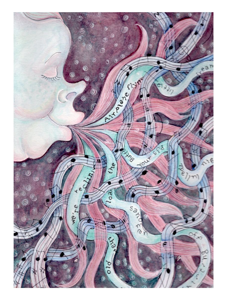
      Here are some thumbnails of the rest for comparison (if you can see them well enough.)

      lullabies.PNG

      Marsha Ottum Owen

      Griffin McPherson 1 Reply Last reply Reply Quote 1
      • Griffin McPherson
        Griffin McPherson @MOO last edited by

        @MOO it’s different from the other images but not so much so that it doesn’t belong. I would keep it in

        1 Reply Last reply Reply Quote 1
        • Lovsey
          Lovsey last edited by

          I vote that you keep it 👍 I think it is very interesting to look at and the tones aren’t that dark compared to your other images (I see the owl as darker).

          MOO 1 Reply Last reply Reply Quote 1
          • MOO
            MOO SVS OG @Lovsey last edited by

            @Lovsey Thanks. True, the owl is really dark. I'm considering another idea. If I do it, I'll post th both and ask for a vote but, it's nice to hear that Iight still be able to use it too. Thanks!

            Marsha Ottum Owen

            1 Reply Last reply Reply Quote 0
            • MOO
              MOO SVS OG last edited by

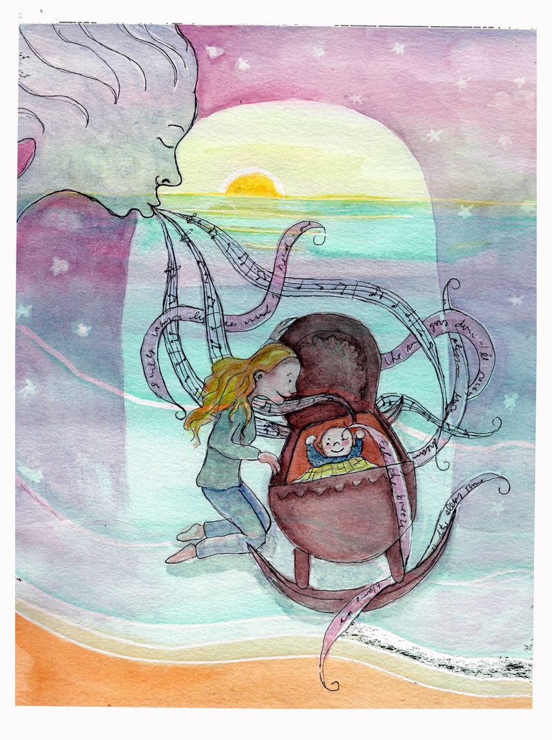
              Here's a new one. The scanner is acting weird so there is black stuff down by the shore for some reason and the cradle is much ligher in reality. This one suits the lutics much better. Anyway, what do you think?

              breezedoover.jpg

              Marsha Ottum Owen

              1 Reply Last reply Reply Quote 1
              • MOO
                MOO SVS OG last edited by

                Here's a proper scan. What a difference!

                lfsebreezeillo.jpg

                Marsha Ottum Owen

                MOO 1 Reply Last reply Reply Quote 0
                • MOO
                  MOO SVS OG @MOO last edited by

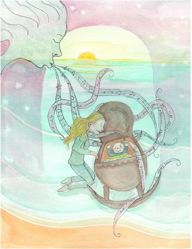
                  One more little change. Notice the streams are not connected to the lips now.
                  @MOO lfsebreezeillo.jpg

                  Marsha Ottum Owen

                  1 Reply Last reply Reply Quote 1
                  • aBullfrogArt
                    aBullfrogArt last edited by

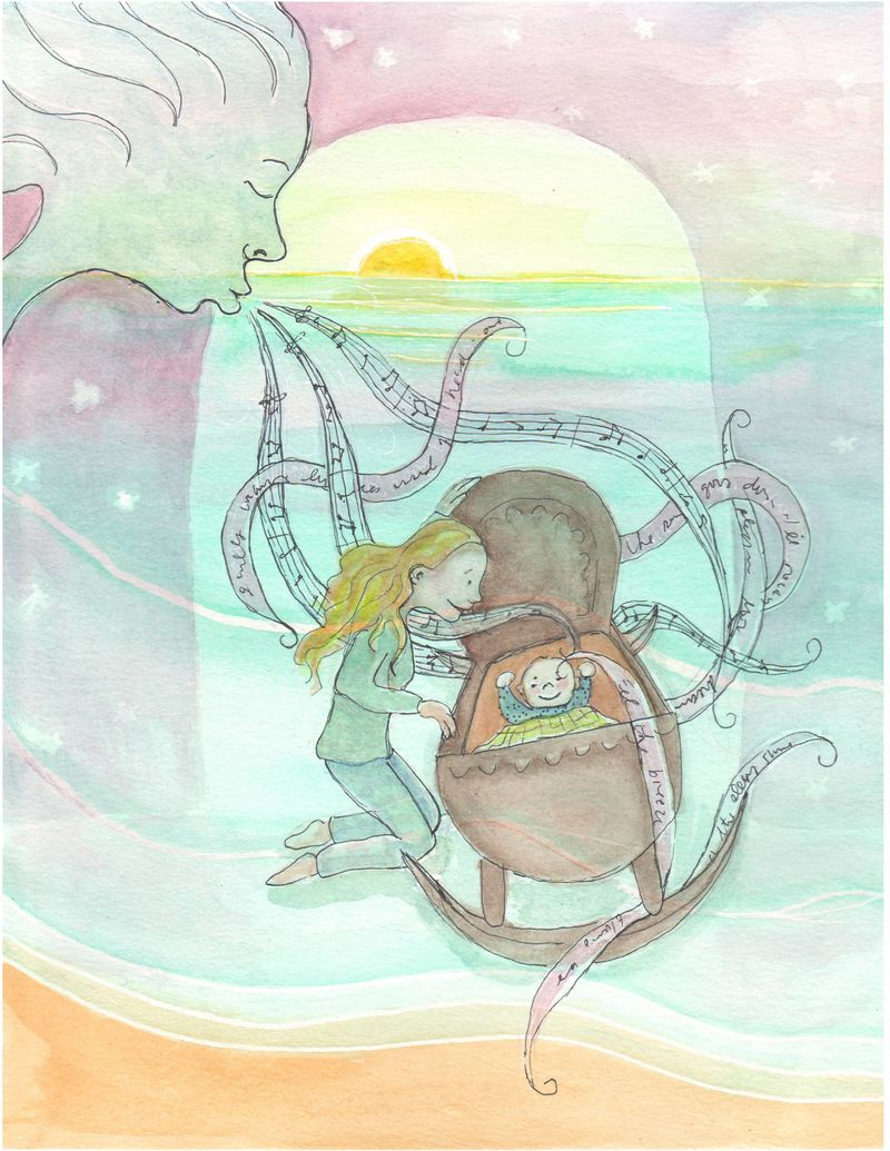
                    @MOO I really like the collection of images. Looking over the second option, I much prefer the original (I don't think it's too dark at all when compared with the rest). I feel like the flow of music and how you filled the space creates a more natural and interesting composition. The newer design is nice as well, certainly lighter, but - for me - gets busy at the cradle, making certain forms a bit difficult to differentiate. Only my initial impression, great work!

                    MOO 1 Reply Last reply Reply Quote 1
                    • MOO
                      MOO SVS OG @aBullfrogArt last edited by

                      @Jeremiah-Gorrell Thank you fo ryour input. I will definitely consider your points as I make my final decision 🙂

                      Marsha Ottum Owen

                      1 Reply Last reply Reply Quote 1
                      • MOO
                        MOO SVS OG last edited by

                        I'm going with the first one but I made a little space between the lips and the streaming thingys. Thanks all!

                        Marsha Ottum Owen

                        1 Reply Last reply Reply Quote 0
                        • First post
                          Last post