Society of Visual Storytelling

    SVSLearn Forums

    • Register
    • Login
    • Search
    • Recent
    • Tags
    • Popular
    • Users
    • Groups
    • Search

    Developing a 'graphic novel' style

    Sketchbook
    8
    42
    3601
    Loading More Posts
    • Oldest to Newest
    • Newest to Oldest
    • Most Votes
    Reply
    • Reply as topic
    Log in to reply
    This topic has been deleted. Only users with topic management privileges can see it.
    • kylebeaudette
      kylebeaudette @braden H last edited by

      @Braden-Hallett hey man!
      Yeah, exactly what I'm working on right now. The backgrounds! They gotta be simple, but get everything across. I keep looking at Quentin Blake, and a few other artists that say a lot by showing little.
      I DO NOT want to do detailed backgrounds, and after purchasing a few graphic novels for kids, I can see that we're not alone๐Ÿ˜…

      Just gotta find that balance. I think if I could finish a page in 5-8 hours I'd be happy.

      Your comics are awesome!!

      Instagram- www.instagram.com/kyle_beaudette/
      Www.twitter.com/kylebeautweet
      Www.etsy.com/shop/Artofkylebeaudette
      https://youtube.com/@kylebeaudette?si=ComtMDsVyK1HPn55

      1 Reply Last reply Reply Quote 1
      • carriecopadraws
        carriecopadraws SVS OG @kylebeaudette last edited by

        @kylebeaudette A lot of graphic novel backgrounds are only a couple panels, for establishing shots. You can get away with less!

        The Prince and the Dressmaker's author, Jen Wang, writes that she didn't like backgrounds and only included them sparingly to establish the location. She uses solid color panels to hint at the environment and mood, and it works really well:
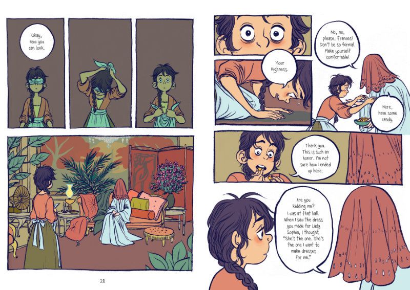
        comic-sample.jpg

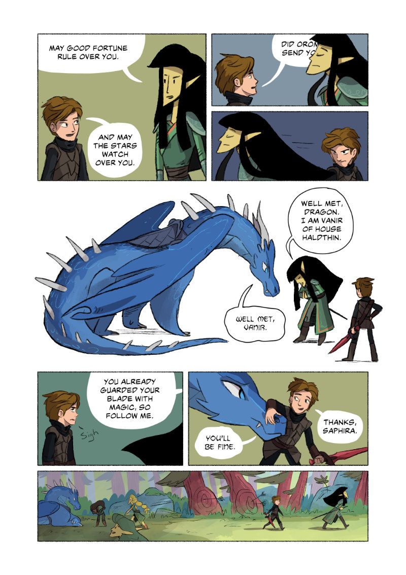
        I tried to do a similar method with my Eragon short comic, only drawing backgrounds in a few panels. That way the focus is on the characters and their dialogue.
        eragon-comic-003.jpg

        I think your work shows potential for graphic novel work! There is that weird balance to find where you have the style you want and work fairly quickly. I heard someone say once that to make a comic you need to be happy with your work at 60% power, since you have to make so many panels and can't spend forever to make them perfect.

        Carrie Copa
        https://carriecopadraws.com/

        kylebeaudette 1 Reply Last reply Reply Quote 5
        • kylebeaudette
          kylebeaudette @carriecopadraws last edited by

          @carriecopadraws great comic! That last panel is the perfect way to do the details after those other block colour ones. Nice!!!
          Yeah, I'd plan to make use of lots of mood-colour backgrounds. It's all about those characters and their expressions/interactions/dialogue. Im no expert, but Ill give it a shot๐Ÿ‘๐Ÿ‘

          Instagram- www.instagram.com/kyle_beaudette/
          Www.twitter.com/kylebeautweet
          Www.etsy.com/shop/Artofkylebeaudette
          https://youtube.com/@kylebeaudette?si=ComtMDsVyK1HPn55

          carriecopadraws 1 Reply Last reply Reply Quote 1
          • carriecopadraws
            carriecopadraws SVS OG @kylebeaudette last edited by

            @kylebeaudette I'm still learning too! Maybe you, me and @Braden-Hallett can start a comic group to cheer each other (and anyone else) on!

            Carrie Copa
            https://carriecopadraws.com/

            kylebeaudette braden H 2 Replies Last reply Reply Quote 1
            • kylebeaudette
              kylebeaudette @carriecopadraws last edited by

              @carriecopadraws let's do it๐Ÿ‘

              Instagram- www.instagram.com/kyle_beaudette/
              Www.twitter.com/kylebeautweet
              Www.etsy.com/shop/Artofkylebeaudette
              https://youtube.com/@kylebeaudette?si=ComtMDsVyK1HPn55

              1 Reply Last reply Reply Quote 1
              • J
                jdubz last edited by

                These are really cool guys. @Braden-Hallett I think you have WAY more detail in your backgrounds that any graphic novel my kids read, so you probably can dial it back even to save time (unless you love doing it hah).

                @kylebeaudette back to your initial question - I'd personally say it's both. Depending on the style of a picture book, your first image actually looks like something you might find depending on the style. I think it might just depend on what's specifically trendy at the moment (or what look the author had in mind).

                I really gotta make a project to try and get into one. The age group really interests me because all my kids are reading this kind of stuff today. Plus, doing stuff at 60% is so my jam with how busy I am these days lol.

                Josh White
                https://www.instagram.com/joshwhiteillustration/

                1 Reply Last reply Reply Quote 3
                • kylebeaudette
                  kylebeaudette last edited by

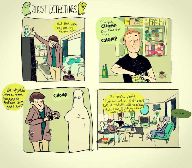
                  IMG_20200817_170456_175.jpg
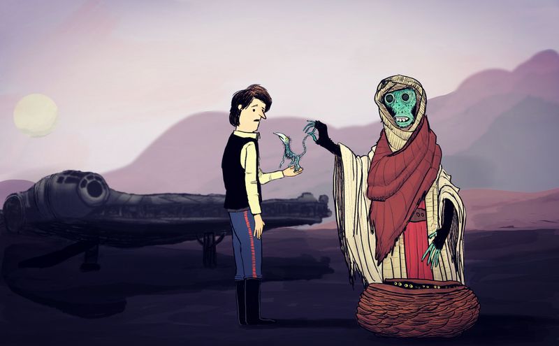
                  Finished this one today. The backgrounds are me tracing living rooms from google images ๐Ÿ˜…

                  Instagram- www.instagram.com/kyle_beaudette/
                  Www.twitter.com/kylebeautweet
                  Www.etsy.com/shop/Artofkylebeaudette
                  https://youtube.com/@kylebeaudette?si=ComtMDsVyK1HPn55

                  1 Reply Last reply Reply Quote 10
                  • braden H
                    braden H @carriecopadraws last edited by

                    @carriecopadraws said in Developing a 'graphic novel' style:

                    @kylebeaudette I'm still learning too! Maybe you, me and @Braden-Hallett can start a comic group to cheer each other (and anyone else) on!

                    ๐Ÿ˜ƒ !!!

                    1 Reply Last reply Reply Quote 2
                    • kylebeaudette
                      kylebeaudette last edited by

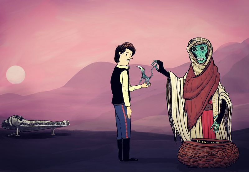
                      IMG_20200817_220332_245.jpg
                      Changed the little creature, added some light background hills, and of course, the falcon.

                      Instagram- www.instagram.com/kyle_beaudette/
                      Www.twitter.com/kylebeautweet
                      Www.etsy.com/shop/Artofkylebeaudette
                      https://youtube.com/@kylebeaudette?si=ComtMDsVyK1HPn55

                      1 Reply Last reply Reply Quote 2
                      • Jade Vaughan
                        Jade Vaughan last edited by

                        @kylebeaudette I really like your loose style! The updated piece is an improvement. Perhaps since the falcon is further away- thin the line work/limit detail so it doesnโ€™t match the two foreground figures.

                        Iโ€™m also looking into developing a comic style. Iโ€™m still figuring out how and would love to join this group!

                        @carriecopadraws I love Jen Wangโ€™s work and use of background. I think you executed the similar formula very well! And 60% power seems about right lol

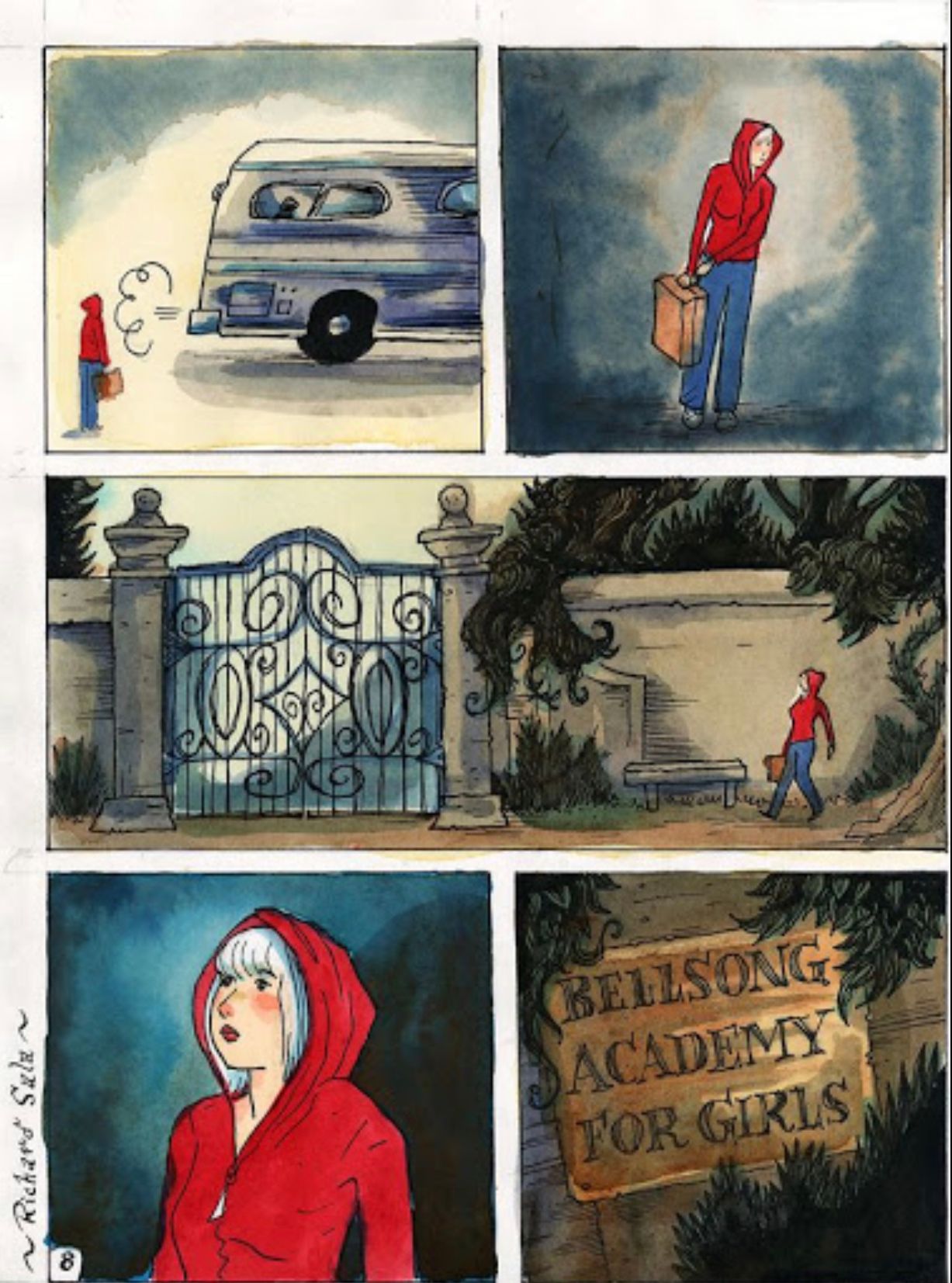
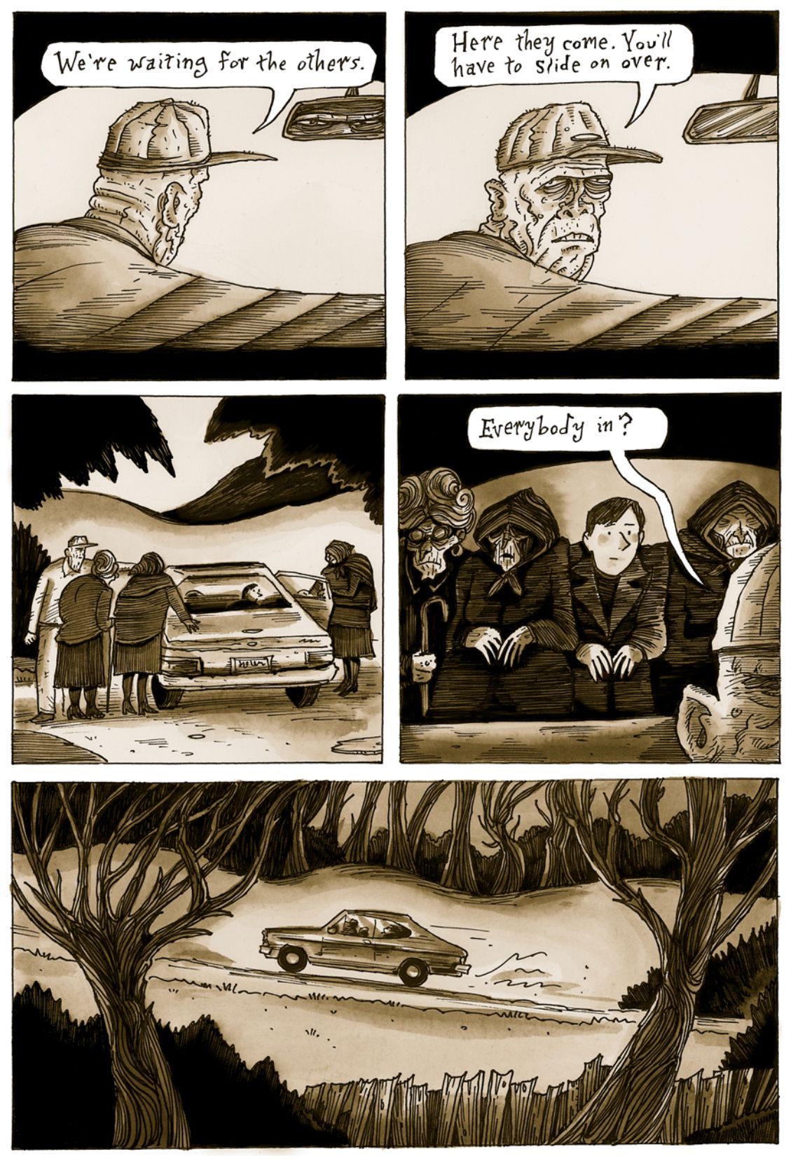
                        Iโ€™ll add in a few examples from artists Iโ€™ve been reading:

                        Richard Salaโ€™s Cat Burglar Black
                        92690B9C-5571-4FCC-8061-E462DB78CF46.jpeg
                        Delphine
                        D093A2F2-41C5-439C-8CDF-B8290CF99661.jpeg

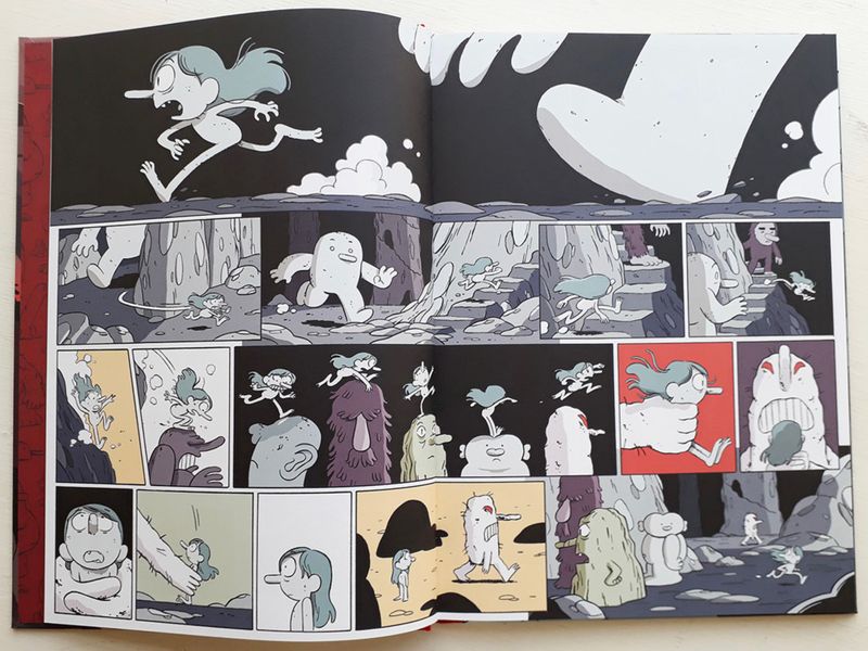
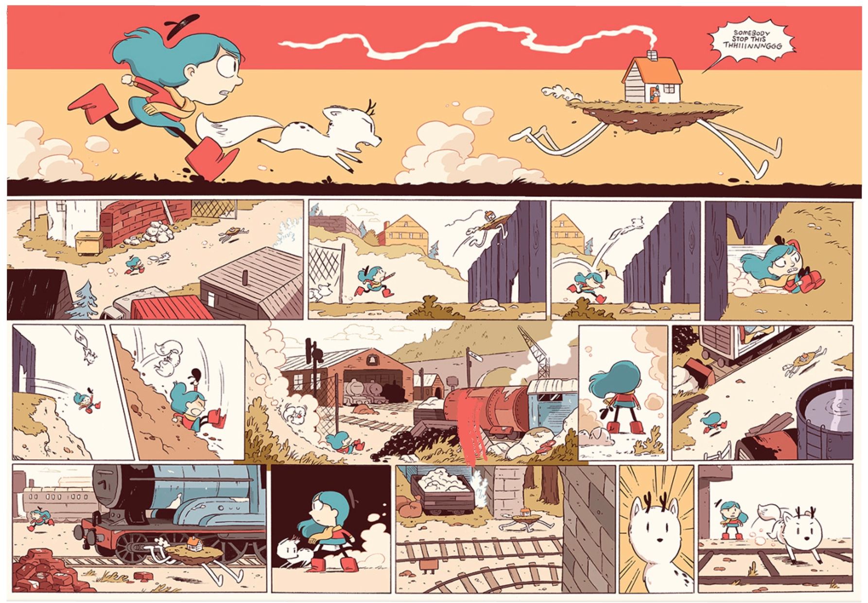
                        Luke Pearsonโ€™s Hilda

                        802CEA17-9F81-44C6-9F92-8CD18A9AA1EB.jpeg
                        F9A46BE8-A531-4837-A674-5D2D796F3142.jpeg

                        Instagram: www.instagram.com/jadepagecraft/
                        Portfolio: www.jadesv.myportfolio.com

                        kylebeaudette 1 Reply Last reply Reply Quote 1
                        • kylebeaudette
                          kylebeaudette @Jade Vaughan last edited by kylebeaudette

                          @Jade-Vaughan love that Hilda, dont think I would ever be that good๐Ÿ˜…

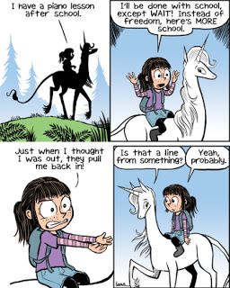
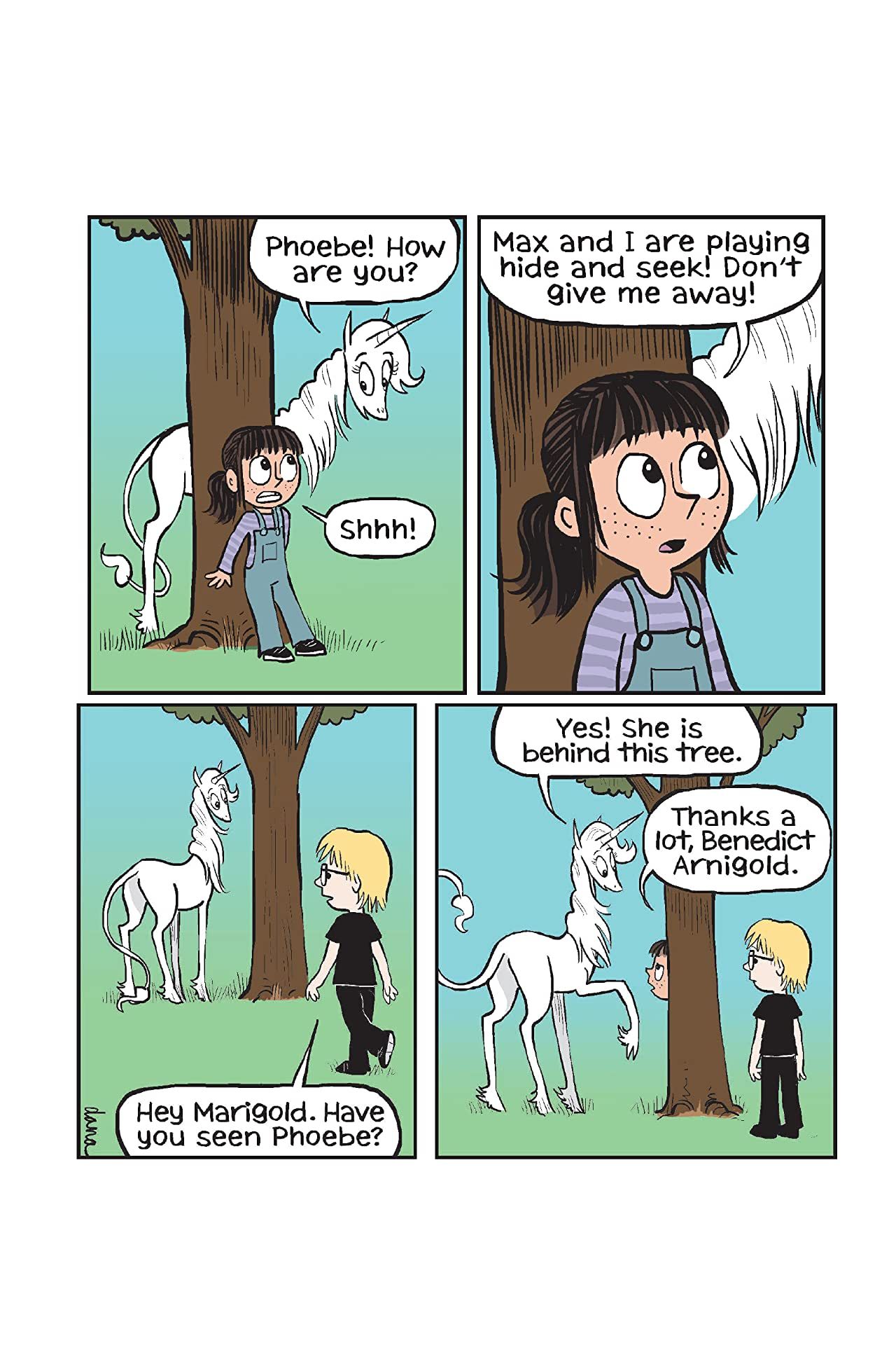
                          I bought a copy of a Phoebe and her Unicorn book to look at, (and also for my classroom this fall!)

                          The backgrounds are simple, the drawings are very animation-esque, and the focus is on humour. It's pretty good, I like the clean visual style.
                          395c4e993bdc166db64c351eff8fb4e6.SX1280_QL80_TTD.jpg !

                          26671197.jpg

                          Instagram- www.instagram.com/kyle_beaudette/
                          Www.twitter.com/kylebeautweet
                          Www.etsy.com/shop/Artofkylebeaudette
                          https://youtube.com/@kylebeaudette?si=ComtMDsVyK1HPn55

                          Jade Vaughan 1 Reply Last reply Reply Quote 1
                          • Jade Vaughan
                            Jade Vaughan @kylebeaudette last edited by

                            @kylebeaudette Very nice!! As you say the clean style does focus more on the character and dialogue. Iโ€™ll be checking it out ๐Ÿ™‚ Iโ€™m sure your class will enjoy it

                            Instagram: www.instagram.com/jadepagecraft/
                            Portfolio: www.jadesv.myportfolio.com

                            1 Reply Last reply Reply Quote 1
                            • kylebeaudette
                              kylebeaudette last edited by

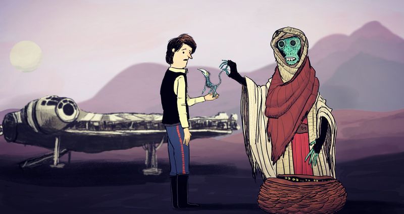
                              Can't stop futzing with this one.j6trj6.jpg

                              Instagram- www.instagram.com/kyle_beaudette/
                              Www.twitter.com/kylebeautweet
                              Www.etsy.com/shop/Artofkylebeaudette
                              https://youtube.com/@kylebeaudette?si=ComtMDsVyK1HPn55

                              braden H chrisaakins 2 Replies Last reply Reply Quote 2
                              • braden H
                                braden H @kylebeaudette last edited by

                                @kylebeaudette have you thought about using a silhouette for the falcon with certain details (like the cockpit windows) picked out? Instead of a full render I mean?

                                kylebeaudette 1 Reply Last reply Reply Quote 0
                                • kylebeaudette
                                  kylebeaudette @braden H last edited by

                                  @Braden-Hallett i took out the line work and liked that, but didn't play with it too much. I'll give it a shot๐Ÿ‘

                                  Instagram- www.instagram.com/kyle_beaudette/
                                  Www.twitter.com/kylebeautweet
                                  Www.etsy.com/shop/Artofkylebeaudette
                                  https://youtube.com/@kylebeaudette?si=ComtMDsVyK1HPn55

                                  1 Reply Last reply Reply Quote 1
                                  • kylebeaudette
                                    kylebeaudette last edited by

                                    IMG_20200820_170541_311.jpg

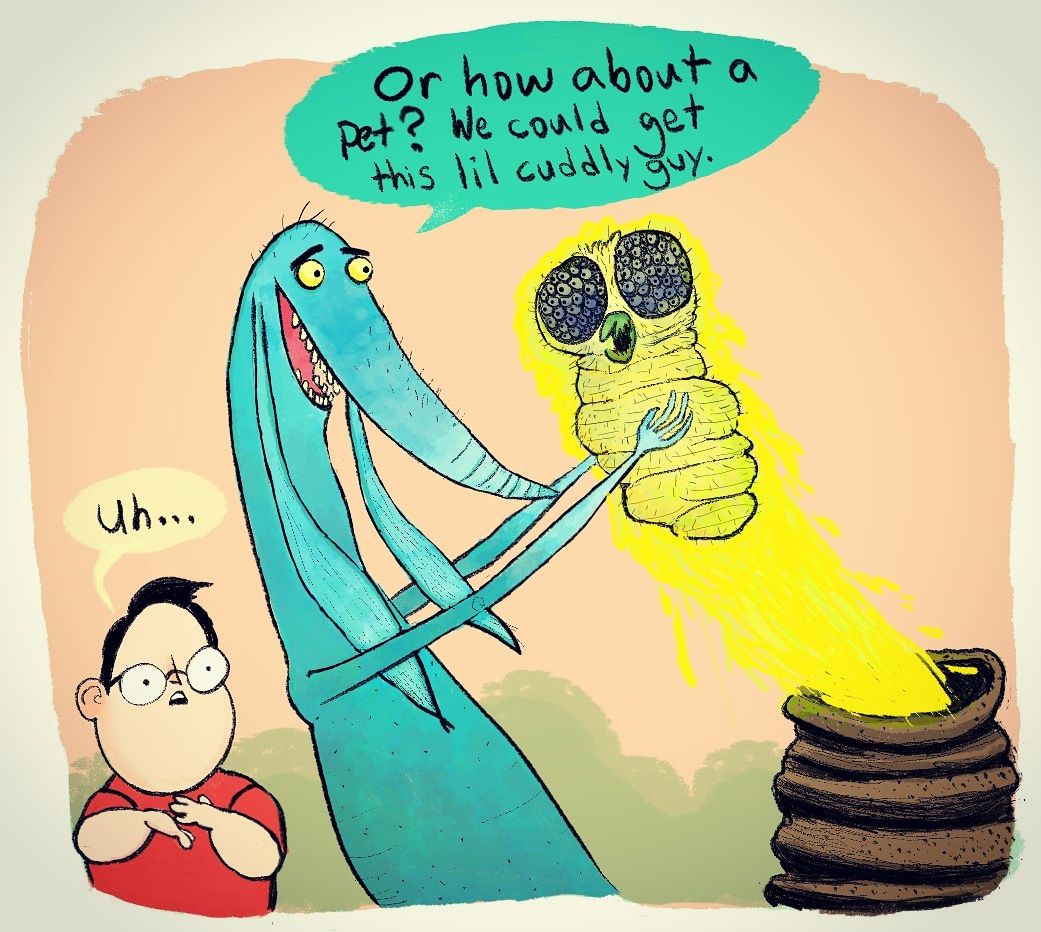
                                    Two old characters of mine, a boy and the monster in his closet (the olde cliche ๐Ÿ™„)
                                    Trying to carve at the lines with an eraser, colouring it early to see how it looks and editing repeatedly

                                    Instagram- www.instagram.com/kyle_beaudette/
                                    Www.twitter.com/kylebeautweet
                                    Www.etsy.com/shop/Artofkylebeaudette
                                    https://youtube.com/@kylebeaudette?si=ComtMDsVyK1HPn55

                                    1 Reply Last reply Reply Quote 1
                                    • chrisaakins
                                      chrisaakins @kylebeaudette last edited by

                                      @kylebeaudette I love seeing this evolution. I do see a tangent with his collar and the mountain behind him though...

                                      Chris Akins
                                      www.chrisakinsart.com
                                      www.instagram.com/chrisakinsart/

                                      kylebeaudette 1 Reply Last reply Reply Quote 0
                                      • kylebeaudette
                                        kylebeaudette @chrisaakins last edited by

                                        @chrisaakins here's the latest! Took Bradens advice to make the falcon a silhouette, and I moved mountains to get rid of that tangent๐Ÿ˜…
                                        IMG_20200820_173834_972.jpg

                                        Instagram- www.instagram.com/kyle_beaudette/
                                        Www.twitter.com/kylebeautweet
                                        Www.etsy.com/shop/Artofkylebeaudette
                                        https://youtube.com/@kylebeaudette?si=ComtMDsVyK1HPn55

                                        J 1 Reply Last reply Reply Quote 1
                                        • braden H
                                          braden H last edited by

                                          Okay! I've been inspired. I'm gonna get this short story done up.

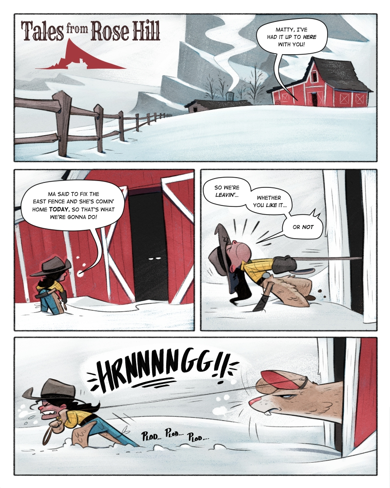
                                          There are a few places I feel I fell down in my webcomic. Getting caught up in details and overbaking textures; too many lighting details in regular panels Sound effects; and probably a few other areas.

                                          SO! I got a couple fo questions for you guys as I 'develop my graphic novel style'.

                                          1.) I'm using the same tools as I use for my regular illustrations. I like the idea of being able to do a graphic novel in the same way as I do a kid's book. Do you think this works?

                                          2.) Do the hand-drawn sound effects work? (the 'HRRNNNNNNG' and stuff) or should I use a SFX font?

                                          3.) I used very limited lighting passes. On the characters I did a very small occlusion shadow pass, and a very simple light pass. Is this enough? Not enough?

                                          I wanna settle on a style before finishing this thing, so feedback is most appreciated ๐Ÿ™‚
                                          22772231-2918-48c6-a972-5dc8c5137e1f-image.png

                                          J 1 Reply Last reply Reply Quote 2
                                          • J
                                            jdubz @kylebeaudette last edited by

                                            @kylebeaudette I think you really improved the silhouette, but I think the contrast is too vast between the foreground/background (the values start to get lost around his legs). It just feels unnaturally dark on the lower side without much reason for it. I think it would help the foreground characters jump out to push all that into the background.

                                            Something like the Falcon would be recognizable even if it was like 3% different from the mountain. So you don't need to make it really stand out that much to get the recognition.

                                            Josh White
                                            https://www.instagram.com/joshwhiteillustration/

                                            kylebeaudette 2 Replies Last reply Reply Quote 0
                                            • First post
                                              Last post