Society of Visual Storytelling

    SVSLearn Forums

    • Register
    • Login
    • Search
    • Recent
    • Tags
    • Popular
    • Users
    • Groups
    • Search

    Developing a 'graphic novel' style

    Sketchbook
    8
    42
    3601
    Loading More Posts
    • Oldest to Newest
    • Newest to Oldest
    • Most Votes
    Reply
    • Reply as topic
    Log in to reply
    This topic has been deleted. Only users with topic management privileges can see it.
    • braden H
      braden H @carriecopadraws last edited by

      @carriecopadraws said in Developing a 'graphic novel' style:

      @kylebeaudette I'm still learning too! Maybe you, me and @Braden-Hallett can start a comic group to cheer each other (and anyone else) on!

      😃 !!!

      1 Reply Last reply Reply Quote 2
      • kylebeaudette
        kylebeaudette last edited by

        IMG_20200817_220332_245.jpg
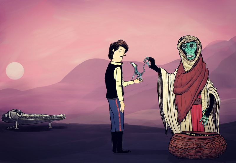
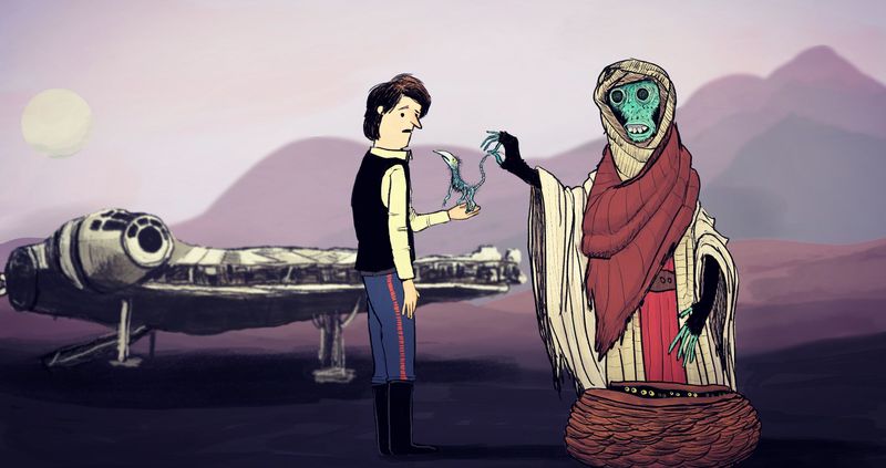
        Changed the little creature, added some light background hills, and of course, the falcon.

        Instagram- www.instagram.com/kyle_beaudette/
        Www.twitter.com/kylebeautweet
        Www.etsy.com/shop/Artofkylebeaudette
        https://youtube.com/@kylebeaudette?si=ComtMDsVyK1HPn55

        1 Reply Last reply Reply Quote 2
        • Jade Vaughan
          Jade Vaughan last edited by

          @kylebeaudette I really like your loose style! The updated piece is an improvement. Perhaps since the falcon is further away- thin the line work/limit detail so it doesn’t match the two foreground figures.

          I’m also looking into developing a comic style. I’m still figuring out how and would love to join this group!

          @carriecopadraws I love Jen Wang’s work and use of background. I think you executed the similar formula very well! And 60% power seems about right lol

          I’ll add in a few examples from artists I’ve been reading:

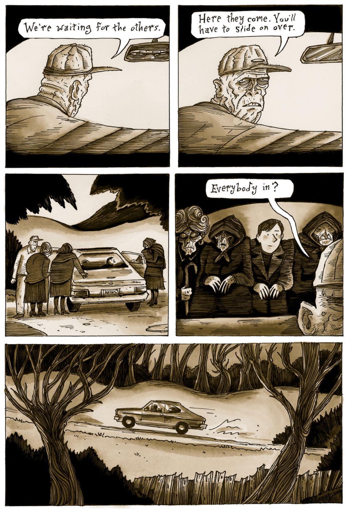
          Richard Sala’s Cat Burglar Black
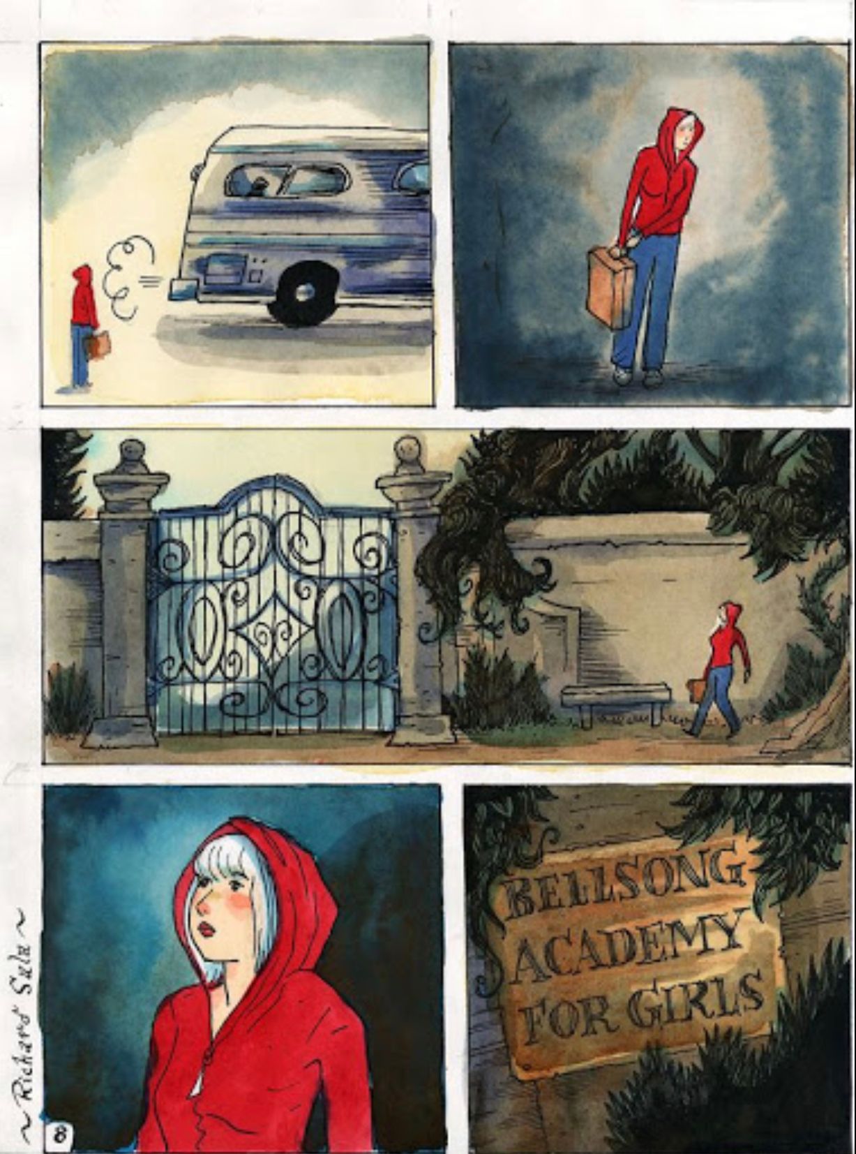
          92690B9C-5571-4FCC-8061-E462DB78CF46.jpeg
          Delphine
          D093A2F2-41C5-439C-8CDF-B8290CF99661.jpeg

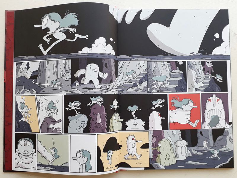
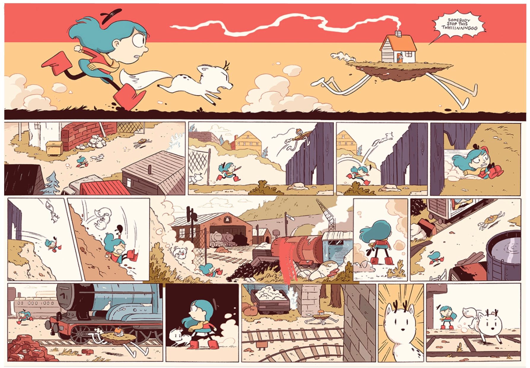
          Luke Pearson’s Hilda

          802CEA17-9F81-44C6-9F92-8CD18A9AA1EB.jpeg
          F9A46BE8-A531-4837-A674-5D2D796F3142.jpeg

          Instagram: www.instagram.com/jadepagecraft/
          Portfolio: www.jadesv.myportfolio.com

          kylebeaudette 1 Reply Last reply Reply Quote 1
          • kylebeaudette
            kylebeaudette @Jade Vaughan last edited by kylebeaudette

            @Jade-Vaughan love that Hilda, dont think I would ever be that good😅

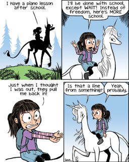
            I bought a copy of a Phoebe and her Unicorn book to look at, (and also for my classroom this fall!)

            The backgrounds are simple, the drawings are very animation-esque, and the focus is on humour. It's pretty good, I like the clean visual style.
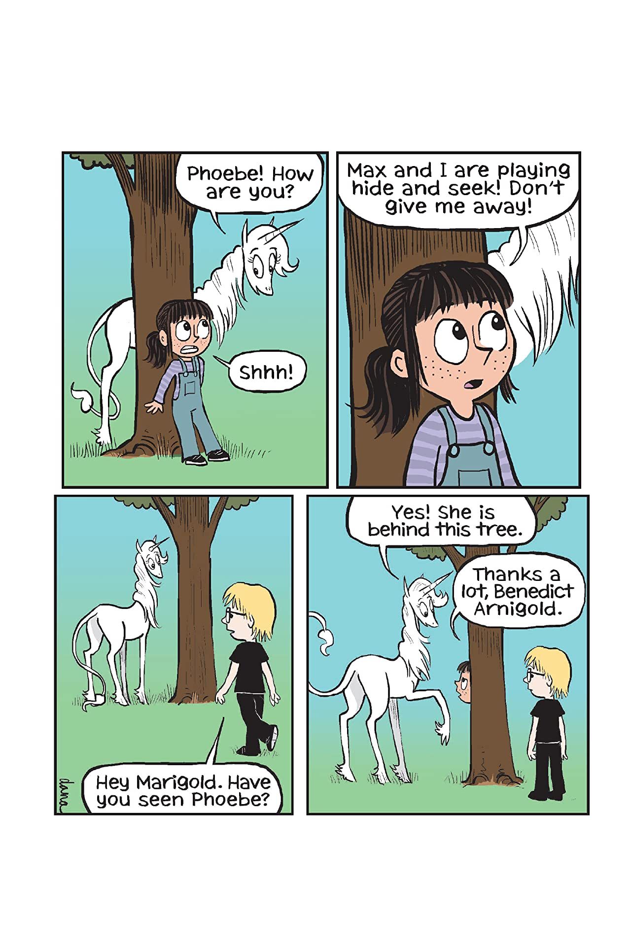
            395c4e993bdc166db64c351eff8fb4e6.SX1280_QL80_TTD.jpg !

            26671197.jpg

            Instagram- www.instagram.com/kyle_beaudette/
            Www.twitter.com/kylebeautweet
            Www.etsy.com/shop/Artofkylebeaudette
            https://youtube.com/@kylebeaudette?si=ComtMDsVyK1HPn55

            Jade Vaughan 1 Reply Last reply Reply Quote 1
            • Jade Vaughan
              Jade Vaughan @kylebeaudette last edited by

              @kylebeaudette Very nice!! As you say the clean style does focus more on the character and dialogue. I’ll be checking it out 🙂 I’m sure your class will enjoy it

              Instagram: www.instagram.com/jadepagecraft/
              Portfolio: www.jadesv.myportfolio.com

              1 Reply Last reply Reply Quote 1
              • kylebeaudette
                kylebeaudette last edited by

                Can't stop futzing with this one.j6trj6.jpg

                Instagram- www.instagram.com/kyle_beaudette/
                Www.twitter.com/kylebeautweet
                Www.etsy.com/shop/Artofkylebeaudette
                https://youtube.com/@kylebeaudette?si=ComtMDsVyK1HPn55

                braden H chrisaakins 2 Replies Last reply Reply Quote 2
                • braden H
                  braden H @kylebeaudette last edited by

                  @kylebeaudette have you thought about using a silhouette for the falcon with certain details (like the cockpit windows) picked out? Instead of a full render I mean?

                  kylebeaudette 1 Reply Last reply Reply Quote 0
                  • kylebeaudette
                    kylebeaudette @braden H last edited by

                    @Braden-Hallett i took out the line work and liked that, but didn't play with it too much. I'll give it a shot👍

                    Instagram- www.instagram.com/kyle_beaudette/
                    Www.twitter.com/kylebeautweet
                    Www.etsy.com/shop/Artofkylebeaudette
                    https://youtube.com/@kylebeaudette?si=ComtMDsVyK1HPn55

                    1 Reply Last reply Reply Quote 1
                    • kylebeaudette
                      kylebeaudette last edited by

                      IMG_20200820_170541_311.jpg

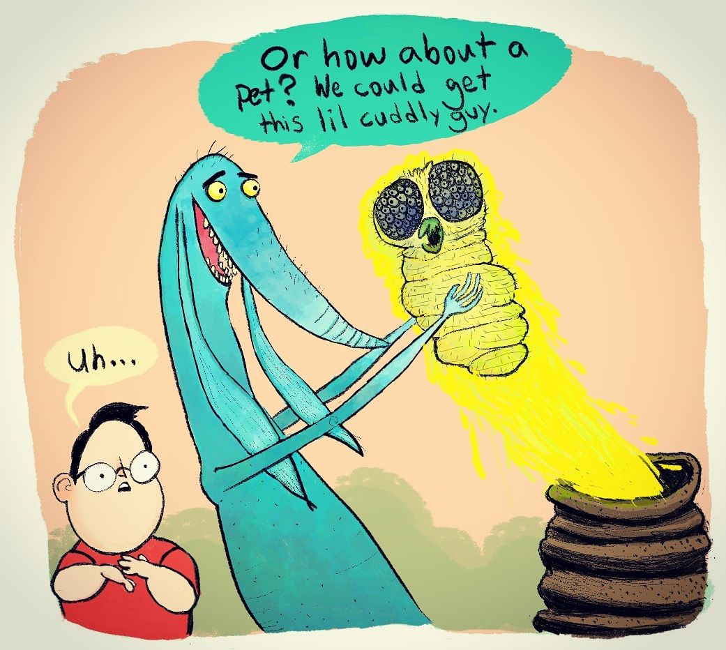
                      Two old characters of mine, a boy and the monster in his closet (the olde cliche 🙄)
                      Trying to carve at the lines with an eraser, colouring it early to see how it looks and editing repeatedly

                      Instagram- www.instagram.com/kyle_beaudette/
                      Www.twitter.com/kylebeautweet
                      Www.etsy.com/shop/Artofkylebeaudette
                      https://youtube.com/@kylebeaudette?si=ComtMDsVyK1HPn55

                      1 Reply Last reply Reply Quote 1
                      • chrisaakins
                        chrisaakins @kylebeaudette last edited by

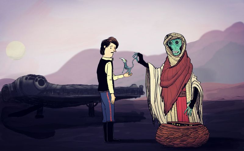
                        @kylebeaudette I love seeing this evolution. I do see a tangent with his collar and the mountain behind him though...

                        Chris Akins
                        www.chrisakinsart.com
                        www.instagram.com/chrisakinsart/

                        kylebeaudette 1 Reply Last reply Reply Quote 0
                        • kylebeaudette
                          kylebeaudette @chrisaakins last edited by

                          @chrisaakins here's the latest! Took Bradens advice to make the falcon a silhouette, and I moved mountains to get rid of that tangent😅
                          IMG_20200820_173834_972.jpg

                          Instagram- www.instagram.com/kyle_beaudette/
                          Www.twitter.com/kylebeautweet
                          Www.etsy.com/shop/Artofkylebeaudette
                          https://youtube.com/@kylebeaudette?si=ComtMDsVyK1HPn55

                          J 1 Reply Last reply Reply Quote 1
                          • braden H
                            braden H last edited by

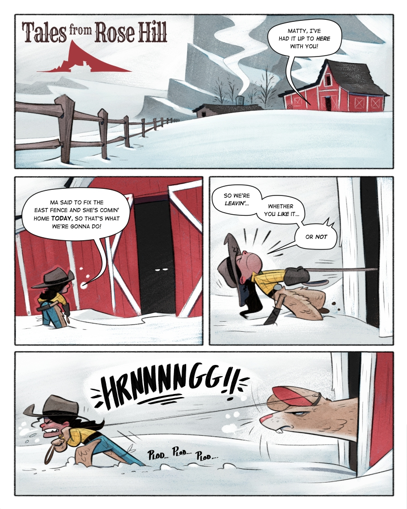
                            Okay! I've been inspired. I'm gonna get this short story done up.

                            There are a few places I feel I fell down in my webcomic. Getting caught up in details and overbaking textures; too many lighting details in regular panels Sound effects; and probably a few other areas.

                            SO! I got a couple fo questions for you guys as I 'develop my graphic novel style'.

                            1.) I'm using the same tools as I use for my regular illustrations. I like the idea of being able to do a graphic novel in the same way as I do a kid's book. Do you think this works?

                            2.) Do the hand-drawn sound effects work? (the 'HRRNNNNNNG' and stuff) or should I use a SFX font?

                            3.) I used very limited lighting passes. On the characters I did a very small occlusion shadow pass, and a very simple light pass. Is this enough? Not enough?

                            I wanna settle on a style before finishing this thing, so feedback is most appreciated 🙂
                            22772231-2918-48c6-a972-5dc8c5137e1f-image.png

                            J 1 Reply Last reply Reply Quote 2
                            • J
                              jdubz @kylebeaudette last edited by

                              @kylebeaudette I think you really improved the silhouette, but I think the contrast is too vast between the foreground/background (the values start to get lost around his legs). It just feels unnaturally dark on the lower side without much reason for it. I think it would help the foreground characters jump out to push all that into the background.

                              Something like the Falcon would be recognizable even if it was like 3% different from the mountain. So you don't need to make it really stand out that much to get the recognition.

                              Josh White
                              https://www.instagram.com/joshwhiteillustration/

                              kylebeaudette 2 Replies Last reply Reply Quote 0
                              • J
                                jdubz @braden H last edited by jdubz

                                @Braden-Hallett

                                Just one thing - specifically I'm not sure you need to "halo" effect that's around the character on the barn panel. I think the shadows and light are overall enough and separating the characters just fine. Overall I don't see any reason to change really much of anything.

                                Not sure about your #2 point. I think that'll come down to preference. I wouldn't count that as something you'd definitely do or not do. It communicates the point clearly. I think maybe the background white on it might be too much visually. If you even made it fade into the background a bit more, there's little chance it would get missed or misunderstood and it might put more emphasis on the character interaction.

                                I mean, despite the minor things you could change here and there, this really could be on a shelf somewhere.

                                Josh White
                                https://www.instagram.com/joshwhiteillustration/

                                braden H 1 Reply Last reply Reply Quote 1
                                • kylebeaudette
                                  kylebeaudette @jdubz last edited by

                                  @Braden-Hallett

                                  It's really gorgeous! I think this style works beautifully 👍👍
                                  As for the handwritten font for sound effects, it works better for me in the hnnnrrggh sound than the 'plod plod plod' part, but really only noticed that because you brought it up.
                                  And as much as I dont want you to, I bet you could simplify this style even more (backgrounds-wise)

                                  But hey, no need because it's very nice!

                                  Instagram- www.instagram.com/kyle_beaudette/
                                  Www.twitter.com/kylebeautweet
                                  Www.etsy.com/shop/Artofkylebeaudette
                                  https://youtube.com/@kylebeaudette?si=ComtMDsVyK1HPn55

                                  1 Reply Last reply Reply Quote 1
                                  • kylebeaudette
                                    kylebeaudette @jdubz last edited by

                                    @jdubz yeah, I see what you mean.
                                    I also know these characters are super flat and animated looking, while I like that, they could probably use a few passes...

                                    Instagram- www.instagram.com/kyle_beaudette/
                                    Www.twitter.com/kylebeautweet
                                    Www.etsy.com/shop/Artofkylebeaudette
                                    https://youtube.com/@kylebeaudette?si=ComtMDsVyK1HPn55

                                    1 Reply Last reply Reply Quote 0
                                    • kylebeaudette
                                      kylebeaudette last edited by

                                      IMG_20200822_122156_372.jpg
                                      Fought with this this morning. Saving it would merge all layers into something very different from what I was seeing while drawing. I use Sketchbook pro, not sure what I was doing wrong.
                                      In the end, I used snip tool to take a picture of the drawing.

                                      Instagram- www.instagram.com/kyle_beaudette/
                                      Www.twitter.com/kylebeautweet
                                      Www.etsy.com/shop/Artofkylebeaudette
                                      https://youtube.com/@kylebeaudette?si=ComtMDsVyK1HPn55

                                      braden H 1 Reply Last reply Reply Quote 3
                                      • braden H
                                        braden H @jdubz last edited by

                                        @jdubz said in Developing a 'graphic novel' style:

                                        Just one thing - specifically I'm not sure you need to "halo" effect that's around the character on the barn panel. I think the shadows and light are overall enough and separating the characters just fine. Overall I don't see any reason to change really much of anything.

                                        Iiiiiiinteresting! I'll take it out and play around with it.

                                        @jdubz said in Developing a 'graphic novel' style:

                                        I mean, despite the minor things you could change here and there, this really could be on a shelf somewhere.

                                        Thanks 😃

                                        @kylebeaudette said in Developing a 'graphic novel' style:

                                        As for the handwritten font for sound effects, it works better for me in the hnnnrrggh sound than the 'plod plod plod' part, but really only noticed that because you brought it up.

                                        Cool cool 🙂 I think I may get some options together and compare side by side.

                                        1 Reply Last reply Reply Quote 0
                                        • braden H
                                          braden H @kylebeaudette last edited by

                                          @kylebeaudette said in Developing a 'graphic novel' style:

                                          Saving it would merge all layers into something very different from what I was seeing while drawing. I use Sketchbook pro, not sure what I was doing wrong.

                                          Are you using a free version that doesn't let you save in layers? Seems strange it would flatten everything down on saving.

                                          1 Reply Last reply Reply Quote 0
                                          • kylebeaudette
                                            kylebeaudette last edited by kylebeaudette

                                            @Braden-Hallett
                                            Sketchbook usually lets me save in layers without issue. I mean, I thought it did?

                                            It's all free now, but I'm using a light version that works better on my Surfacebook2. I'll try opening the file in the other version I have...

                                            I've been toying with the idea of getting Clipstudio, and learning the ropes on that. I doubt a publisher would be thrilled to receive my .tif files from Sketchbook

                                            Instagram- www.instagram.com/kyle_beaudette/
                                            Www.twitter.com/kylebeautweet
                                            Www.etsy.com/shop/Artofkylebeaudette
                                            https://youtube.com/@kylebeaudette?si=ComtMDsVyK1HPn55

                                            braden H J 3 Replies Last reply Reply Quote 1
                                            • First post
                                              Last post