WIP Pinocchio escaping the whale - Critiques are Welcome!
-
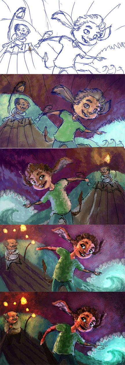
So I'm working on an illustration for an upcoming critique with Marco Bucci. I'm sort of stuck... Is it reading well? too boring? Colors working. Texture of the brush work too much? UGH!
"Never give up! Never surrender!" ~Commander Peter Quincy Taggert
-
@Katrina-Fowler I think if you copy your own style from your Charly submission that it will do a couple things - i think on your Charly illustration you used texture in some places and no texture in others - it was a perfect balance i think - it looked super professional - the other thing i think it would serve by following your own style would be to show that you can hit that style consistently - i think i remember Lee saying something like "make ten more like this and i see a book deal in your near future" - it was something like that....i would shoot for that - make this look like it could be the next frame from Charly illustration - this did not help at all i'm sure but thats what i was thinking
")
-
@Katrina-Fowler I like the forms, composition, colors and lighting but I feel like the textures are too heavy (for my taste)--especially on the boy and his "father."
I'd second @kevin-Longueil on his advice.
-
@Kevin-Longueil said:
@Katrina-Fowler I think if you copy your own style from your Charly submission that it will do a couple things - i think on your Charly illustration you used texture in some places and no texture in others - it was a perfect balance i think - it looked super professional - the other thing i think it would serve by following your own style would be to show that you can hit that style consistently - i think i remember Lee saying something like "make ten more like this and i see a book deal in your near future" - it was something like that....i would shoot for that - make this look like it could be the next frame from Charly illustration - this did not help at all i'm sure but thats what i was thinking
Kevin. THANK YOU!!!!!!!!!!! I KNOW I needed to hear that! I've been floundering lately and your advice was just perfect! This pinocchio piece has been stuck for a while and instead of tossing it and moving on I tried to grind it into submission which ultimately killed it. Sigh... Bye bye bad piece.
Now on to something better!
Phew! I feel much better now!

-
@mattramsey said:
@Katrina-Fowler I like the forms, composition, colors and lighting but I feel like the textures are too heavy (for my taste)--especially on the boy and his "father."
I'd second @kevin-Longueil on his advice.
Thank you Matt for the comment. I agree that the texture is a bit much and it's great that someone else can 'see' it as well. Think I'm going to let this piece rest for a while and work on something else.