JULY CONTEST: Design a book cover for the Wizard of Oz
-
@JessicaStauffer I really love the art style of this. The character design is unique and there is so much to discover!
-
@DKRyland I really love this. I could see this as the cover for a 1930's Futurist re-write of Dorthy's adventures or something. Really beautiful portrayal of Oz. The vintage textures are terrific!
-
Hi Everyone! Here's my submission this month. I wanted to do something completely different than I've ever seen for an OZ cover. Coincidentally, I've been working on my own version of this story for about a year now, so this was super fun to work on for me! Hope you enjoy!
-
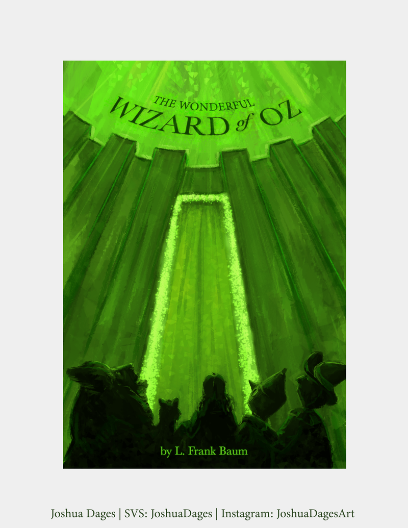
Hi everyone, here is my entry for this month's contest.
-
@JoshuaDages Thank you so much! I really love the green glow of everything and the texture on your piece, it just makes it feel like there is something beyond !
-
@JessicaStauffer LOVE the tin man and the Lions posture!
-
@Ross-Cuellar-0 Thank you! I took the gesture drawing and character design classes SVS has and they helped me soooo much with the design/movement in the characters. I was really happy with how they turned out!
-
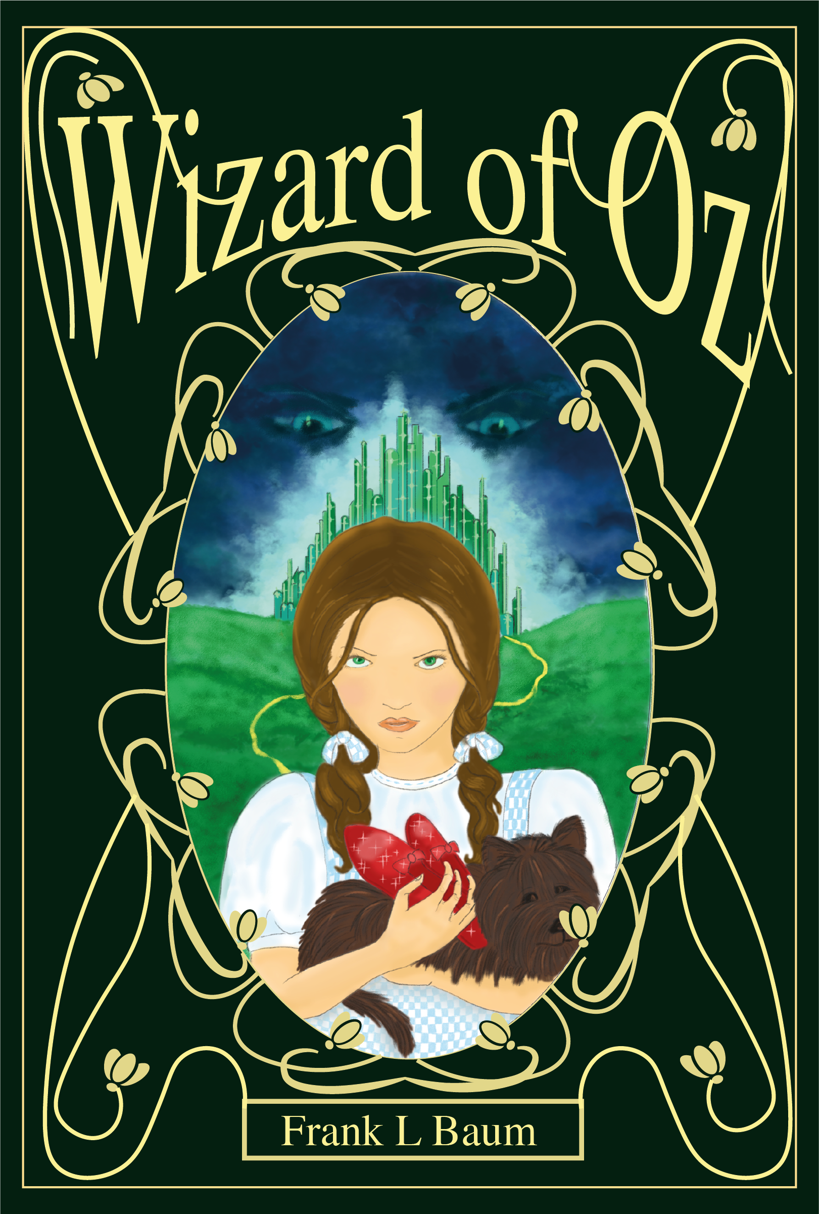
Rachel Penman
www.rachelpenman.co.uk(it was on the image...no idea where it went!!)
-
@JessicaStauffer Thank you!
-
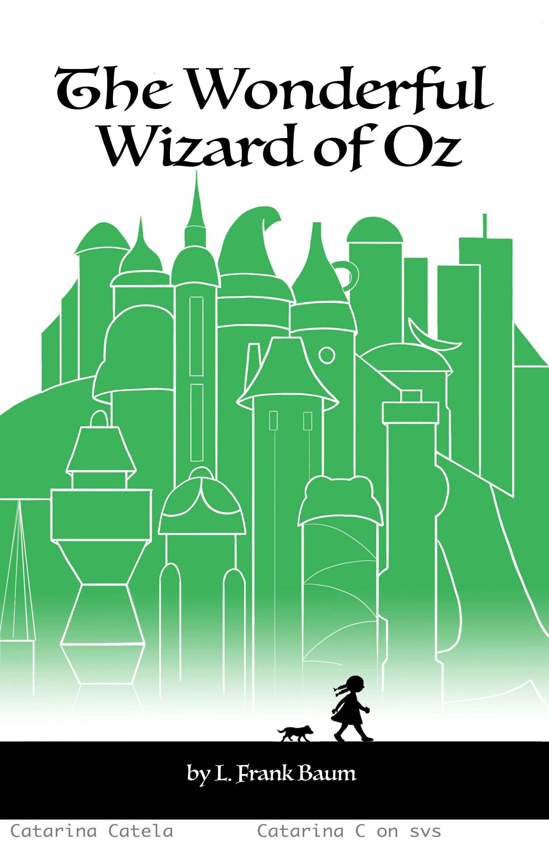
Hello all - here is my submission:
-
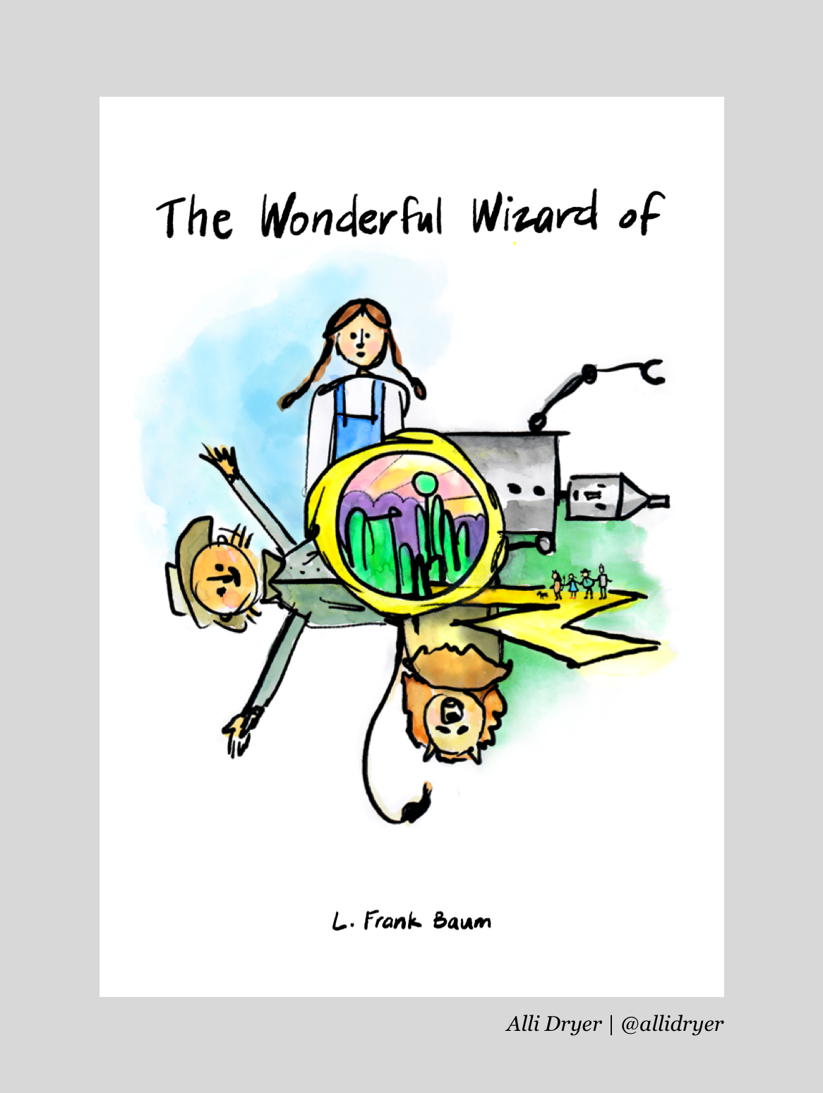
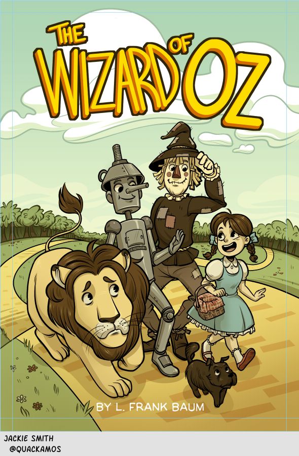
Here is my completed piece, I wanted to do something also in the graphic novel/comic style, and as well as incorporate a hint of the "rubber hose" style of cartoons for fun! I'm nervous posting, but I really want to try get more pieces in my portfolio this year. :' )
-
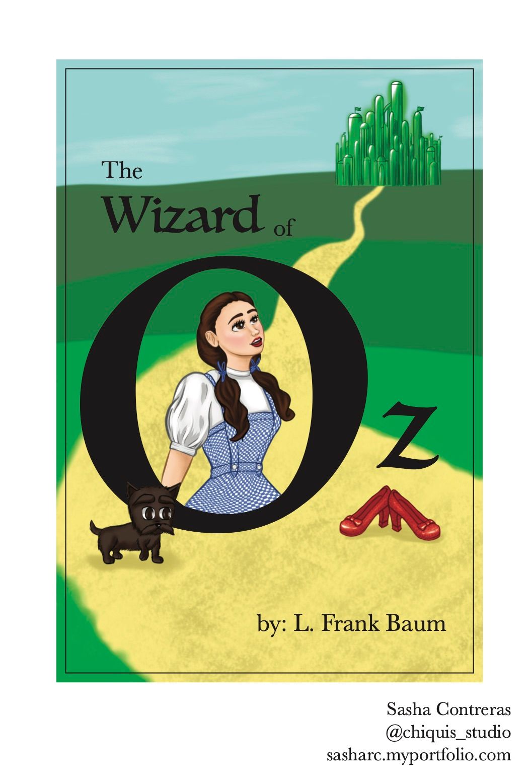
My entry for the Wizard of Oz book cover illustration
-
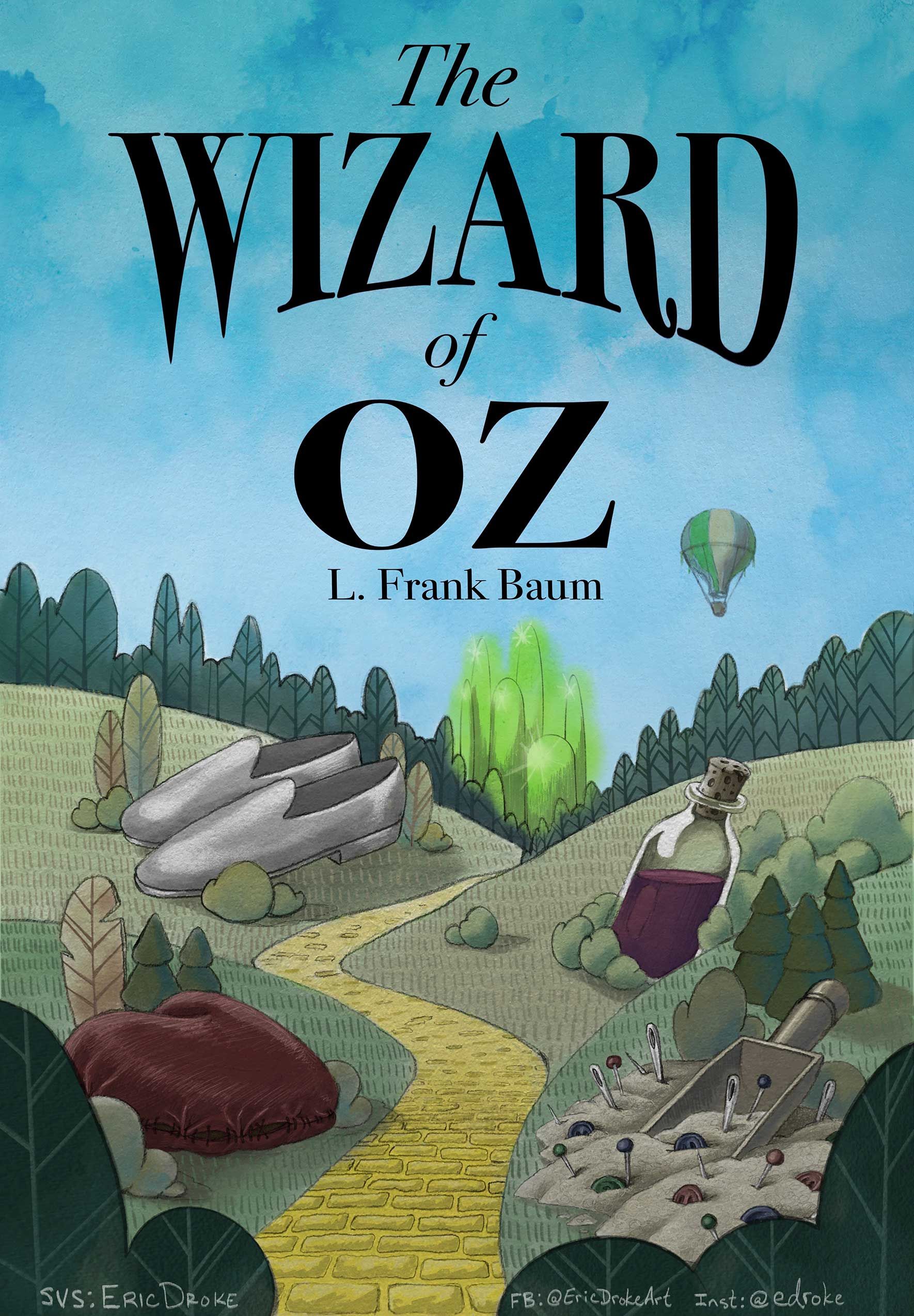
Here's my post for the July contest. It was a challenge working with such an iconic piece of literature. It was tough trying to avoid the original aesthetic, not to mention the movie's influence. I'm still very new to this, so definitely a good challenge for me.
These are the gifts (in the book) given by the Wizard: a silk heart filled with sawdust for the Tin Man, a scoop of bran filled with pins and needles ("bran new brains") for the Scarecrow, and a bottle of "courage" potion for the Lion. (Also, Dorothy's shoes are silver in the book.) All these things were just substitutes for the real gifts acquired along the journey on the yellow brick road... love, wisdom, courage, and a way home. Hope you enjoy!
-
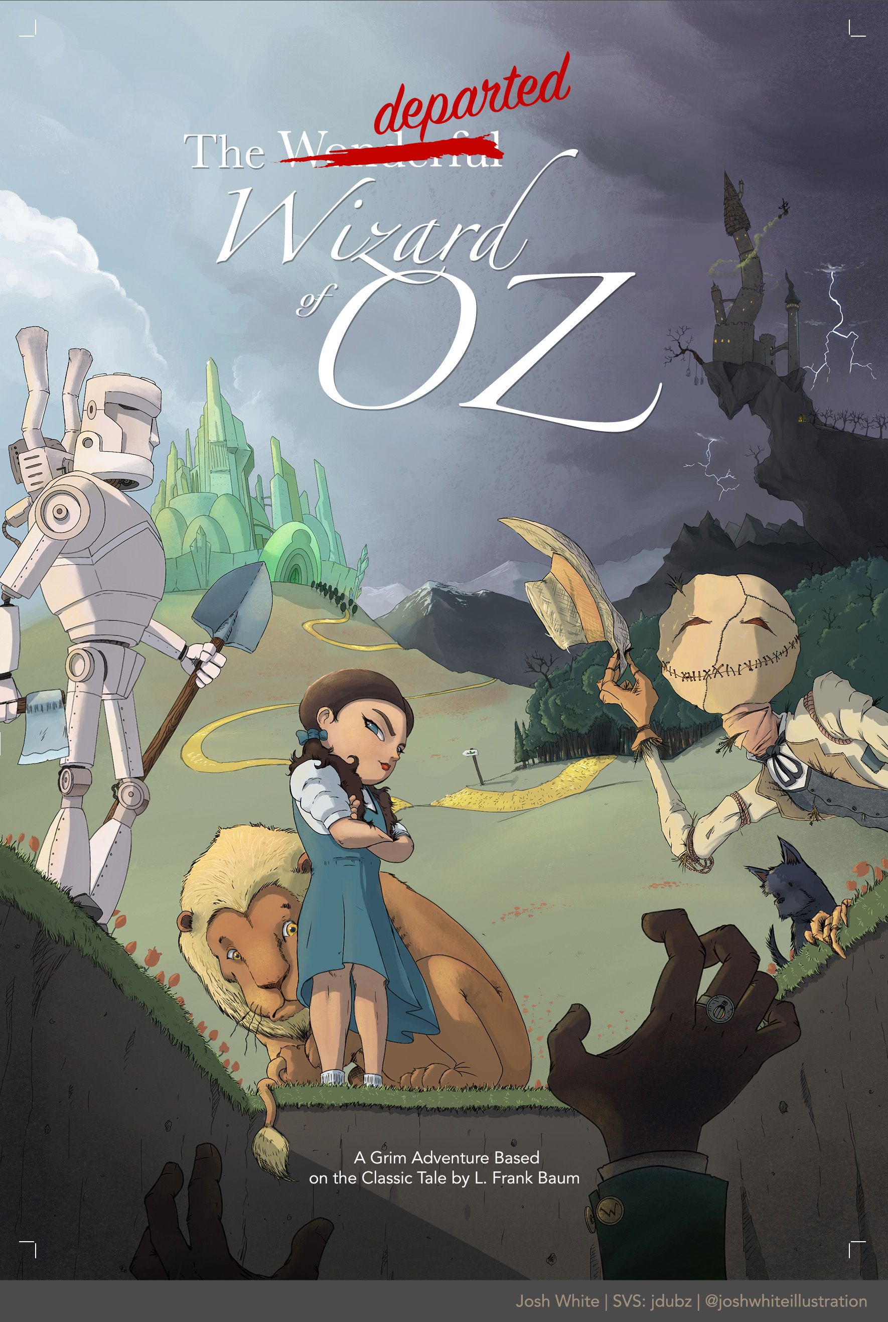
Here's my submission. I'm kind of out in the weeds on this one a bit because it's more of an adaptation of the book, but I really wanted to push myself with mixing styles and I've really been wanting to practice some graphic novel looks, so here we go

-
@Quackamos it’s so cute!!!! This looks like it could be the cover of a comics
-
@jdubz ha!


 this is a fun one. Maybe instead of “Missing” you could write “Departed”, The Departed Wizard of Oz.


-
@Nyrryl-Cadiz Ohhh I like that. I had like 5 words I was trying to figure out and I replaced Vanishing with Missing... I think I like Departed more. Didn't even occur to me

-
@jdubz this is really good, great use of shadow. I wonder how strict the judges will be about changing the brief. It's a great portfolio piece either way, and that's the main goal at the end of the day. Love the dark castle on right too.
-
I don't know if they'll judge based on the spec, but my opinion is that it's disrespectful not to follow them. They would have intended us to follow them or they wouldn't have written them. You wouldn't do this with an actual client would you?
-
@deborah-Haagenson yes that's what I thought, I assumed Jake's intention was to create a more realistic brief as if we were working for a client, so I've stuck to the specs. But if it doesn't align with the market people want to work for, I guess it makes more sense to create something more specific to their portfolio aims. I wonder if solutions that don't fit the brief will be considered in the final 16.