Forum interface issues
-
@sdn I did find the menu that gets me back to recent posts from and about me...that helps....part of it is my newness
-
@Griffin said in Forum interface issues:
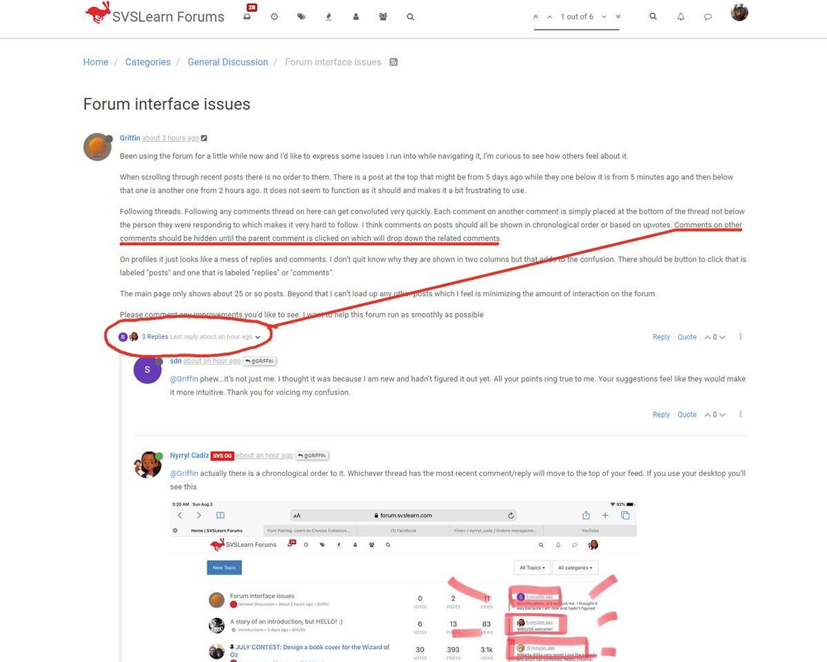
Following threads. Following any comments thread on here can get convoluted very quickly. Each comment on another comment is simply placed at the bottom of the thread not below the person they were responding to which makes it very hard to follow. I think comments on posts should all be shown in chronological order or based on upvotes. Comments on other comments should be hidden until the parent comment is clicked on which will drop down the related comments.
I get that you want the posts and comments to be like facebook’s and instagram or any other popular social media platform. I would love that too. That would make our interactions way smoother. But let’s remember that we’re using this forum for free. The owners of SVS are paying every month just so we can have a place to connect. They don’t do ads so no extra revenue. Good for us but bad for them. Let’s just be thankful for what we have.
The main page only shows about 25 or so posts. Beyond that I can’t load up any other posts which I feel is minimizing the amount of interaction on the forum.
Just scroll down more and it’ll show you more posts
-
@Nyrryl-Cadiz and yes, very thankful...esp for those who come along giving time to help strugglers....a great help
-
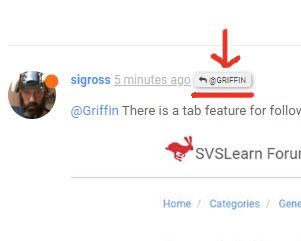
@Griffin There is a tab feature for following a thread. I think It depends on whether someone replies to that thread or press the big reply button at the bottom.
-
@sigross cool! I didn't know there was this function. you really learn something new everyday, huh?
-
@Nyrryl-Cadiz Yes it's handy that! Also if you click the button by that persons name it'll take you to that post.
-
@sigross very cool
-
@Nyrryl-Cadiz aaahh, interesting. I didn’t realize it ordered it that way, thanks for bringing that to my attention. However that still feels like a very odd way for posts to be organized. I think recent posts are more relevant than recent comments because someone could make a comment on a really old post and then that post will be at the top but that doesn’t make it any more relevant to others on the forum.
-
@Nyrryl-Cadiz I am very grateful to have this forum. I don’t mean to sound as though I am making demands, I simply wanted to create a discussion for issues that users have run into. I have no idea how much control the svs team has over this forum but if they are ever able to make changes I just want to have these ideas out there to help them improve it.
-
@sigross oh cool! This will definitely be helpful but it still confuses me that replies show up under the drop down for the comment and also farther down in comments where they are not attached to their parent comment.
-
@Griffin so you're saying the recent comments left by people are not relevant because they are left on older threads? The fact that people are continuously leaving new comments on an older post speaks how relevant that post is.
-
@Nyrryl-Cadiz hmm, the way I see it is that ordering posts by recent comments instead of recent posts is like organizing from specific to general topics instead of general to specific. I think more recent posts are much more likely to be relevant to everybody while a recent comment on an old post could be something bad simple as "wow, I love your work!" which doesn’t make the post any more relevant to other users. I’ve never used other forums before so I don’t know if there is some kind of norm and maybe I’m just not used to this format. Figuring out what works and doesn’t for people is what this post is all about so thanks for offering your perspective!
-
@Griffin just because a post is new does not mean it's more relevant than the old ones. if we follow your suggestion threads like the monthly art contest will be buried by the end of the month and it will be hard for participants to post their last minute entries. The monthly sketchbooks where members posts the projects they're doing for the month will be hidden. People who have updates on projects they started months ago if not years ago will have no chance of getting heard. There are a lot of discussions that span days even months on the forum. Just because a post is old does not mean it's useless.
Also, what's so bad with saying "I love your work" or "looking great" or "beautiful!"? Just because you're not getting anything out of it does not mean it's worthless. It may not mean anything to you but it can do wonders to those who made that initial post.
-
I agree that this forum is not necessarily formatted or organized super well. I'd love to keep a sketchbook here, but the threads are not setup in a way for that to be practical. It's kind of a free for all where things can get buried quickly and I miss out on some threads I would otherwise be interested in. But I do personally like that it's organized by recent comments, because that's where more real time convos are happening, even if a thread is picked back up after a while.
In my ideal world there would be a few permanent sections like "Intros" "Contest" (The current contest pinned to the top, with contest WIPS underneath) "Business" "SVS Classwork". Etc. And the posts in the different sections would be organized by recent comments. You'd be able to come on the forums, see all the sections, with a few of the recent posts in each section displayed, and then be able to see more of them when you click into the actual sections.
That being said, I will say that I've gotten very used to the forums as is, and it's still a very enjoyable experience for me. I jump on, see if I have any notifications. Glance through the top 10-15 topics to see if I want to jump into any convos, lookout specifically for the contest and monthly studio thread, and refer back to critiques offered on my work. I sometimes use the search feature to track down past convos that were helpful.
-
@Nyrryl-Cadiz I think there’s been some misunderstanding
 I think it’s great for people to compliment others work! We are all here to help and support one another. I only used that as an example because although it is important to the person who posted it it’s not a comment that would typically open up discussion within a thread so it might not make sense for it to be brought to the top of the forum
I can see how sorting by recent comments makes sense in a forum like this because that’s where so much happens. I’ve only recently become a regular user on here so I may just need some time to warm up to it. Thanks for helping me understand the forum better

-
Personally, I actually like the fact that this site is a Forum set up and not like Facebook or IG or Twitter... I've done the FB group thing and it's exhausting. FB's interface doesn't promote (require?) in-depth conversation like a forum does. If I want a quick thumbs up/down on an image I'll post to FB, but I much more often desire actual justified thoughtful input and I only get that when I post here. There are "upvote/downvote" buttons on the bottom right of every post that facilitate simple "I like it" commentary without needing to make an actual post. I use that tool more than anything else because I realize I can't add anything substantive to a conversation and don't want to bog it down with "Cool!" all the time.
Being an old grognard over 50, I know that forums require a different mindset than the user interfaces of FB or Instagram or Twitter. The honest truth is forums demand more time and investment to use. They aren't built for passive "check-ins", and they don't interface with mobile very well. I'd venture to guess the average age of the folks using this particular forum is slightly older than, say, Schoolism's FB group for example--and that has to do with the industry itself--a lot of folks who illustrate children's books are slightly older than those desiring to go into animation or movies, or it's a "second career" after investing in an initial one. And most already have social media accounts where they post their work for exposure. There's a different reason they specifically come here.
I'm so sorry, but there's just no getting around the learning curve to using all the little hidden functions of forums (and you're right--they are set up differently and have different UIs for each site wherever you might find them), and the community cultures they generate don't always facilitate quick pop-ins and pop-outs a lot of the time, making engagement a bit of a hurdle for newbies..
There are mechanisms to help you save time, though.
You can tell the thread page to not show any threads you've already clicked on.

The drop down menus on the right can narrow down what appears in your thread list. One setting, "Watched Topics" under the All Topics button will give you threads only you've made.

And the All Categories button can narrow your search to different categories, but that is completely dependent on the original thread-maker opting to use the correct category for their particular topic.
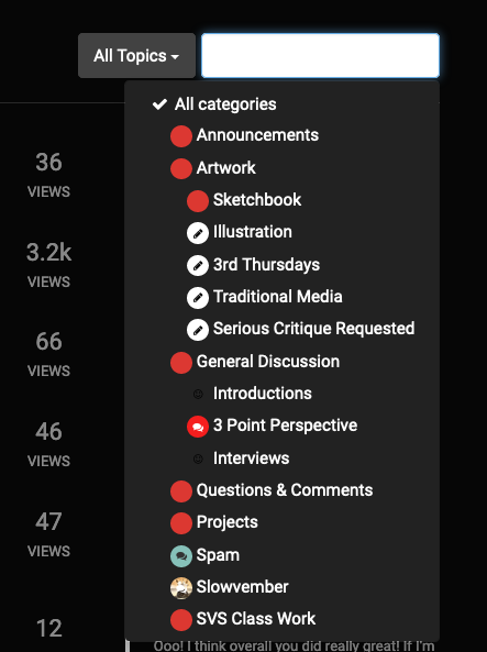
Also note that there is a chat option next to your profile pic on the right that enables you to DM any user without needing to post a thread. AND you can actually follow different users and all their posts by going to their profile page and clicking on the "+" symbol on their icon.
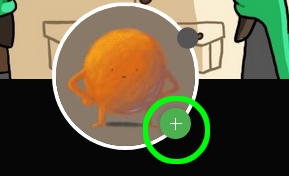
In the beginning I, too, was like "why do I have to wade through miles of posts I don't want to read?" And then I came to the personal conclusion that while I didn't want to read them, there was actually a lot of good stuff I needed to read. And I've settled on clicking and then closing the thread so the mechanism registers that I've read it. In this forum in particular, correctly informative titles and properly used categories can save a lot of time. It's just making sure we, the community, use them enough for them them to matter and have relevance.
Please please hang in there. It gets easier. The content on the forums is worth the time it takes to assimilate the UI. I know you're going to get a lot out of what we all share. I know I have, and I'm thankful I found this place.
-
Unless I’ve missed it in your comments, I’m having a different issue. When I’m scrolling on my iPad to go through all the comments, the page scrolls up or down by itself and skips comments. It always happens when I’m trying to see everyone’s submissions for the contests. Is this happening to anyone else?
-
@silvialcg Yes, that happens to me even on my laptop. It has to do with how the comments/images load versus the speed the scrolling happens. If you scroll faster than the images/comments can load, they will load "behind you" and you will find you've skipped over the comments that didn't have time to load. I've had to check my scroll speed and slow down so it gives the connection time to load everything. There really isn't anything that can be done that I know of... @Chip-Valecek might, but I don't. He does webdesign for a living. And of course sending an email to the SVSLearn folks might get you a better answer than mine...
-
@Griffin said in Forum interface issues:
On profiles it just looks like a mess of replies and comments. I don’t quit know why they are shown in two columns but that adds to the confusion. There should be button to click that is labeled "posts" and one that is labeled "replies" or "comments".
I agree with your sentiments about the usability of the forum, especially when you’re new like I am, but I’m gradually learning how to run with it and make it work best for me. Although, if changes could be easily made to the format in the future then it’s good to have a thread like this to talk about our different experiences

Upvotes seem to affect the order of comments in a post with the higher voted and therefore more useful replies will be pushed closer to the top beneath the original post. But it really does adversely affect the reading flow ..as does the repetition of the replies directly beneath comments (where I prefer them because you can see the whole conversation in one area without scrolling) as well as in consecutive order (unless an upvote pushes it up the thread haha) along with the rest of the unlinked replies. This is the one thing I would fix if I could.
As for within your profile, the left hand column are your ‘best’ posts i.e the upvoted, most helpful/popular posts and the right hand column are your most recent communications, which is straight-forward system when you know about it.
-
@sigross This is a very useful shortcut to learn about! Thanks for sharing
