Society of Visual Storytelling

    SVSLearn Forums

    • Register
    • Login
    • Search
    • Recent
    • Tags
    • Popular
    • Users
    • Groups
    • Search

    Feedback on Black and White sketches for MG/YA

    Artwork
    4
    7
    260
    Loading More Posts
    • Oldest to Newest
    • Newest to Oldest
    • Most Votes
    Reply
    • Reply as topic
    Log in to reply
    This topic has been deleted. Only users with topic management privileges can see it.
    • ChloeB.artistry
      ChloeB.artistry last edited by

      This is new territory for my portfolio, I appreciate any feedback y'all have time for.
      I want a few sweet illustrations that show how I'd handle b&W work. I want to show characters/emotion/and an environment.

      I'm also wondering if mockups of the images on the pages of a book is helpful to upload to my site, or if I should just keep it images-only? (once I complete them)

      THANKS to anyone who takes the time!

      MGHomecoming2.jpg MGHomecoming.jpg homecoming3.jpg homecoming2.jpg homecoming1.jpg

      Nyrryl  Cadiz 1 Reply Last reply Reply Quote 2
      • Nyrryl  Cadiz
        Nyrryl Cadiz SVS OG @ChloeB.artistry last edited by

        @ChloeB-artistry Hi! I love your illustrations. I don't see any major issues so great job! My one critique is to loose the text. Since it's not really telling the story, it's not important. My agent once advises me that clients love to envision their own text on the illustration. Instead, you can use maybe some blocks of lines in lieu of the text.

        Portfolio: nyrrylcadiz.com
        Instagram: https://www.instagram.com/nyrryl_cadiz/
        YouTube: https://www.youtube.com/channel/UCbJCF1Im8ZO7hpGWTKOJMuA

        ChloeB.artistry 1 Reply Last reply Reply Quote 0
        • idid
          idid last edited by

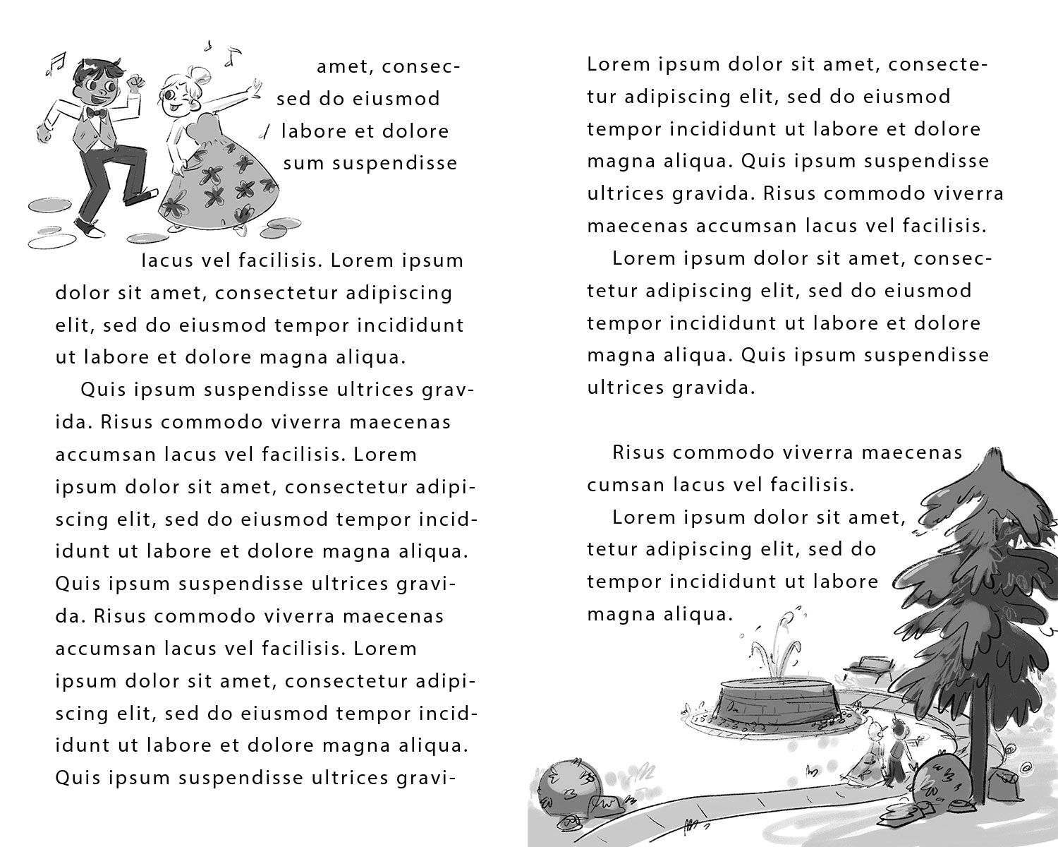
          Great job! One thing I noticed is the distance between image and text. You may want to leave more wrap-space between image and text to give people a bit "breathing-space".

          I would also recommend change "lorem-ipsom .... " to real text.

          One thing I am not sure myself and would like to hear opinions from more people --- is whether to put text there at all. Which is better, illustration/text or just illos on website?

          ChloeB.artistry 1 Reply Last reply Reply Quote 0
          • ChloeB.artistry
            ChloeB.artistry @Nyrryl Cadiz last edited by

            @Nyrryl-Cadiz Thanks for the feedback - I'll definitely try one with lines instead of text to see how it looks!

            Nyrryl  Cadiz 1 Reply Last reply Reply Quote 1
            • ChloeB.artistry
              ChloeB.artistry @idid last edited by

              @idid Thanks, yes, great point.

              I feel like it works best if it's in a mockup-verison - like photoshoped into an open book. Just as this flat image with text like this isn't really speaking to me?

              1 Reply Last reply Reply Quote 0
              • Nyrryl  Cadiz
                Nyrryl Cadiz SVS OG @ChloeB.artistry last edited by

                @ChloeB-artistry you could also use rectangles for blocks of text

                Portfolio: nyrrylcadiz.com
                Instagram: https://www.instagram.com/nyrryl_cadiz/
                YouTube: https://www.youtube.com/channel/UCbJCF1Im8ZO7hpGWTKOJMuA

                1 Reply Last reply Reply Quote 0
                • Art Dud
                  Art Dud last edited by

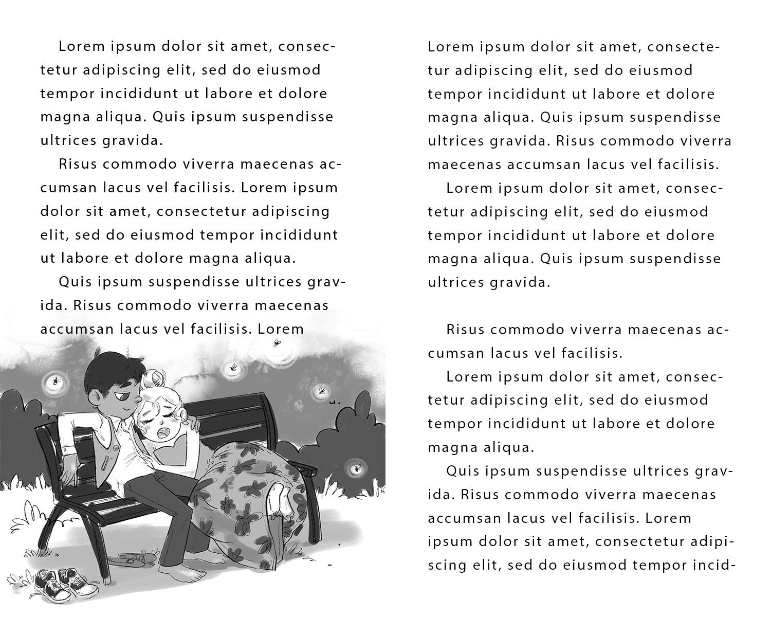
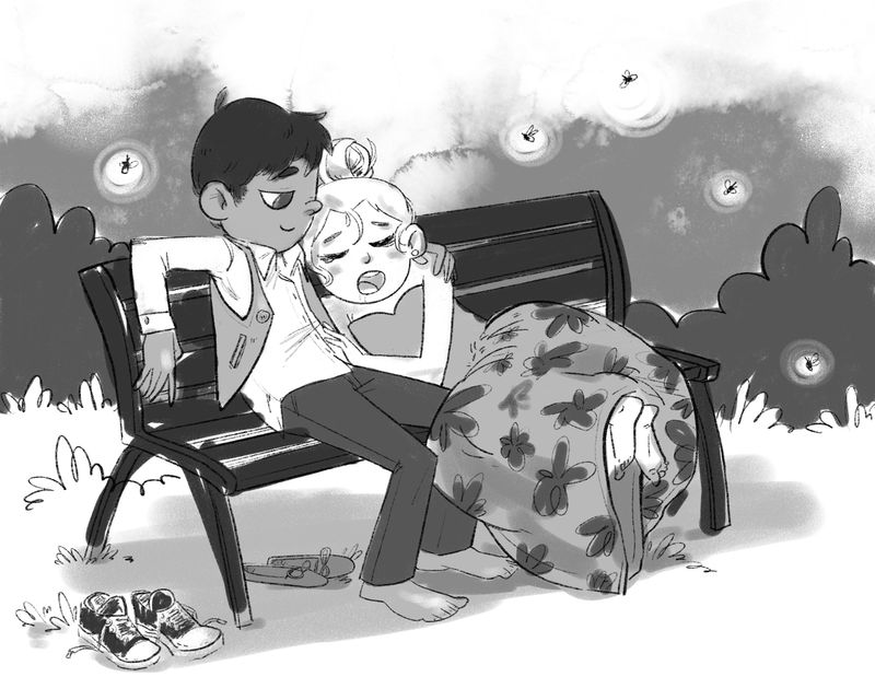
                  I love the energy of your illustration Style. My only observations is wiThe the bench scene, her legs appear to be floating off the edge of the bench. I love the emotions conveyed.

                  www.chrisdudleyart.com
                  @artdud
                  Instagram: @chrisdudleyart

                  1 Reply Last reply Reply Quote 0
                  • First post
                    Last post