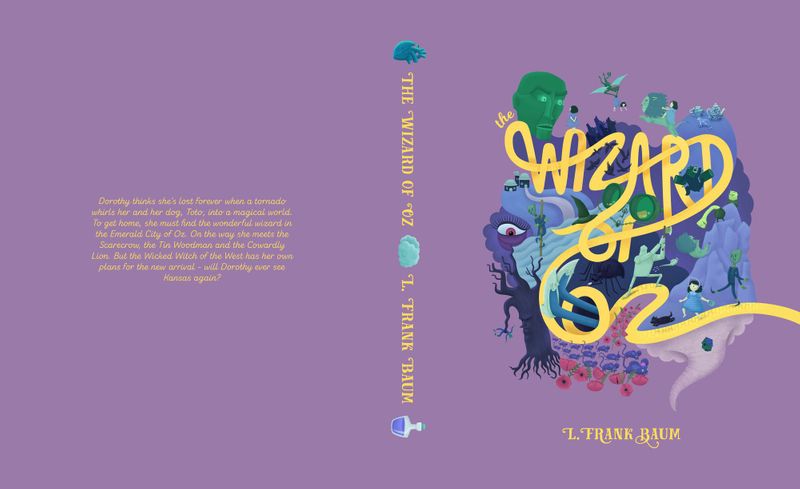
Wizard of Oz improvement help
-
Hi all,
I'm looking for a little advice in improving the cover I did for the Wizard of Oz brief last month. I feel like there could be a great portfolio piece here, but it is too messy at the moment. Do you think it would work better if all the other elements other than the road were similar colours so only the title stood out and the rest looked like one piece until closer inspection? Or if I took out some of the elements? I think the Kalidah falling needs improving, the log, for example, could be better and the whole thing is very dark compared to the rest.
For the back, I was planning on adding a small emerald city below the text and the hot air balloon in the top left corner, unless you have any better suggestions?
-
@carrieannebrown hi I think this pice is amazing. My one suggestion is to rework the values. Maybe lighten the background and darken the illustrations. Other than that, I think your work looks great
-
I'd focus on the front illustration, instead of the layout - since it doesn't seem like the full layout is adding anything special. I think this was one of the strongest illustrations in the prompt last month. I think it holds together well, and the fact that you included so many elements is pretty amazing. And of course the type treatment is wonderful. I don't think there much more to improve.
-
For the whole layout, maybe have the yellow brick road continue onto the back and end in an illustration of something like the house with the feet sticking out of it? Otherwise, I'd agree with @fpichel that the illustration as a vignette alone is very strong and not to worry about the whole layout for portfolio.
-
I really loved your piece! I like the suggestions of reworking some of your values. Along these lines, I wonder if Dorothy and the Scarecrow, and the edge of the silver slippers are getting lost too much. The title, the Tin Man, the eye, and the tree standout so beautifully. The rest of the elements kind of merge together, but you can still make them out, which is appropriate for less important focal points and to help our eye focus on more important things.
Dorothy and the Scarecrow are important elements, and yet they are getting pretty lost in their backgrounds. Dorothy's dress is pretty much the same value and close in hue to her back ground, and I couldn't tell she was wearing a bonnet until I looked closer. The Scarecrow's head is also a similar value to the background. I'd recommend contrasting the bottom Dorothy and the Dorothy looking at the head, (maybe even Dorothy riding the Lion) from the background more, and contrasting the bottom Scarecrow and the Scarecrow by the Tree from the background as well.
-
This was one of the coolest concepts of the month! I loved looking at all of the details. I agree with @fpichel and @Carmanda about focusing on the front illustration unless you're going to add something to the back.
But since you have a cool spine design, you could also do a book mockup that shows the front and spine so that that both are seen!
Really enjoy your piece!
Josh -
This has some amazing details and shows a lot of technical skill and oh-my-goodness a lot of hours of labor. Awesome. I love what you've done with the text, perhaps the same with the treatment of the elements of the design? Lead the eye through with size and value and highlight the focal point with pops of color. What do you think? For example, the eye (the witch?) on the right is where my eye goes first, last, and in between. The wizard's head is huge and I think I looked at it early, but only because my eye couldn't find where else to land. I love the little Dorothy near the scarecrow, but I didn't notice her for a long while. Using James Gurney's studies about eye movement through art, I'd guess you want to see the Dorothy on the road (with Toto) first, then travel up to the wizard's head, then along the yellow brick road, back to Dorothy and then back in for more juicy details. Perhaps that can help guide you as you make color/value/size decisions. Also, another direction for this piece would be more monochromatic. Something like the Uncommoners covers by Karl James Mountford? Also, I agree the value of the background purple is distractingly dark. Keep moving forward!