Society of Visual Storytelling

    SVSLearn Forums

    • Register
    • Login
    • Search
    • Recent
    • Tags
    • Popular
    • Users
    • Groups
    • Search

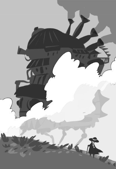
    Howl's Moving Castle - Book Cover WIP

    Artwork
    15
    17
    815
    Loading More Posts
    • Oldest to Newest
    • Newest to Oldest
    • Most Votes
    Reply
    • Reply as topic
    Log in to reply
    This topic has been deleted. Only users with topic management privileges can see it.
    • xin li
      xin li last edited by

      Really cool design, all of them.
      My favorite is #1, very dynamic.

      Web: www.lixin.no
      IG: www.instagram.com/lixin.illustration/

      1 Reply Last reply Reply Quote 1
      • TessaW
        TessaW last edited by

        These are such cool thumbnails. I like 1 and 3. At first I was slightly drawn more to 1 because of it's epicness, but I think as is, I could envision 3 more on book shelves in libraries and in stores. I think you are hitting your keywords and you could even say that option 1 also conveys "traveler" and option 3 also conveys "quirky".

        I don't think the text is incorporated as well into 1 as it is in 3. I think having the text be so large, dark, and in a block shape right in between Sophie and the castle diminishes the impact of the view Sophie is experiencing.

        Website: www.tessawrathall.com

        Instagram: www.instagram.com/tessawrathall_art/

        carriecopadraws 1 Reply Last reply Reply Quote 2
        • carriecopadraws
          carriecopadraws SVS OG @TessaW last edited by

          @TessaW Would #1 be better as a full-page interior illustration instead than a book cover? I do like the epicness of it, and without text you'd get the full effect of the castle in the fog.

          howl sketches opt1-interior.jpg

          Carrie Copa
          https://carriecopadraws.com/

          Laurel Aylesworth 1 Reply Last reply Reply Quote 2
          • NessIllustration
            NessIllustration Pro @carriecopadraws last edited by

            @carriecopadraws I love 3! Yes I think 1 would work better as an inside illustration.

            vanessastoilova.com
            instagram.com/vanessa.stoilova/

            Check out my Youtube channel for tips on how to start your career in illustration! www.youtube.com/c/ArtBusinesswithNess

            1 Reply Last reply Reply Quote 1
            • djlambson
              djlambson last edited by

              I love 3 as well..my focus is on the castle rather than the typeface. It's very exciting, even in black and white!

              https://www.instagram.com/deborahlambson_art/
              https://deborahlambson.com/folio

              1 Reply Last reply Reply Quote 2
              • korilynneillo
                korilynneillo @carriecopadraws last edited by

                @carriecopadraws I've been so excited to see what you do with this! I really like #3 - I agree with everyone that #1 would make a fantastic interior!

                instagram: instagram.com/korilynneillo
                Twitter: @korilynneillo
                Portfolio/shop: korilynneillo.art

                1 Reply Last reply Reply Quote 1
                • Chris Perry 0
                  Chris Perry 0 last edited by

                  I like the comp of 2 but the castle on 3. Good job!

                  1 Reply Last reply Reply Quote 1
                  • Nyrryl  Cadiz
                    Nyrryl Cadiz SVS OG @carriecopadraws last edited by

                    @carriecopadraws they all look so good!

                    Portfolio: nyrrylcadiz.com
                    Instagram: https://www.instagram.com/nyrryl_cadiz/
                    YouTube: https://www.youtube.com/channel/UCbJCF1Im8ZO7hpGWTKOJMuA

                    K.Flagg 1 Reply Last reply Reply Quote 1
                    • K.Flagg
                      K.Flagg @Nyrryl Cadiz last edited by

                      @Nyrryl-Cadiz I think #3 just has such an easy read to it. I do like the composition in one so I like the idea of an interior for that one. That was a great idea.

                      K.Flagg

                      1 Reply Last reply Reply Quote 1
                      • J
                        Joanne Roberts last edited by Joanne Roberts

                        #1 is very good: clear and appropriate, but I feel like I've seen it before. Besides, #3 is fantastic. a great silhouette and clean design! Hope that helps

                        1 Reply Last reply Reply Quote 1
                        • carriecopadraws
                          carriecopadraws SVS OG last edited by

                          Thanks everyone! #3 seems like the clear choice, with #1 as an interior illustration. I'm excited to go forward on this!

                          Carrie Copa
                          https://carriecopadraws.com/

                          1 Reply Last reply Reply Quote 0
                          • Laurel Aylesworth
                            Laurel Aylesworth @carriecopadraws last edited by Laurel Aylesworth

                            @carriecopadraws I think this is a great choice for the cover. You don't have to take this suggestion, but I'm wondering if the clouds/negative space could be an opportunity to be a second read (maybe it's a profile of one of the characters?). Either way, this is looking good. Edited: whoops. You're going with #3 -- my comments were regarding option #1.

                            www.laurelaylesworth.com
                            instagram.com/laurelaylesworth

                            1 Reply Last reply Reply Quote 0
                            • VeronicaMui
                              VeronicaMui last edited by

                              Loving this, looking forward to seeing it in color

                              WEB: Www.veronicamui.com

                              IG: https://www.instagram.com/Veronica.mui

                              1 Reply Last reply Reply Quote 1
                              • Jade Vaughan
                                Jade Vaughan last edited by

                                @carriecopadraws Ooh! Exciting to see your progress on HMC. Makes me want to pick up a pen and start now too though I’m only halfway through the book (finally got it!).

                                I agree that #3 is the best cover design and the first would make a lovely interior art piece.

                                Instagram: www.instagram.com/jadepagecraft/
                                Portfolio: www.jadesv.myportfolio.com

                                1 Reply Last reply Reply Quote 1
                                • First post
                                  Last post