Ninja Turtle Commission - Feedback Please :)
-
Hi SVS Peeps,
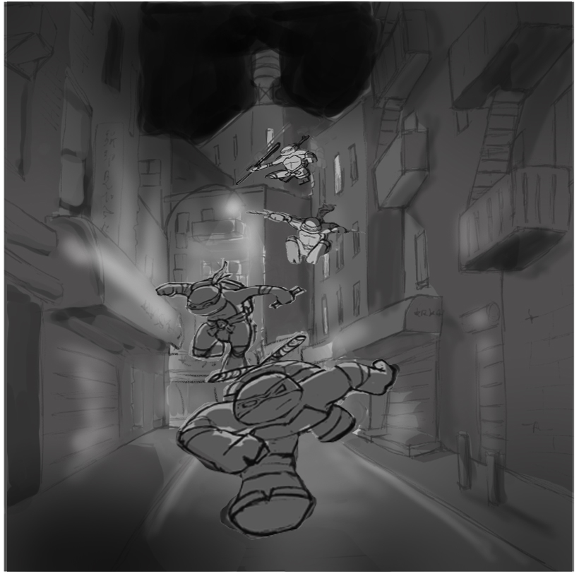
I'm trying to do more environments and am pretty terrible at bringing it all together. I'm working thru the composition class and trying to apply the principles as I go, but would love feedback on lighting and composition if anyone has time.
Draw overs and redlines are always appreciated.
")
Thanks so much,
Kendra
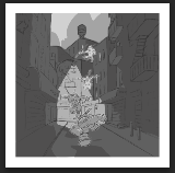
Squint Size
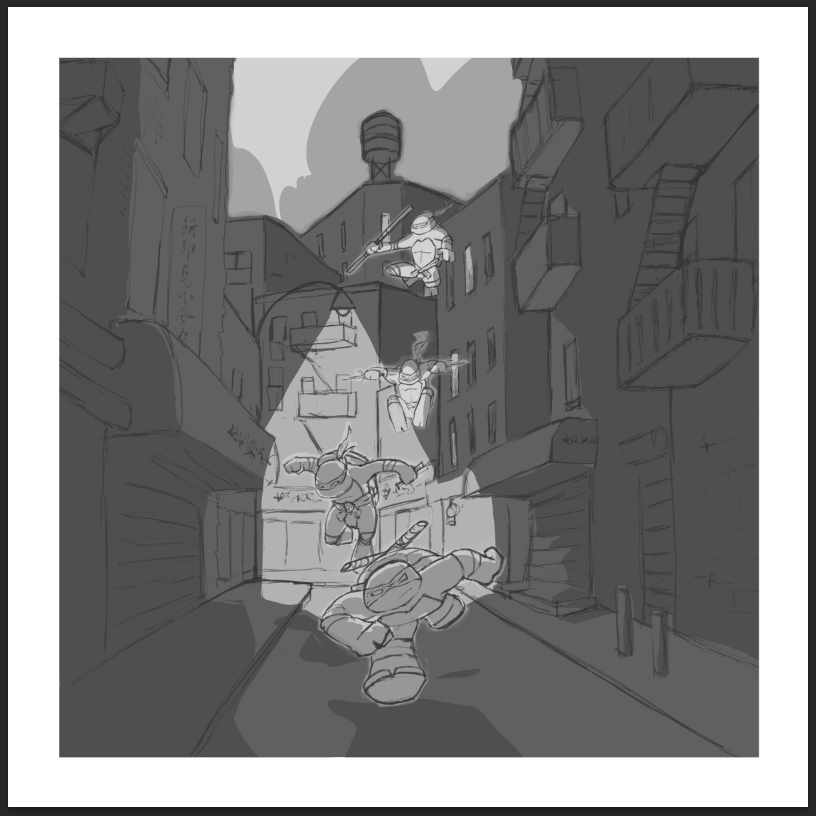
Full Size
-
Hi Kendra!
I am absolutely no expert myself, but I can try to help!
Globally, I think it's a great sketch!
What strikes me is that the top two ninjas read really well (light against dark) however, the two other ninjas don't really read at the "squint" size... especially the third one from the top. He is very similar in value to the background. I would try having him a little darker and or the background a little lighter.Also, the first ninja at the top of the image is kind of creating a tangent with the side of the building. It is not clear wether he is suppose to be in the air, or standing on the building.
Finally, I think you could increase the contrast in the ninja themselves (e.g. darker clothes and shell) to create a stronger focal point (especially in the two ninja in front).
I hope this will help!
Great sketch!
Noémienoemiegionetlandry.squarespace.com
noemie_illustration on Instagram -
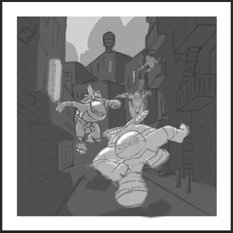
Hi Kendra. Great job so far with the environment. My only thought was that the Turtles are really small. I made them larger and did a little rearranging. I also started trying to move the light source forward but ran out of time!
www.lydiamueller.com
Twitter @lydesigns -
Thank you, Noémie! Tangents are the worst!
Also - I just checked out your website - wow... those nude studies are wonderful!@NoWayMe said:
Hi Kendra!
I am absolutely no expert myself, but I can try to help!
-
Thanks Lydia! always appreciate a draw over!
I really like the placement suggestions and the lighting idea. I'll give it a try!
@gimmehummus said:
Hi Kendra. Great job so far with the environment. My only thought was that the Turtles are really small. I made them larger and did a little rearranging. I also started trying to move the light source forward but ran out of time!
-
@Kendra-Minadeo being an ex-patriate NYker, I know the street you based this on very well, Doyers Street. I've walked it late at night after craving Chinese at Hop Khee on Mott Street... so I looked it up, and found a picture of it at night. Then I took your original and flattened the color, and redid the light according to the photograph, and not the comic book street lamp lighting you had... mostly because I thought your scene was too bright.
I added a vignette around the 4 corners to give the scene the feeling that darkness was enclosing in on all sides, that way your lighting stood out more, the top 2 ninjas actually match the streetlamp glow even better, which was kind of a happy accident.
This is not to say I don't adore what you did here, I am a big TMNT fan, my friend turned me onto the original comics by Eastman/Laird back in the day. My only minor quip is to make Mickey's nunchucks more obvious, but he's so small (3rd figure falling) that I had to squint that you did indicate it. That's just the fan boy in me complaining.
Other than that. I took your original drawing, selected them with the lasso, duplicated them to make them darker, then I used the transform perspective to make them look like they were coming at us more. I then selected Raphael separately and turned him 15 degrees to the right, so he'd appear in a more zig zag approach, and I did the same to Donatello at the top, turning him the other way to the left. I also made him slightly smaller...
Hope that helps.
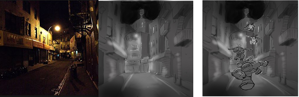
Here's a close up...
-
@Bobby-Aquitania Hey Bobby!
Thanks for taking the time to rework this and give feedback - really appreciate it! Happy Holidays!
I'll post updates as I have them.
Best,
Kenda -
I would suggest correcting the gesture on the ninja turtle who is running. Typically, a bipedal running figure has alternating limbs. With his right leg swinging forward, it should be the left arm that is matching it, rather than the limb on the same side.
That said, I really like the gestures of the two middle turtles. The one in the front and the back, I would rework. I also like the stark contrast of the street lamp clearly illuminating just that particular section of the street. That clean line of demarcation from light to dark appeals to me. Very comic book style. I would not recommend changing that, as others have suggested.