Society of Visual Storytelling

    SVSLearn Forums

    • Register
    • Login
    • Search
    • Recent
    • Tags
    • Popular
    • Users
    • Groups
    • Search
    1. Home
    2. Tags
    3. feedback
    Log in to post
    • All categories
    • J. Morgan Looney

      Critique request
      Artwork • critique feedback • • J. Morgan Looney

      4
      2
      Votes
      4
      Posts
      510
      Views

      Jeanne.M.Bowman

      @J-Morgan-Looney I LOVE Guznag's work! I have been following him for a while and I love how his lines are so expressive. I can see now a bit of that influence in your work here.

    • Griffin McPherson

      WIP help with values
      Questions & Comments • feedback wip • • Griffin McPherson

      3
      0
      Votes
      3
      Posts
      438
      Views

      Griffin McPherson

      @Geoffrey-Mégardon
      Took your advice! I think I’m happy with where the piece is at now but if you have any other feedback I’d love to hear it.
      IMG_2733.jpeg

    • Enni Heikura

      I would really appreciate feedback on my illustrations, I´m trying hard to get them to the professional level but don´t know exactly how to improve right now....
      Questions & Comments • illustration feedback childrens book storytelling critique • • Enni Heikura

      5
      2
      Votes
      5
      Posts
      814
      Views

      Enni Heikura

      @Nyrryl-Cadiz Hi and thank you for your advice! I totally agree that my hands are not the best one, so they could be definitely improved! All the best for you too!

    • Sara Therese Art

      Feedback/critiques on a couple new pieces...
      Questions & Comments • portfolio critique feedback • • Sara Therese Art

      7
      0
      Votes
      7
      Posts
      870
      Views

      Sara Therese Art

      @TheresaMuth Yes, good point. Full disclosure I normally use perspective lines (the Procreate perspective drawing guide drawing assist layer is a great help) but I thought I could be clever and wing it this time around. I obviously ran into problems. The original point of view was going to be from the floor up but as I struggled I decided I'd just change it to have the mouse sitting on a table. 🙈 Oh my gosh, how lazy was that?! Anyway, I'll make the changes @Kevin-Longueil mentioned and I should probably draw in the table edge that he's sitting on so that it's clear. Lesson learned! I'm not at the point in my journey to be winging my perspectives just yet!

    • LukeMurray

      First time posting, would love some feedback
      Artwork • critique feedback • • LukeMurray

      6
      0
      Votes
      6
      Posts
      830
      Views

      TheresaMuth

      Hi Luke! Welcome! I really like your style. The first thing I noticed was that the last (farthest) cross rail on the fence doesn't decrease in width like the first two. Second, the point of highest contrast (IMO) is at the pinky finger/elbow up against the white of the fence. Intentional? (Is holding the ice cream the main point of your story.) Finally, the edges on the left side of the page are so "lost" / fuzzy as compared to the right side -- maybe this was intentional to show distance, but then the street and sidewalk between his legs don't follow the same rules.
      This makes me want to see more of your work and i would love to see your next version of this one. Very intriguing style. ** LIKE **

    • Robyn Hepburn

      I'd love some critical feedback
      Artwork • feedback critique portfolio book cover • • Robyn Hepburn

      18
      3
      Votes
      18
      Posts
      1952
      Views

      Robyn Hepburn

      @Kristen-Lango Hi, Thank you!
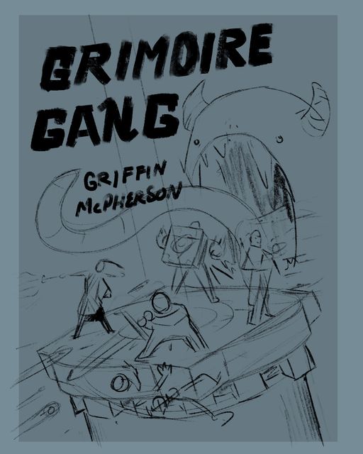
      Yup, I have been working on it...endlessly...but I'm finding this a really great piece for lots of trial and error. In fact, I'm even considering changing it into an internal illustration and then being able to make the cover more figurative. That way this one can be more literal, without the many-seasons and tree-wolves.

      The colour palette thing is a very good point... I love using many colours, or variations on a bunch of colours, but then I feel like I have to hold myself back and limit it because that's what so many illustrators say to do. So it's really helpful to know what your reaction was to those limited colours on the girls' clothes.

      Right, I'll keep going...

    • Griffin McPherson

      Feedback: Another spread
      Projects • spread portfolio feedback • • Griffin McPherson

      5
      3
      Votes
      5
      Posts
      693
      Views

      Erick Reilly

      @Griffin-McPherson I think you have the right amount of bricks. They don't take away the focus from the most important details of the spread, which is what you ant.

    • Griffin McPherson

      Feedback: Spread with room for text
      Projects • feedback spread • • Griffin McPherson

      15
      3
      Votes
      15
      Posts
      1286
      Views

      von_Nimmermehr

      I really like the new version, and i dont think it's a problem, that the rock is kind of the same size as the boat man, in my oppinion. but you kan still play around with is as much as you like.

      The rock just below the boat catched my eye though becaus it just tips the boat, maybe you could make it a bit smaller or a bit bigger?

    • L

      Sample Cover for Portfolio Feedback?
      Questions & Comments • portfolio covers cover feedback kidlit • • Laura Hunt

      7
      2
      Votes
      7
      Posts
      836
      Views

      L

      @Asyas_illos thank you!

    • Griffin McPherson

      Ready to put in my portfolio?
      Questions & Comments • feedback portfolio spread • • Griffin McPherson

      20
      3
      Votes
      20
      Posts
      1996
      Views

      NessIllustration

      @Griffin-McPherson I like the very faded lines!

    • Griffin McPherson

      Spread feedback
      Projects • feedback portfolio spread • • Griffin McPherson

      26
      1
      Votes
      26
      Posts
      2508
      Views

      Tom Harshberger

      I love the idea, the warped perspective is a really cool idea. One thing I'd work on is sketching in a perspective grid so that each item on the wall follows that warping perspective as it goes down the hallway. Even though the perspective is intentionally wacky, the items still need to follow the overall warped lines for it to look right.

      Such a cool idea! Can't wait to see it.

    • ?

      Unique and Appealing Character Design - Beauty and the Beast Meets Fluffy Monsters
      SVS Class Work • classwork characterdesign sketch feedback • • A Former User

      5
      3
      Votes
      5
      Posts
      773
      Views

      ?

      @Frogpunzel YES! I know what you mean. I think you really have to think way outside the box for this one!! 🙂 Good luck!

    • Griffin McPherson

      Feedback: character sheet for portfolio
      Questions & Comments • feedback portfolio • • Griffin McPherson

      12
      0
      Votes
      12
      Posts
      1205
      Views

      kirsten-mcg

      @Griffin-McPherson He looks great to me! Easily recognizable as the same character throughout, and with a lot of fun variation in poses and facial expressions. I really like @ajillustrates 's idea to have him wear the aviation goggles in the bottom middle pose.

    • Griffin McPherson

      Saliva solutions
      Projects • feedback book cover portfolio • • Griffin McPherson

      8
      0
      Votes
      8
      Posts
      833
      Views

      Sarah VanDam

      Yeah, what @kirsten-mcg said is along the lines of what I would comment: I think the saliva could add a lot if you refine the gesture and shape of it. But then, I also think you might want to knock back the value of the monster and saliva in general so that it doesn’t compete as much with the type. I also notice there’s a bit of a tangent with the monster’s tongue and the bottoms of the the “G” that you might want to break up. I DO, however, like the general translucency of the saliva. How lovely to be in a professional field where you can debate this type of thing. 🙂

    • Mia Clarke

      Help me kill my darling
      Artwork • critique feedback • • Mia Clarke

      26
      0
      Votes
      26
      Posts
      2738
      Views

      ArtistErin

      @Griffin-McPherson Yep I agree with you here Griffin, it is easier to begin from scratch and thumbnail, establish values, create your focus and develop elements from there. I know, I'm in that boat too, trying to learn to not do what always gets me into trouble when a composition just isn't working. It sucks sometimes 😞 But that said, you do have beautiful rendering techniques and I love your textures, colors, and mood...

    • Griffin McPherson

      WIP feedback
      Projects • bookcover wip feedback • • Griffin McPherson

      5
      0
      Votes
      5
      Posts
      584
      Views

      Griffin McPherson

      @AngelinaKizz thanks, I’ll check it out!

    • Feedback: Book cover composition
      Projects • feedback book cover • • Griffin McPherson

      7
      1
      Votes
      7
      Posts
      948
      Views

      Griffin McPherson

      @Stephanie-H I think I can find a way to finagle that!

    • Griffin McPherson

      Cover design feedback
      Artwork • feedback cover book cover • • Griffin McPherson

      21
      0
      Votes
      21
      Posts
      2235
      Views

      ?

      @Griffin-McPherson Wow it's really coming together! It seems like you just have some final details to just play around with like some color options for the hair and such.

    • Griffin McPherson

      Book cover feedback
      Projects • feedback book cover covers • • Griffin McPherson

      9
      0
      Votes
      9
      Posts
      945
      Views

      ?

      @Griffin-McPherson What's it look like with the color on the 2nd option? I think having both to compare will help you make your final decision.