First time posting, would love some feedback
-
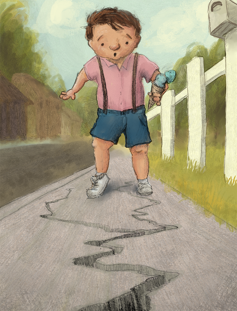
Hey all! I've been working on this piece today, and I would love it get a fresh perspective on it. Is there anything that immediately stands out to you that needs to be fixed?
Any feedback is greatly appreciated!
-
@LukeMurray Ooh, I really like your style, especially the textures.

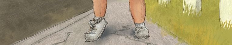
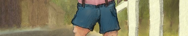
The only thing I think makes it not quite look like it's professional level is the child's right leg... If you look at each part separately the wrongness might become clearer:
Also, if I'm being picky, the ice-cream hand and arm - because of the foreshortening - could be done in a clearer or more interesting way?
Other than that, I really like the colour palette, and how you've made his face very simplified, yet with depth. -
@Robyn-Hepburn Thank you so much for the feedback! I can definitely see what you mean about the ice cream arm. Do you mean because the child's right leg is turned out in that way, it makes it look wonky?
-
Welcome!
I love your texture and color palette.
If you’d like to get super picky, besides the leg…
The fence line, the house line, and the sidewalk line all draw your eye to the center of the page… which happens to be the boys crotch. That’s a bit off feeling. Next I would suggest spending some time working on proportions and age. His face feels too young for his body proportions. So you could go either way, but if you reduced the body proportions, you’d offset the x that’s drawing the eye to the centre of the page.
As the most nit picky of critique, the two hands are at tangents/almost tangents. There isn’t quite enough breathing room around the roof and his hand, and the line of the fence lines up too much with his hand holding the ice cream. You could raise that arm a bit higher trying to “protect” the ice cream and remove that tangent. This would also be helped by adjusting the body proportions.These are just thoughts and you can take them with a grain of salt, but eh there the things I was able to pick out in giving it a once over. I’m looking forward to seeing more of your work. You have a really cute playful style.
-
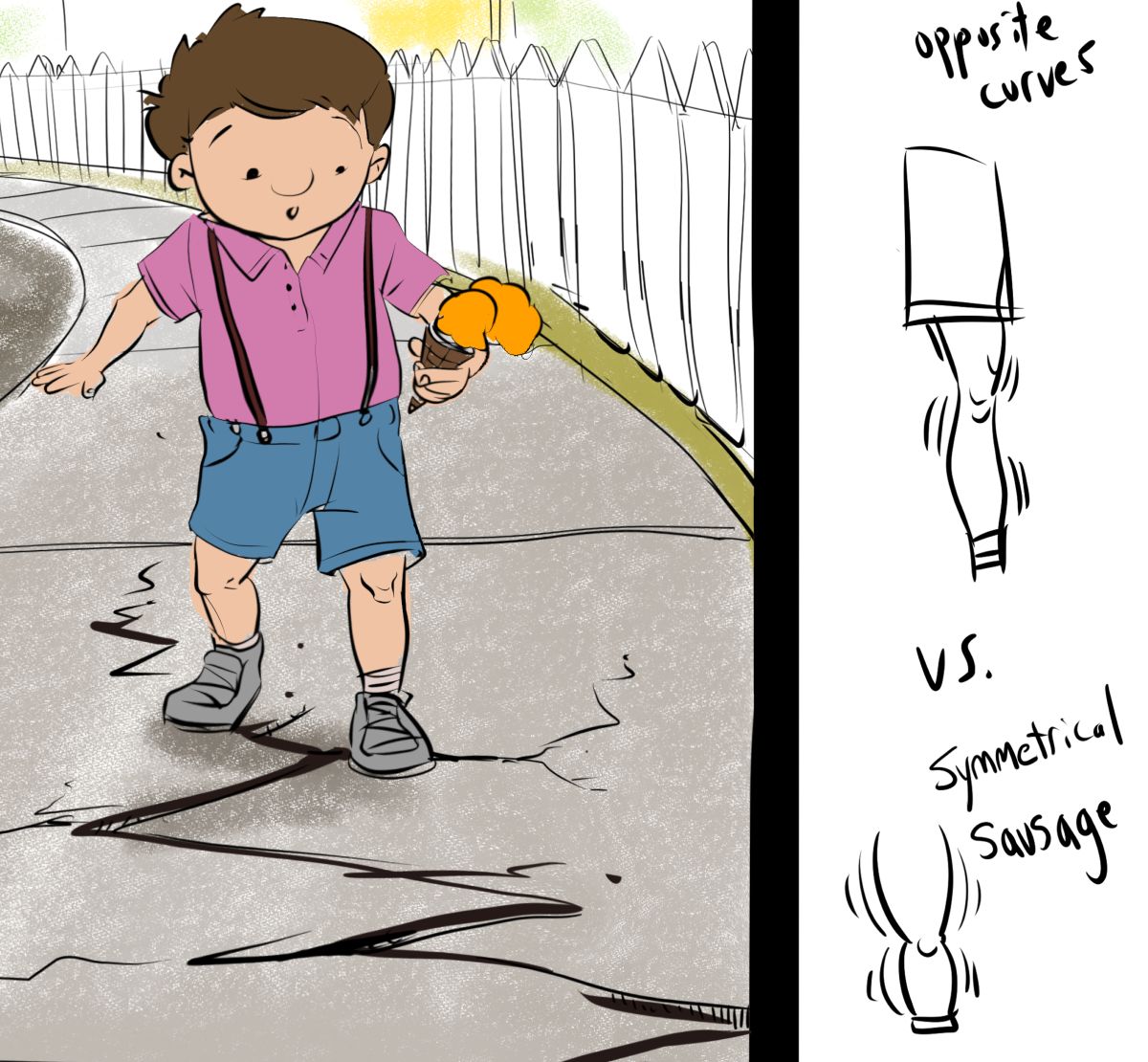
The thing I noticed, besides the background/focal point thing previously mentioned, is the sausage approach to some of the forms. Making an arm or leg symmetrical gives a sausage feel. Also, I'm not sure where you want the focus to be, but I think you're trying to get across the cracks in the sidewalk (based on the superstition?). Keep going, and please share any updates. Fun image!
-
Hi Luke! Welcome! I really like your style. The first thing I noticed was that the last (farthest) cross rail on the fence doesn't decrease in width like the first two. Second, the point of highest contrast (IMO) is at the pinky finger/elbow up against the white of the fence. Intentional? (Is holding the ice cream the main point of your story.) Finally, the edges on the left side of the page are so "lost" / fuzzy as compared to the right side -- maybe this was intentional to show distance, but then the street and sidewalk between his legs don't follow the same rules.
This makes me want to see more of your work and i would love to see your next version of this one. Very intriguing style. ** LIKE **