Society of Visual Storytelling

    SVSLearn Forums

    • Register
    • Login
    • Search
    • Recent
    • Tags
    • Popular
    • Users
    • Groups
    • Search

    Feedback: Spread with room for text

    Projects
    feedback spread
    10
    15
    1200
    Loading More Posts
    • Oldest to Newest
    • Newest to Oldest
    • Most Votes
    Reply
    • Reply as topic
    Log in to reply
    This topic has been deleted. Only users with topic management privileges can see it.
    • Griffin McPherson
      Griffin McPherson last edited by

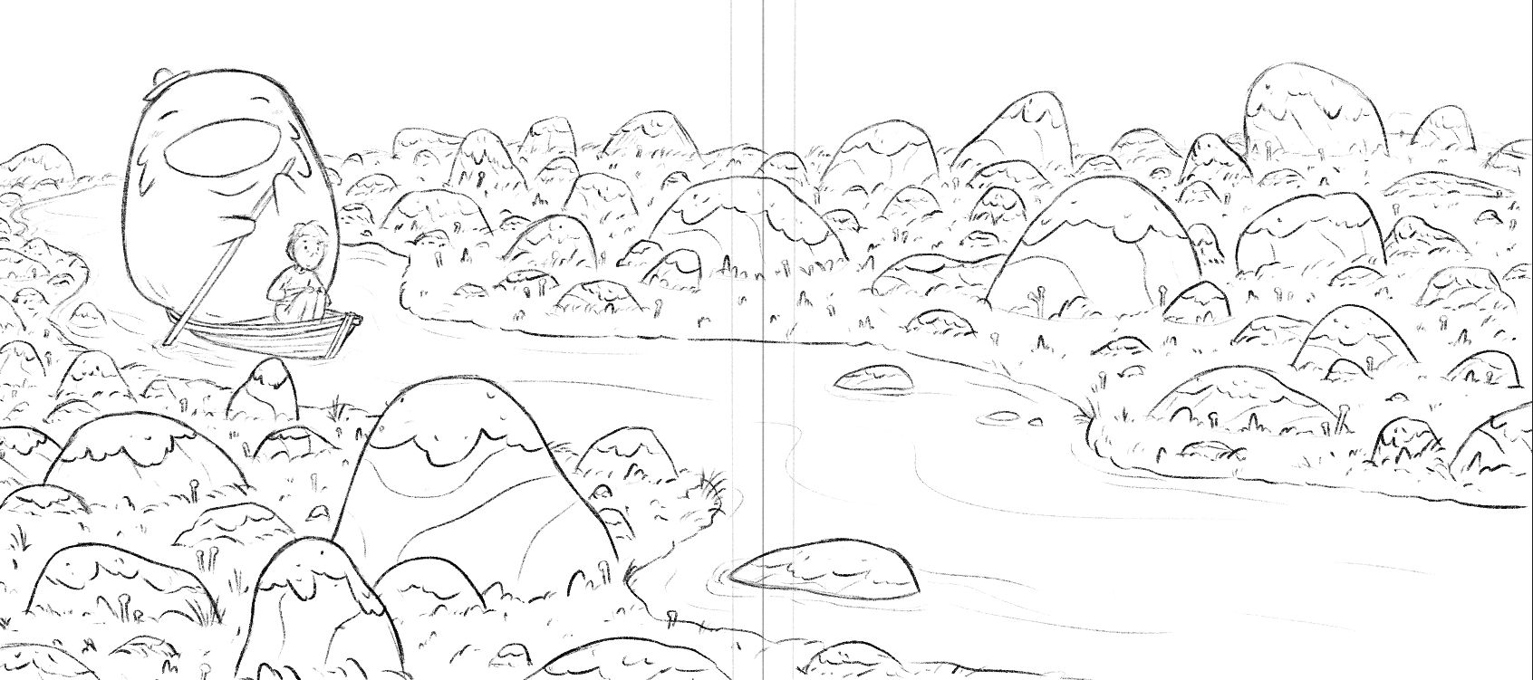
      Another spread with room for text. This is the sketch, just looking for compositional feedback here. I mostly happy with it but I’ve been going back fourth on the lower left and the arrangement of that bigger rock. I like it both ways but I initially had the rock on the left which I worried might put too much weight on that side with the big boatman who is about the same size. So I need some fresh eyes to help me out! Thanks!
      2F3839F2-4021-42A6-89A8-34EDAC4FF47F.jpeg CCDD3946-6EC6-41E6-B543-1F15CABAD8BA.jpeg

      Julia Hegetusch ? ajillustrates kirsten-mcg danielerossi 5 Replies Last reply Reply Quote 3
      • Julia Hegetusch
        Julia Hegetusch @Griffin McPherson last edited by

        @Griffin-McPherson I really like this image. Haven't seen this bevor. Definitely has some ghibli vibes. I like the top one more because the rock is not so close to the boatman. Maybe give the rock a different look because it has a similar shape and size to your (very cute) boatman

        https://moanamaureen.com

        Griffin McPherson 1 Reply Last reply Reply Quote 3
        • Griffin McPherson
          Griffin McPherson @Julia Hegetusch last edited by

          @Julia-Hegetusch thanks for the feedback! I think you’re right about not having the rock right next to the boatman. It’s hard for me to tell exactly because I initially drew it the other way so reversing it looks wrong to me even though I know it probably isn’t.
          The boatmen is Ghibli inspired for sure. Large, round characters are just too endearing not to use

          1 Reply Last reply Reply Quote 1
          • Asyas_illos
            Asyas_illos last edited by

            I’d probably take it all together maybe make a larger rock on the page? Might balance it a smidge?

            Asyasewardillos@gmail.com
            www.Instagram.com/asyas_illos/
            https://asyasewardillos.wixsite.com/mysite

            Griffin McPherson 1 Reply Last reply Reply Quote 1
            • MimiHecher
              MimiHecher last edited by

              I would try to get rid of the big rock as it's size is TOO similar to the boatsman's size, and agree with Ayas on the "make a larger rock". Why not putting one (or two) VERY big in the left bottom corner of the page to create a foreground, and add MIGHTY but outfaded (blueish colored) rocks in the far far background of the picture, breaking with them the horizontal line?
              Don't know whether that can look good, I would have to draw it to get an opinion. 😉 So maybe it's a bad idea and takes the calmness from the illustration.

              1 Reply Last reply Reply Quote 1
              • ?
                A Former User @Griffin McPherson last edited by

                @Griffin-McPherson I like the top one. Very nice illustration!

                1 Reply Last reply Reply Quote 1
                • ajillustrates
                  ajillustrates @Griffin McPherson last edited by

                  @Griffin-McPherson I prefer the top one, because the smaller rock doesn’t compete with your boatman. But the rock that you need to take a look at is the one creating a tangent with the bottom of the boat. Make it a little taller, and the overlap will create more depth in the piece.

                  https://ajillustrates.com
                  https://www.instagram.com/aj.illustrates/

                  Griffin McPherson 1 Reply Last reply Reply Quote 1
                  • Griffin McPherson
                    Griffin McPherson @ajillustrates last edited by

                    @ajillustrates I saw that tangent but it’s a small enough thing that I figured I’d wait to fix it when I do the final line drawing. Good catch nonetheless!

                    1 Reply Last reply Reply Quote 0
                    • kirsten-mcg
                      kirsten-mcg @Griffin McPherson last edited by

                      @Griffin-McPherson Definitely the top one. Moving the large rock forward does help with the weight, and it also takes care of the awkward almost-tangent between the top of the large rock and the ore. I'm excited to see this piece in color! The boatman is adorable!

                      Instagram: https://www.instagram.com/kirsten.mcgonigal.art/
                      Portfolio Site: www.kirstenmcgonigalart.com

                      1 Reply Last reply Reply Quote 1
                      • Griffin McPherson
                        Griffin McPherson @Asyas_illos last edited by

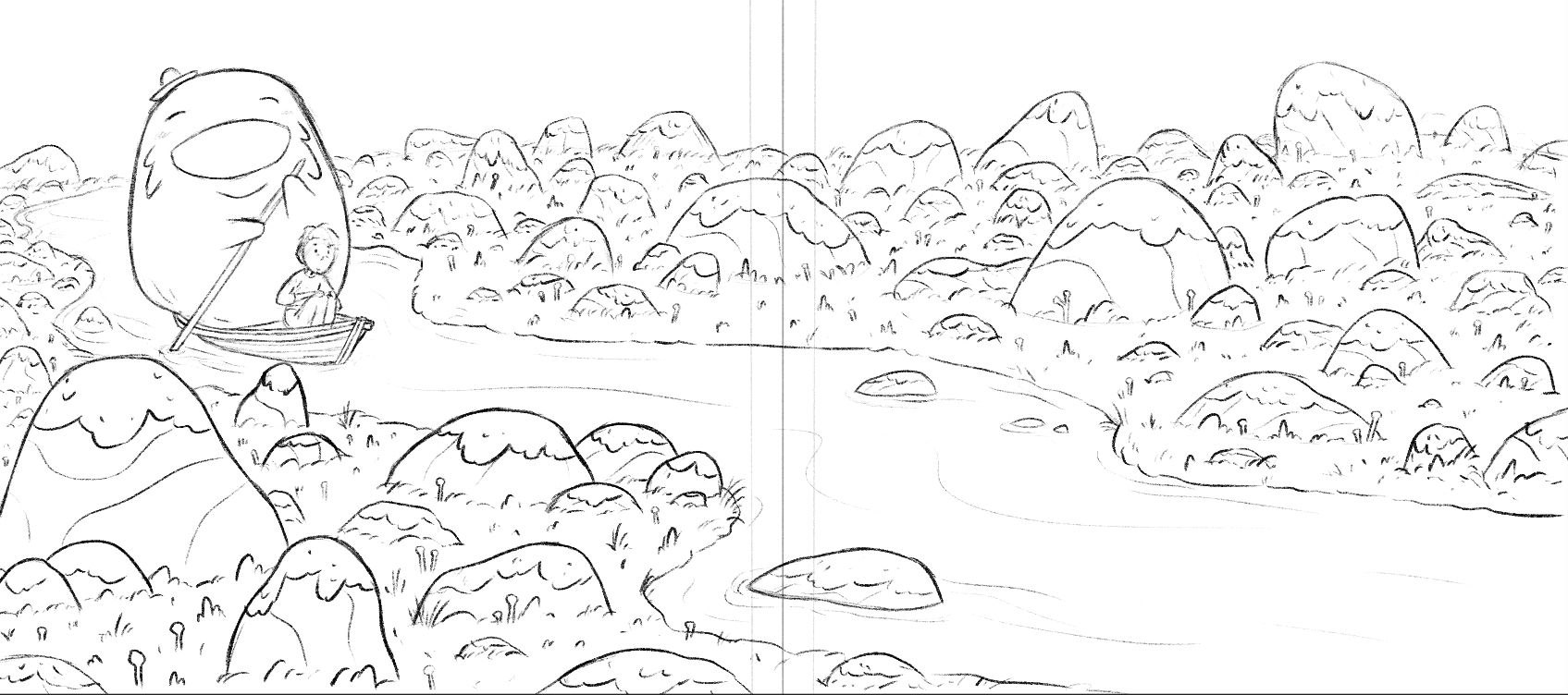
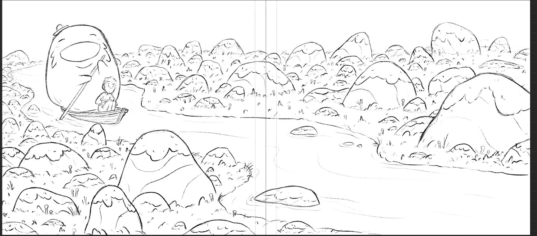
                        @Asyas_illos update: added a bigger rock and I think I like it! I was worried it would flatten out the depth of that area but I think it works nicely. What does everyone else think?9B369509-8F4A-4A68-946F-4FEBA4D58D18.jpeg 6316C2D6-A1B1-40FE-86B1-1B37C0EB1D44.jpeg

                        Jean Watson 1 Reply Last reply Reply Quote 0
                        • Jean Watson
                          Jean Watson @Griffin McPherson last edited by

                          @Griffin-McPherson Like the bigger rock - that was a good suggestion. I wonder whether the rock on the left below the boatman should be a tiny bit squashed so it's shaped more like the biggest rock (decreases the visual link to the boatman. Unless there's meant to be a link?)

                          1 Reply Last reply Reply Quote 1
                          • Asyas_illos
                            Asyas_illos last edited by

                            @Griffin-McPherson i like it much better it creates a nice triangle for your eyes to sweep through.

                            Asyasewardillos@gmail.com
                            www.Instagram.com/asyas_illos/
                            https://asyasewardillos.wixsite.com/mysite

                            Asyas_illos 1 Reply Last reply Reply Quote 1
                            • Asyas_illos
                              Asyas_illos @Asyas_illos last edited by

                              @Jean-Watson is right though there is a tangent with the boat and that small pointy rock but you may have already fixed it. Looking forward to the final!

                              Asyasewardillos@gmail.com
                              www.Instagram.com/asyas_illos/
                              https://asyasewardillos.wixsite.com/mysite

                              1 Reply Last reply Reply Quote 0
                              • danielerossi
                                danielerossi @Griffin McPherson last edited by

                                @Griffin-McPherson What a great illustration! I, too, vote for top. There’s something about the rock being up ahead that makes me think about “what will happen next”.

                                https://www.instagram.com/heyfrankybanky

                                1 Reply Last reply Reply Quote 0
                                • von_Nimmermehr
                                  von_Nimmermehr last edited by

                                  I really like the new version, and i dont think it's a problem, that the rock is kind of the same size as the boat man, in my oppinion. but you kan still play around with is as much as you like.

                                  The rock just below the boat catched my eye though becaus it just tips the boat, maybe you could make it a bit smaller or a bit bigger?

                                  Website: www.von-Nimmermehr.com
                                  Instagram: https://www.instagram.com/von_nimmermehr_illustration/

                                  1 Reply Last reply Reply Quote 0
                                  • First post
                                    Last post