Book cover feedback
-
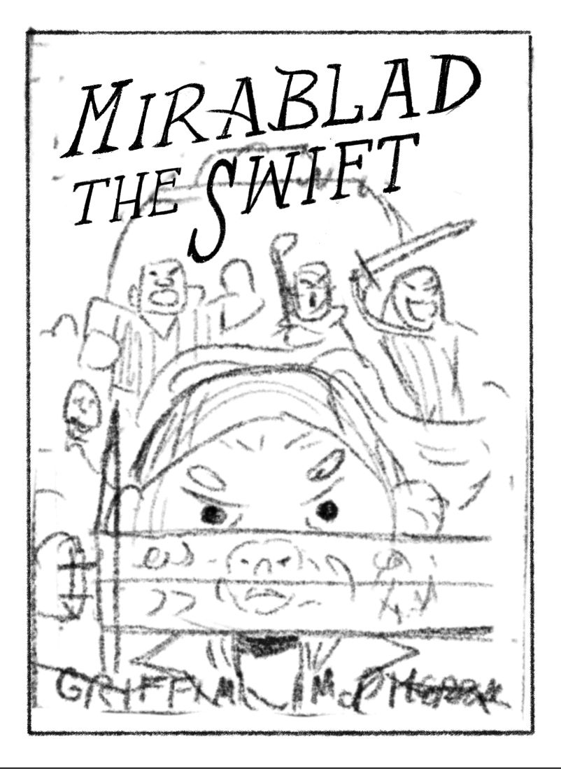
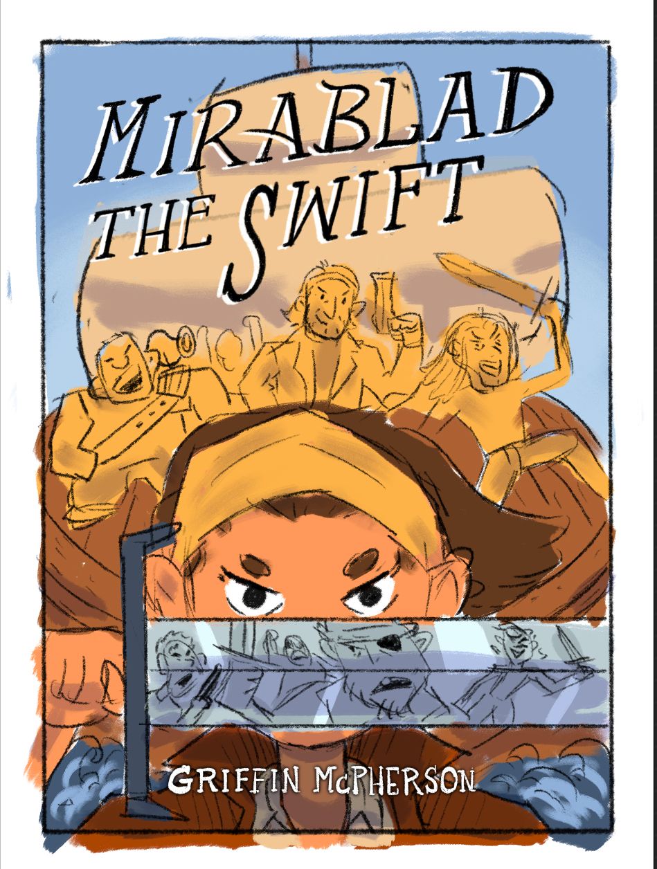
Making a book cover piece for my portfolio and I want to make sure I get the text right. Just working with the thumbnail sketch while I figure out the title placement. Is it working well with the rest of the composition?
Any other feedback on the overall design would be appreciated too! I know it’s just a messy thumbnail so it might be hard to give feedback but the idea is that Mirablad is holding a sword up that’s reflecting enemies charging at her and from behind she has her pirate crew mates charging into battle with her. In the background are the sails of the ship.
-
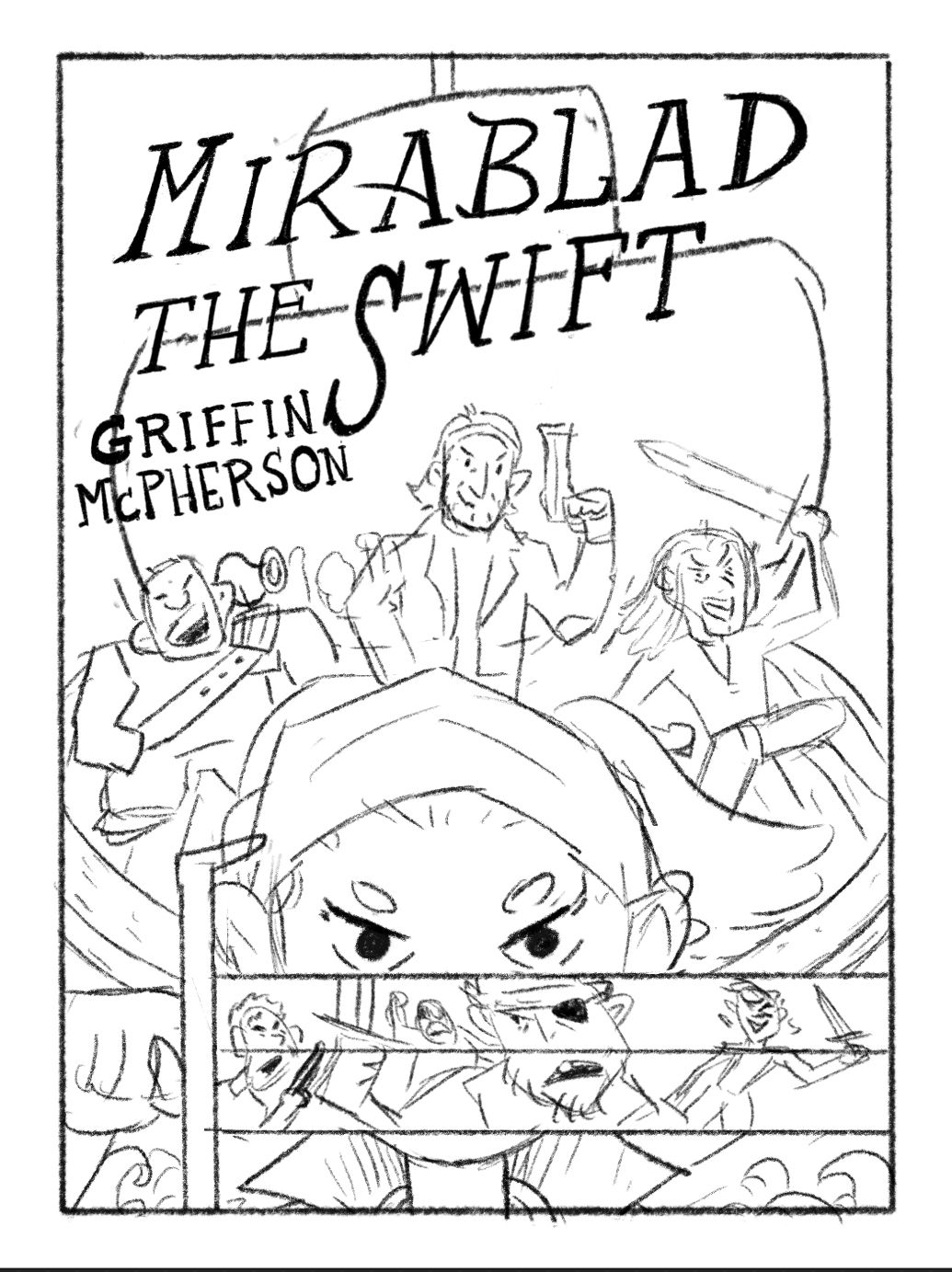
Here are three versions I’ve been working on. You may not notice the difference between the first two. It’s just a slight change in the size of the sail, the first one being bigger. Working with the text is tricky! I want to make sure I get it right before going too far forward.
Which one do you like best? What could I add and what could I subtract?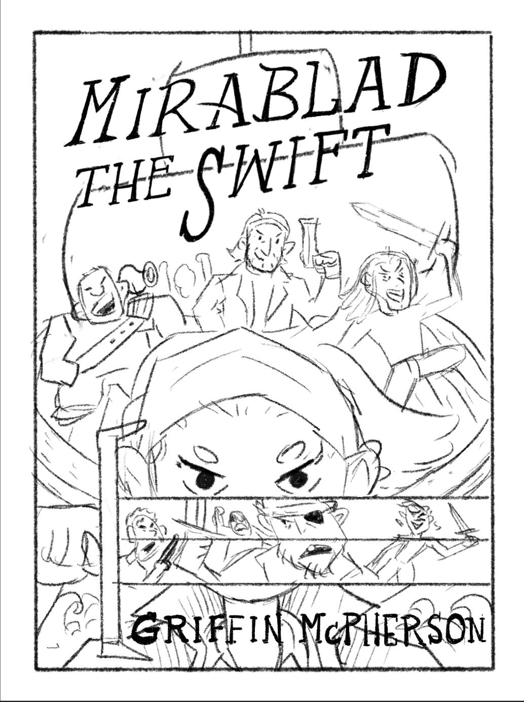 2.
2. 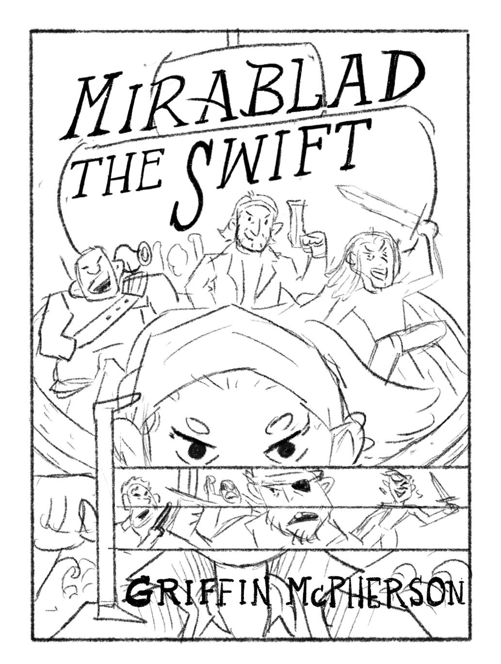 3.
3. 
-
@Griffin-McPherson i like the text at the bottom just maybe a little smaller. This composition looks like it’s going to pretty tricky to pull off, I really want to see her face… but you’ve got the skills so I look forward to seeing how it progresses!
-
@Asyas_illos thanks for the feedback! I think I like the text better at the bottom as well. It’s just a bit busy down there so when I color everything I’ll have to mess around a bit to make it more readable
-
I like the second one when the title text isn't interrupted by the line of the sail.
-
@Stephanie-H glad you brought that up. I’ve deliberated over that a lot. I originally had it so the edge of sail wasn’t going through the text but I thought it might from the text it s weird way. It definitely looks weird right now with the sail running through the text but in the final drawing I’m not going to have the lines in black there. It will be a much lighter line so I’m stilling asking myself if that could work. I drive myself crazy with these little things
-
@Griffin-McPherson If the line weren't so black, I think it could work. Text placement can be difficult.
-
@Stephanie-H here’s a color rough that gives a better idea of what it might look like
-
@Griffin-McPherson What's it look like with the color on the 2nd option? I think having both to compare will help you make your final decision.