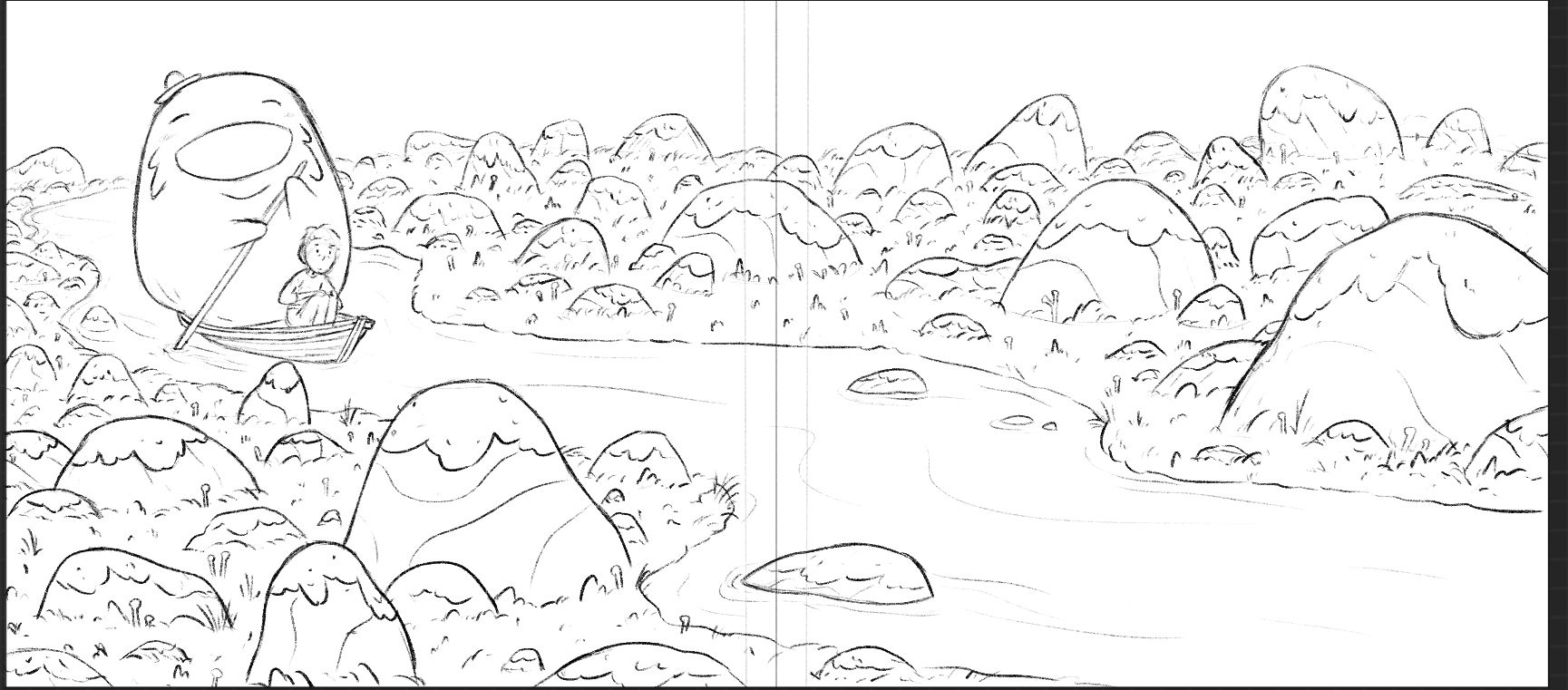
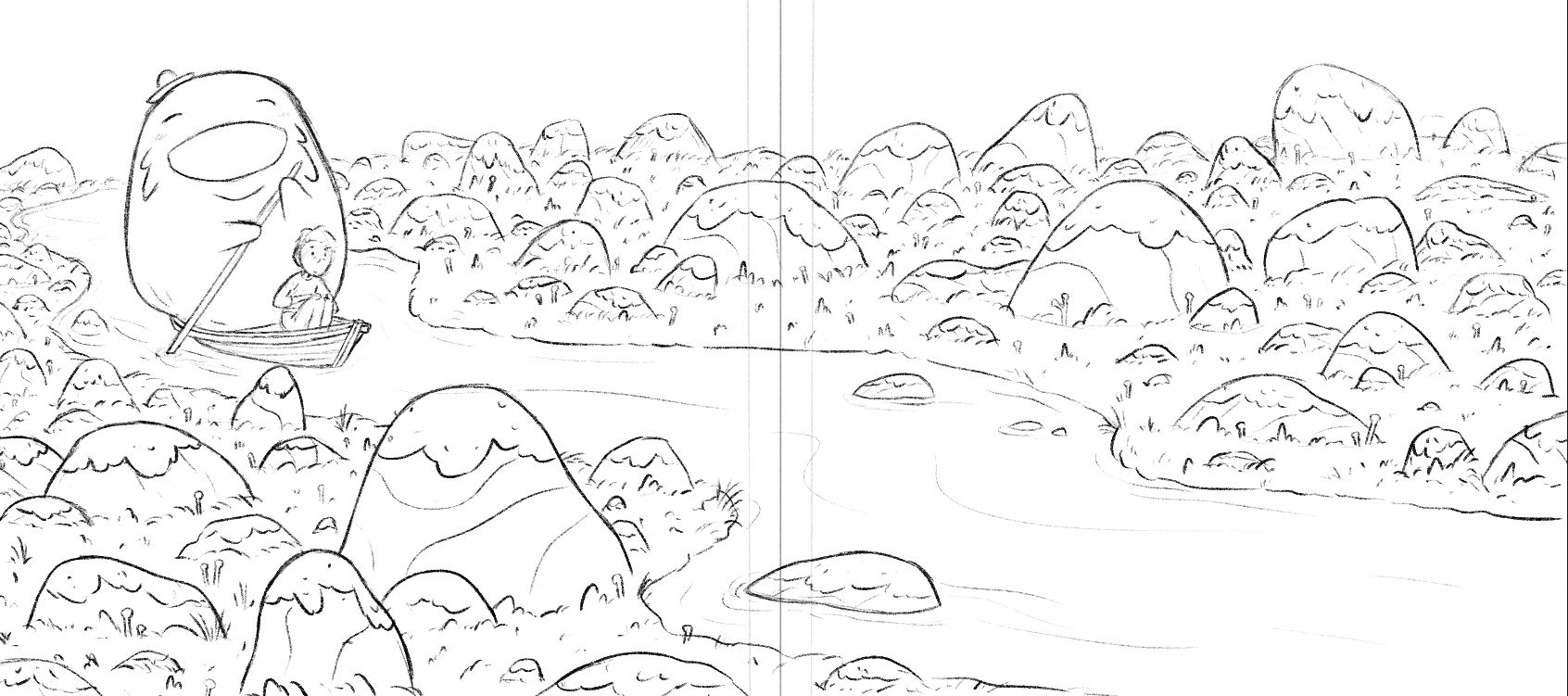
Feedback: Spread with room for text
-
@Griffin-McPherson I like the top one. Very nice illustration!
-
@Griffin-McPherson I prefer the top one, because the smaller rock doesn’t compete with your boatman. But the rock that you need to take a look at is the one creating a tangent with the bottom of the boat. Make it a little taller, and the overlap will create more depth in the piece.
-
@ajillustrates I saw that tangent but it’s a small enough thing that I figured I’d wait to fix it when I do the final line drawing. Good catch nonetheless!
-
@Griffin-McPherson Definitely the top one. Moving the large rock forward does help with the weight, and it also takes care of the awkward almost-tangent between the top of the large rock and the ore. I'm excited to see this piece in color! The boatman is adorable!
-
@Asyas_illos update: added a bigger rock and I think I like it! I was worried it would flatten out the depth of that area but I think it works nicely. What does everyone else think?


-
@Griffin-McPherson Like the bigger rock - that was a good suggestion. I wonder whether the rock on the left below the boatman should be a tiny bit squashed so it's shaped more like the biggest rock (decreases the visual link to the boatman. Unless there's meant to be a link?)
-
@Griffin-McPherson i like it much better it creates a nice triangle for your eyes to sweep through.
-
@Jean-Watson is right though there is a tangent with the boat and that small pointy rock but you may have already fixed it. Looking forward to the final!
-
@Griffin-McPherson What a great illustration! I, too, vote for top. There’s something about the rock being up ahead that makes me think about “what will happen next”.
-
I really like the new version, and i dont think it's a problem, that the rock is kind of the same size as the boat man, in my oppinion. but you kan still play around with is as much as you like.
The rock just below the boat catched my eye though becaus it just tips the boat, maybe you could make it a bit smaller or a bit bigger?